No matter what you're working on—whether it's a commercial or an action-packed scene—this massive bundle is perfect for video editors and motion d...
No matter what you're working on—whether it's a commercial or an action-packed scene—this massive bundle is perfect for video editors and motion designers. It will help take your productions to the next level with professional effects that will capture your audience’s attention.
The Filmmaker VFX Bundle provides you with over 10,000 high-quality assets at a discounted price. No matter what your creative needs are, this bundle has you covered. Let your imagination run wild with thousands of assets to experiment with and create stunning visuals—all with a commercial use license.
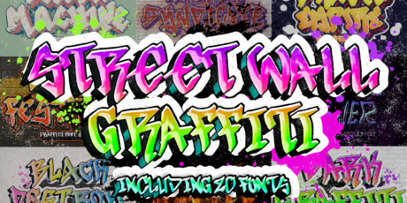
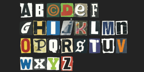
Inside this bundle, you'll find: slideshows, explosion effects, backgrounds, worlds, realistic rain, titles, transitions, overlays, HUD elements, LUTs, animations, fonts, Instagram stories templates, VFX portals, VHS effects, and more.
These assets are compatible with nearly all major video editing software, including Adobe Premiere Pro, Adobe After Effects, Final Cut Pro, DaVinci Resolve, HitFilm Pro, Vegas Pro, and more.
This collection is valued at over $1,000, but for a limited time, you can get it for just $39.
You Will Receive:
10,000 VFX Assets
Slideshows, explosions, backgrounds, worlds, realistic rain, titles, transitions, overlays, HUD elements, LUTs, animations, fonts, Instagram stories, VFX portals, VHS effects, and more.
Compatible with: Adobe Premiere Pro, Adobe After Effects, Final Cut Pro, DaVinci Resolve, HitFilm Pro, Vegas Pro, and other video editing software.
Commercial License Included
Woman enjoying a simulation from vr headset
10,000 VFX Assets Bundle for Filmmakers – Slideshows, Explosions, LUTs, Transitions, Animated Titles & More
No matter what you're working on—whether it's a commercial or an action-packed scene—this massive bundle is perfect for video editors and motion designers. It will help take your productions to the next level with professional effects that will capture your audience’s attention.
The Filmmaker VFX Bundle provides you with over 10,000 high-quality assets at a discounted price. No matter what your creative needs are, this bundle has you covered. Let your imagination run wild with thousands of assets to experiment with and create stunning visuals—all with a commercial use license.
Inside this bundle, you'll find: slideshows, explosion effects, backgrounds, worlds, realistic rain, titles, transitions, overlays, HUD elements, LUTs, animations, fonts, Instagram stories templates, VFX portals, VHS effects, and more.
These assets are compatible with nearly all major video editing software, including Adobe Premiere Pro, Adobe After Effects, Final Cut Pro, DaVinci Resolve, HitFilm Pro, Vegas Pro, and more.
This collection is valued at over $1,000, but for a limited time, you can get it for just $39.
You Will Receive:
10,000 VFX Assets
Slideshows, explosions, backgrounds, worlds, realistic rain, titles, transitions, overlays, HUD elements, LUTs, animations, fonts, Instagram stories, VFX portals, VHS effects, and more.
Compatible with: Adobe Premiere Pro, Adobe After Effects, Final Cut Pro, DaVinci Resolve, HitFilm Pro, Vegas Pro, and other video editing software.
Commercial License Included
Woman enjoying a simulation from vr headset