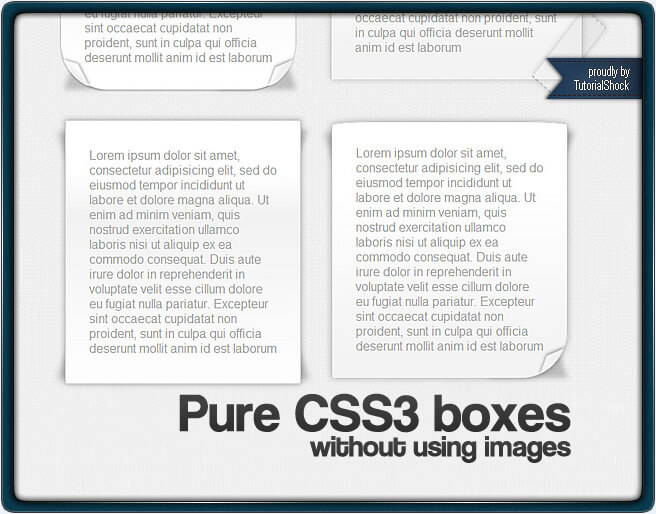
As we have seen during these past few months, CSS3 and HTML5 have demonstrated that designing is now possible without using graphic programs and relying entirely on code. On today’s tutorial we will show you how to make the fascinating set of frame boxes featured in ThemeShock using pure CSS3 and achieve in the process something that can easily look as any Photoshop work. It’s important to state that these boxes look flawless in Safari and quite great in Chrome, so we suggest you to use either one of these browsers to check them out, now let’s begin this tutorial.
Note: This tutorial has been upgraded from its original version thanks to our friend Sven from Advanced Simple who sent us a solution to make these boxes work with Firefox 4, now you can find the improved code within the tutorial.
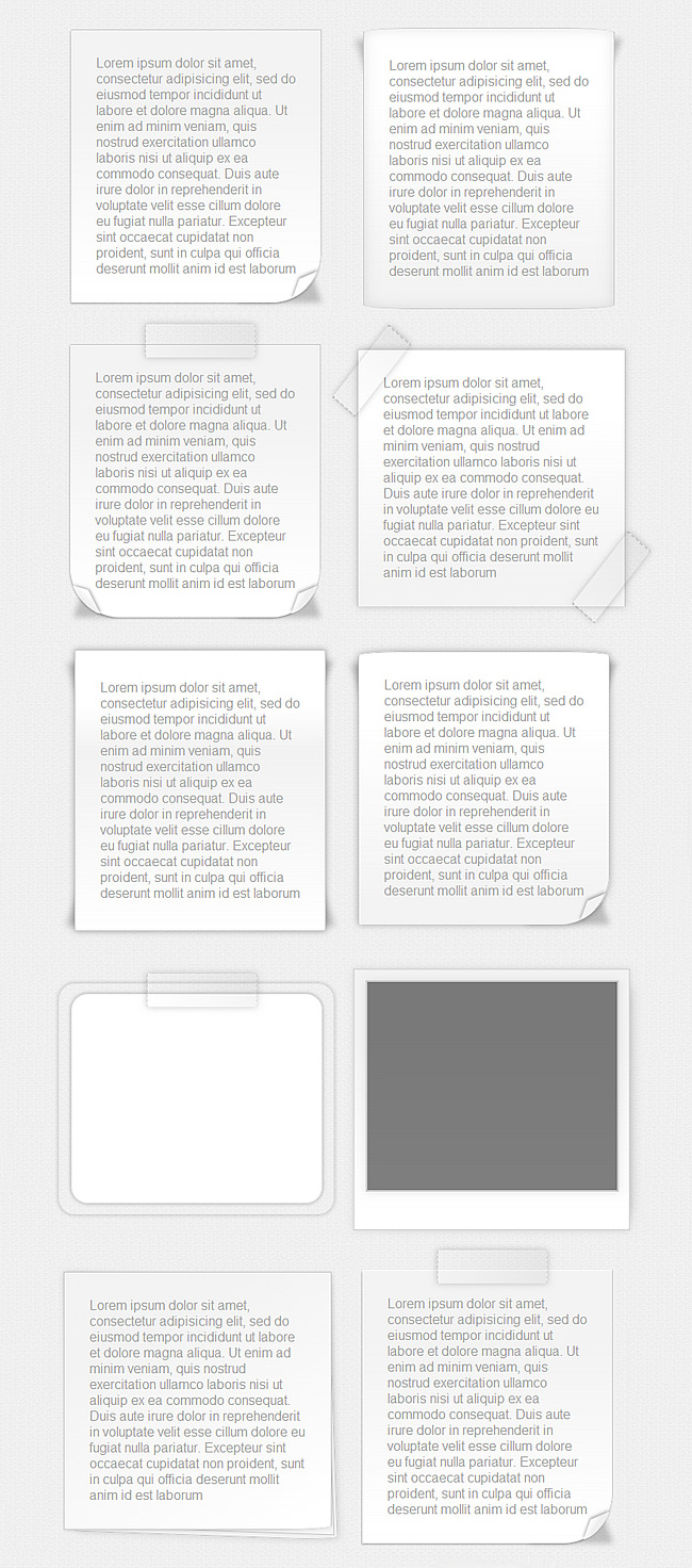
With more than 15 different styles, this exercise truly demonstrates the power of CSS3 combined to a little bit of imagination. Now we’re going to show you the specific code that was utilized to create each one of these fancy frame boxes.
Step … well, the only step: Configuring the CSS
Making these boxes is easier than you think, you only have to get familiarized with the main CSS3 properties and then you can easily start making your own designs without using any graphic software for that purpose, now let’s take a look at how the code was made by our team:
[css]
@charset “utf-8”;
/* CSS Document */
@import url(css/reset.css);
/*******************/
/*** General Page **/
/*******************/
body{
background: url(img/background_1.png);
}
.wrapper{
width: 960px;
overflow: hidden;
margin: auto;
padding: 60px 0 100px;
}
#header{
width: 100%;
background:url(img/bkg_header.png) repeat-x;
}
.header_content{
width: 1000px;
height: 125px;
margin: auto;
}
.set_item{
width: 400px;
float: left;
}
.shk_bundle{
position: fixed;
right:0;
bottom: 10px;
}
.shk_bundle a{
outline: none;
}
.clear{
clear:both;
}
#footer{
width: 100%;
background: url(img/bkg_footer.png);
}
.footer_content{
height: 155px;
width: 1000px;
margin: auto;
}
/*** end general page ***/
[/css]
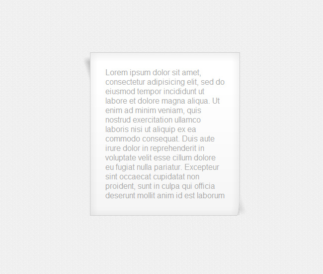
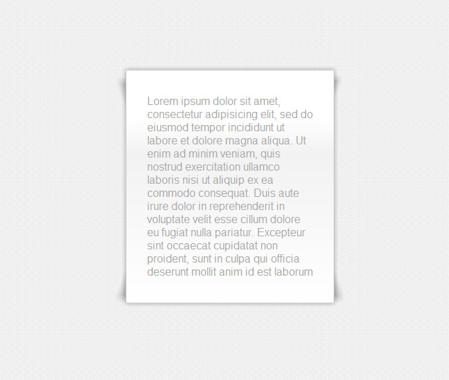
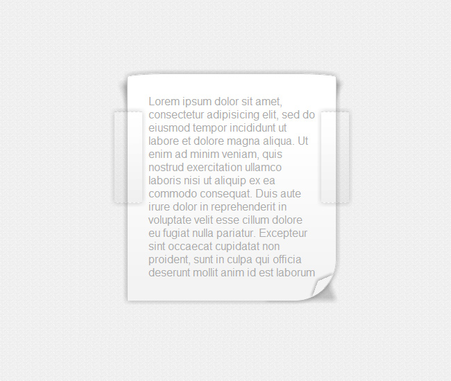
Box # 1
A basic paper box with subtle shadows in the opposite corners and a tiny fold in the bottom right corner, it also has a subtle inner shadow effect to add some depth.
[css]
/* This establishes the design of the boxes’ paragraphs */
.box1 p, .box2 p, .box3 p, .box4 p, .box5 p, .box6 p, .box7 p, .box9 p, .box10 p, .box11 p, .box12 p, .box13 p, .box14 p, .box15 p, .box16 p{
margin: 30px;
color: #aaa;
outline: none;
}
/* In this selector we specify the width, height, borders, position, background color, color and shadow’s dimensions */
.box1{
width: 300px;
margin: 40px;
min-height: 200px;
position:relative;
display: inline-block;
background:#fff;
background: -webkit-gradient(linear, 0% 20%, 0% 1000%, from(#fff), to(#fff), color-stop(.1,#f3f3f3));
background: -moz-linear-gradient(0% 0%, #fff, #f3f3f3 10%, #fff);
border: 1px solid #ccc;
-webkit-box-shadow: 0px 3px 30px rgba(0, 0, 0, 0.1) inset;
-moz-box-shadow: 0px 3px 30px rgba(0, 0, 0, 0.1) inset;
box-shadow: 0px 3px 30px rgba(0, 0, 0, 0.1) inset;
-webkit-border-bottom-right-radius: 6px 50px;
-moz-border-radius-bottomright: 6px 50px;
border-bottom-right-radius:6px 50px;
}
/* On this pseudo class we specify the design that goes prior the box1 class, in this case it’s the shadow placed at the bottom of this box, here’s where we determine the measures, rotation and skew of the shadow itself */
.box1:before{
content: ”;
width: 50px;
height: 100px;
position:absolute;
bottom:0; right:0;
-webkit-box-shadow: 20px 20px 10px rgba(0, 0, 0, 0.1);
-moz-box-shadow: 20px 20px 15px rgba(0, 0, 0, 0.1);
box-shadow: 20px 20px 15px rgba(0, 0, 0, 0.1);
z-index:-1;
-webkit-transform: translate(-35px,-40px)
skew(0deg,30deg)
rotate(-25deg);
-moz-transform: translate(-35px,-40px)
skew(0deg,32deg)
rotate(-25deg);
-o-transform: translate(-35px,-40px)
skew(0deg,32deg)
rotate(-25deg);
}
/* On this pseudo class we specify the design that goes prior the box1 class, in this case it’s the shadow placed on top of the box, here’s where we determine the measures, rotation and the skew of the shadow itself*/
.box1:after{
content: ”;
width: 100px;
height: 100px;
top:0; left:0;
position:absolute;
display: inline-block;
z-index:-1;
-webkit-box-shadow: -10px -10px 10px rgba(0, 0, 0, 0.2);
-moz-box-shadow: -10px -10px 15px rgba(0, 0, 0, 0.2);
box-shadow: -10px -10px 15px rgba(0, 0, 0, 0.2);
-webkit-transform: rotate(2deg)
translate(20px,25px)
skew(20deg);
-moz-transform: rotate(7deg)
translate(20px,25px)
skew(20deg);
-o-transform: rotate(7deg)
translate(20px,25px)
skew(20deg);
transform: rotate(7deg)
translate(20px,25px)
skew(20deg);
}
[/css]
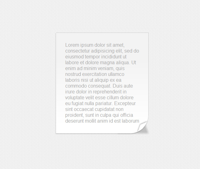
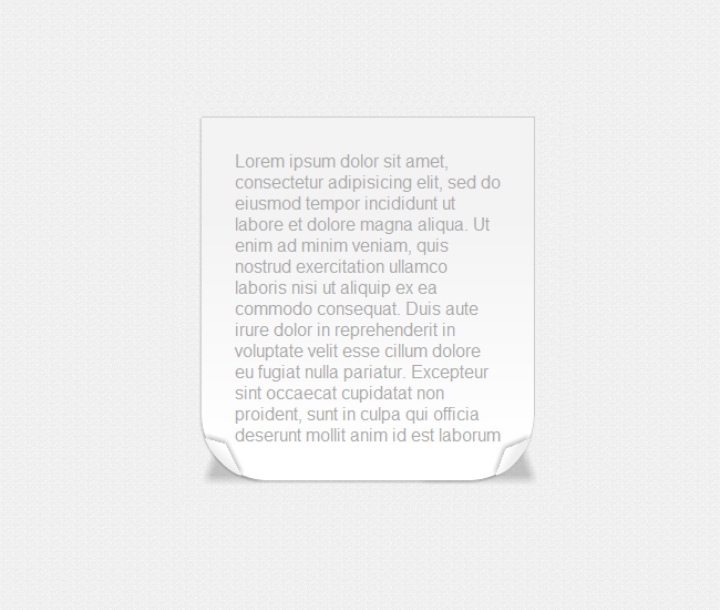
Box # 2
This box has a bigger fold on its bottom right corner with its equivalent shadow, on this case the inner shadow was replaced by a subtle gradient overlay.
[css]
/* This is the second selector of the box, we assign some specific measure values, background colors, borders and shadows */
.box2{
margin: 50px;
width: 300px;
min-height: 150px;
padding: 0 0 1px 0;
position:relative;
background: #f3f3f3;
background: -webkit-gradient(linear, 0% 20%, 0% 92%, from(#f3f3f3), to(#fff), color-stop(.1,#f3f3f3));
background: -moz-linear-gradient(0 0 270deg, #f3f3f3, #f3f3f3 10%, #fff);
border-top: 1px solid #ccc;
border-right: 1px solid #ccc;
-webkit-border-bottom-right-radius: 60px 60px;
-moz-border-radius-bottomright: 60px 60px;
border-bottom-right-radius: 60px 60px;
-webkit-box-shadow: -1px 2px 2px rgba(0, 0, 0, 0.2);
-moz-box-shadow: -1px 2px 2px rgba(0, 0, 0, 0.2);
box-shadow: -1px 2px 2px rgba(0, 0, 0, 0.2);
}
.box2:before{
content:”;
width: 25px;
height: 20px;
position: absolute;
bottom:0;
right:0;
-webkit-border-bottom-right-radius: 30px;
-moz-border-radius-bottomright: 30px;
border-bottom-right-radius: 30px;
-webkit-box-shadow: -2px -2px 5px rgba(0, 0, 0, 0.3);
-moz-box-shadow: -2px -2px 5px rgba(0, 0, 0, 0.3);
box-shadow:-2px -2px 5px rgba(0, 0, 0, 0.3);
-webkit-transform: rotate(-20deg)
skew(-40deg,-3deg)
translate(-13px,-13px);
-moz-transform: rotate(-20deg)
skew(-40deg,-3deg)
translate(-13px,-13px);
-o-transform: rotate(-20deg)
skew(-40deg,-3deg)
translate(-13px,-13px);
transform:
rotate(-20deg)
skew(-40deg,-3deg)
translate(-13px,-13px);
}
/* Here’s where we make the shading of the folds*/
.box2:after{
content: ”;
z-index: -1;
width: 100px;
height: 100px;
position:absolute;
bottom:0;
right:0;
background: rgba(0, 0, 0, 0.2);
display: inline-block;
-webkit-box-shadow: 20px 20px 8px rgba(0, 0, 0, 0.2);
-moz-box-shadow: 20px 20px 18px rgba(0, 0, 0, 0.2);
box-shadow: 20px 20px 8px rgba()0,0,0,0.2;
-webkit-transform: rotate(0deg)
translate(-45px,-20px)
skew(20deg);
-moz-transform: rotate(0deg)
translate(-45px,-20px)
skew(20deg);
-o-transform: rotate(0deg)
translate(-45px,-20px)
skew(20deg);
transform: rotate(0deg)
translate(-45px,-20px)
skew(20deg);
}
[/css]
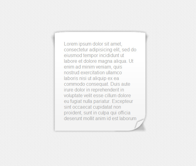
Box # 3
This one emulates a small wrinkled texture that can be noticed at the top and the bottom of the box, is awesome what you can achieve with CSS3.
[css]
/* This is the selector of the third box, here’s where we specify the measure values, background colors, borders and shadows */
.box3{
margin: 50px;
width: 300px;
padding: 5px 0 ;
position:relative;
background:#fff;
background: -webkit-gradient(linear, 0% 20%, 0% 92%, from(#fff), to(#f3f3f3), color-stop(.1,#fff));
border: 1px solid #ccc;
-webkit-border-radius: 60px 5px;
-moz-border-radius: 60px/5px;
border-radius:60px/5px;
-webkit-box-shadow: 0px 0px 35px rgba(0, 0, 0, 0.1) inset;
-moz-box-shadow: 0px 0px 35px rgba(0, 0, 0, 0.1) inset;
box-shadow: 0px 0px 35px rgba(0, 0, 0, 0.1) inset;
}
/* In this pseudo class we generate the right top shadow */
.box3:before{
content: ”;
width: 50px;
height: 50px;
top:0; right:0;
position:absolute;
display: inline-block;
z-index:-1;
-webkit-box-shadow: 10px -10px 8px rgba(0, 0, 0, 0.2);
-moz-box-shadow: 10px -10px 8px rgba(0, 0, 0, 0.2);
-webkit-transform: rotate(2deg)
translate(-14px,20px)
skew(-20deg);
-moz-transform: rotate(2deg)
translate(-14px,20px)
skew(-20deg);
-o-transform: rotate(2deg)
translate(-14px,20px)
skew(-20deg);
transform: rotate(2deg)
translate(-14px,20px)
skew(-20deg);
}
/* In this pseudo class we generate the top right shadow */
.box3:after{
content: ”;
width: 100px;
height: 100px;
top:0; left:0;
position:absolute;
z-index:-1;
display: inline-block;
-webkit-box-shadow: -10px -10px 10px rgba(0, 0, 0, 0.2);
-moz-box-shadow: -10px -10px 10px rgba(0, 0, 0, 0.2);
-webkit-transform: rotate(2deg)
translate(20px,25px)
skew(20deg);
-moz-transform: rotate(2deg)
translate(20px,25px)
skew(20deg);
-o-transform: rotate(2deg)
translate(20px,25px)
skew(20deg);
transform: rotate(2deg)
translate(20px,25px)
skew(20deg);
}
[/css]
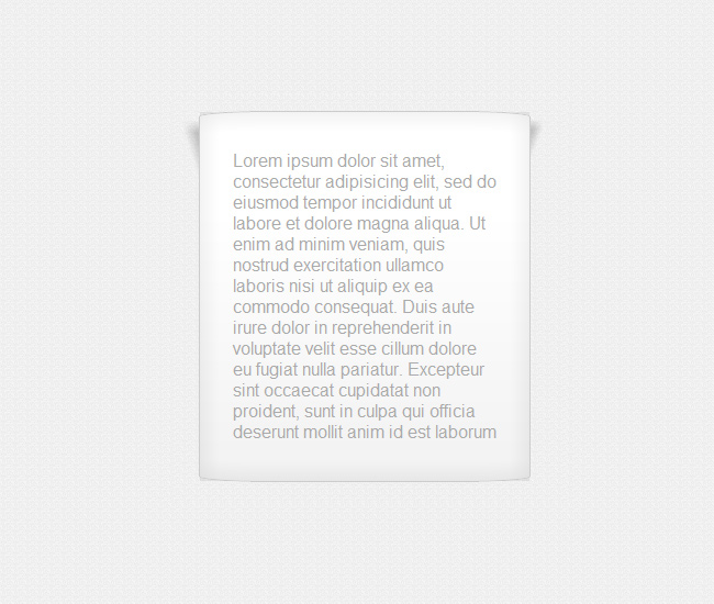
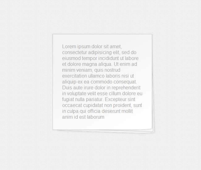
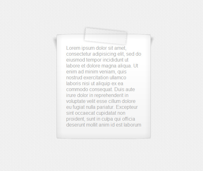
Box # 4
A nice post-it effect accomplished by strategically placing shadows to give a pop-up effect to the box.
[css]
/* This is the selector of the fourth box, here’s where we establish the measures, background colors, borders and shadows */
.box4{
margin: 50px;
min-height: 100px;
width: 300px;
padding: 5px 0 ;
position:relative;
background: #fff;
background: -webkit-gradient(linear, 0% 20%, 0% 100%, from(#fff), to(#fff), color-stop(.2, #f2f2f2));
background: -moz-linear-gradient(0% 0% 360deg, #fff, #f2f2f2 20%, #fff );
border: 1px solid #ccc;
-webkit-box-shadow: 0px 0px 10px rgba(0, 0, 0, 0.3);
-moz-box-shadow: 0px 0px 10px rgba(0, 0, 0, 0.3);
box-shadow: 0px 0px 10px rgba(0, 0, 0, 0.3);
}
/* This is the top right shadow*/
.box4:before{
content: ”;
width: 50px;
height: 50px;
top:0; right:0;
position:absolute;
z-index: -1;
-webkit-box-shadow: 10px -10px 8px rgba(0, 0, 0, 0.2);
-moz-box-shadow: 10px -10px 8px rgba(0, 0, 0, 0.2);
box-shadow: 10px -10px 8px rgba(0, 0, 0, 0.2);
-webkit-transform: rotate(2deg)
translate(-14px,20px)
skew(-20deg);
-moz-transform: rotate(2deg)
translate(-14px,20px)
skew(-20deg);
-o-transform: rotate(2deg)
translate(-14px,20px)
skew(-20deg);
transform: rotate(2deg)
translate(-14px,20px)
skew(-20deg);
}
/* This is the top left shadow*/
.box4:after{
content: ”;
width: 50px;
height: 50px;
top:0; left:0;
position:absolute;
z-index:-1;
display: inline-block;
-webkit-box-shadow: -10px -10px 10px rgba(0, 0, 0, 0.2);
-moz-box-shadow: -10px -10px 10px rgba(0, 0, 0, 0.2);
box-shadow: -10px -10px 10px rgba(0, 0, 0, 0.2);
-webkit-transform: rotate(2deg)
translate(12px,25px)
skew(20deg);
-moz-transform: rotate(2deg)
translate(12px,25px)
skew(20deg);
-o-transform: rotate(2deg)
translate(12px,25px)
skew(20deg);
transform: rotate(2deg)
translate(12px,25px)
skew(20deg);
}
/* This is the bottom right shadow */
.shr_box4{
width: 100px;
height: 100px;
bottom:0; right:0;
position:absolute;
z-index: -1;
-webkit-box-shadow: 10px 10px 10px rgba(0, 0, 0, 0.2);
-moz-box-shadow: 10px 10px 10px rgba(0, 0, 0, 0.2);
box-shadow: 10px 10px 10px rgba(0, 0, 0, 0.2);
-webkit-transform: rotate(0deg)
translate(-20px,-15px)
skew(20deg);
-moz-transform: rotate(0deg)
translate(-20px,-15px)
skew(20deg);
-o-transform: rotate(0deg)
translate(-20px,-15px)
skew(20deg);
transform: rotate(0deg)
translate(-20px,-15px)
skew(20deg);
}
/* This is the bottom left shadow */
.shl_box4{
content: ”;
width: 100px;
height: 100px;
bottom:0; left:0;
position:absolute;
z-index: -1;
-webkit-box-shadow: -10px 10px 10px rgba(0, 0, 0, 0.2);
-moz-box-shadow: -10px 10px 10px rgba(0, 0, 0, 0.2);
box-shadow: -10px 10px 10px rgba(0, 0, 0, 0.2);
-webkit-transform: rotate(0deg)
translate(20px,-15px)
skew(-20deg);
-moz-transform: rotate(0deg)
translate(20px,-15px)
skew(-20deg);
-o-transform: rotate(0deg)
translate(20px,-15px)
skew(-20deg);
transform: rotate(0deg)
translate(20px,-15px)
skew(-20deg);
}
[/css]
Box # 5
Using a gray-white gradient you can play along with shadows and folds to make a more realistic paper box.
[css]
/* This is the selector of the fifth box, here’s where we establish the measures, background colors, borders and shadows */
.box5{
margin: 50px;
width: 300px;
padding: 0 0 1px 0;
position:relative;
background: #f3f3f3;
background: -webkit-gradient(linear, 0% 20%, 0% 92%, from(#f3f3f3), to(#fff), color-stop(.1,#f3f3f3));
background: -moz-linear-gradient(0 0 270deg, #f3f3f3, #f3f3f3 10%, #fff);
border-top: 1px solid #ccc;
border-right: 1px solid #ccc;
-webkit-border-bottom-right-radius: 60px 60px;
-webkit-border-bottom-left-radius: 60px 60px;
-moz-border-radius-bottomright: 60px 60px;
-moz-border-radius-bottomleft: 60px 60px;
border-bottom-left-radius:60px 60px;
border-bottom-right-radius: 60px 60px;
-webkit-box-shadow: -1px 2px 2px rgba(0, 0, 0, 0.2);
-moz-box-shadow: -1px 2px 2px rgba(0, 0, 0, 0.2);
box-shadow: -1px 2px 2px rgba(0, 0, 0, 0.2);
}
/* This is the left fold */
.box5:before{
content:”;
width: 25px;
height: 20px;
background: white;
position: absolute;
bottom:0; right:0;
background: -webkit-gradient(linear, 0% 20%, 50% 40%, from(#fff), to( #eee), color-stop(.1,#fff));
background: -moz-linear-gradient(0 50% 90deg, #fff, #fff 10%, #eee);
-webkit-border-bottom-right-radius: 30px;
-moz-border-radius-bottomright: 30px;
border-bottom-right-radius: 30px;
-webkit-box-shadow: -2px -2px 5px rgba(0, 0, 0, 0.3);
-moz-box-shadow: -2px -2px 5px rgba(0, 0, 0, 0.3);
box-shadow: -2px -2px 5px rgba(0, 0, 0, 0.3);
-webkit-transform: rotate(-20deg)
skew(-40deg,-3deg)
translate(-13px,-13px);
-moz-transform: rotate(-20deg)
skew(-40deg,-3deg)
translate(-13px,-13px);
-o-transform: rotate(-20deg)
skew(-40deg,-3deg)
translate(-13px,-13px);
transform: rotate(-20deg)
skew(-40deg,-3deg)
translate(-13px,-13px);
}
/* In this pseudo class we make the shading for the left fold */
.box5:after{
content: ”;
z-index: -10;
width: 100px;
height: 100px;
position:absolute;
bottom:0;
right:0;
background: rgba(0, 0, 0, 0.2);
display: inline-block;
-webkit-box-shadow: 20px 20px 8px rgba(0, 0, 0, 0.2);
-moz-box-shadow: 20px 20px 18px rgba(0, 0, 0, 0.2);
box-shadow: 20px 20px 8px rgba(0, 0, 0, 0.2);
-webkit-transform: rotate(0deg)
translate(-45px,-20px)
skew(20deg);
-moz-transform: rotate(0deg)
translate(-45px,-20px)
skew(20deg);
-o-transform: rotate(0deg)
translate(-45px,-20px)
skew(20deg);
transform: rotate(0deg)
translate(-45px,-20px)
skew(20deg);
}
/* Here comes the bottom right shadow */
.fold_box5{
z-index: -10;
width: 50px;
height: 50px;
position:absolute;
bottom:0; left:0;
-webkit-box-shadow: -20px 20px 8px rgba(0, 0, 0, 0.2);
-moz-box-shadow: -20px 20px 18px rgba(0, 0, 0, 0.2);
box-shadow: -20px 20px 8px rgba(0, 0, 0, 0.2);
-webkit-transform: rotate(0deg)
translate(40px,-20px)
skew(-20deg);
-moz-transform: rotate(0deg)
translate(40px,-20px)
skew(-20deg);
-o-transform: rotate(0deg)
translate(40px,-20px)
skew(-20deg);
transform: rotate(0deg)
translate(40px,-20px)
skew(-20deg);
}
/* In this selector we make the fold of the bottom left side */
.fold2_box5{
content:”;
width: 25px;
height: 20px;
background: white;
position: absolute;
bottom:0; left:0;
background: #fff;
background: -webkit-gradient(linear, 0% 20%, 50% 80%, from(#fff), to( #eee), color-stop(.1,#fff));
background: -moz-linear-gradient(0 50%, #fff, #fff 10%, #eee);
-webkit-border-bottom-right-radius: 30px;
-moz-border-radius-bottomright: 30px;
border-bottom-right-radius: 30px;
-webkit-box-shadow: -2px -2px 5px rgba(0, 0, 0, 0.3);
-moz-box-shadow: -2px -2px 5px rgba(0, 0, 0, 0.3);
box-shadow: -2px -2px 5px rgba(0, 0, 0, 0.3);
-webkit-transform: rotate(103deg)
skew(-3deg,-40deg)
translate(-13px,-15px);
-moz-transform: rotate(103deg)
skew(-3deg,-40deg)
translate(-13px,-15px);
-o-transform: rotate(103deg)
skew(-3deg,-40deg)
translate(-13px,-15px);
}
[/css]
Box # 6
Another wrinkled effect, if you add some flames on top of this box, you will be able to make a pretty cool burning box, in the meantime let’s just say that the firefighters arrived in time.
[css]
/* This is the selector of the sixth box, here’s where we establish the measures, background colors, borders and shadows */
.box6{
margin: 50px;
width: 300px;
min-height: 150px;
padding: 0 0 1px 0;
position:relative;
background:#fff;
background: -webkit-gradient(linear, 0% 20%, 0% 92%, from(#fff), to(#f3f3f3), color-stop(.1,#fff));
background: -moz-linear-gradient(0 0 270deg, #fff, #fff 10%, #f3f3f3);
border-top: 1px solid #ccc;
border-right: 1px solid #ccc;
border-left: 1px solid #ccc;
-webkit-border-top-left-radius: 60px 5px;
-webkit-border-top-right-radius: 60px 5px;
-webkit-border-bottom-right-radius: 60px 60px;
-moz-border-radius-topleft: 60px 5px;
-moz-border-radius-topright: 60px 5px;
-moz-border-radius-bottomright: 60px 60px;
border-top-left-radius: 60px 5px;
border-top-right-radius: 60px 5px;
border-bottom-right-radius: 60px 60px;
-webkit-box-shadow: 0px 0px 12px rgba(0, 0, 0, 0.3) ;
-moz-box-shadow: 0px 0px 12px rgba(0, 0, 0, 0.3) ;
box-shadow: 0px 0px 12px rgba(0, 0, 0, 0.3) ;
}
/* In this pseudo class we create the fold for the bottom side of the box */
.box6:before{
content:”;
width: 25px;
height: 20px;
position: absolute;
bottom:0;
right:0;
-webkit-border-bottom-right-radius: 30px;
-moz-border-radius-bottomright: 30px;
border-bottom-right-radius: 30px;
-webkit-box-shadow: -2px -2px 5px rgba(0, 0, 0, 0.3);
-moz-box-shadow: -2px -2px 5px rgba(0, 0, 0, 0.3);
box-shadow: -2px -2px 5px rgba(0, 0, 0, 0.3);
-webkit-transform: rotate(-20deg)
skew(-40deg,-3deg)
translate(-13px,-13px);
-moz-transform: rotate(-20deg)
skew(-40deg,-3deg)
translate(-13px,-13px);
-o-transform: rotate(-20deg)
skew(-40deg,-3deg)
translate(-13px,-13px);
transform: rotate(-20deg)
skew(-40deg,-3deg)
translate(-13px,-13px);
}
/* In this pseudo class named box6 we generate the shading of the fold */
.box6:after{
content: ”;
z-index: -10;
width: 100px;
height: 100px;
position:absolute;
bottom:0;
right:0;
background: rgba(0, 0, 0, 0.2);
display: inline-block;
-webkit-box-shadow: 20px 20px 8px rgba(0, 0, 0, 0.2);
-moz-box-shadow: 20px 20px 8px rgba(0, 0, 0, 0.2);
box-shadow: 20px 20px 8px rgba(0, 0, 0, 0.2);
-webkit-transform: rotate(0deg)
translate(-45px,-20px)
skew(20deg);
-moz-transform: rotate(0deg)
translate(-45px,-20px)
skew(20deg);
-o-transform: rotate(0deg)
translate(-45px,-20px)
skew(20deg);
transform: rotate(0deg)
translate(-45px,-20px)
skew(20deg);
}
/* On this class we establish the shadow of the top right section */
.box6_corner_lf{
width: 100px;
height: 100px;
top:0; left:0;
position:absolute;
z-index:-6;
display: inline-block;
-webkit-box-shadow: -10px -10px 10px rgba(0, 0, 0, 0.2);
-moz-box-shadow: -10px -10px 10px rgba(0, 0, 0, 0.2);
box-shadow: -10px -10px 20px rgba(0, 0, 0, 0.2);
-webkit-transform: rotate(2deg)
translate(20px,25px)
skew(20deg);
-moz-transform: rotate(2deg)
translate(20px,20px)
skew(20deg);
-o-transform: rotate(2deg)
translate(20px,20px)
skew(20deg);
transform: rotate(2deg)
translate(20px,20px)
skew(20deg);
}
/* On this class we define the shadow of the top left area */
.box6_corner_rt{
content: ”;
width: 50px;
height: 50px;
top:0; right:0;
position:absolute;
display: inline-block;
z-index:-6;
-webkit-box-shadow: 10px -10px 8px rgba(0, 0, 0, 0.2);
-moz-box-shadow: 10px -10px 18px rgba(0, 0, 0, 0.2);
box-shadow: 10px -10px 8px rgba(0, 0, 0, 0.2);
-webkit-transform: rotate(2deg)
translate(-14px,20px)
skew(-20deg);
-moz-transform: rotate(2deg)
translate(-14px,15px)
skew(-20deg);
-o-transform: rotate(2deg)
translate(-14px,15px)
skew(-20deg);
transform: rotate(2deg)
translate(-14px,15px)
skew(-20deg);
}
[/css]
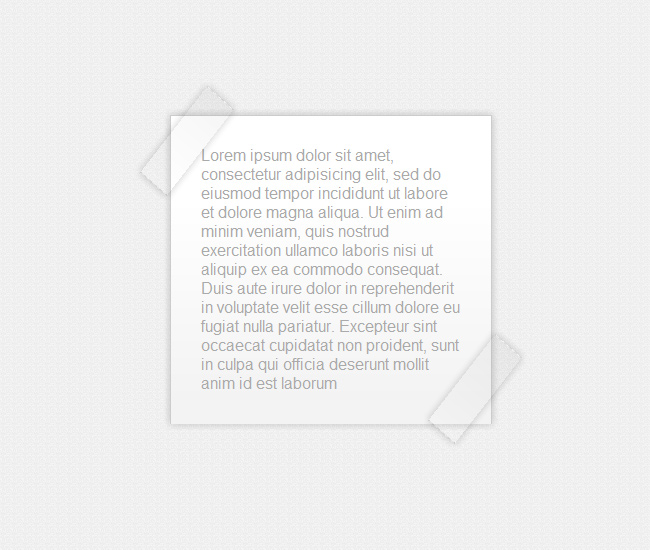
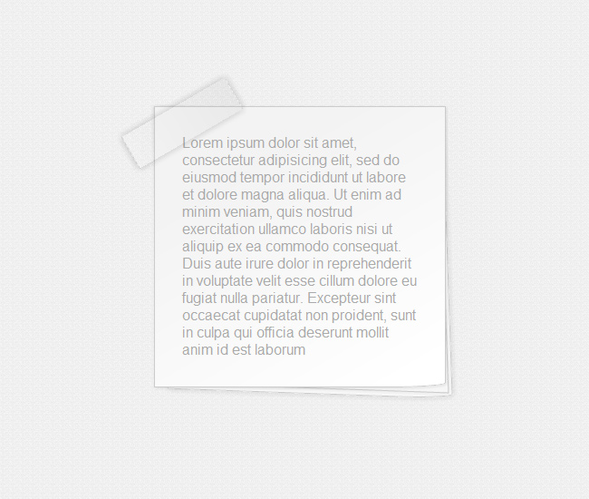
Box # 7
And now to move things to a higher level, what if we add a nice see-through tape to stick our paper box to the wall?.
[css]
/* This is the selector of the seventh box, here’s where we establish the measures, background colors, borders and shadows */
.box7{
margin: 50px;
width: 320px;
min-height: 150px;
padding: 0 0 1px 0;
position:relative;
background: #fff;
background: -webkit-gradient(linear, 0% 20%, 0% 92%, from(#fff), to(#f3f3f3), color-stop(.1,#fff));
background: -moz-linear-gradient(0 0 270deg, #fff, #fff 10%, #f3f3f3);
border-top: 1px solid #ccc;
border-right: 1px solid #ccc;
border-left: 1px solid #ccc;
-webkit-box-shadow: 0px 0px 12px rgba(0, 0, 0, 0.2);
-moz-box-shadow: 0px 0px 12px rgba(0, 0, 0, 0.2);
box-shadow: 0px 0px 12px rgba(0, 0, 0, 0.2);
}
/* This is the top left tape */
.box7:before{
content: ”;
position:absolute;
width: 130px;
height: 30px;
border-left: 1px dashed rgba(0, 0, 0, 0.1);
border-right: 1px dashed rgba(0, 0, 0, 0.1);
background: rgba(0, 0, 0, 0.1);
background: -webkit-gradient(linear, 555% 20%, 0% 92%, from(rgba(0, 0, 0, 0.1)), to(rgba(0, 0, 0, 0.0)), color-stop(.1,rgba(0, 0, 0, 0.2)));
background: -moz-linear-gradient(555% 0 180deg, rgba(0,0,0,0.1), rgba(0,0,0,0.2) 10%, rgba(0,0,0,0.0));
-webkit-box-shadow: 0px 0px 12px rgba(0, 0, 0, 0.2);
-moz-box-shadow: 0px 0px 12px rgba(0, 0, 0, 0.2);
box-shadow: 0px 0px 12px rgba(0, 0, 0, 0.2);
-webkit-transform:translate(-50px,10px)
skew(10deg,10deg)
rotate(-50deg);
-moz-transform:translate(-50px,10px)
skew(10deg,10deg)
rotate(-50deg);
-o-transform:translate(-50px,10px)
skew(10deg,10deg)
rotate(-50deg);
transform:translate(-50px,10px)
skew(10deg,10deg)
rotate(-50deg);
}
/* This is the top bottom right tape */
.box7:after{
content: ”;
position:absolute;
right:0;
bottom:0;
width: 130px;
height: 30px;
background: rgba(0, 0, 0, 0.1);
background: -webkit-gradient(linear, 555% 20%, 0% 92%, from(rgba(0, 0, 0, 0.1)), to(rgba(0, 0, 0, 0.0)), color-stop(.1,rgba(0, 0, 0, 0.2)));
background: -moz-linear-gradient(555% 0 180deg, rgba(0,0,0,0.1), rgba(0,0,0,0.2) 10%, rgba(0,0,0,0.0));
border-left: 1px dashed rgba(0, 0, 0, 0.1);
border-right: 1px dashed rgba(0, 0, 0, 0.1);
-webkit-box-shadow: 0px 0px 12px rgba(0, 0, 0, 0.2);
-moz-box-shadow: 0px 0px 12px rgba(0, 0, 0, 0.2);
box-shadow: 0px 0px 12px rgba(0, 0, 0, 0.2);
-webkit-transform: translate(50px,-20px)
skew(10deg,10deg)
rotate(-50deg);
-moz-transform: translate(50px,-20px)
skew(10deg,10deg)
rotate(-50deg);
-o-transform: translate(50px,-20px)
skew(10deg,10deg)
rotate(-50deg);
transform: translate(50px,-20px)
skew(10deg,10deg)
rotate(-50deg)
}
[/css]
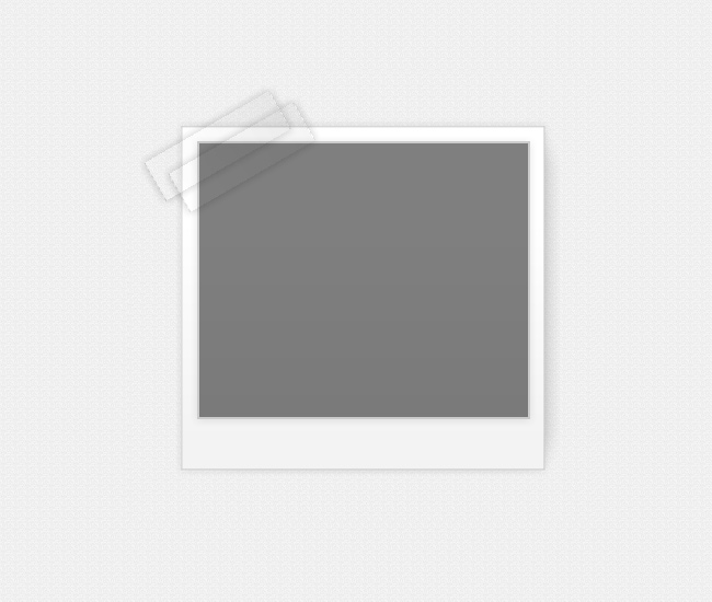
Box # 8
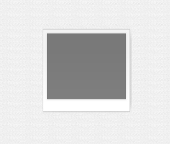
Of course we couldn’t forget about Polaroid, this is one of the most popular boxes ever and now you can make it using pure CSS3.
[css]
/* This is the selector of the eight box, here’s where we establish the measures, background colors, borders and shadows */
.box8{
margin: 70px 50px;
width: 300px;
min-height: 250px;
position:relative;
border: 2px solid #ccc;
background: rgba(0, 0, 0, 0.5);
-webkit-box-shadow: 0px 1px 12px rgba(0, 0, 0, 0.1);
-moz-box-shadow: 0px 1px 12px rgba(0, 0, 0, 0.1);
box-shadow: 0px 1px 12px rgba(0, 0, 0, 0.1);
}
/* This pseudo class is the picture’s frame */
.box8:before{
content: ”;
width: 110%;
left: 0;
height: 125%;
z-index:-1;
position:absolute;
border: 1px solid #ccc;
background: #f3f3f3;
background: -webkit-gradient(linear, 0% 20%, 0% 92%, from(#f3f3f3), to(#fff), color-stop(.1,#f3f3f3));
background: -moz-linear-gradient(0 0 90deg, #f3f3f3, #f3f3f3 10%, #fff);
-webkit-box-shadow: 0px 0px 12px rgba(0, 0, 0, 0.1);
-moz-box-shadow: 0px 0px 12px rgba(0,0,0,0.1);
box-shadow: 0px 0px 12px rgba(0,0,0,0.1);
-webkit-transform: translate(-5%,-5%);
-moz-transform: translate(-5%, -5%);
-o-transform: translate(-5%, -5%);
transform: translate(-5%, -5%);
}
/* This pseudo class is the frame’s global shadow */
.box8:after{
content: ”;
width: 100%;
left: 0;
height: 115%;
z-index:-2;
background: none;
position:absolute;
-webkit-border-radius: 20px;
-moz-border-radius: 20px;
border-radius: 20px;
-webkit-box-shadow: 15px 0px 30px rgba(0, 0, 0, 0.2);
-moz-box-shadow: 15px 0px 30px rgba(0, 0, 0, 0.2);
box-shadow: 15px 0px 30px rgba(0, 0, 0, 0.2);
-webkit-transform: translate(0,0);
-moz-transform: translate(0,0);
-o-transform: translate(0,0);
transform: translate(0,0);
}
[/css]
Box # 9
And to maintain things more and more complex, now let’s add a nice transparent frame around our paper box.

[css]
/* This is the selector of the ninth box, here’s where we establish the measures, background colors, borders and shadows */
.box9{
margin: 70px 50px;
width: 300px;
min-height: 250px;
position:relative;
border: 1px solid rgba(0,0,0,0.1);
-webkit-border-radius: 20px;
-moz-border-radius: 20px;
border-radius:20px;
background: white;
-webkit-box-shadow: 0px 0px 5px rgba(0, 0, 0, 0.3);
-moz-box-shadow: 0px 0px 5px rgba(0,0,0,0.3);
box-shadow:0px 0px 5px rgba(0,0,0,0.3);
}
/* This is the border that envelops the box */
.box9:before{
content: ”;
width: 110%;
left: 0;
height: 111%;
z-index:-1;
position:absolute;
-webkit-border-radius: 20px;
-moz-border-radius: 20px;
border-radius:20px;
border: 1px solid rgba(0,0,0, 0.1);
background: rgba(0, 0, 0, 0.0);
-webkit-box-shadow: 0px 0px 5px rgba(0, 0, 0, 0.2);
-moz-box-shadow: 0px 0px 5px rgba(0,0,0,0.2);
box-shadow: 0px 0px 5px rgba(0,0,0,0.2);
-webkit-transform: translate(-5%,-5%);
-moz-transform: translate(-5%, -5%);
-o-transform: translate(-5%, -5%);
transform: translate(-5%, -5%);
}
/* This is the tape of the top section of the box */
.box9:after{
content: ”;
position:absolute;
top:-25px; left: 30%;
width: 130px;
height: 40px;
background: rgba(0, 0, 0, 0.1);
background: -webkit-gradient(linear, 555% 20%, 0% 92%, from(rgba(0, 0, 0, 0.1)), to(rgba(0, 0, 0, 0.0)), color-stop(.1,rgba(0, 0, 0, 0.2)));
background: -moz-linear-gradient(555% 0 180deg, rgba(0,0,0,0.1), rgba(0,0,0,0.2) 10%, rgba(0,0,0,0.0));
border-left: 1px dashed rgba(0, 0, 0, 0.1);
border-right: 1px dashed rgba(0, 0, 0, 0.1);
-webkit-box-shadow: 0px 0px 12px rgba(0, 0, 0, 0.2);
-moz-box-shadow: 0px 0px 12px rgba(0,0,0,0.2);
box-shadow: 0px 0px 12px rgba(0,0,0,0.2);
}
[/css]
Box # 10
Let’s pile up a few sheets whilst we play with boxes and gradients, you can realize that the gradient was well thought to help the realistic look.
[css]
/* This is the selector of the tenth box, here’s where we establish the measures, background colors, borders and shadows */
.box10{
margin: 50px;
width: 320px;
min-height: 150px;
padding: 0 0 1px 0;
position:relative;
background: #fff;
background: -webkit-gradient(linear, 100% 100%, 50% 10%, from(#fff), to(#f3f3f3), color-stop(.1,#fff));
background: -moz-linear-gradient(100% 50%, #fff, #fff 10%, #f3f3f3);
border: 1px solid #ccc;
-webkit-box-shadow: 1px 1px 4px rgba(0,0,0, 0.1);
-moz-box-shadow: 1px 1px 4px rgba(0,0,0, 0.1);
box-shadow: 1px 1px 4px rgba(0,0,0, 0.1);
-webkit-border-bottom-right-radius: 60px 5px;
-moz-border-radius-bottomright: 60px 5px;
border-bottom-right-radius: 60px 5px;
}
/* These (before and after ) pseudo class are the ones that give the multiple sheets effect*/
.box10:before{
content: ”;
width: 98%;
z-index:-1;
height: 100%;
padding: 0 0 1px 0;
position: absolute;
bottom:0; right:0;
background: #fff;
background: -webkit-gradient(linear, 0% 20%, 0% 92%, from(#fff), to(#f9f9f9), color-stop(.1,#fff));
background: -moz-linear-gradient(0 0 270deg, #fff, #fff 10%, #f9f9f9);
border: 1px solid #ccc;
-webkit-box-shadow: 1px 1px 8px rgba(0,0,0, 0.1);
-moz-box-shadow: 1px 1px 8px rgba(0,0,0,0.1);
box-shadow: 1px 1px 8px rgba(0,0,0,0.1);
-webkit-border-bottom-right-radius: 60px 5px;
-moz-border-radius-bottomright: 60px 5px;
border-bottom-right-radius: 60px 5px;
-webkit-transform: skew(2deg,2deg)
translate(3px,8px);
-moz-transform: skew(2deg,2deg)
translate(3px,8px);
-o-transform: skew(2deg,2deg)
translate(3px,8px);
transform: skew(2deg,2deg)
translate(3px,8px);
}
.box10:after{
content: ”;
width: 98%;
z-index:-1;
height: 98%;
padding: 0 0 1px 0;
position: absolute;
bottom:0; right:0;
background: #fff;
background: -webkit-gradient(linear, 0% 20%, 0% 100%, from(#f3f3f3), to(#f6f6f6), color-stop(.1,#fff));
background: -moz-linear-gradient(0 0 360deg, #f3f3f3, #fff 10%, #f6f6f6);
border: 1px solid #ccc;
-webkit-box-shadow: 0px 0px 8px rgba(0,0,0, 0.1);
-moz-box-shadow: 0px 0px 8px rgba(0,0,0, 0.1);
box-shadow: 0px 0px 8px rgba(0,0,0, 0.1);
-webkit-transform: skew(2deg,2deg)
translate(-1px,2px);
-moz-transform: skew(2deg,2deg)
translate(-1px,2px) ;
-o-transform: skew(2deg,2deg)
translate(-1px,2px) ;
transform: skew(2deg,2deg)
translate(-1px,2px) ;
}
[/css]
Box # 11
If you combine a gray-white gradient and a transparent tape, your frame box will look almost like if it actually were an acetate sheet.
[css]
/* This is the selector of the eleventh box, here’s where we establish the measures, background colors, borders and shadows */
.box11{
margin: 50px;
width: 300px;
min-height: 150px;
padding: 0 0 1px 0;
position:relative;
background: #f3f3f3;
background: -webkit-gradient(linear, 0% 20%, 0% 92%, from(#f3f3f3), to(#fff), color-stop(.1,#f3f3f3));
background: -moz-linear-gradient(0 0 270deg, #f3f3f3, #f3f3f3 10%, #fff);
border-top: 1px solid white;
border-right: 1px solid #ccc;
-webkit-border-bottom-right-radius: 60px 60px;
-moz-border-radius-bottomright: 60px 60px;
border-bottom-right-radius: 60px 60px;
-webkit-box-shadow: -1px 2px 2px rgba(0, 0, 0, 0.2);
-moz-box-shadow: -1px 2px 2px rgba(0,0,0,0.2);
box-shadow: -1px 2px 2px rgba(0,0,0,0.2);
}
/* This pseudo class creates the bottom fold */
.box11:before{
content:”;
width: 25px;
height: 20px;
background: white;
position: absolute;
bottom:0; right:0;
background:#fff;
background: -webkit-gradient(linear, 0% 20%, 50% 40%, from(#fff), to( #eee), color-stop(.1,#fff));
background: -moz-linear-gradient(0 50%, #fff, #fff 10%, #eee);
-webkit-border-bottom-right-radius: 30px;
-moz-border-radius-bottomright: 30px;
border-bottom-right-radius: 30px;
-webkit-box-shadow: -2px -2px 5px rgba(0, 0, 0, 0.3);
-moz-box-shadow: -2px -2px 5px rgba(0,0,0,0.3);
box-shadow: -2px -2px 5px rgba(0, 0, 0, 0.3);
-webkit-transform: rotate(-20deg)
skew(-40deg,-3deg)
translate(-13px,-13px);
transform: rotate(-20deg)
skew(-40deg,-3deg)
translate(-13px,-13px);
-moz-transform: rotate(-20deg)
skew(-40deg,-3deg)
translate(-13px,-13px);
transform: rotate(-20deg)
skew(-40deg,-3deg)
translate(-13px,-13px);
-o-transform: rotate(-20deg)
skew(-40deg,-3deg)
translate(-13px,-13px);
transform: rotate(-20deg)
skew(-40deg,-3deg)
translate(-13px,-13px);
transform: rotate(-20deg)
skew(-40deg,-3deg)
translate(-13px,-13px);
transform: rotate(-20deg)
skew(-40deg,-3deg)
translate(-13px,-13px);
}
/* This is the shading of the fold */
.box11:after{
content: ”;
z-index: -1;
width: 100px;
height: 100px;
position:absolute;
bottom:0;
right:0;
background: rgba(0, 0, 0, 0.2);
display: inline-block;
-webkit-box-shadow: 20px 20px 8px rgba(0, 0, 0, 0.2);
-moz-box-shadow: 20px 20px 17px rgba(0,0,0,0.2);
box-shadow: 20px 20px 17px rgba(0,0,0,0.2);
-webkit-transform: rotate(0deg)
translate(-45px,-20px)
skew(20deg);
-moz-transform: rotate(0deg)
translate(-40px,-17px)
skew(20deg);
-o-transform: rotate(0deg)
translate(-40px,-17px)
skew(20deg);
transform: rotate(0deg)
translate(-40px,-17px)
skew(20deg);
}
/* This is the top tape of the box */
.box11_tape{
position:absolute;
top:-25px; left: 30%;
width: 130px;
height: 40px;
background:#ccc;
background: -webkit-gradient(linear, 555% 20%, 0% 92%, from(rgba(0, 0, 0, 0.1)), to(rgba(0, 0, 0, 0.0)), color-stop(.1,rgba(0, 0, 0, 0.2)));
background: -moz-linear-gradient(555% 0 180deg, rgba(0,0,0,0.1), rgba(0,0,0,0.2) 10%, rgba(0,0,0,0.0));
border-left: 1px dashed rgba(0, 0, 0, 0.1);
border-right: 1px dashed rgba(0, 0, 0, 0.1);
-webkit-box-shadow: 0px 0px 12px rgba(0, 0, 0, 0.2);
-moz-box-shadow: 0px 0px 12px rgba(0, 0, 0, 0.2);
box-shadow: 0px 0px 12px rgba(0, 0, 0, 0.2);
}
[/css]
Box # 12
This one is just an exercise that plays with folds, shadows, gradients and a tape on top that retains the frame against the wall.
[css]
/* This is the selector of the twelfth box, here’s where we establish the measures, background colors, borders and shadows */
.box12{
margin: 50px;
width: 300px;
padding: 0 0 1px 0;
position:relative;
background:#f3f3f3;
background: -webkit-gradient(linear, 0% 20%, 0% 92%, from(#f3f3f3), to(#fff), color-stop(.1,#f3f3f3));
background: -moz-linear-gradient(0 0 270deg, #f3f3f3, #f3f3f3 10%, #fff);
border-top: 1px solid #ccc;
border-right: 1px solid #ccc;
-webkit-border-bottom-right-radius: 60px 60px;
-moz-border-radius-bottomright: 60px 60px;
border-bottom-right-radius: 60px 60px;
-webkit-border-bottom-left-radius: 60px 60px;
-moz-border-radius-bottomleft: 60px 60px;
border-bottom-left-radius: 60px 60px;
-webkit-box-shadow: -1px 2px 2px rgba(0, 0, 0, 0.2);
-moz-box-shadow: -1px 2px 2px rgba(0, 0, 0, 0.2);
box-shadow: -1px 2px 2px rgba(0, 0, 0, 0.2);
}
/* This is the bottom left fold */
.box12:before{
content:”;
width: 25px;
height: 20px;
background: white;
position: absolute;
bottom:0; right:0;
background: -webkit-gradient(linear, 0% 20%, 50% 40%, from(#fff), to( #eee), color-stop(.1,#fff));
background: -moz-linear-gradient(0 50%, #fff, #fff 10%, #eee);
-webkit-border-bottom-right-radius: 30px;
-moz-border-radius-bottomright: 30px;
border-bottom-right-radius: 30px;
-webkit-box-shadow: -2px -2px 5px rgba(0, 0, 0, 0.3);
-moz-box-shadow: -2px -2px 5px rgba(0, 0, 0, 0.3);
box-shadow: -2px -2px 5px rgba(0, 0, 0, 0.3);
-webkit-transform: rotate(-20deg)
skew(-40deg,-3deg)
translate(-13px,-13px);
-moz-transform: rotate(-20deg)
skew(-40deg,-3deg)
translate(-13px,-13px);
-o-transform: rotate(-20deg)
skew(-40deg,-3deg)
translate(-13px,-13px);
transform: rotate(-20deg)
skew(-40deg,-3deg)
translate(-13px,-13px);
}
/* This is the shading of the right fold */
.box12:after{
content: ”;
z-index: -10;
width: 100px;
height: 100px;
position:absolute;
bottom:0;
right:0;
background: rgba(0, 0, 0, 0.2);
display: inline-block;
-webkit-box-shadow: 20px 20px 8px rgba(0, 0, 0, 0.2);
-moz-box-shadow: 20px 20px 17px rgba(0, 0, 0, 0.2);
box-shadow: 20px 20px 8px rgba(0, 0, 0, 0.2);
-webkit-transform: rotate(0deg)
translate(-45px,-20px)
skew(20deg);
-moz-transform: rotate(0deg)
translate(-40px,-17px)
skew(20deg);
-o-transform: rotate(0deg)
translate(-40px,-17px)
skew(20deg);
transform: rotate(0deg)
translate(-45px,-20px)
skew(20deg);
}
/* This is the shading of the left fold */
.fold_box12{
z-index: -10;
width: 50px;
height: 50px;
position:absolute;
bottom:0; left:0;
-webkit-box-shadow: -20px 20px 8px rgba(0, 0, 0, 0.2);
-moz-box-shadow: -20px 20px 17px rgba(0, 0, 0, 0.2);
box-shadow: -20px 20px 8px rgba(0, 0, 0, 0.2);
-webkit-transform: rotate(0deg)
translate(40px,-20px)
skew(-20deg);
-moz-transform: rotate(0deg)
translate(40px,-17px)
skew(-20deg);
-o-transform: rotate(0deg)
translate(40px,-17px)
skew(-20deg);
transform: rotate(0deg)
translate(40px,-20px)
skew(-20deg);
}
/* This is the bottom left fold */
.fold2_box12{
width: 25px;
height: 20px;
z-index:20;
background: white;
position: absolute;
bottom:0; left:0;
background: -webkit-gradient(linear, 0% 20%, 50% 80%, from(#fff), to( #eee), color-stop(.1,#fff));
background: -moz-linear-gradient(0 50%, #fff, #fff 10%, #eee);
-webkit-border-bottom-right-radius: 30px;
-moz-border-radius-bottomright: 30px;
border-bottom-right-radius: 30px;
-webkit-box-shadow: -2px -2px 5px rgba(0, 0, 0, 0.3);
-moz-box-shadow: -2px -2px 5px rgba(0, 0, 0, 0.3);
box-shadow: -2px -2px 5px rgba(0, 0, 0, 0.3);
-webkit-transform: rotate(103deg)
skew(-3deg,-40deg)
translate(-13px,-15px);
-moz-transform: rotate(103deg)
skew(-3deg,-40deg)
translate(-13px,-15px);
-o-transform: rotate(103deg)
skew(-3deg,-40deg)
translate(-13px,-15px);
transform: rotate(103deg)
skew(-3deg,-40deg)
translate(-13px,-15px);
}
/* This is the top tape of the box */
.box12_tape{
content: ”;
position:absolute;
top:-25px; left: 30%;
width: 130px;
height: 40px;
background: #ccc;
background: -webkit-gradient(linear, 555% 20%, 0% 92%, from(rgba(0, 0, 0, 0.1)), to(rgba(0, 0, 0, 0.0)), color-stop(.1,rgba(0, 0, 0, 0.2)));
background: -moz-linear-gradient(555% 0% 180deg, rgba(0,0,0,0.1), rgba(0,0,0,0.2) 10%, rgba(0,0,0,0.0));
border-left: 1px dashed rgba(0, 0, 0, 0.1);
border-right: 1px dashed rgba(0, 0, 0, 0.1);
-webkit-box-shadow: 0px 0px 12px rgba(0, 0, 0, 0.2);
-moz-box-shadow: 0px 0px 12px rgba(0, 0, 0, 0.2);
box-shadow: 0px 0px 12px rgba(0, 0, 0, 0.2);
}
[/css]
Box # 13
On this case we combine a wrinkled paper box with a fold in its bottom right corner and then we stick it to the wall using 2 tapes at both sides.
[css]
/* This is the selector of the thirteenth box, here’s where we establish the measures, background colors, borders and shadows */
.box13{
margin: 50px;
width: 300px;
min-height: 150px;
padding: 0 0 1px 0;
position:relative;
background:#fff;
background: -webkit-gradient(linear, 0% 20%, 0% 92%, from(#fff), to(#f3f3f3), color-stop(.1,#fff));
background: -moz-linear-gradient(0% 0% 270deg, #fff, #fff 10%, #f3f3f3);
border-top: 1px solid #ccc;
border-right: 1px solid #ccc;
border-left: 1px solid #ccc;
-webkit-border-top-left-radius: 60px 5px;
-moz-border-radius-topleft:60px 5px;
border-top-left-radius:60px 5px;
-webkit-border-top-right-radius: 60px 5px;
-moz-border-radius-topright:60px 5px;
border-top-right-radius:60px 5px;
-webkit-border-bottom-right-radius: 60px 60px;
-moz-border-radius-bottomright:60px 60px;
border-bottom-right-radius: 60px 60px;
-webkit-box-shadow: 0px 0px 12px rgba(0, 0, 0, 0.3) ;
-moz-box-shadow: 0px 0px 12px rgba(0, 0, 0, 0.3) ;
box-shadow: 0px 0px 12px rgba(0, 0, 0, 0.3) ;
}
/* This is the bottom left fold */
.box13:before{
content:”;
width: 25px;
height: 20px;
position: absolute;
bottom:0;
right:0;
-webkit-border-bottom-right-radius: 30px;
-moz-border-radius-bottomright: 30px;
border-bottom-right-radius: 30px;
-webkit-box-shadow: -2px -2px 5px rgba(0, 0, 0, 0.3);
-moz-box-shadow: -2px -2px 5px rgba(0, 0, 0, 0.3);
box-shadow: -2px -2px 5px rgba(0, 0, 0, 0.3);
-webkit-transform:
rotate(-20deg)
skew(-40deg,-3deg)
translate(-13px,-13px);
-moz-transform: rotate(-20deg)
skew(-40deg,-3deg)
translate(-13px,-13px);
-o-transform: rotate(-20deg)
skew(-40deg,-3deg)
translate(-13px,-13px);
transform: rotate(-20deg)
skew(-40deg,-3deg)
translate(-13px,-13px);
}
/* This is the fold’s shading */
.box13:after{
content: ”;
z-index: -10;
width: 100px;
height: 100px;
position:absolute;
bottom:0;
right:0;
background: rgba(0, 0, 0, 0.2);
display: inline-block;
-webkit-box-shadow: 20px 20px 8px rgba(0, 0, 0, 0.2);
-moz-box-shadow: 20px 20px 18px rgba(0, 0, 0, 0.2);
box-shadow: 20px 20px 8px rgba(0, 0, 0, 0.2);
-webkit-transform: rotate(0deg)
translate(-45px,-20px)
skew(20deg);
-moz-transform: rotate(0deg)
translate(-45px,-20px)
skew(20deg);
-o-transform: rotate(0deg)
translate(-45px,-20px)
skew(20deg);
transform: rotate(0deg)
translate(-45px,-20px)
skew(20deg);
}
/* This is the top left shadow */
.box13_corner_lf{
width: 100px;
height: 100px;
top:0; left:0;
position:absolute;
z-index:-6;
display: inline-block;
-webkit-box-shadow: -10px -10px 10px rgba(0, 0, 0, 0.2);
-moz-box-shadow: -10px -10px 10px rgba(0, 0, 0, 0.2);
box-shadow: -10px -10px 10px rgba(0, 0, 0, 0.2);
-webkit-transform: rotate(2deg)
translate(20px,25px)
skew(20deg);
-moz-transform: rotate(2deg)
translate(20px,25px)
skew(20deg);
-o-transform: rotate(2deg)
translate(20px,25px)
skew(20deg);
transform: rotate(2deg)
translate(20px,25px)
skew(20deg);
}
/* this is the top right shadow */
.box13_corner_rt{
content: ”;
width: 50px;
height: 50px;
top:0; right:0;
position:absolute;
display: inline-block;
z-index:-6;
-webkit-box-shadow: 10px -10px 8px rgba(0, 0, 0, 0.2);
-moz-box-shadow: 10px -10px 8px rgba(0, 0, 0, 0.2);
box-shadow: 10px -10px 8px rgba(0, 0, 0, 0.2);
-webkit-transform: rotate(2deg)
translate(-14px,20px)
skew(-20deg);
-moz-transform: rotate(2deg)
translate(-14px,20px)
skew(-20deg);
-o-transform: rotate(2deg)
translate(-14px,20px)
skew(-20deg);
transform: rotate(2deg)
translate(-14px,20px)
skew(-20deg);
}
/* This is the left side tape */
.box13_tape:before{
content: ”;
position:absolute;
top:0; left: 0;
width: 130px;
height: 40px;
background:rgba(0,0,0,0.2);
background: -webkit-gradient(linear, 555% 20%, 0% 92%, from(rgba(0, 0, 0, 0.1)), to(rgba(0, 0, 0, 0.0)), color-stop(.1,rgba(0, 0, 0, 0.2)));
background: -moz-linear-gradient(555% 0% 180deg, rgba(0,0,0,0.1), rgba(0,0,0,0.2) 10%, rgba(0,0,0,0.0));
border-left: 1px dashed rgba(0, 0, 0, 0.1);
border-right: 1px dashed rgba(0, 0, 0, 0.1);
-webkit-box-shadow: 0px 0px 12px rgba(0, 0, 0, 0.2);
-moz-box-shadow: 0px 0px 12px rgba(0, 0, 0, 0.2);
box-shadow: 0px 0px 12px rgba(0, 0, 0, 0.2);
-webkit-transform: rotate(90deg) skew(0,0) translate(100px,65px);
-moz-transform: rotate(90deg) skew(0,0) translate(100px,65px);
-o-transform: rotate(90deg) skew(0,0) translate(100px,65px);
transform: rotate(90deg) skew(0,0) translate(100px,65px);
}
/* This is the right side tape */
.box13_tape:after{
content: ”;
position:absolute;
top:0; right: 0;
width: 130px;
height: 40px;
background:rgba(0, 0, 0, 0.1);
background: -webkit-gradient(linear, 555% 20%, 0% 92%, from(rgba(0, 0, 0, 0.1)), to(rgba(0, 0, 0, 0.0)), color-stop(.1,rgba(0, 0, 0, 0.2)));
background: -moz-linear-gradient(555% 0% 180deg, rgba(0,0,0,0.1), rgba(0,0,0,0.2) 10%, rgba(0,0,0,0.0));
border-left: 1px dashed rgba(0, 0, 0, 0.1);
border-right: 1px dashed rgba(0, 0, 0, 0.1);
-webkit-box-shadow: 0px 0px 12px rgba(0, 0, 0, 0.2);
-moz-box-shadow: 0px 0px 12px rgba(0, 0, 0, 0.2);
box-shadow: 0px 0px 12px rgba(0, 0, 0, 0.2);
-webkit-transform: rotate(90deg) skew(0,0) translate(100px,-65px);
-moz-transform: rotate(90deg) skew(0,0) translate(100px,-65px);
-o-transform: rotate(90deg) skew(0,0) translate(100px,-65px);
transform: rotate(90deg) skew(0,0) translate(100px,-65px);
}
[/css]
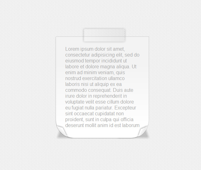
Box # 14
But with CSS3 you can place an object not only vertically or horizontally but with any angle you want, and that’s exactly what we did with the tape on this example.
[css]
/* This is the selector of the fourteenth box, here’s where we establish the measures, background colors, borders and shadows */
.box14{
margin: 50px;
width: 300px;
padding: 5px 0 ;
position:relative;
background:#fff;
background: -webkit-gradient(linear, 0% 20%, 0% 92%, from(#fff), to(#f3f3f3), color-stop(.1,#fff));
background: -moz-linear-gradient(0% 0% 270deg, #fff, #fff 10%, #f3f3f3);
border: 1px solid #ccc;
-webkit-border-radius: 60px 5px;
-moz-border-radius: 60px/5px;
border-radius: 60px/5px;
-webkit-box-shadow: 0px 0px 35px rgba(0, 0, 0, 0.1) inset;
-moz-box-shadow: 0px 0px 35px rgba(0, 0, 0, 0.1) inset;
box-shadow: 0px 0px 35px rgba(0, 0, 0, 0.1) inset;
}
/* This is the top right shadow */
.box14:before{
content: ”;
width: 50px;
height: 50px;
top:0; right:0;
position:absolute;
display: inline-block;
z-index:-1;
-webkit-box-shadow: 10px -10px 8px rgba(0, 0, 0, 0.2);
-moz-box-shadow: 10px -10px 8px rgba(0, 0, 0, 0.2);
box-shadow: 10px -10px 8px rgba(0, 0, 0, 0.2);
-webkit-transform: rotate(2deg)
translate(-14px,20px)
skew(-20deg);
-moz-transform: rotate(2deg)
translate(-14px,20px)
skew(-20deg);
-o-transform: rotate(2deg)
translate(-14px,20px)
skew(-20deg);
transform: rotate(2deg)
translate(-14px,20px)
skew(-20deg);
}
/* This is the top left shadow */
.box14:after{
content: ”;
width: 100px;
height: 100px;
top:0; left:0;
position:absolute;
z-index:-1;
display: inline-block;
-webkit-box-shadow: -10px -10px 10px rgba(0, 0, 0, 0.2);
-moz-box-shadow: -10px -10px 10px rgba(0, 0, 0, 0.2);
box-shadow: -10px -10px 10px rgba(0, 0, 0, 0.2);
-webkit-transform: rotate(2deg)
translate(20px,25px)
skew(20deg);
-moz-transform: rotate(2deg)
translate(20px,25px)
skew(20deg);
-o-transform: rotate(2deg)
translate(20px,25px)
skew(20deg);
transform: rotate(2deg)
translate(20px,25px)
skew(20deg);
}
/* This class establishes the tape of the top side of the box */
.box14_tape{
position:absolute;
top:0; right: 0;
width: 130px;
height: 40px;
background: rgba(0, 0, 0, 0.1);
background: -webkit-gradient(linear, 555% 20%, 0% 92%, from(rgba(0, 0, 0, 0.1)), to(rgba(0, 0, 0, 0.0)), color-stop(.1,rgba(0, 0, 0, 0.2)));
background: -moz-linear-gradient(555% 0% 180deg, rgba(0,0,0,0.1), rgba(0,0,0,0.2) 10%, rgba(0,0,0,0.0));
border-left: 1px dashed rgba(0, 0, 0, 0.1);
border-right: 1px dashed rgba(0, 0, 0, 0.1);
-webkit-box-shadow: 0px 0px 12px rgba(0, 0, 0, 0.2);
-moz-box-shadow: 0px 0px 12px rgba(0,0,0,0.2);
box-shadow: 0px 0px 12px rgba(0,0,0,0.2);
-webkit-transform: rotate(6deg) skew(0,0) translate(-60%,-5px);
-moz-transform: rotate(6deg) skew(0,0) translate(-60%,-5px);
-o-transform: rotate(6deg) skew(0,0) translate(-60%,-5px);
transform: rotate(6deg) skew(0,0) translate(-60%,-5px);
}
[/css]
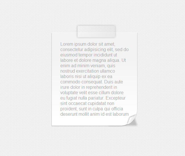
Box # 15
This looks like a series of post-it notes attached to the wall using a tape instead of a pin.
[css]
/* This is the selector of the fifteenth box, here’s where we establish the measures, background colors, borders and shadows */
.box15{
margin: 50px;
width: 320px;
min-height: 150px;
padding: 0 0 1px 0;
position:relative;
background:#fff;
background: -webkit-gradient(linear, 100% 100%, 50% 10%, from(#fff), to(#f3f3f3), color-stop(.1,#fff));
background: -moz-linear-gradient(100% 50% 90deg, #fff, #fff 10%, #f3f3f3);
border: 1px solid #ccc;
-webkit-box-shadow: 1px 1px 4px rgba(0,0,0, 0.1);
-moz-box-shadow: 1px 1px 4px rgba(0,0,0,0.1);
box-shadow: 1px 1px 4px rgba(0,0,0,0.1);
-webkit-border-bottom-right-radius: 60px 5px;
-moz-border-radius-bottomright: 60px 5px;
border-bottom-right-radius: 60px 5px;
}
/* This pseudo class creates the multiple sheets effect */
.box15:before{
content: ”;
width: 98%;
z-index:-1;
height: 100%;
padding: 0 0 1px 0;
position: absolute;
bottom:0; right:0;
background: #fff;
background: -webkit-gradient(linear, 0% 20%, 0% 92%, from(#fff), to(#f9f9f9), color-stop(.1,#fff));
background: -moz-linear-gradient(0 0 270deg, #fff, #fff 10%, #f9f9f9);
border: 1px solid #ccc;
-webkit-box-shadow: 1px 1px 8px rgba(0,0,0, 0.1);
-moz-box-shadow: 1px 1px 8px rgba(0,0,0,0.1);
box-shadow: 1px 1px 8px rgba(0,0,0,0.1);
-webkit-border-bottom-right-radius: 60px 5px;
-moz-border-radius-bottomright: 60px 5px;
border-bottom-right-radius: 60px 5px;
-webkit-transform: skew(2deg,2deg)
translate(3px,8px);
-moz-transform: skew(2deg,2deg)
translate(3px,8px);
-o-transform: skew(2deg,2deg)
translate(3px,8px);
transform: skew(2deg,2deg)
translate(3px,8px);
}
.box15:after{
content: ”;
width: 98%;
z-index:-1;
height: 98%;
padding: 0 0 1px 0;
position: absolute;
bottom:0; right:0;
background: #f3f3f3;
background: -webkit-gradient(linear, 0% 20%, 0% 100%, from(#f3f3f3), to(#f6f6f6), color-stop(.1,#fff));
background: -moz-linear-gradient(0% 0% 360deg, #f3f3f3, #fff, #f6f6f6);
border: 1px solid #ccc;
-webkit-box-shadow: 0px 0px 8px rgba(0,0,0, 0.1);
-moz-box-shadow: 0px 0px 8px rgba(0,0,0,0.1);
box-shadow: 0px 0px 8px rgba(0,0,0,0.1);
-webkit-transform: skew(2deg,2deg)
translate(-1px,2px);
-moz-transform: skew(2deg,2deg)
translate(-1px,2px);
-o-transform: skew(2deg,2deg)
translate(-1px,2px);
transform: skew(2deg,2deg)
translate(-1px,2px);
}
/* This class creates the top left tape */
.box15_tape{
position:absolute;
top:0; left: 0;
width: 130px;
height: 40px;
background:rgba(0, 0, 0, 0.1);
background: -webkit-gradient(linear, 555% 20%, 0% 92%, from(rgba(0, 0, 0, 0.1)), to(rgba(0, 0, 0, 0.0)), color-stop(.1,rgba(0, 0, 0, 0.2)));
background: -moz-linear-gradient(555% 0 180deg, rgba(0,0,0,0.1), rgba(0,0,0,0.2) 10%, rgba(0,0,0,0.0));
border-left: 1px dashed rgba(0, 0, 0, 0.1);
border-right: 1px dashed rgba(0, 0, 0, 0.1);
-webkit-box-shadow: 0px 0px 12px rgba(0, 0, 0, 0.2);
-moz-box-shadow: 0px 0px 12px rgba(0,0,0,0.2);
box-shadow: 0px 0px 12px rgba(0,0,0,0.2);
-webkit-transform: rotate(-30deg) skew(0,0) translate(-30px,-20px);
-moz-transform: rotate(-30deg) skew(0,0) translate(-30px,-20px);
-o-transform: rotate(-30deg) skew(0,0) translate(-30px,-20px);
transform: rotate(-30deg) skew(0,0) translate(-30px,-20px);
}
[/css]
Box # 16
Finally, we combine the famous Polaroid frame with some subtle shadows and two tapes placed on top of each other to prove their transparent property.
[css]
/* This is the selector of the sixteenth box, here’s where we establish the measures, background colors, borders and shadows */
.box16{
margin: 70px 50px;
width: 300px;
min-height: 250px;
position:relative;
border: 2px solid #ccc;
background: rgba(0, 0, 0, 0.5);
-webkit-box-shadow: 0px 1px 12px rgba(0, 0, 0, 0.1);
-moz-box-shadow: 0px 1px 12px rgba(0,0,0,0.1);
box-shadow: 0px 1px 12px rgba(0,0,0,0.1);
}
/* This is the picture’s frame */
.box16:before{
content: ”;
width: 110%;
left: 0;
height: 125%;
z-index:-1;
position:absolute;
border: 1px solid #ccc;
background:#fff;
background: -webkit-gradient(linear, 0% 20%, 0% 92%, from(#fff), to(#f3f3f3), color-stop(.1,#fff));
background: -moz-linear-gradient(0% 0% 270deg, #fff, #fff 10%, #f3f3f3);
-webkit-box-shadow: 0px 0px 12px rgba(0, 0, 0, 0.1);
-moz-box-shadow: 0px 0px 12px rgba(0,0,0,0.1);
box-shadow: 0px 0px 12px rgba(0,0,0,0.1);
-webkit-transform: translate(-5%,-5%);
-moz-transform: translate(-5%,-5%);
-o-transform: translate(-5%,-5%);
transform: translate(-5%,-5%);
}
/* This pseudo class creates the frame’s shadow */
.box16:after{
content: ”;
width: 100%;
left: 0;
height: 115%;
z-index:-2;
background: none;
position:absolute;
-webkit-border-radius: 20px;
-moz-border-radius: 20px;
border-radius: 20px;
-webkit-box-shadow: 15px 0px 30px rgba(0, 0, 0, 0.2);
-moz-box-shadow: 15px 0px 30px rgba(0, 0, 0, 0.2);
box-shadow: 15px 0px 30px rgba(0, 0, 0, 0.2);
-webkit-transform: translate(0,0);
-moz-transform: translate(0,0);
-o-transform: translate(0,0);
transform: translate(0,0);
}
/* This selector and pseudo class creates the tapes of the top left sector */
.box16_tape{
position:absolute;
top:0; left: 0;
width: 130px;
height: 40px;
background: rgba(0,0,0,0.2);
background: -webkit-gradient(linear, 555% 20%, 0% 92%, from(rgba(0, 0, 0, 0.1)), to(rgba(0, 0, 0, 0.0)), color-stop(.1,rgba(0, 0, 0, 0.2)));
background: -moz-linear-gradient(555% 0 180deg, rgba(0,0,0,0.1), rgba(0,0,0,0.2) 10%, rgba(0,0,0,0.0));
border-left: 1px dashed rgba(0, 0, 0, 0.1);
border-right: 1px dashed rgba(0, 0, 0, 0.1);
-webkit-box-shadow: 0px 0px 12px rgba(0, 0, 0, 0.2);
-moz-box-shadow: 0px 0px 12px rgba(0,0,0,0.2);
box-shadow: 0px 0px 12px rgba(0,0,0,0.2);
-webkit-transform: rotate(-30deg) skew(0,0) translate(-20px,-20px);
-moz-transform: rotate(-30deg) skew(0,0) translate(-20px,-20px);
-o-transform: rotate(-30deg) skew(0,0) translate(-20px,-20px);
transform: rotate(-30deg) skew(0,0) translate(-20px,-20px);
}
.box16_tape:before{
content: ”;
position:absolute;
top:0; left: 0;
width: 130px;
height: 40px;
background:rgba(0,0,0,0.2);
background: -webkit-gradient(linear, 555% 20%, 0% 92%, from(rgba(0, 0, 0, 0.1)), to(rgba(0, 0, 0, 0.0)), color-stop(.1,rgba(0, 0, 0, 0.2)));
background: -moz-linear-gradient(555% 0 180deg, rgba(0,0,0,0.1), rgba(0,0,0,0.2) 10%, rgba(0,0,0,0.0));
border-left: 1px dashed rgba(0, 0, 0, 0.1);
border-right: 1px dashed rgba(0, 0, 0, 0.1);
-webkit-box-shadow: 0px 0px 12px rgba(0, 0, 0, 0.2);
-moz-box-shadow: 0px 0px 12px rgba(0,0,0,0.2);
box-shadow: 0px 0px 12px rgba(0,0,0,0.2);
-webkit-transform: rotate(0deg) skew(0,0) translate(-15px,-20px);
-moz-transform: rotate(0deg) skew(0,0) translate(-15px,-20px);
-o-transform: rotate(0deg) skew(0,0) translate(-15px,-20px);
transform: rotate(0deg) skew(0,0) translate(-15px,-20px);
}
[/css]
And that’s it folks, now you know how our creative team developed this fantastic boxes, the major inspiration that made us create these boxes was the original photo frames (PSD) released in our sister page WordPressThemeShock, you can take a look at them by visiting the site. Thanks for stopping by and well, we hope that this tutorial can be truly helpful during those times when you prefer to work everything straight with code instead of wasting time with JPEG and things like that.
View Demo