Around the end of the year you’ll find in all web design theme oriented blogs and sites countdowns on what trends you should look out for in 2012, you may be thinking that this is just one more of those repetitive listings but you’re wrong! This is not your usual countdown …….it’s THE COUNTDOWN for web design trends 2012, complete with all the information, inquire, showcase, video tutorials and controversy points of view that the other trends listings don’t show you.
Yeah, yeah, so our categories in the trend listing can be alike to others seen in the web now days. But here at webdesignshock.com we’ve looked to make the difference by giving you a much more thorough guide to web design in 2012, that besides providing a general description of each trend and two or three examples, it also brings you detailed information concerning each trend!
Contents
Html5, CSS3/CSS4, JavaScript and JQuery
I. HTML5 still in the top
HTML5 fighting future challenges!
What is HTML 5 & 5 Reasons to Use It
II. JQuery will rock for another year
III. CSS3 and CSS4 in da house
IV. Check out what’s coming up!
3D Effects (again) that wow!
I. Fantastic 3D effects to check out!
II. Put your 3D glasses on for Stereoscopic websites!
Technology Enables to Stream Stereoscopic 3D Videos
III. Parallax Scrolling for a 3-Dimensional Feel?
3D Parallax JQuery plug-in with editor
Parallax as a means of faking 3D space
Easy Breezy One-Page experiences
I. Tips for a better One-page website
II. Wait a minute!…One-page websites are dying?!
Typography Boom!
I. Type is everywhere
II. Home page “Hellos”
III. And with them came…Introductory Texts
The compelling and creative
Compelling home page introduction
The interactive
The informative
A cool introductory text to boost your website’s traffic
The simple and concrete
IV. Slab typefaces for the Bold
Grid your Layouts (always), be responsive
In times where the world is moving fast and leaving behind anything that might make it stop for a fraction of a second, Web design is always looking for ways to play around with images and to present them in a more quick way for the user, in this sense a Grid-Driven layout has become a great tool to organize information and add it structure so that the user finds it easier to comprehend.
“Back to Basics” Minimalistic sites!
Minimalism in website design will provide the visitor with a relaxing space of understated taglines and texts, simple and often light or primary colors, and a preference for visual silence. This is a design plan that may seem like a challenge to the majority of web designers, because developing a site by sharing only the necessary info about a product or theme is not an easy thing to do in this media-frenzy world we live, but don’t be afraid to risk it minimizing your contents, and bringing your visitor a fresh site that’s up to date with the latest in web design.
Go for Oversized Headers and Footers
I. Big Headers…
II. And big footers…
Create a Compelling User Experience!
I. Responsive Web Design when really needed!
II. QR Codes…your augmented reality
QR codes that go beyond!
Html5, CSS3/CSS4, JavaScript and JQuery
Through time Flash has gotten bad rep and become the ugly duckling of web design, but with just cause. Although flash has shown to have major web presence over the past years, it’s no secret that due to web designer’s abuse on Flash it’s now known for being heavy, not compatible with mobile devices and being created upon less readable codes, just to name a few of the “contras” it’s known for.
We have to admit that this has probably been caused by web designers that used it for functionalities that would’ve been best presented in a much simplified way for the user, but whatever has been the case flash has now become a thing of the past, while CSS3, HTML5, JavaScript and JQuery make their way doing pretty much everything that Flash can do, only a million times better.
HTML5, CSS3, JavaScript and JQuery boost your website design with beautiful shapes, smart typography, really cool social tools, and a practical drag and drop functionality. They have become of somewhat of a household use thanks to the great features that they bring to a design such as updated design elements, interactivity for users, faster loading times, and mobile compatibility. however, and this is important, you have to be totally careful on what server you want to work with, due to the load speed is critical nowadays, about 5 seconds waiting and the user will abandon your site, so both your server and configuration have to be the best you can afford and grant, if needed here’s a lists of web hosting companies to have a look.
Here are some beautiful sites created in HTML5, CSS3, JavaScript and JQuery for you to check out and use for inspiration:
HTML5 still in the top!
Here are some beautiful sites created in HTML5 for you to check out and use for inspiration:

At teamviget.com they tell us: “We’re searching the universe for intelligent beings who inspire us and will help us conquer new frontiers. Read our stories and make contact if you are ready to join the adventure.”

Facio Design we pride themselves in keeping up with the latest web technologies, ensuring that every website we build is accessible to both visitors and search engines.

AX Visual Limited is a robust web development service, mobile application development service and corporate image consulting service, which offers a one-stop full service – from initial design, to final product launch and online marketing.

One-Nyne Design is the one-stop creative agency featuring innovations in new media, branding and animation.
HTML5 fighting future challenges!
It’s no secret how HTML5 has become a great tool in facing the future challenges in web design that start to come our way. HTML5 represents the “next big step in the progress of the Web,” says Jeffrey Jaffe, chief executive of the World Wide Web Consortium, as shown in this piece we’ve brought for you to check out posted in nytimes.com By Steve Lohr titled “In a New Web World, No Application Is an Island”:
“How’s that? Isn’t the Web already the crucial utility of online commerce, information and entertainment? In many ways, it certainly is. The Web’s importance is indisputable — but there are signs that it is slipping. Investment, innovation and energy have been shifting elsewhere in computing — mainly, to shopping, gaming and news applications for smart phones and tablet computers.
These applications often tap into Web sites for information on all manner of things. But they do not reside on the open Web, and cannot be searched and linked to one another in the same way Web applications can. Think of the apps tailored for Apple’s iPhones and iPads, or those made for Google’s Android operating system. Social networking sites like Facebook and Twitter have similar characteristics, as walled gardens that are connected to the open Web but are separate from it.
But the Web’s fortunes may soon brighten remarkably. The scenario relies on a collection of technologies, already years in development, which is starting to make its way into the mainstream of computing. HTML5 is the geeky umbrella term for this assemblage. (It’s the fifth generation of HyperText Markup Language, which is the way Web pages are written in code.) Engineers say the technology will make it possible to write Web applications, accessed with a browser, that are as visually rich and lively as the so-called native applications that are now designed to run on a specific device, like an iPad or an Android-based tablet.
The Web browsing software that is needed to bring HTML5 to life has recently arrived. Last week, Mozilla, the maker of Firefox, released the newest version of its browser, showing off its support for the new technology. A week earlier, Microsoft brought out its new Internet Explorer tuned to run HTML5. The Safari brower from Apple, meanwhile, also supports the new technology, and the company has particularly embraced HTML5’s video-playing feature as an alternative to Adobe’s Flash player. And the Chrome browser team from Google has long been a leader in HTML5 development.(…)”
Take a look at a few more examples of beautiful sites created in HTML5 for inspiration:

FreeAgent is accounting software, simplified, through a stress-free way to manage your books and invoicing. Take the tour, hear the buzz or peruse our pricing.

Stephen Caver’s site design, emphasizes a clean displays of content while facilitating great user experience. Stephen has experience in information architecture, interaction design, HTML andCSS. He has worked with clients such as the World Wide Web Consortium, Change.org and the Mozilla Creative Collective.

Moods of Norway has been doing the hibbedy-dibbedy on the international fashion dance floor for 6 years now, the philosophy is still the same even though the Norwegian oil price is as flexible as an Bulgarian gymnast after 14 tequila shots. Their main goal, besides making their grandmas happy, is to make happy clothes for happy people around the world.

This Tron Legacy interactive experience is a acollaboration between Disney Publishing Worldwide and Internet Explorer 9, exploring new ways of storytelling using HTML5 and modern web technologies. Using an HTML5 Canvas and audio tags, the experience animates a traditional graphic novel to life.
What is HTML 5 & 5 Reasons to Use It
“Matthias Galica, Founder & CEO of ShareSquare getsharesquare.com (a platform for connecting offline audiences with the bands and brands they love, through immediate calls-to-action and rich engagement on the mobile web, with real-time analytics), discusses HTML 5 and why it can be a powerful tool to reach customers.
The question of native apps versus HTML is an ongoing debate and there is definitely potential for many companies to benefit from this new technology.”
Check out the last examples of beautiful sites created in HTML5 for inspiration:

Wired.co.uk launched to bring you the stories, people and ideas that are changing our day-to-day world. Their teams of editors in London and around the globe aim to bring you the most important, interesting and inspiring news and features, 24/7.

A postcard is created by an analog signal: you. This site takes that postcard and converts it to digital. The Wilderness Machine brings it back to analog. Look for it on tour with the band in North America. If you’re lucky enough to get someone’s postcard from it, plant it. A tree will grow out of it.
Here are just a couple of the useful pieces on HTML5 features that we have for you to check out here at webdesignshock.com for further information:
HTML5 For Web Designers Review
“Being a web savvy tech nut it’s pretty rare that I buy a book on web technology. Let’s be honest most of us are the same – we live on the web and if it’s not on the web we don’t have the time. However, we are embarking on a new project at work and it seemed like the perfect project to try out some HTML5. What better way to cut through the hype than with an experienced and trustworthy guide.”

Percentage Grid System in HTML5
“When diagramming for the web, one of the most useful ways of doing it is through grid systems to help the designer layout faster. Today we found a nice percentage based grid system that is nested in the Easy framework’s CSS.
This grid system features a percentage-based width in all its columns to make them adjust to the container element, which means that by using this system you will not have to set the width value for every column manually, just put it inside any container and both the column widths and gutters will be adjust perfectly.”

JQuery will rock for another year
Here are some beautiful sites created in JQuery for you to check out and use for inspiration:

Peter Pearson is a web designer and developer currently working with Catch Digital an independent digital creative agency based in London. He lives in St Albans, Hertfordshire, hates the commute, and may be able to help you with small design and development projects. This site is a showcase of his freelance and university work as a web designer, developer, animator and artist.

This is a team of very talented young people, gathered around the same idea and divided into jobs where their talent and skills are most useful. They’ve become a “factory” that inspires personal
satisfaction in each of their clients.

Pline studios has been started to serve our architectural visualization skills throughout the nation and abroad. Theirs 3d architectural studio has been started after a long hurdled journey and a lengthy period of experience and experiments in the field of architectural visualization. With over 17 years in the field of architectural visualization, they’ve conducted many international level presentations.

The Outback is a creative studio, and more. The Outback is a vibrant space where the color of creativity shine in the whirlwind of ideas marked. Talent, technology and professionalism are the silver of the house in environment that resonates innovation. Our atmosphere full of design, motion graphics and digital brand activation will turn its gaze on the universe of communication.

At sitepoint.com they tells us some of the reasons why JQuery will be on the top of the list for web designers worldwide with the article “What’s so good about JQuery?” posted by Earle Castledine, from which we decided to share with you guys some fragments, for you to check out the traits that come with incorporating JQuery to your site:
“You’ve read that jQuery makes it easy to play with the DOM, add effects, and execute Ajax requests, but what makes it better than, say, writing your own library, or using one of the other (also excellent) JavaScript libraries out there?(…).
Cross-browser Compatibility
Aside from being a joy to use, one of the biggest benefits of jQuery is that it handles a lot of infuriating cross-browser issues for you. Anyone who has written serious JavaScript in the past can attest that cross-browser inconsistencies will drive you mad. For example, a design that renders perfectly in Mozilla Firefox and Internet Explorer 8 just falls apart in Internet Explorer 7, or an interface component you’ve spent days handcrafting works beautifully in all major browsers except Opera on Linux. And the client just happens to use Opera on Linux. These types of issues are never easy to track down, and even harder to completely eradicate.(…)
Helpful Utilities
Also included is an assortment of utility functions that implement common functions useful for writing jQuery (or are missing from JavaScript!): string trimming, the ability to easily extend objects, and more. These functions by themselves are particularly handy, but they help promote a seamless integration between jQuery and JavaScript which results in code that’s easier to write and maintain. (…)
jQuery UI
jQuery has already been used to make some impressive widgets and effects, some of which were useful enough to justify inclusion in the core jQuery library itself. However, the jQuery team wisely decided that in order to keep the core library focused, they’d separate out higher-level constructs and package them into a neat library that sits on top of jQuery.(…)
Plugins
The jQuery team has taken great care in making the jQuery library extensible. By including only a core set of features while providing a framework for extending the library, they’ve made it easy to create plugins that you can reuse in all your jQuery projects, as well as share with other developers. A lot of fairly common functionality has been omitted from the jQuery core library, and relegated to the realm of the plugin. Don’t worry, this is a feature, not a flaw. Any additional required functionality can be included easily on a page-by-page basis to keep bandwidth and code bloat to a minimum.(…)
Keeping Markup Clean
Separating script behavior from page presentation is best practice in the web development game—though it does present its share of challenges. jQuery makes it a cinch to completely rid your markup of inline scripting, thanks to its ability to easily hook elements on the page and attach code to them in a natural, CSS-like manner. jQuery lacks a mechanism for adding inline code, so this separation of concerns leads to leaner, cleaner, and more maintainable code. Hence, it’s easy to do things the right way, and almost impossible to do them the wrong way! (…)
Widespread Adoption
If you care to put every JavaScript library you can think of into Google Trends, you’ll witness jQuery’s exponential rise to superstardom. It’s good to be in the in crowd when it comes to libraries, as popularity equates to more active code development and plenty of interesting third-party goodies.(…)”
Take a look at a few more examples of beautiful sites created with Jquery for inspiration:

Merix Studio is a Poland-based web design agency operating internationally, that has over 10 years experience in web development. Their offer is focused on delivering user-centered, attractive and usable graphic designs together with clean, W3C standards compliant code.

This website was designed and developed by Ricardo Mestre. It uses HTML 4.01 Strict for markup and CSS 3 techniquesfor presentational elements. Eye-candy tricks are provided by the open-source jQuery Javascript library and a couple of plugins (Background-Position, ColorBox, jQuery Easing & Preload Css Images).

AM is a New York based design studio that specializes in creating an effective online presence for small-sized business, startups and individuals.

Today, 26 earth years later, he is working at an ad/web firm called Rodeopark Communications. He is still as fond of web development as he was in his early years. The techniques evolve and changes which brings a constant drive to learn new things.
Here are some of the useful pieces on JQuery features that we have for you to check out here at webdesignshock.com for further information:
JQuery Tooltip, 100 Fresh Resources!
“As a Web designer you’ll always be on the lookout for the freshest resources to incorporate in your site, to keep it up to date in the latest trends in web design and make the web surfing progression a trouble-free route for your visitors, especially considering, that site users’ needs nowadays point to a site that brings them rich information with best visual presentation, and that above all grants it in a easy access fashion.
So it’s essential that during the creation of your site, you enhance it with the latest in practical access tools that serve as much information to the visitor as can be possible after just one click, without having to wait more than a several seconds after the click.”

Amazing JQuery Photo Slider
“What’s up guys?, to continue with our experiment series, our designing and programming team joined forces to create an amazing carousel vintage photo slider with PHP and jQuery. This is definitely a nice photo slider to be applied in different websites so you can showcase your work in a more original way. This tutorial is going to cover the programming part of the carousel (stay close to find out the release time of the design part) so you can learn how we did this fancy photo slider and you can adapt it to your own projects. You can also take a look at the demo to see how it works and download all the source files.”

Dialog Box / Alert Message In JQuery With Apprise
“When you’re working on a page that has a permanent interaction with its visitors, it’s important to create different communication channels that let people know where they’re standing and what are their possibilities inside the page, and one of these methods is using dialog / alert boxes.
Apprise is a great jQuery alternative to create attractive, fast and simple alert/dialog boxes. It gives you total control over style, content, position, and functionality. Apprise’s premise is to offer an attractive alert/dialog box for the average developer that is not interested in downloading a massive UI framework.”

CSS3 and CSS4 in da house!
Here are some beautiful sites created in CSS for you to check out and use for inspiration:

idosurfbetter.com tell us: “For too long people have been victims of poor online experiences and slow web surfing, but now it’s finally time for everyone to shout out…I do surf better!”


Babak Salari is a Montreal-based photographer and educator who’s projects include: Iranian artists in exile; matriarchal, indigenous communities in Mexico; and gays and transvestites in Cuba. Recently, he documented those displaced and brutalized by war in Afghanistan, Pakistan, Iraq, Lebanon and Palestine.
Experimental CSS Properties
Many web designers are concerned for common CSS3 properties like as border-radius, box-shadow or transform, while there are other much more advance and unpopular features on CSS3 that should be getting credit for their usability enhancements.
“The Future of CSS: Experimental CSS Properties” posted By Christian Krammer at smashingmagazine.com tell us about this un-recognized features that many of us should be diving into by now, especially with the year 2012 just around the corner. Here’s the intro to this great article on CSS3 for you to check out, for further information on the matter visit the source :
“Despite contemporary browsers supporting a wealth of CSS3 properties, most designers and developers seem to focus on the quite harmless properties such as border-radius, box-shadow or transform. These are well documented, well tested and frequently used, and so it’s almost impossible to not stumble on them these days if you are designing websites.
But hidden deep within the treasure chests of browsers are advanced, heavily underrated properties that don’t get that much attention. Perhaps some of them rightly so, but others deserve more recognition. The greatest wealth lies under the hood of WebKit browsers, and in the age of iPhone, iPad and Android apps, getting acquainted with them can be quite useful. Even the Gecko engine, used by Firefox and the like, provides some distinct properties. In this article, we will look at some of the less known CSS 2.1 and CSS3 properties and their support in modern browsers.
Some explanation: For each property, I state the support: “WebKit” means that it is available only in browsers that use the WebKit engine (Safari, Chrome, iPhone, iPad, Android), and “Gecko” indicates the availability in Firefox and the like. Finally, certain properties are part of the official CSS 2.1. specification, which means that a broad range of browsers, even older ones, support them. Finally, a label of CSS3 indicates adherence to this specification, supported by the latest browser versions, such as Firefox 4, Chrome 10, Safari 5, Opera 11.10 and Internet Explorer 9.”
Take a look at a few more examples of beautiful sites created in CSS for inspiration:

lostworldsfairs.com tell us: We look from the Milky Way into the universe beyond. Life and time are enriched by science and technology. The pearl of our night sky welcomes Earthlings to reflect on our past home and prepare us for a future of exploration, discovery, and the marvels of space.


Eye Styles is a fun and exciting experience where you can discover “Eyewear as unique as you”. We offer fabulous frames, contact lenses and eyes exams, with your individual needs in mind and take pride in the quality of care we provide.
The following article is an excerpt from Eric Meyer’s recent book Smashing CSS, published by Wiley in cooperation with Smashing Magazine. We’ve brought some apart of the post to put all you web junkies up to date in up and coming trends in CSS,but for further information don’t forget to visit the source of the post at http://coding.smashingmagazine.com/2011/02/11/the-bright-near-future-of-css/, you’ll find detailed information and coding strategies on each feature:
“In this article, the focus is on what’s coming: styling techniques you’ll use in the immediate and near-term future. From styling HTML 5 elements to rearranging layout based on display parameters to crazy selection patterns to transforming element layout, these are all techniques that you may use tomorrow, next month, or next year. With partial browser support, they’re all on the cutting edge of Web design.
Accordingly, be careful not to get cut! A number of useful sites can help you figure out the exact syntaxes and patterns you need to use these techniques.
Furthermore, a number of JavaScript libraries can extend support for advanced CSS back into older browsers, in some cases as far back as IE/Win 5.5. Some are very narrowly focused on certain browser families, whereas others are more broadly meant to allow support in all known browsers. These can be useful in cases where your visitors haven’t quite caught up with the times but you don’t want them to miss out on all the fun. (Some of these libraries are CSS3 PIE, cssSandpaper, :select[ivizr], ie7-js,eCSStender).
There are also a good many CSS enhancements available as plug-ins for popular JavaScript libraries such as jQuery. If you’re a user of such a library, definitely do some digging to see what’s been created. Again: Be careful! While these techniques are powerful and can deliver a lot of power to your pages, you need to test them thoroughly in the browsers of the day to make sure you didn’t just accidentally make the page completely unreadable in older browsers.”
Check out the last examples of beautiful sites created in CSS for inspiration:


Here at webdesignshock.com we also have useful pieces on CSS3 for you to check out for further information:
CSS Menu, 180 Scripts, Plugins And Freebies
“(…)More and more so CSS (Cascade Style Sheet) menus have come to replace Flash menus when it comes creating a practical website design, as it’s become obvious through their use in time, that despite the visual beauty of their bar and button features, they are twice as difficult to construct and turn out to be heavy on website.
As a result, CSS has become evidently trendy because of its lightness, and simple to create, easy to update and put into action features, since all you have to do when using it, is to import the CSS style sheet on your HTML or any other web script page and add all the page appearance alterations according to your desired CSS style settings.”

Nice Tool To Create CSS Comparison Tables
“Every Web Designers & Developer which know a bit HTML & CSS, know that there is one big black hole when it comes to designing HTML tables. It’s annoying, It’s clumsy and it’s a waste of time. Therefore, everyone who can, trying to avoid it. But there is a simple solution to that oppressive problem and it’s called Compare Ninja.”

CSS Extended Through Dynamic Behaviors
“As most of you know, we’re always looking for new tools and hacks to help web designers / developers with their work. Today we’ve found a neat tool that will help you enhance the power of CSS. LESS is a nice JavaScript library developed by Alexis Sellier that extends CSS by adding dynamic behaviors on the way of variables, mixings, operations and functions. The library offers support for IE6+ browsers and webkit and from the server-side is powered through the file Node.js.
LESS works like this. The variables allow you to specify widely used values in a single place, and then re-use them throughout the style sheet, making global changes as easy as changing one single line of code, making things easier for the developer.”

And check out what’s coming up!
In developer.mozilla.org you can check the upcoming launches in the “Welcome to the Mozilla Demo Studio,” where developers like you can develop, share, demonstrate, and learn all about Web technologies”. It has great features like giving you the possibility of inspecting the source code for those demos so you can see how they work, while you read documentation to learn about the open standards and technologies that power the Web.

Here are some of the up and coming launches HTML5, CSS3, Javascript and jQuery that can be found at developer.mozilla.org:


3D Effects (again) that wow!
As always web developers are looking to find new ways to make the user experience more interactive. Incorporating 3D effects into website design has become one of the most effective features that web creators have found to complete this interactive experience. With it web is developing into the illusion of depth, sometimes to the point where websites are like a movie or game.
What web designer would have out with this up and coming trend is to not distract the viewer from the real content of the site, since a 3D Effect should really be incorporated in a site to enhance or boost the user’s understanding and connection with the content and information being provided.
Fantastic 3D effects to check out!
Here we’ve summed up 30 of some of the great examples of 3D effects for your inspiration; check them out and be sure to guarantee an interactive experience for your user within the site:


Put your 3D glasses on for Stereoscopic websites!
3D is everywhere to be seen now days in movies, toys, even cereal boxes and website design is not the exception, ok so many of you may be thinking that this is no secret how 3D effects have been incorporated to website design over the years, but as time goes by designers have looked to go farther with the traits that 3D can offer, besides a simple 3D effect. And this is where, Stereoscopic 3D websites come in.
Although criticized in many ways for not being practical in the sense that you need a pair of 3D glasses to enjoy the content, and well not many people carry a pair of these everywhere they go, Stereoscopic 3D websites can be a the answer of the future for boosting a user’s interactive experience within the site. This is something that’s not always taking into consideration; many times web designers use Stereoscopic 3D for visual enhancement of a site without worrying if it actually improves the visitor’s usability.
Here are some outstanding examples of Stereoscopic 3D websites for you to check out:


Technology Enables to Stream Stereoscopic 3D Videos
NVIDIA announced in December of 2011 that it is making NVIDIA® 3D Vision™ video player technology available for free to Web developers, enabling them to easily build websites for streaming high-quality 3D video to 3D Vision-equipped PCs. On this matter we’ve subtracted pieces from this great article from pressroom.nvidia.com, check it out! and for further information the source:
“NVIDIA is the first company to deliver a 3D video plug-in for the Microsoft Media Platform (MMP) Player Framework v2.5 (F.K.A. Silverlight Media Framework) with support for active-shutter 3D glasses. The plug-in is based on the same technology that powers NVIDIA’s popular 3D Web community, www.3DVisionLive.com. The MPP Player Framework is open-source code that enables developers to quickly deploy robust, scalable, customizable media-player applications for the Web, based on Microsoft Silverlight and with full support for IIS Smooth Streaming and Microsoft PlayReady DRM.
“With NVIDIA’s new 3D video plug-in, developers can now take full advantage of the stereoscopic 3D video streaming support available in the latest version of Microsoft Media Platform Player Framework,” said David Sayed, senior product manager at Microsoft Corp. “Microsoft is delighted to work with NVIDIA to deliver exciting functionality and capabilities to help developers build the next wave of websites powered by the Microsoft Media Platform.” (…)
” (…)The Web is enabling an entirely new market for creating and delivering compelling, innovative 3D content,” said Jon Barad, senior business development manager at NVIDIA. “Our 3D Vision technology now makes it easy for web developers to integrate world-class stereo 3D video capabilities into all types of sites.”
About NVIDIA 3D Vision
NVIDIA is the worldwide leader in 3D technology for personal computers. The NVIDIA 3D Vision technology, which includes 3D Vision software and advanced active shutter glasses, delivers breathtaking stereoscopic 3D images for gamers, movie-lovers and photo enthusiasts when configured with NVIDIA GPUs and a 3D display or projector. NVIDIA 3D Vision technology supports the richest array of 3D content available, including 500 3D games, Blu-ray 3D movies, 3D photos and streaming Web video. It also enables users to upload, share and view full-resolution 3D photos, as well as enjoy 3D movies at NVIDIA’s3DVisionLive.com, the world’s first 3D Vision online community. In addition, the NVIDIA 3DTV Play™ software enables consumers to attach their PC or notebook to 3D HDTVs and HDMI 1.4-capable audio/video receivers and enjoy all the latest 3D content in the comfort of their living rooms in full HD 3D, and with HD surround sound audio.”


In case some of you web design junkies still don’t know Orbcreation is set to launch mid January 2012. In the mean time, orbcreation are treating potential users with a series of ‘experiences’ which show the scope of this technology. You can find out more by visiting www.orbcreation.com
“(…)It has been built by Richard Knol who has been developing and creating complex programmes for many years. 3D Focus exclusively spoke to Richard Knol about Orbcreation asking how it is different to Second Life, how he intends to monetise the service and what plans he has for the future…
3D Focus: Can you give us a brief overview of Orbcreation?
Richard Knol: Orbcreation is about giving people the ability to create 3D worlds. These worlds could be a simple room with information/images on the walls, an office building, a shopping mall or an entire virtual world with trees, flowers and butterflies flying around.
The purpose of these worlds is to give people a different perspective on the ideas or information. Website owners will be able to present their content differently to the standard “2D webpage, click to view the next page” style we all know. They are visually stimulating, interesting and a great way to showcase or feature something special.
You will be able to create an entire website in 3D but we think it will be more appealing to add or merge a 3D world with existing websites. (…)
(…) 3D Focus: Some of the features of Orbcreation sound like they are already available in Second Life. How is this different?
Richard Knol: The main difference is that Orbcreation will run in your own Internet browser. People will visit your end products like they visit a website, whereas in Second Life people lead a “second life” and stay within the environment. (…)
3D Focus: What will you be launching from day one in January?
Richard Knol: From day one people will be able to create web worlds by using the standard components we have available. There are buildings, terrains, basic building blocks, furniture, displays for video images or text, and lots more. There will also be cool items like flags that you can display images on and butterflies that all behave independently.
When you have finished building, you will receive a .zip archive from us to host it yourself or we can host it for you for a small fee. Soon after the launch we will add the ability to upload 3D models that you have created yourself. These will be added to the Orblet library and you will be able to sell them to others earning revenue for yourself. It is certainly going to evolve and develop and we love that concept; people will be able to create with us. (…)
(…) 3D Focus: Will Orbcreation be compatible with iphones and ipads?
Richard Knol: Unfortunately not. The Unity web player is only available for desktop computers. When the Flash export feature arrives it might work on some Android phones and tablets, but Adobe has already announced that they will not be putting much effort into mobile platforms anymore. In any case the visual impact of 3D images can be ‘lost’ on smaller screens. It’s a bit like watching a movie like Avatar on your iPhone, a bit pointless!
3D Focus: Why is the world ready for this now?
Richard Knol: The computers are now powerful enough and the technology is available. The weird thing is that you have the game developers that produce awesome graphics with real time shadows, special lighting and everything you can think of. And there are the Web designers on the other hand who are limited to HTML, Flash and static images. The only thing we did was combine the two. I guess it was just having the vision.
3D Focus: How do you intend to monetise this?
Richard Knol: When you build your world, you construct it with orblets. Many of these orblets are free and some of them will cost a small amount of money (around $1 or $2). When you are ready you can either receive all of the files and host it yourself or we can do that for you. If you want multi user support we can host that for you for a fee, but this will also only cost a small amount. (…)
(…) 3D Focus: Will people’s Orbs be available to view in stereoscopic 3D?
Richard Knol: Yes, there is a checkbox you can click in the general settings of your world when you are building it. If switched on, people will get a 3D goggles icon in the bottom of their screens and they can enjoy the world in anaglyph 3D. We may add other 3D viewing options in the future, but it all depends on the developments in hardware and the support for it by Unity. The most important thing is that we support the double camera that you need for stereoscopic viewing.”
Parallax Scrolling for a 3-Dimensional Feel?
As 3D web development has come to be a big trend amongst web designers these days, so have all the tools that allow us to create this 3D effect, Parallax Scrolling is one of them. For those of you that still don’t know it very well, it referrers to the effect that plays with the foreground and background to create the illusion of depth by scrolling to the sides.
Here are some outstanding examples of this popular trend that’s coming on strong for 2012:


In the creative cellars of the picturesque town of Stryn, Norway (pop. 6750), two local designers Simen Staalnacke and Peder Børresen, upon homecoming from years of global travels, nights of sizzling cocktails, and international studies; gave birth to a concept soon to be known, worn, and adored, as The Moods of Norway. Soon the duo met up with the third musketeer, Stefan Dahlkvist and drew their lines for the coming collections.

They create usable, responsible web design that is as nice to look at as it is to use. Their irreverent design department quietly considers your functional requirements, then marries them to the esthetic elements that make your followers, your tribe, respond.

The website provides information about the placement of part-time promotions and the current status of Titelführbarkeit in Germany, Austria and Switzerland.
3D Parallax jQuery Plugin with Editor
“freshD — The jQuery 3D Parallax Plugin magically animates your objects in a dynamic created 3D world. For those of you who don’t know what Parallax is, the best way to describe it is the way objects in the background tend to move less than objects closer to the viewer, the most front objects also transform themselves to the viewer’s point of view. Here’s a wiki link for something more indepth.
(…)Well, since it needs quite some configuration for putting the elements on the screen so that they move in smooth 3D motion we added a WYSIWYG configuration system. Open it in a browser, customize your freshD Parallax world and paste the resulting HTML in your Site.
Also this is not one of the typical Parallax plugins. It does not only move sideways it got real depth. Move the mouse in all directions to see the items move, zoom and transform (skew).
(…) It does work in all modern browsers (Chrome, Safari, Opera, Safari, IE9 ) in the superawesome version! The mobile devices like iPhone, iPad and Androids can use the automatic start version. Only in IE8 you got a minor fallback since no skewing is possible (but that does hardly stop the freshD magic).(…) No! When using the configuration system it is very comfortable and results in copying some files/text to your server. The plugin itself is as easy to install as every jQuery plugin you know (…)”

Collide is launching the H2H campaign where they are asking everyone to get involved by donating $18 each (18 dollars for the 18 inches).


Today, you find yourself with so much information that is not enough time to see everything you want. We all feel the same. When you have many choices, what we like is the practical and original. People compare. And a good picture makes a product or service stand out from the rest. Therefore, as a brand, you need to create a permanent bond with consumers. So love at first sight must be maintained over time.

Protect Photos, Passwords, And More. “While we’ve covered apps in the past that help protect your data on iOS, but no other app does the job with as much flair as the just released Ben the Bodyguard.”

For the purchase of 1 liter of drinking Alpro Soya Light Dairy Central Asturian, and / or drink Alpro Soya Light Dairy chocolate flavor Central Asturian, we will refund the amount of your purchase.
Parallax as a means of faking 3D space
In the following piece taken from the article “Building a parallax scrollingstorytelling framework” posted by netmagazine.com, Stevan Živadinović, the brains behind multi-plane side-scroller web comic Hobo Lobo of Hamelin, walks us through the development of the Parallaxer platform and gives a crash course on turning pencil drawings into transparent-background assets. For further information be sure to check out the full piece with useful visual aid, coding info and more!
“(…)Parallax as a means of faking 3D space is pretty counterintuitive. When you look around you with a simple 50mm camera lens, you see that as the distance to an object increases, bigger things can fit into your field of view. At about half a metre, you can see a full book. At about three metres you can see a whole couch. From 20m you can see a whole house. Pretty straightforward stuff.
Parallax, however, doesn’t deal with distances. It deals with vectors. If you look through your camera from the previous example, and step one metre to the side, the book will have completely left your viewport, you will see about two-thirds of the couch, and the house will barely have moved. This stuff is pretty confusing to describe mathematically.
To better conceive how the huge panoramic ought to behave, let’s split the stage and all of the parallax layers into panels. This solves a lot of problems we don’t yet know we have. For one, instead of having to work with a single panorama that is difficult to fully grasp, we can draw our story in segments and better anticipate the interplay between the layers while they’re within view, in and close to the centre of our browser window (shown below as the dotted line)(…)”

Whether through research, strategic thinking and planning, evaluation or direct delivery, their work helped clients to make real and valuable changes.

UNIQUE HANDMADE DIARIES FOR 2012 / recycle / sheets of plastic made out of packaging / Printed on 100% recycled paper / handmade / plastic sheets manufactured by protected workshop SALET / each piece is unique // ONLY CZECH VERSION AVAILABLE.


At Campaign Monitor, they’re all about crafting beautiful experiences for designers. 2011 is shaping up to be a big year for them.

A Frenchman is protecting your secrets. yes, seriously. ben the bodyguard is protecting your passwords, photos, contacts and other sensitive stuff on your iphone® or ipod touch®

Easy Breezy One-Page experiences
Web designers struggle to find new ways to maximize the user’s experience In order to make their website, not just something compelling and complete with the information needed, but to provide this information and wow factor through an easy access experience in a site responsible site that’s available without having to bare the haggles of a never ending loading period.
One-page websites have become a great feature to incorporate in your website design to fulfill this purpose. Fitting the entire site content and information in a single page layout make your site a more efficient one, since a visitors tends to click back to the home page several times while web surfing a page. These kinds of website make use of cool traits to spice up their layouts in HTML5, CSS3 and JavaScript to create a single page with multi-faceted with tabs, animations and pop-ups.
We must warn that a one-page website although innovative, is not recommended for all types of sites, this trend is better for sites with less content such as events, personal sites, products and micro sites; while e-commerce sites and other wide display sites should avoid this type of format. Here we give you some great single page layout examples for you to check out and use as inspiration:


CreativePeople is a small company with big ideas! Perhaps the only independent interactive creative agency in Russia that came into Creative Agency Awards and is constantly working with clients around the world. In this we are helped by our representatives in Switzerland, France, Germany and Ukraine.

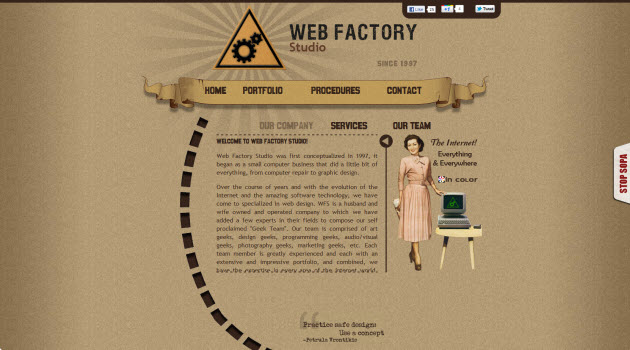
Web Factory Studio was first conceptualized in 1997, it began as a small computer business that did a little bit of everything, from computer repair to graphic design.


Ryan Scherf is a designer, developer, author, teacher and entrepreneur from Minneapolis, MN, USA. He’s been in and off as a freelance designer for roughly 10 years.

Smultron is a web technology agency based in Cracow. They are dedicated web professionals with a wide swath of experience in web programming solutions for clientele worldwide. All these experiences combined have made them a dependable team. Openness to new challenges and precision are their basic strengths.


Campfire is a marketing agency that launches products and changes perceptions through storytelling. We ignite the influencers, fan cultures and communities that drive results for our clients.

Tips for a better one-page website
In the article “6 tips to create better one-page websites” posted by webdesignerdepot.com you can find great tips to avoid the typical vies and mistakes when creating a one-page website design. Check the fragments we’ve brought for you from this post and be sure to check out the full article for further information:
“One-page websites are hot and popular — no doubt about that. But they aren’t for everyone or every business. It’s easy to want one because they’re popular; and if done correctly, yours could be a hit. But make sure you’re project qualifies first.
A good candidate for a one-page website is not super-heavy on content. You only have one page to get your point across, and there are only so many animations and tricks you can throw in before they get stale.
Plus, most one-page websites are unconventional in their layout. Trying to fit a lot of content onto one page without looking cluttered is pretty tough.
If you qualify, make sure your website hits the mark. There are always certain things you have to follow through on when making any website, but the points below are especially critical to single-page websites.
Stay focused: Make everything as simple as possible for the audience. (…) If you are a designer putting together a portfolio, present your best work; don’t get distracted by mediocre projects or your side t-shirt business.
Strip your website of any fluff, and get down to the stuff that matters. (…) With one-pagers, you get one shot, and if the information someone is looking for is not there, you’ll lose them.
Give the layout a hierarchy: (…) a great design and focused layout can help define your website’s purpose. You, as the designer, have the power to direct the visitor’s eyes where you want them to go. People naturally notice big things first and small things last, so use that to your advantage. Important things should not be the smallest or last things on the page.
(…) Again, you have precious few opportunities to get your message across, so get it right. If you find that you have too much content to be able to do this, then consider going with a multiple-page website.
Clear navigation: Some one-page websites are static pages whose navigation takes the visitor to external websites. (…) Absolutely nothing is wrong with this, and it even makes things easy (especially for non-coders). The only thing is that visitors should know when they are being directed to an external page.
(…) Your aim is to keep everything simple. Redirecting users to external websites without warning can be confusing. They might assume that the link is broken or incorrect. Consider using icons (plenty of free ones are out there) or headings to let visitors know where they’re headed.
Go design crazy: (…) You don’t want the website to be boring or repetitive, so go nuts. Take the design to the next level, and think outside the box. An unorthodox design is fine to draw attention to your product and make it memorable.
One-pagers are becoming synonymous with great design, because you can do more with the bigger canvas. (…) Scrolling through one-page websites is often like thumbing through a magazine or a well-assembled slide presentation. Exploit the possibilities (…)
Go coding crazy: Much like with the design, you want to show off your coding skills as well. Single-page websites are supposed to be interacted with. The user experience is critical, so pay attention to the details. The code can take your website to the next level.
Some things to pay attention to are the colors and behavior of links (especially the hover selector); the look and behavior of forms (for example, making the form fit the design, and using AJAX and JavaScript validators); submission and error messages (used with the forms and some AJAX); and the grid and placement of content (as well as the content’s behavior in the browser window). All of these should align with the design.
Get it moving: In addition to taking care of the coding details, you can use code to create some movement and excitement on the page. Again, avoid being boring. Give your page a sense of life and motion; make it look like it’s moving with visitors. Add some fun animations or transitions to make the page stand out.(…)”

He began my career back in 2004 working as a freelancer for small, local organizations. He’s been contracting out to larger companies such as Tag New Media, through whom he was able to work with Rossignol, and Ancile Solutions Ltd., an SAP Software Partner.

Leon is an Interaction Designer at American Heart Association. This portfolio represents a few of the things that inspire me about my work.


They’re a UK based marketing agency that love to deliver stylish marketing solutions. Our dynamic team focus on producing result-driven marketing, web design, graphic design, brand development, market research & social media strategies. They care about each and every pixel of our projects & we personally handcraft marketing solutions that communicate professionalism, quality & excellence.

We are a group of dedicated professionals based in INDIA who offer full range of creative services, from design to development, multimedia, e-commerce, SEO. We’ve been serving with creativity & effectiveness since 2003.

Fascinated by the media, they understand and develop websites for customers according to their needs.

They design and develop user-friendly web sites applications

They are visual architects. A team made up of writers, animators, sound engineers, voice over artists and branding experts.

At mokshastudio.com they say: “We blah blah blah blah design blah develop blah blah web sites blah logos blahmultimedia blah print designs…” check out their site

I’m Jordan Vitanov, digital artist and designer, working in web development and print media. Here you can find a selection of my recent work in web design, print media, logo design and some of my typography experiments. I like clear and clean design, my inspiration comes often from all things around me.

“This is my personal design portfolio, “True perfectionism with the real skills”- These words describe my work. My work ranges from web design, print design to icon design through photography, pixel art and illustration.”

Located just a stone throw away from the Sydney CBD in Newtown, he prides himself on supplying high quality websites and online marketing solutions to help small and medium sized businesses and individuals make their mark and be successful online.

Wait a minute! …. One-page websites are dying?!
Not all the web design community is all for One page web design and the article: “Single-page websites may be a dying breed” posted by royal.pingdom.com on December 23rd, 2011 is a clear example of this, and as web web designers you should always be open to consider all points of view, so check out this article and tell us what what’s YOUR point of view it includes some interesting statistics and information:
“(…) Now it seems like the single-page website may be a dying breed. We looked at the numbers and here’s what we found.
Verisign’s “State of the Domain” report that was just released presents figures from October 2011, in which we can read that an estimated 88% of .com and .net domains resolve to a website.
The report finds that .com and .net domains have reached a combined total of 112 million domain names, up from around 88 million in 1998.
Verisign has published about this since early 2008 and there is something interesting showing in the numbers recently: single-page websites have declined from 24% (in 2009-2010) of the total of .com and .net sites to 20% in the most recent report.
Sure, this is not a huge drop but keeping in mind that the single-page website share stayed steady at 24% for such a long time, a drop to 20% in about 16 months could be significant.
One reason could perhaps be that the typical use of one-page websites is of declining interest. According to Verisign, “one-page websites include under- construction, brochure-ware and parked pages in addition to online advertising revenue generating parked pages.”
Will the decline continue?
Although it’s probably too soon to say anything for sure regarding a possible trend for one-page websites, it does raise some interesting questions.
First and foremost is of course why this is happening, especially in light of the fact that the percentage of domains with no websites attached has held steady at 11-12% ever since 2008.
It could be just a short-term shift in the numbers, a shift that will turn around at some point. But it could also be that we’re seeing a start of a gradual decline of single-page websites.(…)”
For further information be sure to visit the full post http://royal.pingdom.com/2011/12/23/single-page-websites-may-be-a-dying-breed/
Typography Boom!

Rob Edwards is a web & graphic designer, that’s been working for the past few years now as both a freelancer and within creative agencies. He works within and around the areas of Surrey & London, and is currently available for freelance and fulltime work.
As web development evolves with society the graphic identity of website design evolves with it, more and more users and developers recognize the power of communication in even the smallest graphic detail within a website. Individuals now wish to go further in web surfing, and will not settle with a good site that provides solid information as they used to, now they look for a site that looks out for their specific needs.
Website design must thrive on establishing a strong relationship with the visitor. The most direct and quick way to do it is through graphic identity, because once that a user enters a site that provides him with the needed information in a visual ambiance that makes him feel at home believe us there will be no turning back: you’ve got yourselves a current visitor.
Now in this graphic identity, image has always been crucial to enhance a site’s presentation and boost content, but we’ve been seeing how over the last couple of years fonts have taken center stage, and have gone from being the backup information for a beautiful image, to being the center of it all and in many cases to even replace the image thanks to the dynamic shapes, sizes and colors it’s taken on.

One Million Dollars, is the creative agency, located in Belgium and founded on the 1st April 2009.
This doesn’t mean that just by slapping on a couple of font faces in your site you’ll be done with it, you know there’s so much more that comes into developing a fresh site that’s compelling for visitors. But by choosing the just right font style, size or color to compliment your site you can help your site stay fresh and have an up dated look.
Thanks to the use of plug-ins typography in web design has improved over the last couple of years. Since when it was first announced in 2004, it’s only now 8 years later after several dozen font replacement techniques that the font-face CSS method to embedding web-safe fonts to websites is finally accessible to all of us. Now most browsers support it and we already see an abundance of websites using beautiful and readable typography, probably by 2012 this will go totally mainstream. There are many traits now available on the market for web designers in font usage thanks to CSS3, the use of free and subscription-based font libraries, and the availability of web font licenses that have helped the typography boom to skyrocket and to definitely continue for many years to come.

Simple as Milk are a design studio with a difference. They are a freelance co-operative; a team of talented freelance designers who enjoy working together and love inspiring each other’s work.
Also, “as more browsers support font-replacement methods, web designers can integrate custom fonts without having to make them image-based. That means we don’t have to stick to the overused Arial, Times and Century Gothic fonts all the time. We can use bolder, bigger and funner typography that’ll be crisp and indexed to grab the user’s attention”. (Fragment extracted from webpagebynumbers.com in reference to the upcoming trends that will be seen in font usage for 2012)
What you as designers can take advantage of from this on growing trend is not just to create a pretty layout and cool font usage, it’s to use font placement and design to boost your site’s content, after all font is meant for usability purposes and if these new font trend encourage us to create a dynamic content through style, size and color. Let’s hope that most web designers make use of this trend not by using ten different fonts in a single site, but that will be focused on uncluttered designs with fewer fonts that are fancy but at the same time easy to read, especially considering the increase of users accessing websites through mobile devices.

Type is everywhere
“Type is everywhere. Every print publication, website, movie, advertisement and public message involves the creation or selection of a fitting typeface. Online, a rich and artistic typographical culture exists, where typefaces are created and graphic design seeps in to every image.
In episode 2 of Off Book, typeface designers Jonathan Hoefler and Tobias Frere-Jones outline the importance of selecting the right font to convey a particular feeling. Graphic designer Paula Scher talks about building identity in messaging, while Eddie Opara uses texture to create reaction. Infographic designers Julia Vakser and Deroy Peraza map complicated data sets into digestible imagery, mixing color, graphics and type.”
Since the boom of typography as center stage of website design there are several micro-trends and practices within it that have gone mainstream boosted its popularity amongst web junkies, here are just a few for you to check out:
Home page “Hellos”
It can seem kind of cheesy for some web designers, but opening your site with a big HELLO! At the beginning of a home page has become a big trend amongst website these days many of you may be asking yourselves…what the hell for? Well, as web designers dig their brains out every day to find new and exciting ways to produce a much more personal web surfing experience with the user, and break the barriers between virtual and real life.
So, web designers wish to recreate the experience where of someone when they first meet anyone and introduce themselves for the first time with a big hello to approach the user in a much more personal way, besides this also gives a company the chance to include within the hello a description of their line of work that’s much more close to the user than the usual boring ABOUT US section, so that an immediate connection can be made and you’ll have the visitor feeling right at home. it’s like
This can also be an opportunity for you as web designers to include some catchy phrase that traps the user into the experience of your site. Think of it like walking up to a client in real life and telling him about your work with a smart comment or two. The rules have not been written for this big fat hello practice as far as size, color, placement or content, so all is fair in the war of assuring yourselves a faithful visitor to your site.


I contribute my grain of sand in the interface design, user experience and the creation and optimization, or ecommerce websites and more.

Daniel Martin builds modern and cool sites, memorable logos and any other pixel artwork. Welcome to my portfolio.

Justin is an interactive English developer that works at Fi, Stockholm.


Dan is a web designer living in Springfield, Missouri. As a graduate in graphic design from Missouri State University, he began my career as a traditionally trained print designer, but the majority of my work today is centered around user interface communication based web design.


Living his dream for the past 9 years, Venkate is an interactive art director and designer who’s passionate for the web. Venkate designs user friendly websites. That attracts look for their beauty and performance.

“I’m a Designer & Developer in the Los Angeles area and I work for Meteor Games as their Graphic and UI designer. I grew up in Atlantic City, NJ and moved out to sunny southern California to pursue my dreams of making the world a prettier place, one design at a time’
And with them came…Introductory Texts
We talked a little bit about this in the “hello trend”, so as web designers grab hold of the hello technique to assure the visitor’s permanence in their site with it grows the liking for including a little introductory text that gives visitors a little quick look into what the site they’re visiting is all about. Like we said before, imagine yourselves going through the experience of meeting someone for the first time, and introducing yourself for the first time with a big hello to approach the user in a much more personal way, just that on this opportunity you’ll be thinking about the introduction that comes after the big fat hello.
Remember you have only a few seconds to catch your web audience, since users now days will decide with just a simple glimpse through a home page whether the site they’ve entered is the right place or not to satisfy their needs, so the introductory text that’s well crafted is the key to achieving that.
Here are some great pointers given by sixrevisions.com in the article “Designing a Website’s Introductory Text: Tips and Examples” by Jacob Gube:
“(…)The Text Should Be Concise and Useful: Your copy should be clear and succinct — 1 to 3 sentences should suffice — akin to the abstract of a scientific paper or an excerpt of a blog post.
Short intro text improves usability by giving the web page some context, but if it’s too long, users tend to skip it according to an article by leading usability expert, Jakob Nielsen.
A thoughtfully designed and informative introduction helps first-time site visitors swiftly determine what the site is about. A well-crafted site introduction text is actionable. (…)
(…) Show Off Your Company’s Personality: Since a site’s introductory text is commonly the first thing a new site visitor will see when they land on your web pages, it’s a great chance to display your company’s personality, just like how your website’s design theme (e.g. dark, clean, grunge, minimalist, etc.) embodies your company’s personality.(…)
(…)Be Direct: Internet users don’t have a lot of time; they want to know as quickly as possible why they’re on your site. You can do this by being clear and to-the-point with your message. For example, the introductory text of Free Association tells visitors who they work with and what they do.(…)
(…)Offer Your Value Proposition: Informing visitors what you have to offer is a good idea. This is referred to as your value proposition. What value do you provide your customers? What makes you unique? (…)”
Check out the some of the great examples we’ve summed up for you, of more than creative introductory text available in sites throughout the world today:
The compelling and creative

“We believe in using the free market to free people. At its core, the Slavery Footprint website allows consumers to visualize how their consumption habits are connected to modern-day slavery. Through our “Free World” mobile app and online action center, we provide consumers an outlet to voice their demand for things made without slave labor”

At warchild.org.uk they say: “We’re directly transforming the lives of tens of thousands of children. And we’re campaigning to improve the lives of millions more. We’ve delivered our message to Prime Ministers, and received BRIT awards for our iconic music projects. Imagine what we could achieve with your help. Want to find out more? Here’s some stuff to get your teeth into…”

Kantt is a digital agency from Copenhagen. They love to be challenged in the emerging and innovative technologies and adapt our solutions to your wants and needs, and strive to have a proven, playful approach to our tasks without losing focus.


Dare is a new agency, albeit with a decade of results behind us. By merging MCBD and Dare, they’ve achieved the UK’s first true marriage of broadcast and digital, that puts us in a unique position to build brands for a digital world.

Moovents is a Social Media Agency that specializes in Web Marketing. This is a PR and Event Management, whose core business is to find the communication and promotion strategy that best suits the needs of the customer.

Morfus Is a Brazilian interactive Art Director and storyteller.

They’re actually a collection of projects built by the team at Viget. They love building products for awesome clients, and building their own stuff.
Compelling Home Page Introduction
On the article “How to Grab Attention with Your Website Home Page Introduction” posted by Stephanie Hamilton on the blog.crazyegg.com, gives us some great tips on how to make a compelling and cool home page introduction:
“Be Concise: Shoot for one to three sentences as a rule of thumb. Notice how quickly you understand what HalfOfUs.com does.
Visitors immediately understand what the site’s overarching goal. In this case direct text works the best.
Provoke action: The introductory text should serve as a call to action, in the case of Half Of Us eliciting visitors to purchase an art print to support cancer research.
Place prominently: Instantly visitors see the introductory text as it’s placed on the left of the page. Top-left is ideal as studies show attention is often paid moreso to this area. The text also contains ample spacing around it to make it more distinct.
Stay above the fold: The introductory text is immediately seen through its position on the left-hand side of the screen without the need for scrolling “below the fold” on even the smallest screens. This supports the notion that visitors look towards the top left of the page when searching for important information.
Use short, punchy headings: The first sentence “Exploring online space” is short with a larger font size. The headline grabs the site visitor right away.
Immediately communicate value: Clock ties in its value to the customer in its introductory text by promising easy time tracking. Right away the visitor understands the benefit.
Place call-to-action nearby: A call to action is placed close to the introductory text, encouraging visitors to sign up. Encourage visitors to take the next action by placing the call to action close to the text. Doing so prevents the visitor from missing the conversion behavior and ultimately hitting the back button.
Surround with graphics: The sunburst directs our gaze directly towards the headline, garnering more attention.
Mix up your fonts: The type size and font type of the heading on The Bright Future of Car Sharing manages to capture your attention due to its relative scale and interesting design.
Use plenty of white space: Spacing is used to enhance the importance and distinctiveness of the type and draw the eye.
Show some personality: Wonder Themes used the introductory text to show off their personality in getting visitors interested in their services. It’s short and simple yet written to embody the personality of the site. As the headline is usually the first thing visitors see when landing on your page, this text can go far in drawing visitors in and getting them interested.
Crafting powerful introductory text can be the difference between visitors sticking around or bouncing via the back button.
How do you optimize your website home page introduction? What are your opinions of the examples given above? We would love to hear your thoughts.”
The interactive

At this Australian Red Cross site they say: “We’ll take your vote to the international stage. In November 2011, Red Cross and Red Crescent Movement representatives will meet in Geneva. At this meeting, we will use the results of your vote to demonstrate a groundswell of united public concern of the horrific effects of nuclear weapons.”

The informative

KITCHEN SINK STUDIOS® INCORPORATED is a creative and design consultancy based in Phoenix, Arizona. The firm is owned and operated by Nicolas Hower and Kory Kapfer.

Twofold was born by two brothers in 2008 with the idea of a niche agency that was able to cover all facets of design and technical development. After gaining broad experience in the graphic design, web development, advertising and film industries, their aim was to apply this knowledge to provide a consistent and complete design approach for businesses across a broad range of media.

They’re user friendly, their approach is both intelligent and down to earth. A love for the web, great design and the latest technologies means your project is more than just a job.

This is an award winning digital agency in Surrey. They design, develop and support websites, web systems, and web, mobile and desktop application.


“We are communicators. Central to every great client + agency relationship is remarkable communication. It’s the wide-open conduit where every idea has the right of way. In fact, we’re listening for that paramount idea that, with a bit of distillation, can change the world”


David Bushell, is a graphic designer (from north-west UK), that spends most of his time designing and building websites like this one.
A cool introductory text to boost your website’s traffic
We’ve brought you fragments of “Web Content Writing–Can a Crisp Introductory Text Enhance Website Traffic?” that was posted by webguru-india.com pointing out the great advantages that can bring including an introductory text to boost your site’s traffic:
“Studies reveal that visitors usually take half a second to judge a website and decide whether to leave it or explore it further. (…) Many websites place a short text in their home page for highlighting its purposes to the visitors. A crisp and well-written introductory content can help the users to understand whether they are in the correct place or not. In this article, we will first state few goals of the introductory text. Thereafter, we will provide you with some web content writing tips that will help you grab attention of the visitors.
Introductory Content – What Does It Aim At?
To provide information about purposes of the website
To encourage visitors to explore various sections of the site
To offer information regarding what visitors can expect, if they decide to explore the site
Writing Interesting Introductory Content
1. Studies reveal that web users have short attention span. They usually prefer short text and skip long paragraphs and articles. Therefore, placing brief text in the site would encourage the user to read it. The introductory text should be short and brief; 2-3 sentences are enough. If you can manage to express your ideas in few words, that would work well.
2. Apart from paying attention to the text length, you should carefully scrutinize the information that you put in the introductory text. Avoid bragging about your company. Rather, highlight your specialized areas. Opt for a Direct Approach.
3. Stating the benefits you are offering to your customers in the introductory text can be a great idea. This is termed as value proposition. Along with the benefits, you can also mention the unique features of your company.
4. to ensure that visitors read the text, opt for few simple typography techniques.
Most of us are aware of the fact that bigger objects capture attention. Additionally, if you place a bigger object against a background of smaller objects, it would definitely be successful in grabbing attention of the visitors. In other words, bold headlines stating the purpose of content are useful.
Using text font intelligently can also encourage visitors to read the content. For instance, you should avoid styles like Bank Gothic on a baby product’s website, or Monotype Corsiva on a car seller’s website. Additionally, if you place the content against a contrasting background, like black letters against white background, that would also work well, but avoid striking contrasts like red letters against a green background.
5. The ultimate goal of any website is to increase the conversation rate. To fulfill this purpose, placing the introductory text near the call-to-action statement (or vice-versa) can be a great idea. This technique will help visitors to understand the actions they should take, after reading the introductory text.
6. to ensure that visitors read the message, you can modify the surrounding visual elements, like an image before or after a call-to-action statement, colored text boxes for a special piece of information, or even a small Flash animation to grab attention. This technique will automatically direct the eye towards the message.
Along with the website design, the introductory text plays an important role in attracting attention of your target audience. To encourage them to read the content, keep it short and brief. You can also mention unique features of your company.”
The simple and concrete

Within the photo world, fashion photography is one of the most sought-after careers, and it’s easy to see why. It can be limitlessly lucrative, glamorous and high profile – making it an extremely competitive branch of the business to break into. Without the know-how to properly shoot fashion photos and the savvy to market yourself, it can be nearly impossible to get established.

I’m Josh, a Creative Director & UX Designer with a serious passion for progressive, usable, responsive design. This site is a demonstration of the flexibility, accessibility, and possibilities of HTML5 and CSS3. With the exception of a few icons, screenshots, and two small repeatable textures, the entire site was built using CSS3 and SVG images—ensuring scalability for any display size and orientation.


They build sexy web applications with Rails, Node.js, passion and dedication.

Unfold is an independent digital agency established in Oslo by 6 partners with extensive industry experience, developing creative concepts for national and international brands. They work closely with our clients to deliver compelling, useful and engaging interactive experiences across all digital platforms.


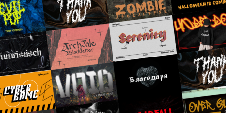
Slab typefaces for the Bold
Slab typefaces is another sort of new practice amongst modern website design, for those of you that still don’t know Slab typeface means using all capital letters as well as bold. This is a great technique that’s grown with the typography boom over the years. Here are some good technique Slab typefaces examples to get the attention of the users visiting your site:

Social is a full service design house located in Rock Hill, South Carolina’s historic Old Town district. Social is owned and operated by partners Tamara LaValla, Zan Maddox and Ben Visser. They provide an array of services and are committed to supporting our community, both on and off the clock, with an enthusiasm for creating exceptional work for exceptional clients.


The Brand New Conference is a one-day event organized by Under Consideration, focusing on the practice of corporate and brand identity — a direct extension of the popular blog, Brand New. The conference consists of eight sessions offering a broad range of points of view with speakers from around the world practicing in different environments, from global consultancies, to in-house groups, to small firms.

Graphic designer and web designer that specializes in front end web design, logos design/branding, stationery, brochures and lots more stuff. Basically he is here for all your marketing needs. From suits to new recruits, he will arm you with all the visual stimuli that you need to attract the bees, which in return make the honey.

“We are a team of designers, developers and doers. We believe in making things better, and we do. We work really hard. Sometimes we don’t take lunch”.


Living in Sevastopol, Ukraine, we have been developing software and designing interfaces for several years. Contact us and get an immediate reply.
 “We are a Creative Designer & Developer Team with a heart of passionate about what we do, and how we do it. Homes in Tangerang and Jakarta, Indonesia. We create clean, smart, effective and usability websites & applications. We believe that creativity blended with technology is the key to unlocking ideas and delivering results”

Jordan Vitanov, is a digital artist and designer, working in web development and print media. If you have a project that needs some creative injection then that’s where I come in! My job is to build your website so that it is functional and user-friendly but at the same time attractive. Moreover, I add personal touch to your product and make sure that is eye-catching and easy to use. My aim is to bring across your message and identity in the most creative way.

Giuseppe Scappaticcio is an italian Web Strategist based in Tuscany, Italy. He has been working for over 10 years in the internet industry, producing a moltitude of professional, innovative, and creative projects for his clients, including corporate branding, website design and web promotions. He is UI Design Manager at Dada.pro, BU of Dada, Internet Company in Florence, where he manages an international team of Web Designers.


“Design is something that we love doing so why not do it for a cause that we feel worthy”. Yoke was founded by Jay Bigford and Alister Wynn. It was formed with the idea that our day job should not just be a means to earn our keep, but also an extension of our values that we keep close to our heart. This was the premise for Yoke.

Grid your Layouts (always), be responsive
In times when the power of the image comes first than the written message, all sort of communication channels are looking for the way to avoid using the word to produce a certain message and letting the image prevail. If many of you still are asking yourselves why…Well it’s pretty simple: image is quicker, the world is moving fast and leaving behind anything that might make it stop for a fraction of a second.
Web design has not been the exception to this trend, and is always looking for new ways to play around with images to present them in a more compelling or fresh manner for the user. So, inspired in print layouts, editorial web layouts have come to use Grid-Driven layouts to organize information and add it structure so that the user finds it easier to comprehend.
Here are some great examples of Grid-Driven layouts usage, for you to check out:

Protest Was Founded By A Small Group Of Snowboarders In Holland. That’s right: Holland. One of the flattest places in the universe. Home to exactly five hills and fourteen waves. That’s right: We counted the number of hills and waves and we said, “To hell with logic, To hell with obstacles – Let’s do what we love.”


“We are unapologetic chameleons. Not for our ability to blend in, but for our ability to adapt to the situation or opportunity. Notoriously resistant of categorization. Politely unwilling to neatly fit into anyone’s pigeonhole”.


Lolz LLC is a young, prolific, and multi-disciplined team that has the ability to tackle anything digital and make it great, who’s mission is to create engaging experiences on the internet. We combine cutting edge creative, with technical innovation that is unrivaled by any other digital agency. We make sure every project we take on plays into our unique strengths, allowing our clients to be happy and to produce the best work possible.

KOKOKAKA IS A WEB AGENCY with a strong belief in digital media. We have a passion for fashion, art, film & music. And love to combine it with interactive ideas. Since our start in 2001 we have produced some of the most award winning digital experiences in the world. Our office is located in an old theatre in Gothenburg, Sweden.

Powered by digital – it’s our way of life. We’re passionate about the collision of technology, creativity, metrics and audience intent. Our aggressively growing team of specialists includes designers, web developers, strategists and content specialists.

“We build sexy web applications with Rails, Node.js, passion and dedication. We love the web, and we love to make it even more awesome. We design for the mobile web using HTML5, CSS transitions and other flavors of magic – making websites not just look good but feel good on mobile browsers.”


Major Tom is a preeminent music company encompassing recording, publishing, music supervision and soundtrack composition for commercials, TV and film. Working from an uncompromising creative perspective, we explore the fertile ground where art and culture in all its forms collide with music.

Yvan Rodic also known as Face Hunter was Born in Vevey, a French-speaking part of Switzerland. Rodic (1977-) studied Communication at Polycom Lausanne before taking on copy writing stints for Leo Burnett and Saatchi & Saatchi in Geneva, Brussels and Paris. A born trend-spotter with a natural eye for photography, it was not long before he combined writing for magazines with snapping pictures of people at art events in his then home, Paris.


Giang Nguyen is a young graphic & interactive designer, who worked for studio-egregius (Vietnam) as a graphic designer & and later as a self-employed designer in Saigon, Vietnam.

“We are a small London design studio that creates award-winning work in branding, design and advertising. Embracing traditional and digital media, we work with a range of clients including start-ups, educational systems, corporations and not-for-profit organisations. We bring a personal and effective approach to every project we work on, which is why our clients love us and why they keep coming back”.

Since our founding in 2000, we have for holistic communication solutions in the online environment and are a resource for the development and implementation ofonline marketing campaigns and the creation of websites and web-based applications . Trust Tirol’s first address when it comes to online and will give you an overview of our diverse client portfolio.

We’re fanatical about design. We won’t sleep until every pixel on your web page is perfect. We’re one of those creative digital production agencies that will always put the value of meaningful and enduring interactive experiences above and beyond anything else.

Hopestacle is a protean band music, field experiences and encounters. Fused jazz, children of St. Germain, they explore the intersections with the graphic arts, painting, films, collages …
“Back to Basics” Minimalistic sites!
Social behavior trends show that society is now leaning towards going “back to the basics”. Individuals are thirsty to find their origins and make them flourish through their every day practices, in recognition of their ancient customs. This may sound like voodoo crap to many of you, but believe or not booming trends in web design such as web responsible design and user experience, are terms that actually come directly from this new focus on the true and intangible value of what we consume. This may be the reason why although Minimalism has been around for a while, it is has been only been until recently that it has taken over web design.
Now, you’ll see it manifest like in other fields of design with a relaxing uncluttered spaces that focuses in the content of the information, and not the way it’s been presented. The minimalistic site doesn’t worry about providing a compelling web, full of information that catches the viewer with flashy colors and images, and guarantees the user a web surfing experience free of bombarding sale offers, invasive images and color.
Minimalistic website design will provide the visitor with a relaxing space of understated taglines and texts, simple and often light or primary colors, and a preference for visual silence. This is a design plan that may seem like a challenge to the majority of web designers, because developing a site by sharing only the necessary info about a product or theme is not an easy thing to do, and can actually be a challenge for many web designers in this media-frenzy world we live. But don’t be afraid to risk it and bring your visitors a fresh site that’s up to date with the latest in web design.
Now, check out some great examples in minimalistic web design for you to use as inspiration:


Large Photo Background for a Compelling Site
Whether designers are using photos as site backgrounds or as accent pieces, photos are increasingly high-resolution and larger-than-life. This is another example of the current minimalism trend: instead of littering pages with photos, many designers are choosing one standout image and pairing it with a few simple words.


For the sixth year in a row, Tom Callos and the members and friends of the Ultimate Black Belt Test (UBBT) will be taking the martial arts out of the dojo and into the world by raising funds —and then building a house in rural America for someone in desperate need of one. In 2011, Ms. Georgia of Greensboro, Alabama will have a clean, warm, safe place to live because of the charity and compassion of the international martial arts community.

Brook Pifer is an award winning photographer who’s love of the portrait enables her to capture authentic moments filled with spontaneity, determination and introspection. She works with advertising and entertainment clients such as MTV, AIGA, BVK, Atlantic Records, Saiphs Sports Apparel and mix1. Editorial assignments have enabled Brook to work with celebrities including Akon, Sean Kingston, Christian Siriano, Go Radio and The Maine.

“We are a creative, customer service, technology-driven agency. We channel all of our energies into helping companies grow. We also happen to be a bunch of friendly people who love what we do and give it 100% every day – this has been a very successful formula for us and for our clients”

The Bently Reserve Conference Center is the epitome of everything San Francisco, boasting the West Coast’s most advanced networking technologies, unparalleled eco-friendly operations, and the classic style of the Financial District’s most distinguished building. Plan your next meeting or conference at the Reserve, and discover what it means to do business at the venue that defines our City’s traditions.


“We try in the implementation of projects to look beyond the box and turn like unusual methods, ideas and techniques. We have understood that traditional models of work in the future no longer alone. For our own projects we expand our horizons and develop new ideas and concepts. Through the experience we collect to provide our customer’s projects are always up to date and future oriented.”

CreativePeople – a small company with big ideas! Perhaps the only independent interactive creative agency in Russia that came into Creative Agency Awards and constantly working with clients around the world.

Celebrating 15 years of service (1994), the Piz’za-za Restaurant and Wine Bar, located in the heart of Old Hull in Gatineau, enjoys a faithful and ever growing clientele. Specializing in fine pizzas, the restaurant rapidly acquired an enviable reputation by giving considerable recognition to the Italian pie it produces with only in-house and terroir ingredients.


Using inspiration from Glam Rock of the 1980’s, Norwegian Black Metal, and new American Metal, Killer Brigade is bringing to the world a new wave of self-expression with their clothes.

“Benefits and Common Mistakes of Using Large Background Images
A lot of you might have noticed that web developers tend to use large background images for their websites during the past couple of years. One of the reasons is the development of Internet connection – loading large images is no longer a rare thing. Plus, there’s no need to explain that large images are impressive and portray the website message brighter. (…) Large images may add some special feeling of contrast and make your website stand out from a range of the similar ones. With large background pics you may make your site layout appealing and trendy as well as display the offered products or services more vividly.(…)
The large backgrounds imply not only photos but also illustrations, animations or even videos. Photos and illustrations are far more popular, though some well-thought animation may also look impressive. We will talk about the static large background images that make the visitors stay longer on your website. The trend of using large backgrounds is irresistible and this trend is not going anywhere anytime soon, so if you need an awesome modern website feel free to make use of it.(…)
(…)Avoid wrong usage of centered, scaled or tiled images: You may make the image corner blend into the background so that the edges wouldn’t be noticeable for the users with larger screen resolutions. Or at least make sure that the image used for the background is wide enough to be applied for the most popular resolutions.
You might have heard about the cascading style sheets that help browsers to replicate images and make a large background out of a few of them. You may use this tool to repeat the images in a proper way: you may repeat the image horizontally, vertically or in both directions.
(…)Optimize image formats: Perhaps you know that image quality and expected resolution are the essential factors for scaling images. The image quality and page load time can be optimized by using the appropriate image format.
We all know the image formats such as .GIF, .Jpg and .PNG, and remembering conditions for their best usage is a very important thing. Just to remind you, GIF is better used for shapes, lines, circles, text and other simple graphic elements. As for photos, Jpeg format is the best for this purpose, while it won’t work so well for graphics.(…)
(…)Create a seamless background: To make the background look seamless you should ensure that the pic edges are completely consistent with the pattern. If you cut the image in such a way that its left edge blends into its right edge and correspondingly, its top edge blends into the bottom one, you will be able to create the seamless large background consisting of small repeating elements. The site visitor doesn’t have to notice any edges of each individual image. (…)”
Piece extracted from the article “Benefits and Common Mistakes of Using Large Background Images” posted by blog.templatemonster.com, be sure to check out the full piece for further information.

CAYENNE is a specialized agency in the creation and brand positioning for companies, institutions and places. They are not a provider of design. We are true partners with our customers. Sometimes we help CEOs.

Cat-Rabbit is a Melbourne based textile artist who spends equal amounts of time sewing, drinking tea and thinking about owning a pug dog. Her work has been exhibited in Australia and internationally and is stocked in various nice stores online and in real life.


CAU (pronounced ‘cow’, naturally) stands for Carne Argentina Única. And that translates as unique Argentinian beef, our speciality. What makes our beef unique? Well, for almost 200 years, Argentinians have been breeding Aberdeen Angus on the pampas. Here, they roam freely while grazing on 17 varieties of grass. This produces some of the best, most flavoursome beef in the world.


Welcome to Creative Spaces. This website is designed to help you find a suitable and affordable space to develop, exhibit or perform your work. Here you will find spaces to hire, to lease, to share or spaces to occupy for a short period of time. You may also find case studies on spaces that have been transformed from their normal function into locations for arts projects.

Alexey Abramov is a graphic designer, living in Moscow and working with clients from all over the world. His work is produced with great attention to detail, complimentary pallette, expressive typography and clear communication.
Go for Oversized Headers and Footers
Headers and footers have always been a useful space within the website for purpose such as enhancing the user’s visual experience and brand remembrance. But now these elements are about oversized…oversized…oversized, oversized headers and footers! You’ll see in many website designs these days how the header can take up more than half of the screen and it includes a compelling message that will make visitor never forget they’ve entered YOUR site!
Here are some great examples of some of the catching footers and headers that you can expect for 2012:
Big Headers…


And big footers…


Create a Compelling User Experience!
“Navigation Arts’ Director of Information Architecture, Kelley McDonald, discusses how to engage site visitors through effective site structure and relevant content. This is why terms like usability, accessibility, and of course responsible web design have come a household name in all web designers’ corners to complete the user experience. Remember that a site that’s up to date, fresh, complete of content, fresh in usability trends and that above all responds to your target market needs will turn into big bucks for you!……….more the visitors….more the success!”
More attention will be paid to the user experience and interface in 2012. It’s no secret that visitors now days are looking for sites that provide ease breezy navigation and usability regardless of the device they use to surf with. Also when web designers develop a site these days besides having to think about providing complete content about whatever is the theme for their web, and having to care like we said for designing a space that’s mobile friendly they’ll have to consider that when an user enters their site will go through sort of an experience that will be meant to satisfy even their most specific needs.
This is why terms like usability, accessibility, and of course responsible web design have come a household name in all web designers’ corners to complete the user experience. Remember that a site that’s up to date, fresh, complete of content, fresh in usability trends and that above all responds to your target market needs will turn into big bucks for you!……….more the visitors….more the success!
Drive-By User Testing: An Example of Quick User Testing from Start to Finish
“Newman and Ben went down to the local coffee shop – The Daily Grind – to find somebody to user test. Kate was nice enough to volunteer. Thanks Kate!”
Here we’ve summed up some sites that are a great example when it comes to creating a web that turns an everyday web surfing habit for the user into a full experience, like no other:

5th dimension, for the first time in history, lets users create their own personalized projection and have it projected onto a chosen building in either Joburg or Cape Town. And if that wasn’t enough, visitors will also have the chance to win free tickets for you and 3 friends to the experience featuring Etienne de Crecy Beats ‘N’ Cubes LIVE.

In an interactive experience with an adorable baby, after a serious of questions asked by the baby about your eating habits and things of the sort, the software through the baby makes an estimate on what your real age is. This website has a very nice theme along with nice graphics.

This site is an absolutely brilliant concept for the promotion of Volkswagen Polo. You can literally drive around the website in polo. I’m sure you will enjoy the ride. The Volkswagen just tells you: “There’s more than one way to approach everything, including this website. By all means fell free to choose your own path (…) Use the arrow keys to drive your new polo and explore. Press the space bar to stop. (…) Discover features by driving into parking bays or simply click on them (…) Jump to the features by using the quick nav. at the top of the screen”

In this site totally thought for kids’ interaction, Erky and Perky are on the hunt to find crumbs. This website features excellent character animation and very good graphics.

Through this website Leo Houlding and this team of elite climbers, sponsored by Berghaus, recently took on one of the toughest climbs in the world and made into an interactive web game for users. Play this addictive and adventure filled game in which you have to climb mount Asgard. The special thing about this game is its graphics which look very realistic. “Relive the epic climb by taking the last spot on the team and joining them in conquering Mount Asgard”, is what they say.
Quick and Dirty User Testing

“Steve Krug’s “Rocket Surgery made Easy” makes you want to run out and user test some websites. And, that’s what we did.
Here are two videos of Ben and Me testing some random websites. We did it to test our screen recording software. And, we did it to get the feel for facilitating a test. And, we did it to test out our new YOUTUBE Channel!
Of course, we had some insights to share – but it’s too dang late for typing this out. We’ll talk about it on Monday’s Better User Experience Podcast!”
Responsive Web Design when really needed !
When the term “responsive web design” (don’t miss our article about it) started catching on for other industries and fields of design, when they referred to all the new practices included in the industrialization of their products to make a more eco-friendly, user friendly and up to date product, it was only a matter of time until web designers would have to be concerned with this up and coming trend.
Yeah……. Yeah so many of may still be against it thinking that it is a fashion trend that will soon fade, or are probably still struggling with the conversion of your site that’s already great and up to date one that fits into the web responsible category, but you better get used not only with having to hear the term but with having to adapt your web design to it, because times are moving fast and users seem to care less everyday for surfing through a web that not up to standards in web responsible design.
For those of you that still don’t know what this trend is about very well it refers to designs that make use of the new CSS3 media queries, that allow web designers to tailor your site to different screen resolutions without changing your content, to make your site compatible with desktop browsers and mobile devices alike. It was very common in the past for web designers to develop two different designs the common one and the mobile site, but with the use of media queries this is just a thing of the past.
Here are some examples of sites that took this past trend into action:


Many web developers prefer to not got through the haggles of converting their site to fit these standards since they think that’s its completely unnecessary, but probably half of the users that access your site do it through a mobile device and you don’t even know it yet. To check out your website’s analytics to see how it is being viewed.
So remember, don’t let 2012 catch you without a responsible website design especially when the majority of cell purchases in the world are Smartphones, which are estimated to outsell personal computers the following years.
“(…) Morgan Stanley Internet analyst said she expects smartphone sales will surpass PC and laptop sales in 2012, with more than 450 million units sold. By 2013, smart phone sales will approach 650 million unit sales … In her “State of the Internet” report, (Mary) Meeker spoke about growth in the smartphone market and its link to social networking sites, as well as about Internet video and advertising. Watch out for mobile growth in China, she said. Its population of smartphone users is relatively nascent, with 14.5 million 3G users, or two percent of the population. That compares with 37 million in the United States. But that population grew by 941 percent in the third quarter compared with one year ago (…)” washingtonpost.com
QR Codes…your augmented reality

Now that mobile devices with internet access can be seen EVERY single place that you can imagine, Quick Response codes have become a hot trend in marketing to this day. For those of you that are still note very familiar with the term, Quick Response codes Quick Response codes that allow a person to snap a picture of the code with their Smartphone (performing a sort of scan of it with your mobile device), and the phone’s browser will open up the advertiser’s website.
These black and white patterned boxes are now everywhere to be found! From restaurants, to business cards, to magazines, movie theaters…So if your website is mobile compatible, or has a special feature specifically for mobile users, you can even include this code on your website to allow for quick mobile bookmarking. The marketing benefits of this up and coming trend are endless!
If some of you web designers still haven’t caught up with the Quick Response codes trend here’s a site where you can generate your own QR code here: http://qrcode.kaywa.com/.
QR codes that go beyond!
The http://www.awwwards.com (The awards for design, creativity and innovation on the Internet, which recognize and promote the best web designers in the world.) makes homage to the Quick Response codes, which they refer to as “a primary form of augmented reality” featuring in a post of theirs the 10 Creative uses of QR codes, that we’ve showcased in this post for you to check as inspiration.
As always we love to hear your opinions, so don’t forget to leave your comments on the trends we’ve talked about in this post, or your criticism on the way we’ve approached a certain topic or even if you think that we’ve left one of the 2012 trends out don’t forget in reminding us…..Hope you enjoy!