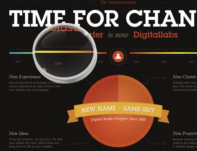
Everything inside the design world is permanently changing, evolving and adapting into new ways of expression and communication looking to satisfy the new consuming needs and set innovative exchanging channels. 2010 made a huge closure for the final year of the first XXI century decade, we witnessed the rising of tablets (iPad, Samsung Galaxy Tablet among others), the demise of Internet Explorer 6 and the absurd fanaticism towards Flash (though it’s losing a lot of fans), which is going to be slowly replaced by HTML5 (we’re not saying that Flash is dead, only that HTML5 will begin to cover many of its current uses).
Editorial disclaimer
Of course that the common design elements such as typography, navigability, color and more have also changed and as you will see on this article, these changes must be apprehended by every designer that wants to set his mark during 2011. Our team made a thoughtful investigation before releasing this article, we stumbled across several web galleries such as Creattica and Behance to see what people are currently enjoying to stare at; so it’s important to clarify that this is not an opinion article, because all the information contained on this post is fully supported by several references and resources that we studied and is not based exclusively in personal preferences. Bottom line, our main purpose is to offer you a complete revision across those elements that established the trends during 2010 and we consider that are going to evolve or get bigger during 2011.
No more clutter, it’s time to clean things up
There’s been several years from the inception of the internet, since the early nineties when only a few websites were online and all the design was ruled by Comic Sans and primary colors it has occurred a series of changes that have made a complete transformation to the way web design must be taken.
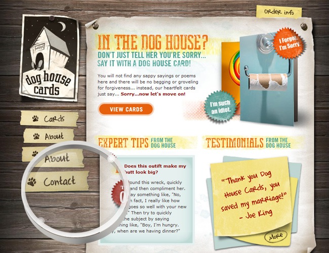
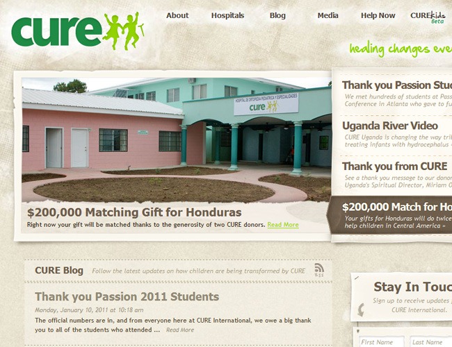
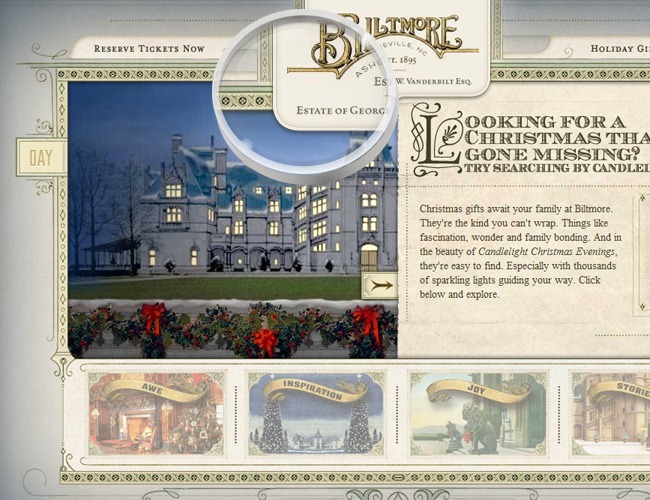
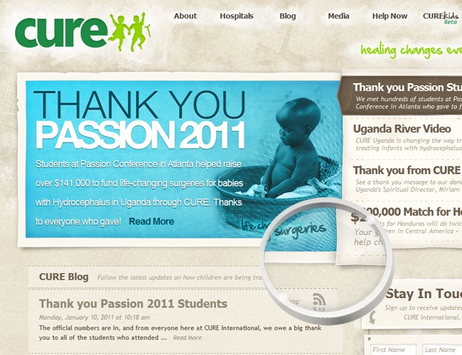
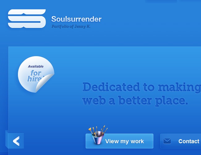
In 2010 the places filled with details, heavy text blocks, dark color palettes and picture after picture began to see their decline as people begin to opt for much cleaner interfaces, way more minimal. By minimal we’re not meaning mediocre but all the opposite, a better use of the diagramming without saturating the pages with irrelevant information.
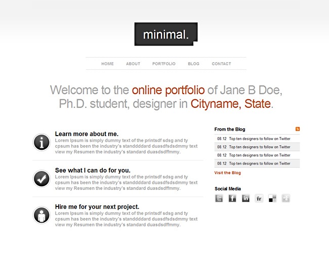
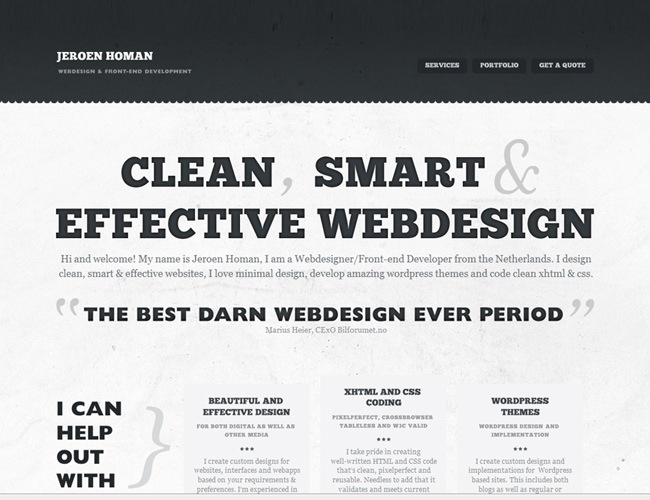
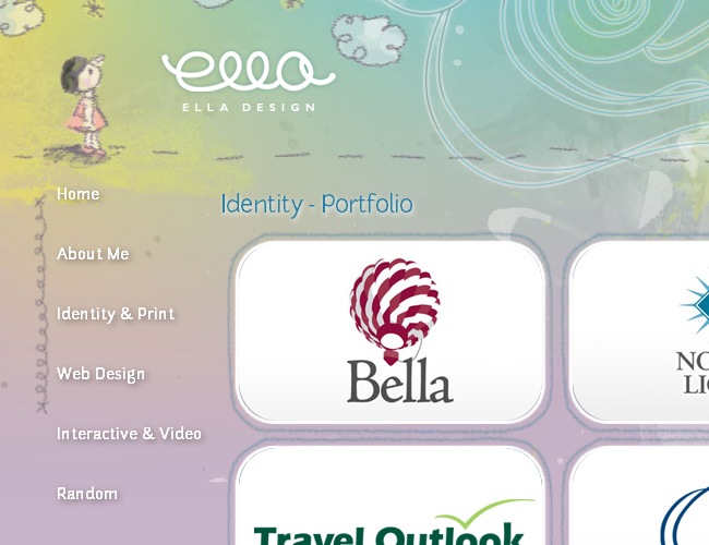
The Jane Doe theme by Curt Ziegler is a good example of this new clean tendency, the site has a very restricted color palette, SansSerif everywhere and a very subtle texture on the back. Beyond that we can realize how the clean spaces doesn’t look like a laziness expression from the author but as a right-guess; the information is well distributed and the navigability is completely functional.
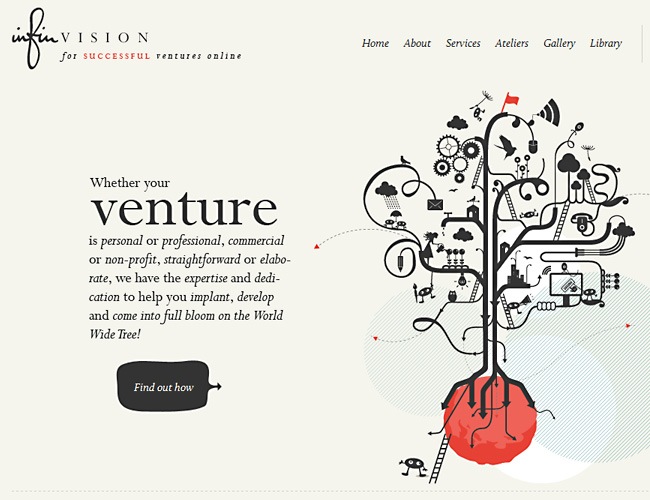
InfiVision’s website took things a little bit further by using illustrations, serif fonts and a color background. But even with these details the site remains clean, the diagramming is excellent and the fonts look nice. What this site teaches us is that you can get riskier without having to make things look bizarre or old-fashioned.
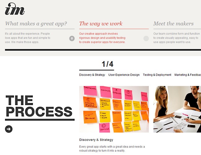
Image Mechanics is a website dedicated to develop mobile applications and provide design services in general. Their website is a clear example of the quality of their job, as you will be able to find all their information inside a beautiful and elegant interface where interactivity does everything, lots of white areas and bold typefaces complete the site’s identity.
More good examples
Don’t be shy, start playing with typefaces
Big fonts can work if you know the secret
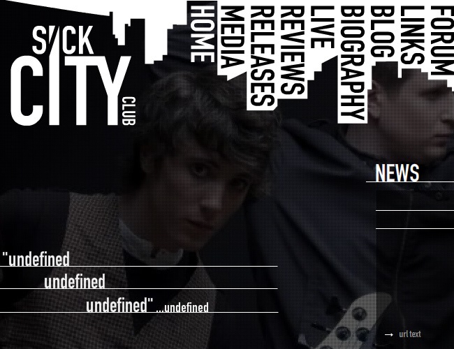
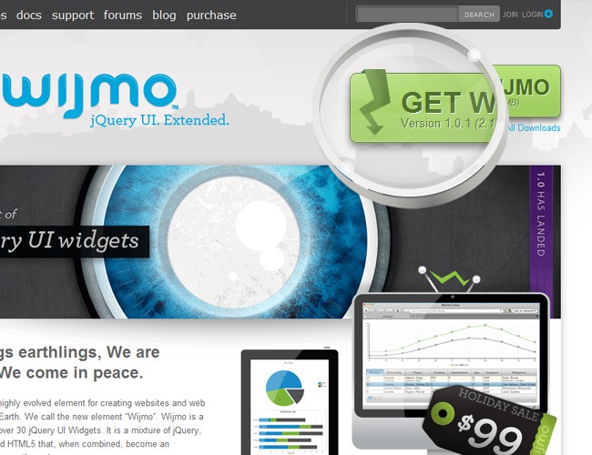
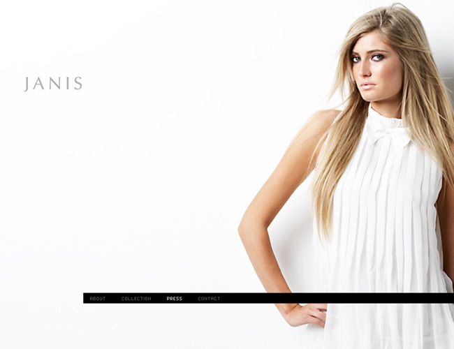
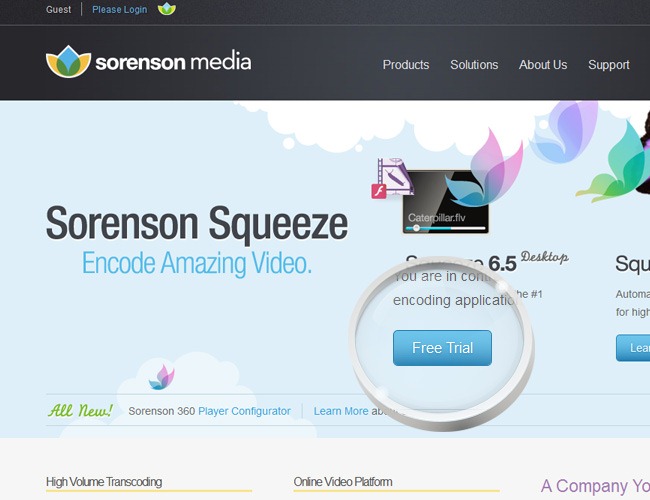
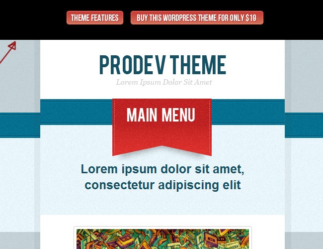
Usually typefaces play a minor role inside any website, as the only purpose was to display information, which means that they were utilized for their literal purpose. Since 2010, a new trend has began to gain strength and that’s utilizing big and bold fonts with the exclusive intention of grab the surfer’s attention. You can find a lot examples of how a strong title can be as eye-catching as a picture, it’s just an issue of playing your carts in a good way.
It’s OK to use a 60 pt title on top of your page as long as it looks well and not as a serious mistake. Likewise the idea of small fonts to show genius is now obsolete and on these days can be easily confused as a lack of trust.
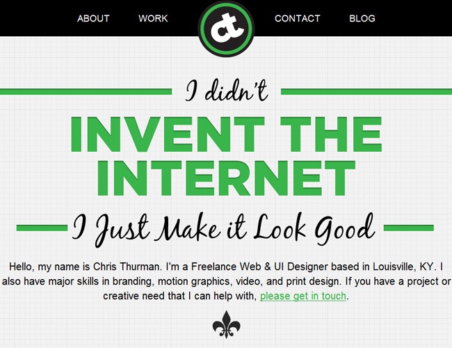
Chris Thurman may seem a little bit cocky, but the truth is that he is actually doing something for the welfare of the whole web design community by delivering quality products such as their personal portfolio, which is a brilliant example of how to use big typefaces in a really nice way. Mixing sans serif and serif fonts, color and b/w fonts and different sizes can bring a lot of life to your site.
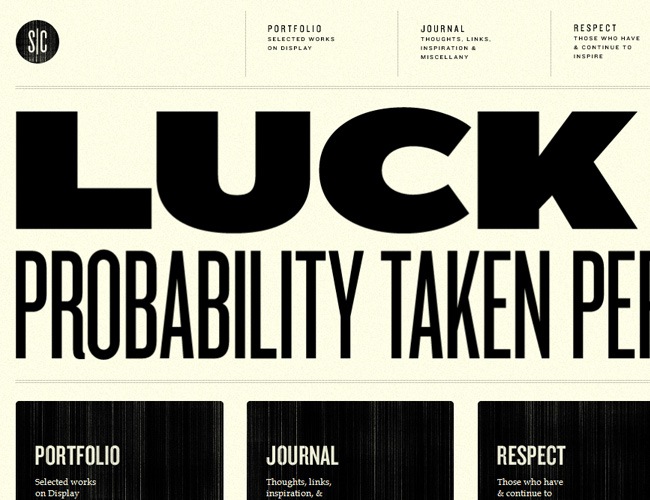
Typography is everything on this webpage, from the small menu elements proceeded by a shocking header and the great text boxes with a subtle grunge texture. Besides the designer’s picture (which is not a photograph by the way) there’s not a single picture on this page and it doesn’t look bad but at the opposite, looks really well.
Another beautiful example of typography taking the lead role inside a webpage. With a basic three color palette, the designer experimented with many different typefaces and somehow nailed because the final design looks awesome, so this proves you that it’s not strictly necessary to stick to a single font family when constructing a website.
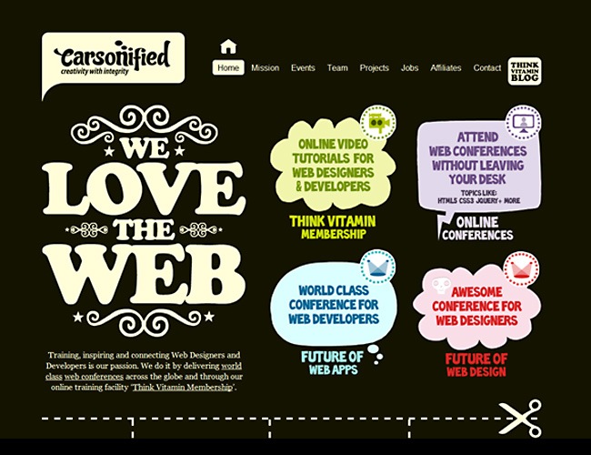
Carsonified is the living expression of typography utilized both as a communication media and illustrating component at the same time. Every word on the design is providing important information for the visitors and at the same time is generating an aesthetical experience to the people. The use of color is very thoughtful and works really great with the selected fonts.
Reducing kerning and tracking values
With the present need of designing for mobile devices such as iPhone and Android, designers have learned that they no longer have huge resolutions to work with and that the 960 grid is the new commander in chief. With this reduction in sizes, one of the best ways of save space is by reducing the space between words and characters to the minimal values. So it’s now often to find really tight menu elements that fortunately look great and are still easy to read.
Creative agency Epic has started to work with typefaces on their website to fit the mobile market, the main menu features a sans-serif font with a reduced tracking value that allows to display all the elements in a small area that can probably fit inside a mobile screen. It’s important to use proper font sizes to maintain the readability as well as play with contrast, because a red font over a vermilion background is not just the best choice.
Many years ago, the members of the Bauhaus school were the first ones that begun working with bold typefaces in an unconventional way, and a reminiscence of that era can be sensed in places like this one. Look at the amount of words that are displayed inside the text box thanks to the reduced tracking value and once again, notice the high contrast and proper size implemented to maintain the legibility at its best.
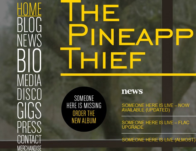
Another example of reducing spaces is The Pineapple Thief. By looking at the menu you can truly realize the purpose of reducing tracking, you can still understand with ease the words even when they’re boxed in a very small space, though it’s not advisable to excess its use throughout the whole place because it becomes annoying.
More examples of reduced tracking
Quit using plain backgrounds, textures rock!
For the past few years, a hard tendency of zero textures and fully gradient and solid color objects ruled. One of the reasons behind this phenomena was the popularity of the web 2.0 look, which is characterized by glossy elements, gradients and plain backgrounds.
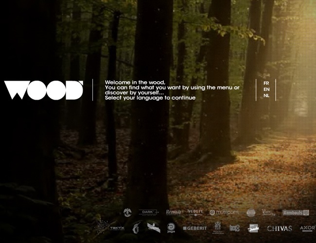
But now the trend is beginning to change and it seems that it’s time for textures to reappear in web design and the evidence relies on the several websites that are starting to use noisy textures within their places. The grunge look that was so popular during the nineties has been reinterpreted and adapted to the present time, with a new style of combining grungy textures along with clean interfaces and bold typefaces; graphic designers are returning to the creation of custom Photoshop textures, which now are way much nicer than before thanks to the advance in this popular graphic software.
The great thing about textures is that they add richness to the design, you can say that they spice up things a little bit. Currently the most popular textures are the noisy / grunge ones, wood-like textures and mostly everything that comes up from experimentation.
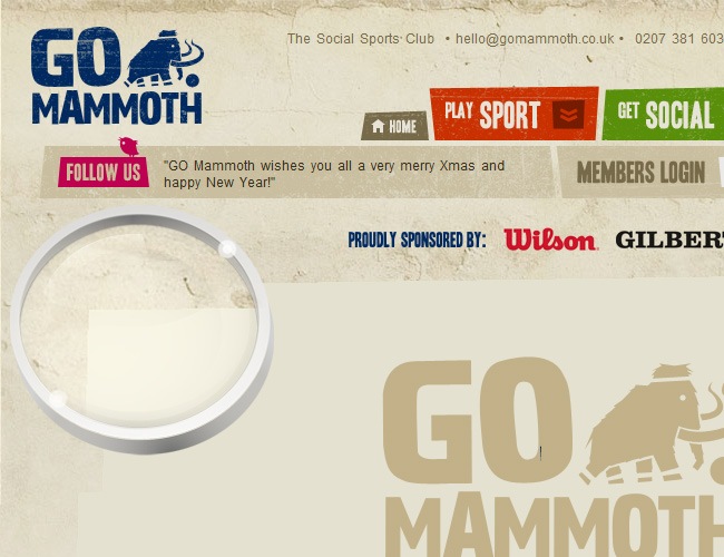
Go Mammoth opted for a vintage look on their website, and as a part of this style they used a creased paper texture on the background (you can appreciate it with detail on the zoom in of the screenshot) that just fits perfectly with all the rest of the site.
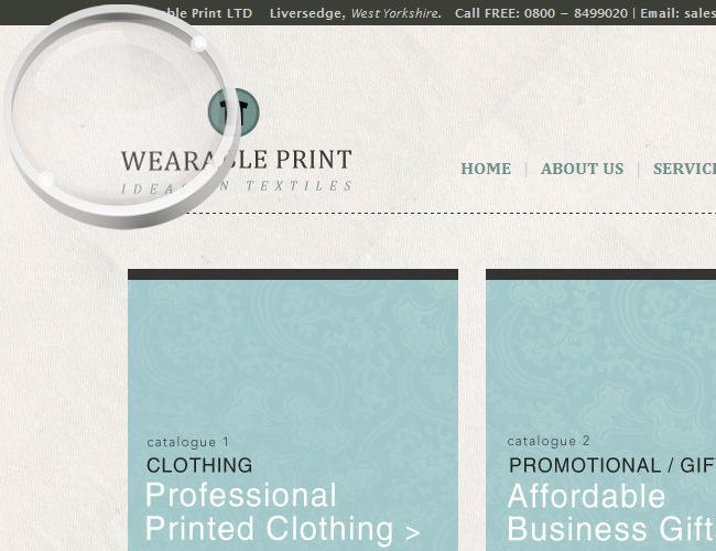
Wearable Print has a beautiful noise texture on the background, kind of a fabric style with a very low opacity so it does not get too scandalous. Just try to imagine how this site will look if we change the texture for a plain beige tone.
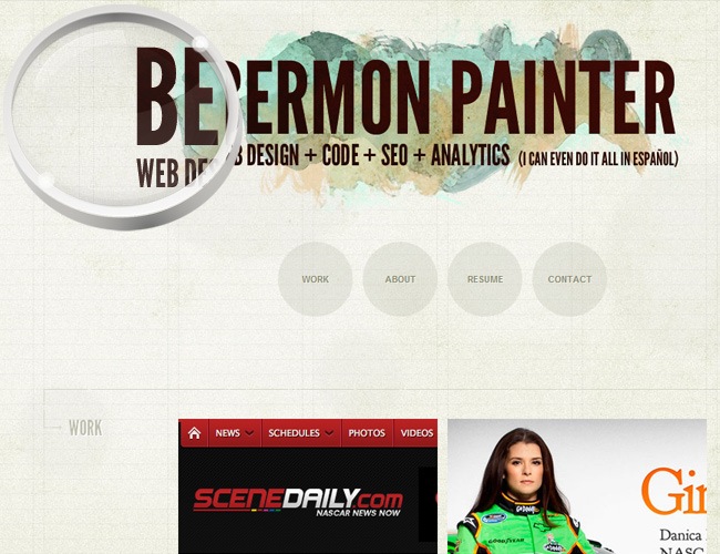
Bermon Painter’s website uses a combination of paper and subtle noise textures for the background that together generate a really rich surface for all the remaining information to place above.
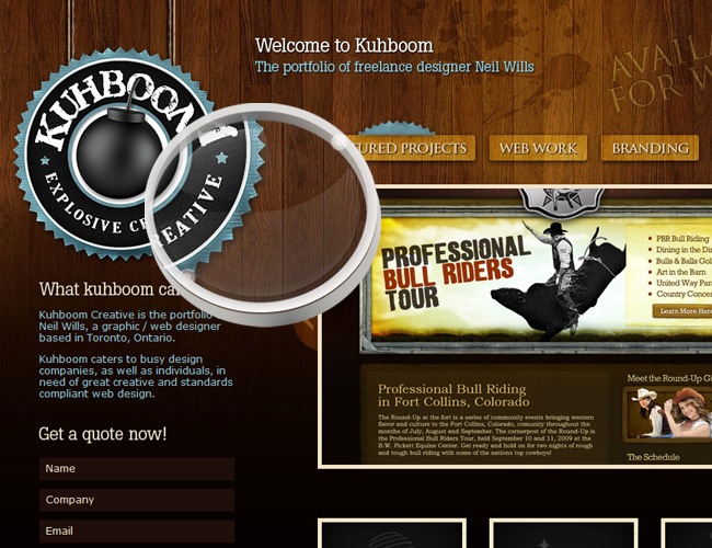
Kuhboom makes an splendid implementation of a wood texture on its background, it’s very important to use a proper chromatic palette when you’re going to work with nature textures like wood so your design does not look weird.
On this website you can also find a lovely application of wood texture that fits perfectly with a very green design, on this case the texture has been applied in a nice and elegant way that does not look awkward at all.
A beautiful website where you can find both wood and noise textures over the entire site. The application turned out really well and the site’s look is just beautiful and proves how you can make a proper use of textures inside your designs.
More great examples
Crispy, pixel perfect web elements are the new look
As we said at the beginning of this article, resolutions are changing in a way that have never happened before, and now designers need to worry not only for making high-scale web elements but also super crisp icons, buttons and menus that can look perfect both in a mobile device and a 60 inch TV screen.
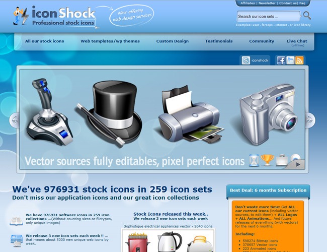
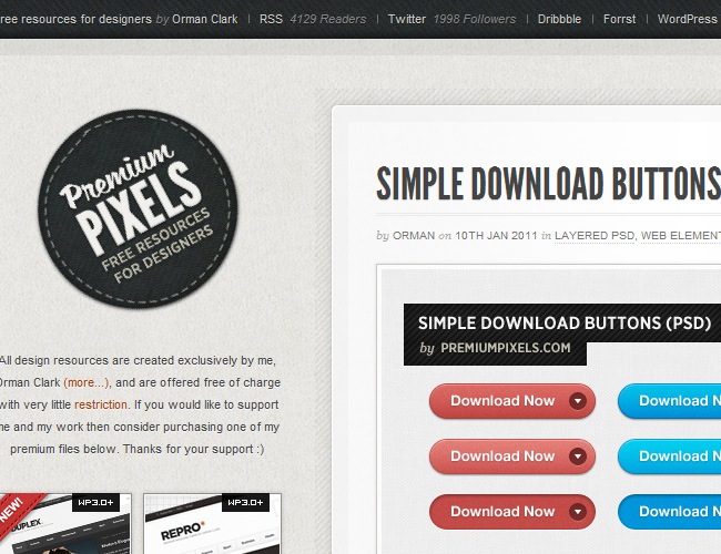
So now is becoming a trend in web design to make everything pixel perfect, which is a technique that can be achieved with patience and using powerful graphic software such as Photoshop and Illustrator. The idea of pixel perfect is that every detail is carefully planned so you don’t see any blurry or pixelated areas. If you buy a template, button set or just anything web from the major suppliers such as Iconshock, you will receive a complete set with not only big objects but in several resolutions, which usually oscillate from 16 pixels to 256, covering almost every existent screen resolution.
The trick for creating beautiful pixel elements is to always use the Anti-alias property along with the Snap to Pixels options, also you must always zoom in whilst designing to make sure that you’re doing things as perfect as possible it is.
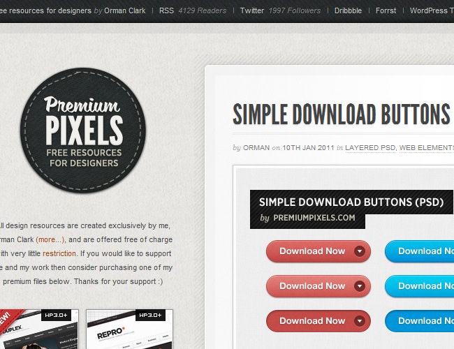
This button is a perfect example of what we’re talking about, carefully crafted and just perfect for the view, something like this is what you need to achieve from now on.
These beautiful boxes are as simple as you can imagine because all the importance has been given to the details, every corner was perfectly executed, even the shadows look highly crispy.
You can use textures along with pixel perfect objects, but you must be really careful that the texture does not suffer any damage when switching from one resolution to another. This case nailed and is a good example of crisp design.
You can recognize pixel perfect design from miles, it’s like watching regular television and then switch to HD, you’re seeing the same content but with much more detail and richness.
A beautiful web template with tons of pixel perfect buttons and web elements, it’s just too great to go back to the old blurry borders and stuff.
More crispy examples
Don’t force your eyes, employ bigger icons
A few years, there was an unbreakable rule that told that everything that was going for the internet had to be optimized with a 72 dpi resolution and the small size possible. Now that we’re at the gates of a new decade, all these rules are starting to seem obsolete. Mac OS X has set a maximum icon resolution of 512×512 pixels and many monitors support 300 dpi resolutions, so that thing of doing everything small and shy is over, the era of big icons and high detailed elements has began.
Step by step, most websites are changing their old 24 x 24 pixel icons for much bigger ones, this does not only affect icon’s size itself but also the amount of details that can know be incrusted within a single icon. We can expect that throughout 2011 more and more sites will insert bigger icons on their sites.
Andrew McClintock’s website uses beautiful big icons full of details, you can notice all the pixel work that’s behind every icon, with a great management of lights and shadows that gives a lot of realism to every piece.
Another beautiful example of bigger icon design, achieving the great amount of details on the digital screen section will be difficult in a smaller format.
Here you can realize what big icon really means, because the same icon is used for both the header section and as an icon at the bottom. You can create big icons both in pixel and vector formats, this is completely up to you, or even mixing techniques to see what happens.
Using big icons will help you create more complex elements and at the same time communicate a lot more of things using a single icon. But it’s also important to realize that at bigger sizes the errors also grow, so be extremely careful whilst customizing your icons.
A few more good examples
Let your pictures be the background
In the past it was considered a true genius the one that put a big image on a website as a background and that this pictures was neither pixelated or oversized. Now with the increment of DSLR cameras, megapixels and photo optimization, it’s a reality to use massive quality pictures for your backgrounds. This technique is highly appreciated by graphic designers and photographers, though we found different kinds of websites utilizing it as well.
The trick to make this work is to always shot at higher resolutions and then fix your image in Photoshop to reduce its size without losing quality, remember that everything in web has to be in RGB mode (CMYK is for printing) and cannot surpass a size of 1 Mb (unless you know that the people that are going to visit your site possess a good internet connection).
This is the first example of massive pictures in web design, though this image has obviously been passed through a digital edition process, it can be considered as part of the category.
It’s suggested that when you use massive pictures for your designs, a part of the picture display less items that the rest so you can place text or any other element on top of it and that this element cab be read easily.
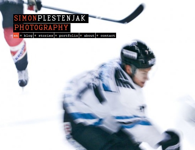
Take advantage of your camera by implementing motion swap, blur and many other cool effects to your shots that can provide a lot of motion to your websites like this awesome hockey picture from Simon Plestenjak’s portfolio.
Photography is without a doubt the best way to awake people’s emotions, you can use it not only as a background but also make it fit with the rest of the design to deliver a complete feeling to the audience.
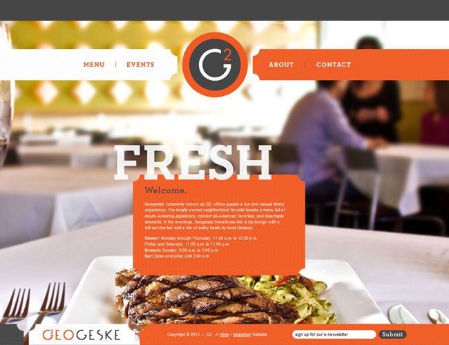
Selective focus is an excellent diagramming tool as you can see on this example where the plate is focused and the rest blurred so the menu doesn’t get lost and people can navigate the site with ease.
More great examples
And if you want to go further, then try animated backgrounds
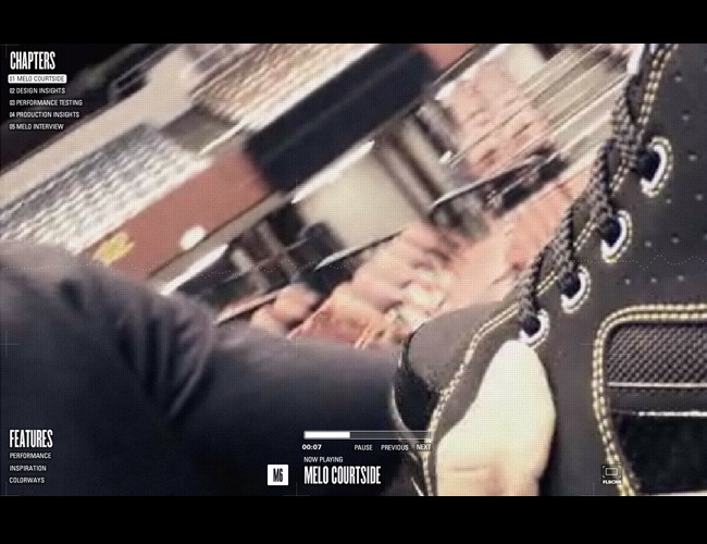
So using big photographs is now possible, but what if we tell you that you can go even further and place fullscreen or really big animations on your websites?. Thanks to Flash and HTML5 this is now a reality. It’s amazing how developers have managed to place incredible animations that don’t take too much broadband, making the animation possible.
These animations are part of the next era in web design, where 2D will be replaced by 3D and both hardware and applications will help in that process by adjusting to these technologies. Although this technique is still in a baby face, the applications are already great and on the next years there will be more and more sites using fully animated interfaces.
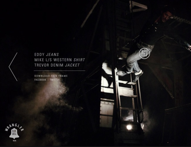
Wrangler Europe is the first example of this section. On this page you an actually play and rewind a short clip by simply executing a drag function with your mouse, the fluency of the animation is just great and does not affect your computer’s performance.
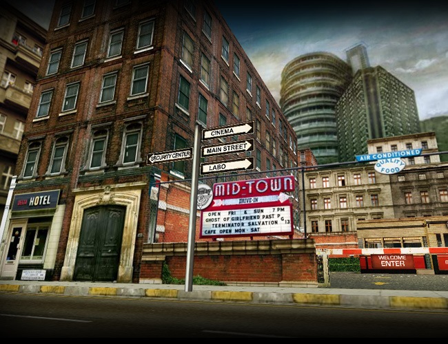
Bandit3 is an astounding Flash website where you can actually go across the city and interact with the different elements that you will find on it. This type of animation is an stunning example of what developers are currently accomplishing with Flash and HTML5.
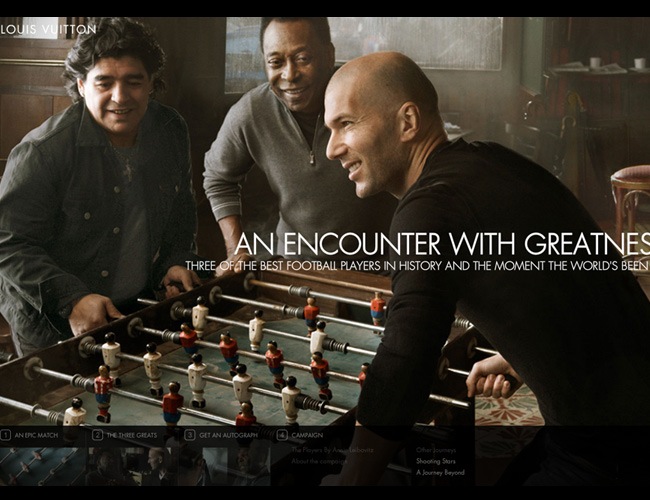
Louis Vuitton launched a beautiful campaign with the three major soccer players in history (Pelé, Maradona and Zidane) and to support it they launched a website where you can see videos, articles and of course a full screen animated introduction.
Another animated background, created on this case by the people of Nike. You will find a few storytellers featured on fullscreen videos without the navigation buttons ever getting lost.
And more examples
Lighter spaces will still rocking this year
During the past few years, there’s been a tendency for developing heavy, over saturated websites with dark colors and bright fonts on top of them, but now that tendency is beginning to change. Along with the new wave of making everything much cleaner and minimal than before comes also a preference for lighter spaces, with pastel tones and light palettes.
By making lighter interfaces, information can be easily processed by the average viewer, because with darker backgrounds an inclination towards clutter shows up, and people spend less time on the page before switching to another one. Our advice then is for you to bright up your page during 2011.
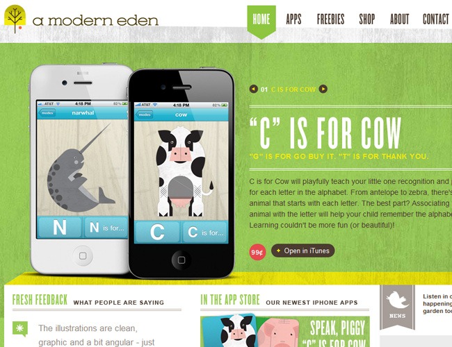
A Modern Eden is one example of lighter interfaces, the color palette is composed by light green, white, yellow and basically an earth colors palette. The typography is also an example of a much lighter design, as it does not use much bolds and heavy fonts.
These websites are just so easy for the eyes that they can become eye-catching without even having an astounding design, just by offering a refreshing color palette they’re able to grab some audience.
These guys are not only working for a noble cause on real life but also are contributing to educate everyone’s eyes with a lovely webpage where light colors and a perfectly chosen typography are part of it.
Another great example that on this case makes a nice appropriation of textures that unlike most sites are not overused to generate darker tones and textures.
And more great examples
Break the 90 degrees, opt for rounded corners
During the first Internet years, the graphic programs where very basic and there was not amazing tools such as CS5 and the new CSS3, and that’s why many designers took the habit of doing everything straight, because it was much simpler to do and everyone was doing it, but now that there’s been more than 10 years since the end of the 20th century, it’s time for things to change a little bit.
One of the most common things to find was straight corners everywhere, from windows to button, everything was built with a 90 degrees corner. Now we’re seeing how many websites are beginning to incorporate rounded corners on their interfaces, which gives a smoother and nicer appearance to design, you can generate these rounded elements via Illustrator or any other graphic program or utilizing directly a language program such as CSS3.
One of the best design sources around, Creattica’s webpage follows a strict code of good graphic design practices such as incorporating clean interfaces and on this case, rounded corners on their elements.
Everything on this site is rounded and looks beautiful, because it provides a friendly and softer appearance to the whole page, and this happened by only changing the straight corners for rounded ones.
Beautiful website that uses a beautiful vintage aesthetic and rounded corners on the header and on many other elements across the page. Combining different styles along with the latest trends is always a nice resource in web design.
Rounded corners usually go great on natural and environmentalist webpages as they suggest fluidity and just a natural movement.
More examples
Think not only vertical, there’s also an horizontal space
The most common way of designing a website is using a vertical navigation, which is obviously an effective way of displaying information in a logical and organized way, but what about sideways?, you can easily achieve the same type of structure following an horizontal pitch.
After completing our research, we noticed that many websites are starting to utilize an horizontal navigation following the trend initiated by the developers of The Horizontal Way, which is one of the first websites that uses a fully horizontal navigation and features many more sites with this type of navigability.
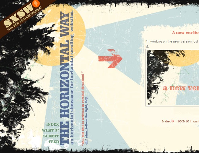
And this is the example that we were talking about, The Horizontal Way features many great websites with an horizontal navigation, so if you want to create a site like this, then this is the perfect reference place to begin.
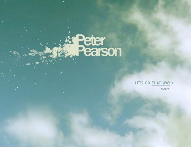
Peter Pearson’s website does not only posses an horizontal system but also a beautiful aesthetic that can be taken as reference for any graphic designer.
Horizontal navigation works great for Photography websites as it helps people to avoid slow galleries and stuff and switch it for a progressive loading system that works horizontally.
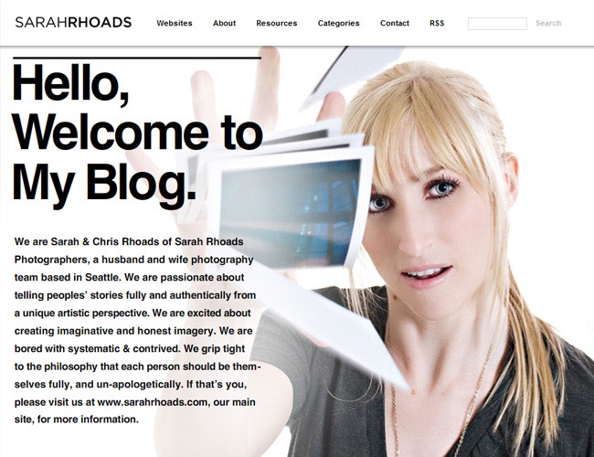
Sarah and Chris Rhoads have a beautiful weblog with a custom scroll bar and an horizontal navigation nicely diagrammed and that even has an speed control included on top of the site.
And keep scrolling that way
Not enough space?, try to utilize sliders
Using sliders is a technique that does not only save a lot of space by showing many information in a single spot but also can be used as a great design element to prettify the whole aesthetic of a website, and that can be confirmed with the fact that there’s more than one site that actually sells slider designs ready for installation.
Now we want to show you some examples of beautiful sliders that we encountered during our research, some of them used with a more graphic intention and others to provide plenty of information without using an excessive amount of space.
An astonishing slider design, the interactivity is amazing and not only provides a great touch to the design but also provides complementary information to the visitor.
The dotted lines and textured buttons are a beautiful detail for this slider that is one of the most prominent elements of this whole webpage.
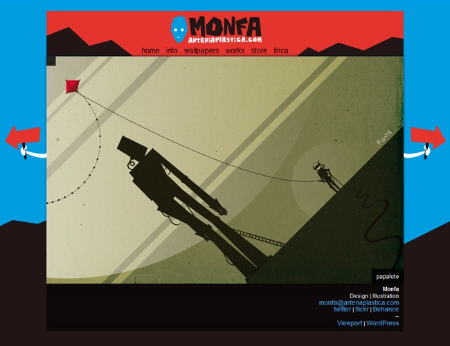
An important thing in web design is integration, which is creating a complete atmosphere inside your designs. A good example of this is Monfa, where the slider’s buttons appear like there were part of the illustration.
Corporative designs also make use of sliders to show their products in a fancy and elegant way, this means that sliders can range from intricated designs to simple and classy designs.
Iconshock revamped their website in 2010, the whole site went through an exhaustive redesign process and the result is splendid. One of the great things about this new design is the slider, simple and gorgeous.
More great sliders
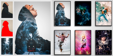
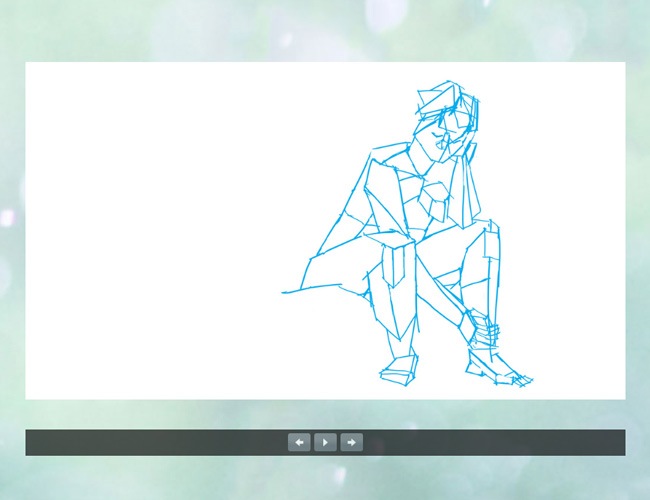
No more realism, place vector illustrations
If it’s true that photography will always have its place in web design, the trend for 2011 is quit using realistic illustrations and big photographs and begin implementing big vector illustrations. The reason behind this change is that this illustrations can help to set surreal sceneries and also are more lightweight than complicated designs.
So this is not an affirmation that vector illustrations are going to be the only accepted style, but that graphic design is going back to its roots and in that order of ideas, it’s time to leave aside those fancy illustrations and go with something a little bit simpler.
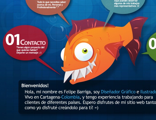
Felipe is a Colombian graphic designer that developed one of the most beautiful portfolios around. The central character is a clear example of big vector illustrations that are starting to being used.
Awesome character designs, from the little Pikachu-like to the big blue fella, this is another great example of simple vector artworks taking over realistic style.
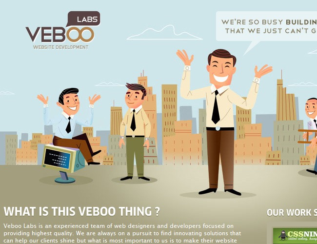
Another tendency that we have witnessed is that companies are creating more friendly websites and are abandoning the old clean and sober look, Veboo is a breathing example of that.
Need inspiration?, here’s a couple more sites
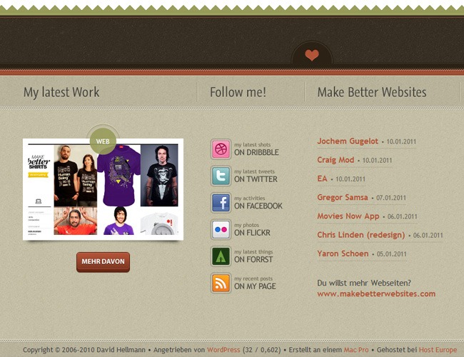
Footers are there for a reason, not only decoration
Webdesignshock gave a first clue a few months ago on this topic with the huge showcase of 200 great footer designs and now that 2010 is over we want to say that we were right, footers are becoming more important every day as designers realize that they’re a vital part of every design and they must be utilized with the same importance than the header.
On the past footers were used to place disclaimers, some basic company information or the contact link of the company, but now that’s changing. Footers are now areas where you can place things like social stream boxes, contact forms and tons of information, let’s take a look at some examples.

This is a good example of modern web design: Textures, vector elements and of course a functional footer where you can find complementary information and enjoy a good design.
And the good design practices keep showing up, here you can find noise textures, a pixel perfect button and a good diagramming, everything inside a very good looking footer.
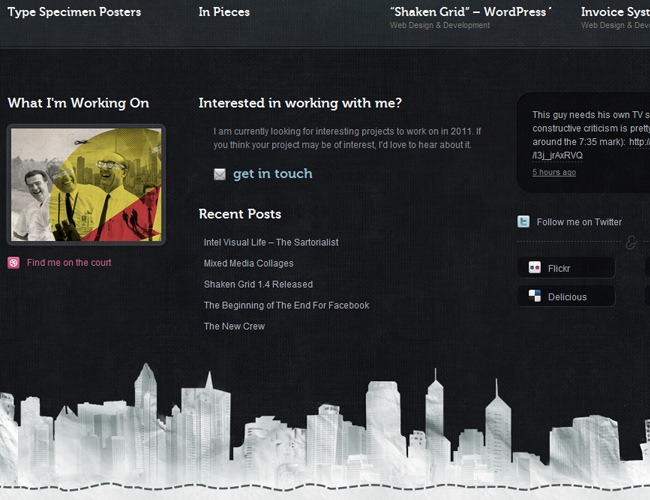
Beautiful footer design by Sawyer Hollenshead, you can find his latest tweets, contact information and social links escorted by a pretty cool city illustration on the bottom.
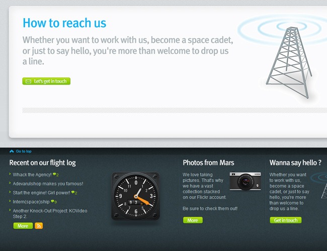
Beautiful noise texture, nice icons and color palette and relevant information that makes a proper use of the footer section on this page.
Let’s stare at some more good footers
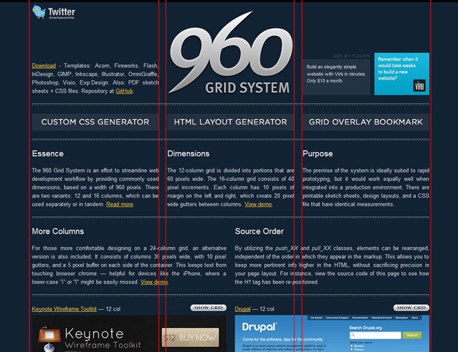
960 grid system will still rule for a while
The 960 grid system has been defining the way web design is made during the last couple of years, and due to the huge increment on the tablet and smartphone sells, this system will have an extended time of life. What the system basically does is divide the site in a 12 column grid of 60 pixels wide and a variation of that consists in a 16 column grid.
960 pixels is the safe zone for devices like iPhone, which is becoming more and more popular among people, and this dictates that designer must absolutely respect this dimensions. On this case instead of showing you a few examples of the 960 grid applied in website we want to recommend you the official 960 website where you can find several examples and a complete documentation on the subject.
Work with stripes instead of plain and boring elements
Well it’s not exactly that rainbow screen that used to show up during those times where the TV signal disappeared every once in a while, but designing using stripes is starting to become very popular among graphic designers, and that’s why we consider that probably during this year we’re going to see more stripes inside web design.
You can use stripes on a traditional way, simulating the old TV look or simply for recreating light and other elements, the possibilities are open and waiting for you to discover them, here’s a short list of examples so you can grasp some inspiration.
One first way of using stripes and that’s becoming a very strong trend among designers is this little stripes that are used instead of the regular horizontal lines, they give a nicer appearance to every design and fulfill exactly the same mission which is helping with the diagramming of the site.
The second way of using stripes is the classic TV style. Organic Grid makes a beautiful use of stripes throughout their entire website, which is one of the nicest of this whole article.
And the third example of using stripes is on the way that you can see behind this tree’s illustration. These stripes generate a lovely texture to every design and are subtle enough to be used anywhere.
Now let’s see a few more examples

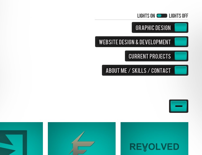
Use boxes for diagramming, simple as that
Diagramming is something implicit in graphic and web design, so you’re probably wondering what’s the novelty of this category. Well the thing is that now many graphic and web designers are using small boxes on their websites to organize all the information instead of big columns and cluttered structures, which points to the clean look that we already talked about before.
So, during 2011, is probably that the standard web structure with a big header, a content section and finally a footer is going to be displaced by new types of grids and structures with more of these little boxes included inside of them.
Perfect reticules with reduced spaces in between is what you perceive when visiting this page; the diagramming is very simplistic and the boxes do all the diagramming instead of a complex structure.
Usually these boxes can be used to display a little introduction and a picture to inform people about what the content is about, this is a great way of safe space and communicate all the important things to the visitor.
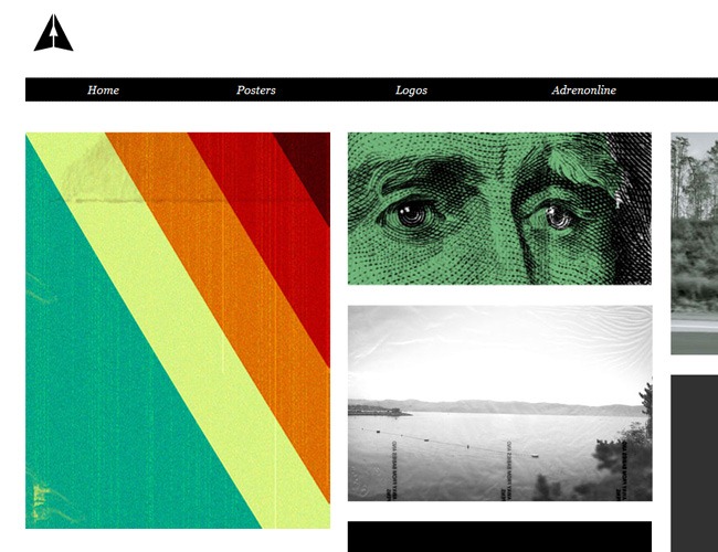
You can play with hierarchies to create more animated designs, Adrenonline is an example of this as the page plays with different box sizes through the whole page.
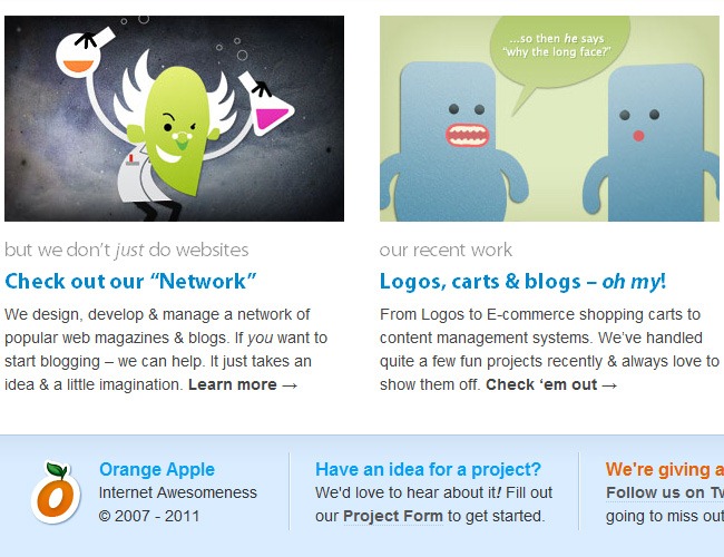
Many weblogs are utilizing boxes to display more information in less space, as you can see in Orange Apple’s webpage.
More examples

No more numbered pages, try progressive loading
This is not specifically a web design tendency but a functionality trend; previously all the websites that had tons of information to displayed used several pages for people to look for, this process was tedious as every time the person needed to see more content the page refreshed entirely and the whole thing just got boring, fortunately now there’s a better way to do things and it’s called progressive loading.
What progressive loading does is that as you keep scrolling, the new content is loaded instead of the entire webpage, so you don’t have to spend longer periods before continue your research as the server now needs to load less elements. A great example of progressive loading can be found at Iconshock’s icon sets, where as you continue to scroll, new icons are showed up.
Steady objects work great with progressive loading
If you incorporate a progressive loading system, you need to define certain elements to remain visible throughout the entire navigation, so people can always take another direction or go back home. Usually this steady elements are displayed on the sides but you can place them also on top or at the bottom of a page.
Usually this elements contain menu buttons, social links or just a go home button, the important thing is that the visitor doesn’t feel abandoned at any moment during his visit.

Creattica’s menu remains during the entire navigation process, so people can always access to the main options and links.
A great idea is to keep your social buttons in a fixed position so people can rate and share your contents at any moment during the navigation.
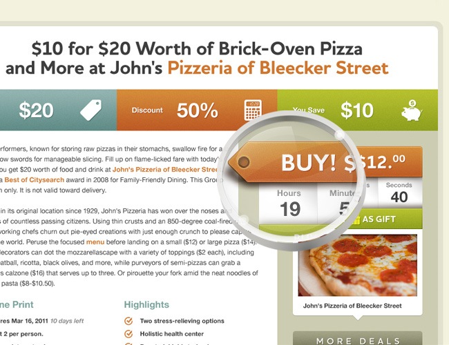
This element is utilized as an advertising banner that offers an specific service, these kind of elements are known as floating bars and are very popular amongst e-commerce websites.
Why having a lot of pages?, make single page websites
This is another topic that points to functionality, the use of several pages in web design tends to difficult every programmer’s job as he has to organize more folders and roots underneath the pretty design that’s displayed in front, this also represents a reduction in the loading times which usually ends up driving away the visitors.
One of the different ways that can provide a solution to this problem is the creation of single pages, which can utilize progressive loading to be more effective than page after page inside a website and can also make a much better appropriation of design and diagramming.
You can utilize single page websites when you don’t have a lot of information but it’s still enough to fill a couple of pages. This website is a good example of how to save space by making a great web design.

You can also use single pages to create different ambiences inside an only stage. An example of this can be found at Midtsommerjazz 2010 where using different colors the design team created a beautiful single page website.

You can also create an unifying element to conserve the integrity across the entire page, on this case the color ribbon is present during the whole site, helping to keep everything with the same identity.
Another way of making astounding single page websites is by transforming the whole design into an illustration, as it happens on this place where you begin on the sky and end at the bottom of the sea.
More great examples
There’s more than one way of making shadows
This is something that apparently has been ignored by many designers during all these years, and is the fact that shadows behave in more than one way, but the only method used was cloning the element, turn it to black, then fade it and finally place it according to the light source.
Now we have been seen new ways of playing with shadows, with new designs that include adding textures, changing their form and just thinking out of the box whilst maintaining the physics login unaltered. So, since 2011 we’re going to see more fancy objects and great shadows behind or even on top of them
This shadow helps you create more realistic objects because it’s more natural than the regular shadows used by default in most icons and illustrations. On this picture you can actually feel the folded sensation.

This folded appearance helps to give a 3D look to your elements without using intricated methods or complex gradients and textures.
On this case the different shadows overlap between each other, generating a beautiful appearance for the different elements on this webpage. The difference between these and the regular shadows is so subtle and yet so noticeable that you should start using these type of shadows on your designs occasionally.
You can mix stripes and shadow to elaborate lovely designs like the shadows utilized on this website.
More nice examples
CSS3 has arrived, so be careful Photoshop
There was a lot of debate during 2010 around CSS3, some people said that Photoshop was done, others said that this was going to be a huge complement for web developers and the rest simply said that was the natural course of things, but if there’s something true is that 2011 could become the year of CSS3 and HTML5, though nothing can be ensured.
CSS3 offers a new world of possibilities for those who are not familiarized with graphic programs like Photoshop and Illustrator. Now you can generate things like rounded corners, drop shadows, astounding 3D buttons, add glow and a lot more. Many programmers are starting to use CSS3 on their design, though the support is yet not present in all the different browsers around, and that might slow the raise of this powerful language.
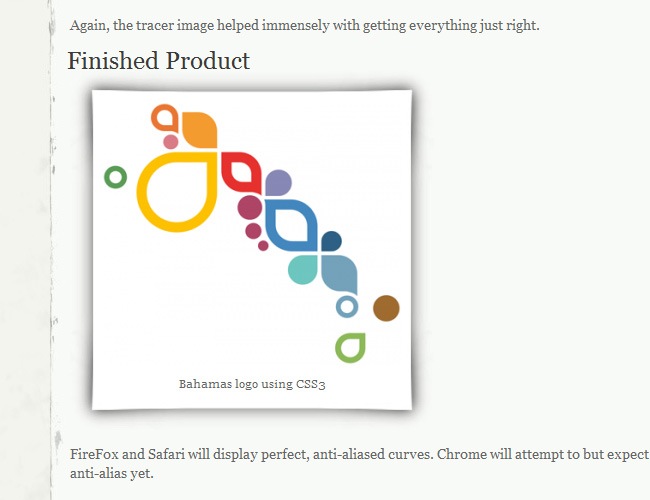
This Bahamas logo was developed with pure CSS3, there’s not a single vector taken from Illustrator or Photoshop on this design.
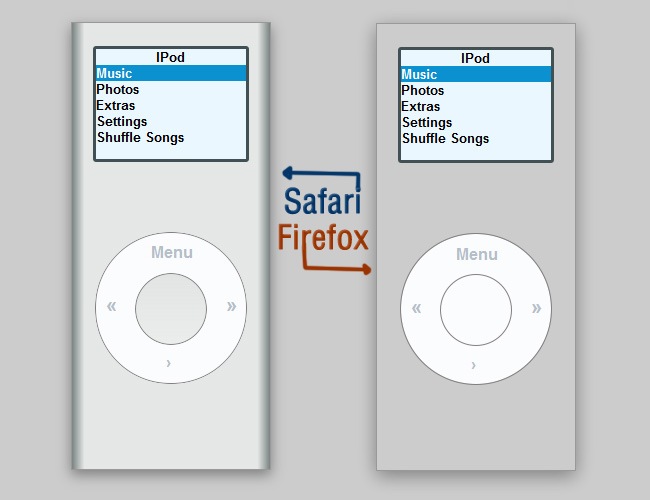
By staring at this screenshot you can realize that there’s still some compatibility issues between the different browsers for working with CSS3, though you can already realize the incredible things that can now be achieved.
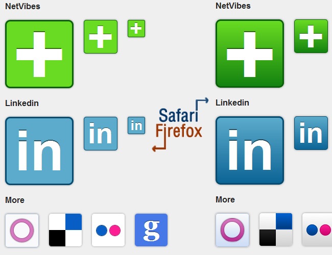
Now you can make great social icons without spending all your time working with pixel art and instead of that just inserting a few lines of code to achieve a similar result
Glow can now be achieved directly on CSS3 and you can make beautiful buttons like these, the problem is once again the browser support.
A couple more of good examples
Watch out Flash lovers, HTML5 has entered the game
HTML5 saw the light recently and soon has become a powerful contender for Adobe Flash. It’s important to state that HTML5 will not kill Flash, as it will only cover some of the functions that were previously made exclusively via Flash, so instead of being a fight, this is actually HTML5 relieving some hard work to the Flash platform.
With HTML5 you can do a lot of things, including rendering using your video card, make graphic effects like rounded corners, glows and shadows, insert videos with a lot of ease, create custom forms, generate pop ups and more awesome implementations.
On this page you can find many of the implementations that HTML5 has to offer, including rounded corners, alpha channel, lists and popups. A really nice example of how to properly use this language.
On a site like this HTML5 fits perfectly, instead of burning your head off with layers, interpolations and stuff, HTML5 can help you generate this little interactivity effects in a much easier and fast way.
Rollover actions where previously made with MovieClips, now you can generate them with HTML5, which can save you a lot of time and loading times because as you probably know, this last one has always been one of the major flaws of Adobe Flash.
More sweet HTML5 implementations
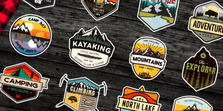
Sewn badges and banners are getting popular
Once in a while graphic designers and illustrators fell in love with a little detail and begin to use it sporadically until suddenly it becomes a trend. In the past we saw the boom of glossy gradients, the connecting arrows and surreal characters; in 2011 a tendency that has been showing up for a while and that will stay during this year is the use of sewn-like elements, badges and banners in web design.
We saw many sites that are combining these elements on their designs, creating a new trend that many people are beginning to follow, so before its time is gone, you should probably take a look at these examples of really nice sewn badge and banner designs.
On this example we can see both sewn lines and a banner on the design. Sewn lines are used to generate a realistic clothing or leather texture, while banners are a nicer and different way of illustrating a website.
Sewn badges are becoming popular day after day, and now it’s common to find them inside different kinds of websites, the simplicity of the design and the change from squared to rounded formats might be the reason behind their boom.
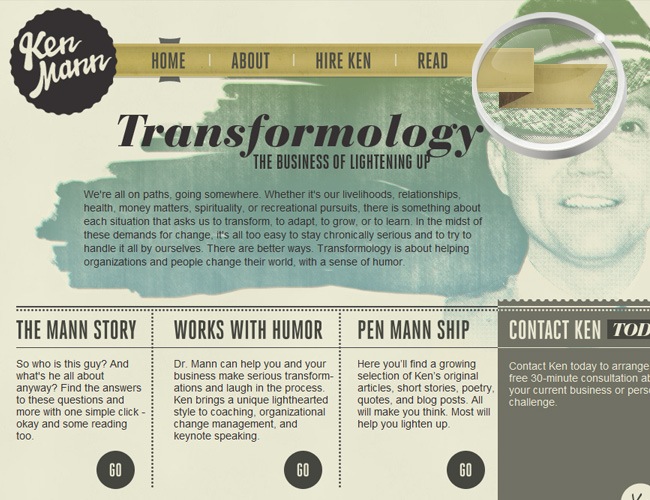
You can also combine badges and banners into a single element, as it happens at Ken Mann’s website. Depending on the look that you’re looking for, you can define how your banner and badges are going to look like.
Some additional good references

Place little interactive objects within your website
This more than a tendency is a suggestion for all the web designers, though it’s certain that you need to be very careful with the diagramming and the design, there are some details that can prettify your designs even if they don’t have an actual function. Usually these elements are small animations or interactive buttons that people usually discover by accident.
We found some nice examples of little elements that add an aggregated value to their websites where they’re located, and now we’re going to show you a few of them. The effects vary from small animated badges to fully animated backgrounds where the entire websites appear to be alive.
This animation cannot be viewed in every browser (we saw it using Safari) but once you do it, is a beautiful detail that despite of not having a real function, is a really cute detail.
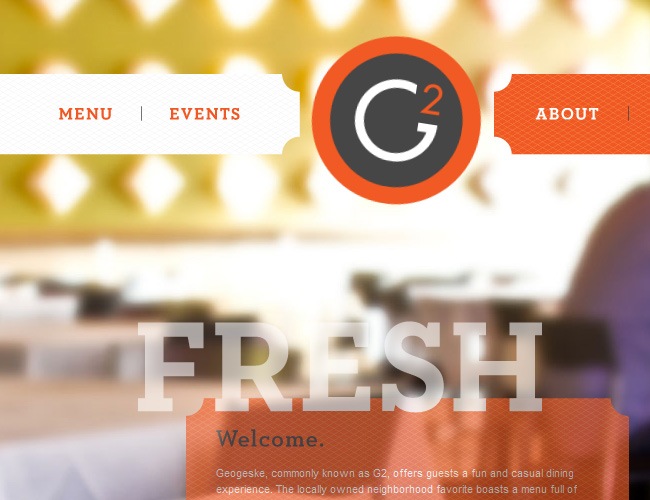
The G2 banner drops from the top to its position as soon as you enter the page, this is another example of useless interactions that are created with the only purpose of enrich the browsing experience.
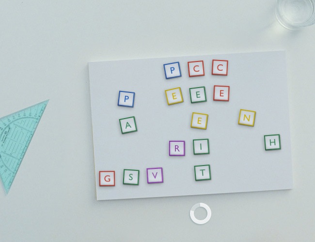
A beautiful interaction that invites you to put together the hidden message in order to access the website, this could be skipped from the design but people love it as it offers a chilling experience.
If you leave it static, this menu will still be entirely functional, but the fact that is fully animated makes the interaction way more pleasant than normal. These animated websites are usually made with Flash, but as you have seen, know you can use more than just this popular tool.
More fancy examples
So that’s new, but what’s going to disappear?
So far we have seen all the major tendencies that will emerge during the next 12 months, but when something goes up, something goes down, that’s an universal law that also applies for web design, so let’s list those design elements that either worked during 2010 the time of their demise has come.
No more bokeh backgrounds
Though this style has been very popular during the recent years, noise textures and clean interfaces are the new real deal, so please stop abusing of this blurry images and designs.
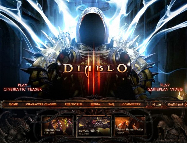
Unless you’re Blizzard, it’s time to stop making 3D interfaces
Realistic and highly detailed websites are no longer the trend, now everything is taking a much simpler direction, with vector illustrations, wooden and noise textures and clean interfaces. So the only way you can maintain a 3D and highly detailed websites is if you’re making astonishing videogames.
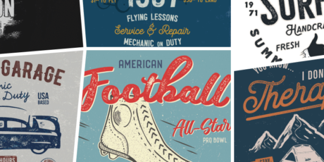
Vintage is dead, only retro fonts will survive this new year
Vintage became extremely popular during the past couple of years. If you wanted to sound cool, the only thing you need to say was “I was looking for a vintage look, with a lot of texture and oxide colors”. But now that 2011 has began, vintage is no longer the trend as everything is getting simpler, cleaner and vanguard, so it’s time to pack your bags and say good bye to your beloved vintage website but before you do it, keep in mind that retro fonts will still be functional in web design during this year.
Typography is constantly renovating itself, so let’s see what’s coming in 2011
On this year we’re going to witness some changes in the way typography is utilized, while others will remain the same (e.g using Helvetica or Yanone to save you from a hurry). Although is a little bit subjective to define an actual typeface tendency because everyone is free to choose the font they want and work with it as they wish, we have seen some patterns repeating in many websites and that’s how we established the future of typography in 2011.
Bigger titles
It’s time to break the grid, stop being scared of going beyond 72 points, big titles are now getting really popular among graphic and web designers.
Reduced tracking and kerning
With the arrival of mobile design, everything needs to be shrinked to fit into the new screen resolutions and one of of reaching this objective is by reducing the spaces between words and characters without sacrificing legibility.
SansSerif fonts will dictate the course of this year
Nobody denies the importance of script typefaces and the fact that they give a lot of elegance to any design, but in 2011, SansSerif fonts are going to be the chosen ones by most designers and creative teams to implement within their designs thanks to their elevated readability and simplicity.
Vintage is dead, but retro fonts not so much
Although the whole vintage wave is starting to get boring, retro fonts can still be used in web design and make them fit perfectly, probably the biggest argument to support this thesis is the huge popularity of Lobster, a retro font that everyone is starting to utilize on their designs.
Mixing bold and light fonts is still a good idea
You can find this on many websites, from DesignBump to some less known websites, the idea of using bold and light fonts in a single sentence or word has become a popular way of making good graphic design. Until we saw during our research, this tendency will remain for a while.
Pressed letters will continue to work in 2011
This effect was once considered as kitsch and unpleasant, but know graphic designers have reinvented pressed typography and what was seen as bad now is considered interesting, so it’s probable that we’re about to witness a boom of pressed letters in web design.
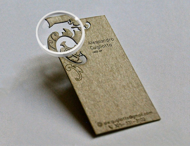
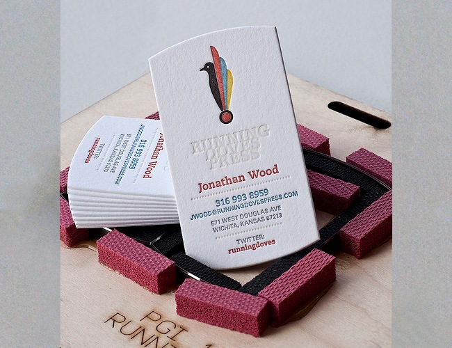
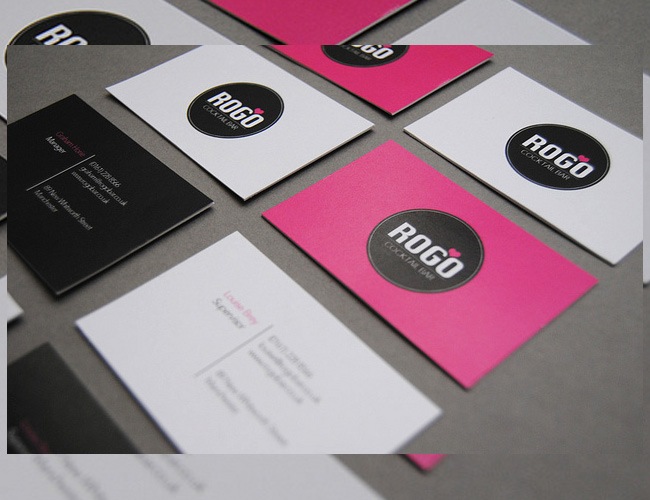
Simple and textured business cards are coming this year
Business cards are the most immediate way of introducing yourself to a client or just a random person, they talk for us and give people an initial idea of who we are and what we offer. Usually business cards are created in small formats and printed in durable materials so people can conserve them for a long time.
There are as many designs as people are because everyone has his own identity, though there are a series of parameters that people usually follow such as diagramming, format, material and typefaces. During 2011, the tendency will go towards much simplistic designs, with tons of light colors and SansSerif fonts. As for the materials, textures and die-cut designs will set the trend during the next months.
Die-cut gives your cards an added value
Applying die-cut techniques to your business cards is a method that can help you to communicate something usual or simply work as an additional design value that all people will enjoy. To create die-cut cards is important to deliver your files fully vectorized to your printer because cutting machines follow vectors to generate intricate shapes.
Explore textures to give your cards a little bit of substance
There are many different types of textured papers that you can utilize on your business card’s designs, from durex and canson papers to more grained materials. Many persons create handcrafted business cards using several materials such as wood, metal and plastics, and all these words indicate that in 2011, textured cards will occupy an important place on the market.
Keep things clean, move back to basics
Being minimal is not a synonym of black and white, though many people usually have that confusion. Minimal designs are those who avoid arabesques, saturated color palettes and excessive amounts of information. Using less colors, clean designs and placing only the key information is the best way to design a business cards if you’re planning on expand your business during 2011.
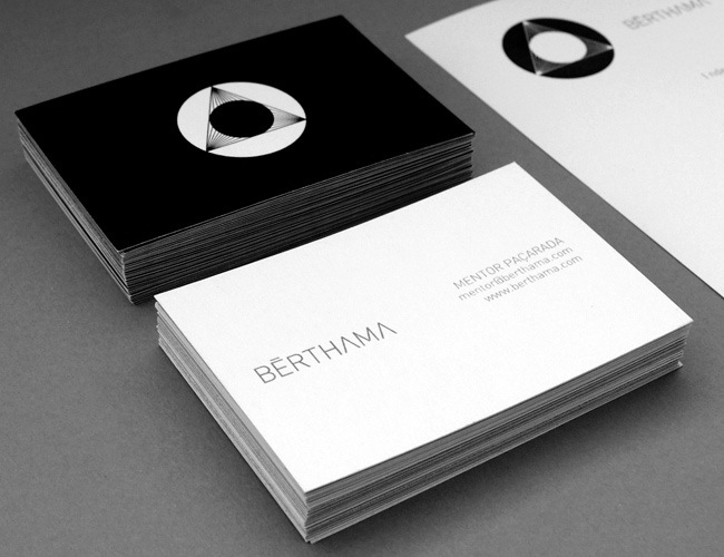
Big logos, less information
Instead of filling your cards with tons of information (come on, nobody wants to know your astrological sign), the new tendencies are establishing simpler designs with big logos in one side and the main information on the other, all for making an effective brand positioning. Give your logos the corresponding importance so people can start remembering it.
Empower your brand with innovative logo designs
Logos are the trademark of any company, they are along with the name the iconic components that determine the whole image of any business. Designing a logo is something as complex that there’s an specific field dedicated to it, which is graphic design; logos must represent the company’s vision, show the products in a clear and creative way and be simpler enough for people to remember them easily.
Some companies have encouraged really complex designs on their logos, which though present splendid examples of quality design are usually difficult to recognize or remember by the common people. In 2011 the tendency will opt for simple designs, clean typefaces, lots of vectors and symmetry.
Less is more, keep things simple
Whilst it’s true that a more elaborated logo can provide more information and demonstrate a high-end design, simpler designs will prevail in 2011. The world is moving extremely fast and people have no time to stare at a logo for more than a few seconds, so it’s imperative that your logo gets recognized instantly and positions effectively.
No more 3D and loud gradients
Get rid of those light to dark gradients, lighting effects and 3D looks, for this year everything is going to be simpler as we told you before. Although a 3D logo looks lovely, that style is getting old-fashioned and hard to position in the market.
Use simple vectors instead of complex bitmaps
Many logos in the past years used heavy bitmap images or even photographs within their designs and now that tendency is over. For 2011 we will expect a lot of vector work in logo design, with minimal color palettes and just a new direction towards simplicity and quality.
Readable typefaces, your message must reach as fast as possible
Unless your brand is Coca Cola, people won’t be able to remember your company’s name if you use a custom and elaborated typeface. You need to implement clean fonts that people can read from a considerable distance in a short period of time. We suggest you to utilize SansSerif fonts (GillSans, Helvetica, Yanone, Futura) or really simple Serif fonts (no arabesques) with your logo.
Live colors, no more vintage and oxide palettes
In 2011, the color tendency for logo design will be a return to basic colors like yellows, blues, greens and reds. Designs with oxide colors and vintage aesthetics are not longer the trend, so move back to MS Paint and use that 12 color’s palette that we used when we were kids.
Symmetry is back, no more axiality in your logos
Many years ago everything was designed following perfect grid structures and following high standards in terms of symmetry, then people got bored with that and started to break those rules, and it’s been many years since that event. Now symmetry is back with a fresh concept, not as a obliged rule but as a way of making effective and simple logo designs.
Mobile design is now a reality, and it has its own style for 2011
2010 was probably the most relevant year of the decade in terms of technology with the arrival of the iPad and the whole tablet technology, the large increment of Smartphone’s sells (iPhone, Android, BlackBerry), 3D cinema, HD television and more things that made an astounding closure for the decade.
With the growing sells of tablets and smartphones, the traditional web design standards will become obsolete in a very short period and graphic designers will have to adapt to this new screen resolutions and technologies. Smartphones support the 960 pixels structure and tablets even bigger resolutions, which means that the minimum space where a webpage must be displayed is in a smartphone’s screen and designers must learn to design for that media specifically.
Metallic / wood textures and gradients work fine
Although in standard web design the utilization of gradients is becoming obsolete, for smaller resolutions like the smartphone’s case they still work. You can combine subtle textures, gradients and metallic/wood designs to generate beautiful interfaces.
Use simple icons and front perspective
When you’re designing for small resolutions like the one observed on iPhone, it’s very important that every detail is read with ease, and a good way of achieving this is by making detailed but simple icons and work in front perspective. The current mobile technology is not prepared to support 3D environments and stuff (this will probably happen in the future) and that’s why simpler interfaces work better on these devices.
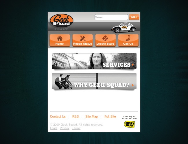
Glossy and bright colors are also accepted
Watching web mobile design is like staring at the web design trends that set the mark a couple of years ago, and this probably occurs because the technology is still in an elemental phase and designers are still looking for the best way for designing specifically for mobile devices.
In terms of color we will find a lot of glossy and bright color interfaces in web mobile pages, this tendency may last only a few months but for the present time, glossy and bright designs will still be acceptable (we suspect that this is going to end) for a while.
So basically what we’re going to see in 2011 for web mobile design is a reinterpretation of the old web 2.0 look, with tons of glossy elements, high-end icons and textures. Our personal suggestion for making your own web mobile design is to think of it as your website’s naked version, with only information and the essential look displayed, we will see a lot of things coming up from this subject through the next months, hopefully it all will end for the best.
And now we have reached the end of this article, a complete journey across the main design trends that will set the mark during 2011 on the main design fields (web design, typography, business cards, logo design and web mobile); this year will definitely bring a lot of curved balls and only after 2012 arrives, the consistency of this article will be able to be evaluated, our team made a huge research in order to determine the direction that graphic and web design are taking, so this article can become an useful guide for every designer to predict the course that must be taken throughout 2011, we want to thank you for supporting Webdesignshock, please leave us your opinions regarding this post and well, have a blast designing in 2011 :).
