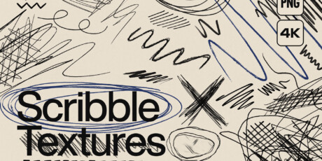
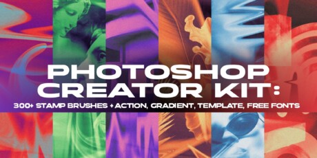
Unleash pure creativity with our 500+ Scribble Textures collection, a massive pack of handcrafted, high-resolution PNG textures created to bring d...
Unleash pure creativity with our 500+ Scribble Textures collection, a massive pack of handcrafted, high-resolution PNG textures created to bring depth, emotion, and artistic intensity to your designs.
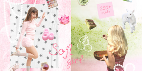
Whether you're working on branding, social media graphics, t-shirt designs, posters, packaging, or digital art, these scribble overlays will instantly enhance your visuals with a bold, modern edge.
Just place the PNG texture over your artwork, experiment with blending modes like Multiply, Overlay, Screen, and adjust the opacity to achieve a professional result in seconds.
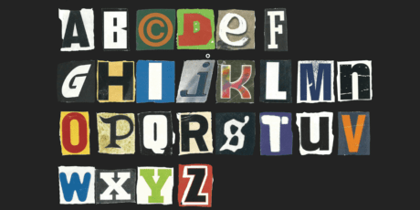
These scribble textures are designed to help creatives incorporate a raw, hand drawn aesthetic, grunge and urban vibes, artistic layering effects, dynamic backgrounds, and visually appealing overlays into any project.
The commercial use license allows you to use these assets for unlimited copies, no matter where in the world you are operating.
Whether you’re a graphic designer, content creator, Amazon merch seller, or digital artist, this bundle unlocks endless creative possibilities. Grab it today for just $29 before it returns to its regular retail price of $149.
Upgrade your workflow and craft standout visuals with 500+ Scribble Textures today!
You Will Receive:
500+ Unique Scribble Textures
High-Resolution PNG Files
Transparent Background (Easy Overlay Use)
Ready to Drag & Drop
Organized & Easy to Access
Compatible With: PS, AI, Canva, Procreate, Affinity Designer, Figma
Commercial Use
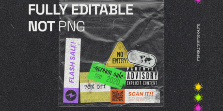
500+ Scribble Textures High-Resolution PNG Bundle; Transparent Backgrounds; Ready to Drag & Drop
Unleash pure creativity with our 500+ Scribble Textures collection, a massive pack of handcrafted, high-resolution PNG textures created to bring depth, emotion, and artistic intensity to your designs.
Whether you're working on branding, social media graphics, t-shirt designs, posters, packaging, or digital art, these scribble overlays will instantly enhance your visuals with a bold, modern edge.
Just place the PNG texture over your artwork, experiment with blending modes like Multiply, Overlay, Screen, and adjust the opacity to achieve a professional result in seconds.
These scribble textures are designed to help creatives incorporate a raw, hand drawn aesthetic, grunge and urban vibes, artistic layering effects, dynamic backgrounds, and visually appealing overlays into any project.
The commercial use license allows you to use these assets for unlimited copies, no matter where in the world you are operating.
Whether you’re a graphic designer, content creator, Amazon merch seller, or digital artist, this bundle unlocks endless creative possibilities. Grab it today for just $29 before it returns to its regular retail price of $149.
Upgrade your workflow and craft standout visuals with 500+ Scribble Textures today!
You Will Receive:
500+ Unique Scribble Textures
High-Resolution PNG Files
Transparent Background (Easy Overlay Use)
Ready to Drag & Drop
Organized & Easy to Access
Compatible With: PS, AI, Canva, Procreate, Affinity Designer, Figma
Commercial Use