Generate App Icons, Illustrations & Logos with AI
Artificial intelligence has been a part of our daily lives for some years now, making us use it constantly. Previously, it was believed that in order to create an application, design a logo, or make a design, one had to necessarily know and have a program or learn to use commands and programming concepts that are not commonplace for ordinary people.
App icons are the face of your mobile application. They are the first thing that every user sees when browsing through an app store, and they obviously play a crucial role in attracting potential users or clients to your app. A well-designed app icon can also help users easily identify your app on their device and increase brand recognition.
However, designing an app icon that successfully represents your app and stands out from other apps can be very time-consuming and challenging. This is where an app icon generator can be incredibly helpful.
Recently, I was browsing the web to see what applications I could find, to understand what is currently being used in technology. I realized that the majority of apps icons on the market are already generated and executed by AI, which surprised me because it is still something with which I am not completely familiar. I decided to download one of these applications to see if everything worked well, and indeed, it worked even better than a traditionally app icon design.
So, using an app icon generator offers a range of benefits to app designers and developers, like saving time and effort by computerize the design process. Instead of spending a lot of time creating a single icon, an app icon generator can easily create multiple icons in just a few minutes.
Additionally, app icons generators often offer a wide range of styles and customization options, which allow designers to create unique and visually aesthetic icons that accurately represent their app’s branding and mission.
What is an App Icon
An app icon is a small graphic or image that represents a mobile application on a user’s device or on the app store. It’s function is to work as the face of the app, and it is usually the first visual element that users and clients may associate with your app. App icons are usually displayed on the home screen of a mobile device or in an app store, where they can attract new users and clients to download the application.
An app icon should be simple, memorable, and visually appealing. It should effectively represent the app’s brand and functionality, conveying its purpose and value to the user. Additionally, app icons should be consistent with the whole design of the app (including colors and typography), as they reinforce the app’s identity and brand recognition. App icons come in various styles, as we have mentioned before, depending on the device and its operating system (iOS or Android).
What Characteristics Should a Good App Icon Have
An app icon is like the cover of a book, it’s the first thing people see and depending on what they think about it, they make their decision to download and use the app. That’s why it is crucial for an app icon to have certain characteristics that make it stand out, visually appealing, and easily recognizable to its users. In this article, we will explore which characteristics a good app icon should have to help it make a great first impression.
Pixels
Pixels play a crucial role in the design of a great app icon. App icons are typically small, so each pixel counts in terms of making an impact and being visually appealing.
When designing an app icon, it is essential to consider the recommended size and resolution for each platform and device. This information can usually be found on the platform’s developer guidelines or documentation. It’s important to adhere to these standards to ensure that the app icon is displayed correctly and looks sharp on all devices.
Each pixel in an app icon can affect its overall appearance, so designers need to pay close attention to every detail. Elements such as shapes, lines and color gradients must be precise and crisp to create a professional and polished app icon. Additionally, designers need to consider the icon’s visual impact when displayed at different sizes. This is particularly important for icons that will be displayed on many different device sizes (like iOS devices, which have different screen sizes).
Another important factor when designing app icons is the file format. PNG and JPG are the most common file formats for app icons, but PNG is usually the most recommended format for Android app icons. These file formats provide the necessary clarity and color depth to make the icon look appealing on different devices.
Size
The file size of an app icon is a very important factor to consider when designing the perfect app icon. For example, if you use a very large file size it can slow down the app’s loading time, meanwhile a small file size can result in a loss of image quality. Therefore, designers should aim to strike a balance between file size and image quality when creating an app icon.
To achieve a balance between file size and image quality, designers can use optimization tools that can compress the file size without affecting the image quality significantly.
Another aspect to consider is the file format used for the app icon. For iOS apps, PNG and JPEG formats are recommended, while for Android apps, PNG is the recommended format. PNG files can support transparent backgrounds, which can be useful when the app icon needs to blend seamlessly into the home screen background.
It’s also important to ensure that the app icon file size meets the platform’s requirements. For example, the iOS system requires app icons to be between 29×29 pixels and 180×180 pixels, and the file size should be less than 500KB. On the other hand, Google Play Store recommends a minimum size of 512×512 pixels for app icons and a maximum file size of 1024KB.
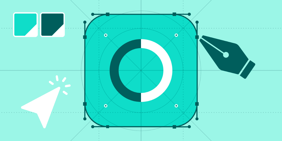
Shape
The shape of an app icon is an important design element that can affect its user’s perception of the app. A good app icon should have recognizable shapes that are simple, yet distinctive. The shape should be designed with a focus on simplicity and clarity, as a cluttered or overly complex design may not be easily distinguishable on the user’s home screen.
The shape of the app icon should be designed in a way that is faithful to the app’s purpose, features and branding. For example, if the app is related to fitness or health, the icon could be designed with shapes that reflect healthy lifestyles, such as a heart or sports shoes. Similarly, if the app is related to cooking, the icon can be designed with a shape that represents food, such as a chef’s hat or a plate.
When designing an app icon, it is important to really consider the platform and device for which the app is being made. Different platforms may have different shape guidelines, and designers must ensure that their app icon is designed to meet those guidelines. For example, Apple has specific guidelines for app icon shapes, such as using rounded corners for all app icons, while Android allows for more flexibility in shape design.
Furthermore, the shape of the app icon should be designed to be easily recognizable at different sizes. App icons can appear in various sizes on different devices, and the shape should be designed to remain clear and distinct at smaller sizes. This can be achieved by using simple shapes and bold lines that are easily recognizable, even at smaller sizes.
Colors
The use of color is an important design element when creating a great app icon. Colors can evoke emotions, convey meaning and attract attention, making them a critical aspect of app icon design. A good app icon should have a color palette that is visually appealing, relevant to the app’s purpose and also reflects the app’s initial branding.
When choosing colors for an app icon, designers should consider the app’s purpose and target audience. Following the same example as the fitness or health app, designers may choose colors such as green or blue, which are associated with health and wellness. Similarly, if the app is related to music or entertainment, designers may choose brighter and more vibrant colors to convey excitement and energy.
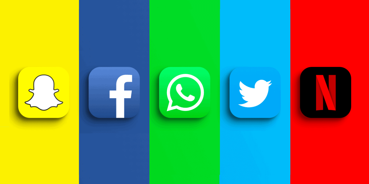
Another important consideration when choosing colors for an app icon is brand recognition. The color scheme should be consistent with the app’s color palette and should be easily identifiable as belonging to the app’s brand. For example, Facebook’s app icon is blue, which is consistent with their overall branding and is easily recognizable as belonging to Facebook.
Designers should also consider the platform for which the app will be developed when deciding on the color they want to include on their app icon. Like Apple’s system specific color guidelines for their app icons, designers must meet those guidelines when creating app icons for their iOS devices.
Finally, designers should consider the contrast between colors in their app icon design. App icons must be easily recognizable, even at their smallest versions, and using contrasting colors can help achieve this goal. Like using white or clear texts on dark backgrounds can make the texts more readable and distinguishable.
File weight
When it comes to designing a great app icon, the file weight is just as important as the design elements themselves. The file weight, or the file size, is the amount of space the app icon takes up on the device. It is essential to consider both the minimum and maximum file weight of the app icon when creating it.
The minimum file weight refers to the smallest file size that can be used for the app icon. It is important to keep the file size as small as possible to make sure that the app loads quickly and doesn’t take up too much storage on the user’s device. This is particularly important for users who have limited or very low storage space on their own device since they clearly won’t keep a heavy app. On the contrary, if the file weight is too small it can end-up with low-quality or being a pixelated icon, which can negatively impact the user’s perception of the app.
On the other hand, the maximum file weight refers to the largest file size an app icon can have. A larger file size allows for more intricate designs and details, which can make the app icon stand out and be more visually appealing. However, a larger file size can also result in slower loading times and take up even more space on the user’s device.
Finding the right balance between the minimum and maximum file weight is crucial to creating an effective app icon. The file weight should always be optimized to ensure that the app’s loading times are fast enough and that they take up minimal storage on the user’s device, while also ensuring that the icon is very high quality and pretty.
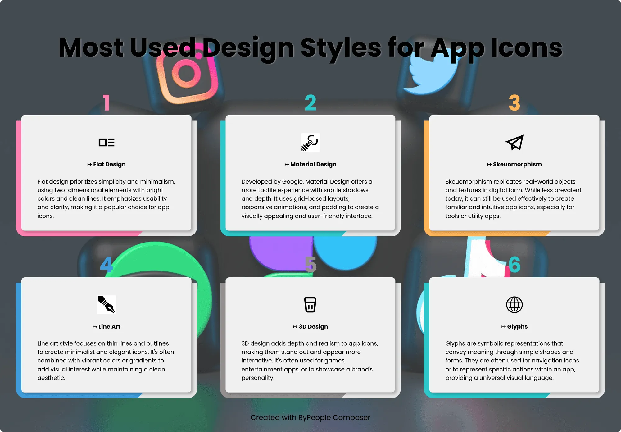
Most Used Design Styles for App Icons
When it comes to designing app icons, there are many design styles to choose from. From sleek and minimalistic to bright and bold, the possibilities are endless. However, some design styles have become particularly popular among app designers and users alike. In this section, we will talk about some of the most commonly used design styles for app icons and what makes them so appealing.
iOS Style
The iOS design style for app icons is characterized by its sleek and minimalistic aesthetic. This design style favors simple shapes, bold colors, and crisp lines. iOS app icons typically feature a flat, two-dimensional design with rounded corners and a subtle shadow effect, giving them a sense of depth.
One of the most important features of the iOS design style is the use of a grid system to make sure you get a consistency across all app icons. This grid system helps to ensure that app icons have a unified look and feel, even when they come from different developers.
The color palette for iOS app icons tends to be bright and bold, with a focus on primary colors. This creates a striking and visually appealing effect that makes app icons stand out on the user’s home screen.
Flat Style
Flat style app icons are a type of app icon design that is characterized by a minimalistic, two-dimensional aesthetic. The design style is simple, with clean lines, bold colors and minimal shading or texture. This style is often associated with modern, minimalist design trends and is popular for its simplicity and clarity.
Flat style app icons can be used for a variety of mobile applications, from social media and productivity apps to games and entertainment. This style is extremely useful for many app icons because of its ability to stand out on a user’s device and provide an explicit representation of the app’s brand and functionality. Flat style app icons are often used at the same time as other design elements (such as typography) to create a cohesive and visually appealing design.
Minimalist Style
Minimalist style app icons are a type of app icon design that emphasizes simplicity and restraint. This design style is characterized by the use of clean and sharp lines, monochromatic or limited color palettes and a lack of details like shading or texture. Minimalist style app icons are often associated with modern design trends and are popular for their elegant and sophisticated aesthetic.
They can be used for a wide range of mobile apps, from productivity apps, to entertainment and social media apps. The minimalist design style works great for app icons because it ensures that the most important thing of the design is not its visual component but the brand’s recognition and understanding. Minimalist style app icons are often used in combination with typography and negative space to create a balanced and visually pleasing overall design.
3D Style
3D style app icons are a type of app icon design that creates the illusion of three-dimensional depth and dimensionality. This design style often involves the use of details like lighting, shadows and gradients to give a sense of depth and realism to the app icons. 3D style app icons can be used for a variety of mobile applications, from gaming and entertainment to productivity and utility apps.
This design style is popular for its ability to create a visually striking and immersive experience for users. The 3D effect can be achieved through many techniques, including isometric design, perspective distortion and extrusion. The use of bold and bright colors and gradients can enhance the effect and create more depth and texture.
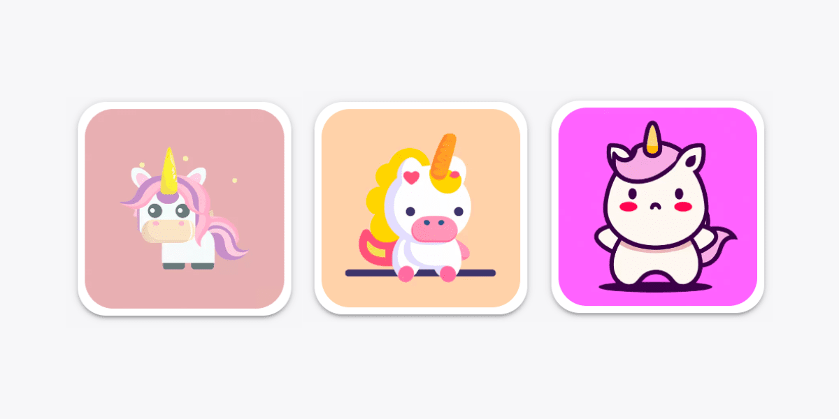
Cartoon Style
Cartoon style app icons are a type of app icon design that uses playful and whimsical illustrations to represent the app’s brand and functionality. This style is characterized by the use of bright and vibrant colors, bold lines and exaggerated shapes to create a fun and playfulness vibe amongst the app. Cartoon style app icons can be used for a wide range of mobile applications, from gaming and entertainment to educational and children’s apps.
The use of cartoonish illustrations or drawings can also create a friendly and approachable tone that appeals to a wider range of users, especially children and young adults. This design style often involves the use of characters or mascots to represent the app’s brand and create a memorable and engaging user experience. Cartoon style app icons can also be used amongst other design elements (such as typography and negative space) to create a cohesive and visually appealing overall design.
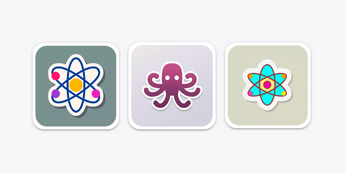
Isometric Style
Isometric style app icons are a type of app icon design that uses a technique called isometric projection to create the illusion of three-dimensional depth and perspective. Isometric projection is a method in which you draw a three-dimensional object in only two dimensions by using angles that maintain the relative sizes of the object’s sides. This design style also involves the use of bright colors, bold lines and exaggerated proportions to create a playful and striking aesthetic.
Isometric style app icons can be used for a variety of mobile applications, from gaming and entertainment to productivity and utility apps. This design style is popular for its ability to create a sense of depth and dimensionality without changing or modifying the object’s style while keeping it flat. Isometric style app icons are often used in combination with other design elements, such as typography and negative space, to create a balanced and visually appealing overall design.
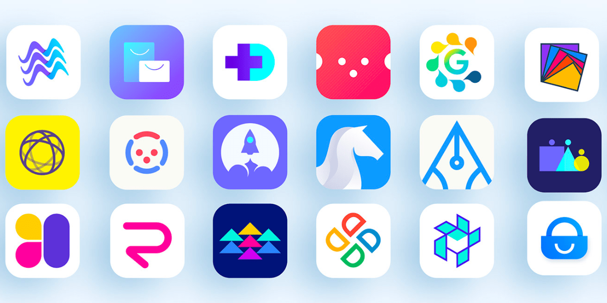
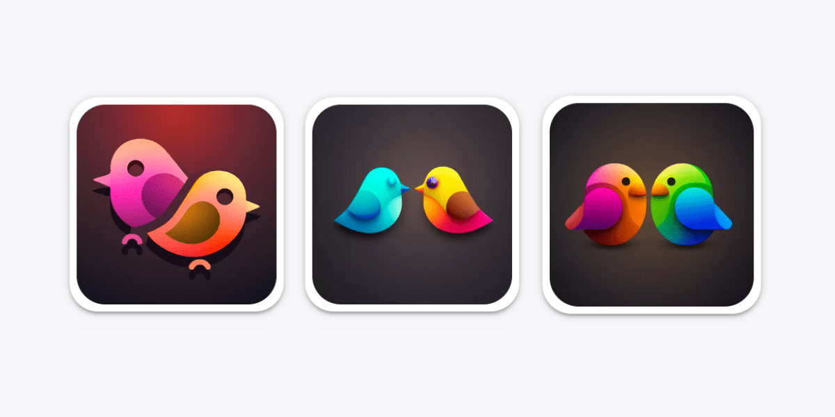
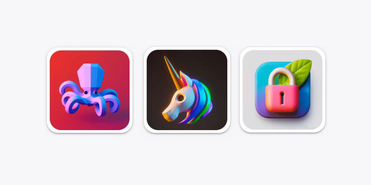
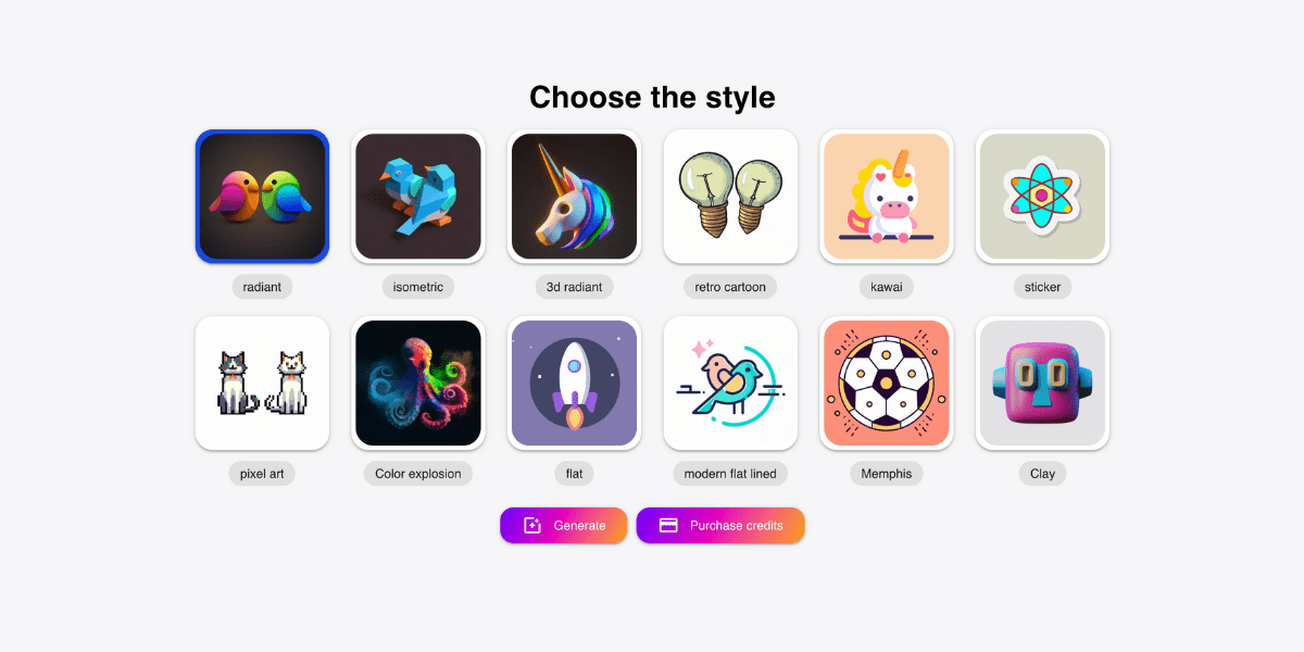
You can find many of these design styles in Magic Creator, a web application from ByPeople that uses artificial intelligence to generate beautiful designs such as icons, logos, and illustrations in just minutes. It offers twelve unique design styles, including not only the ones we’ve talked about above, but also radiant styles, retro cartoon styles, kawai, sticker style, pixel art style, color explosion style, memphis style and clay style. Do you want to know more about these styles? We’ve got you!
Radiant Style
App icons with radiant style are a type of app icon design that incorporates radiant gradients to create a dynamic and eye-catching visual effect. This design style uses of daring and vivid colors that blend and transition into each other seamlessly, this creates a sense of movement and energy into the app icon.
Radiant style app icons are often associated with vibrant and energetic brands, as well as apps that are designed to capture the user’s attention quickly and effectively. They can be used for many types of mobile applications, from gaming and entertainment, to utility apps. The radiant style design technique can be applied in a variety of ways such as through radial, linear and multicolor gradients. The use of gradients can help make the app icon appear more dynamic and engaging to the user.
Retro Cartoon Style
Retro cartoon style app icons are a type of app icon design that combines elements of vintage and cartoon aesthetics. This design style often includes bold outlines, vibrant colors, and exaggerated shapes reminiscent of classic cartoons from the mid-20th century.
Retro cartoon style app icons can be used for a variety of mobile applications, from gaming and entertainment to productivity and utility apps. This design style is popular for its ability to create a playful and nostalgic experience for users. The use of retro color palettes and typography can enhance the vintage feel and create a sense of familiarity and comfort for users.
Kawai Style
Kawaii-style app icons are a type of app icon design that features cute and playful characters, objects, and themes. This design style originated in Japan and is characterized by its use of bright colors, rounded shapes, and simplified illustrations. Kawaii-style app icons often feature characters from popular anime or manga franchises, as well as popular cultural icons like cats, bears, and other animals.
This design style is popular for its ability to create a fun and lighthearted user experience and is often used in social media, gaming, and entertainment apps. The use of bold colors and exaggerated features like large eyes and heads contribute to the overall charm and appeal of kawaii-style app icons.
Sticker Style
Sticker style app icons are a type of app icon design that mimics the look of cute and colorful stickers. This design style typically features bright colors, bold outlines, and playful illustrations or typography. Sticker style app icons can be used for a variety of mobile applications, including messaging, social media, and entertainment apps.
This style is extremely popular for two main reasons: its ability to create both a fun and fantastic visual experience for users, and its potential for customization and personalization. Sticker style app icons often incorporate a mix of hand-drawn and digital elements to create a unique and eye-catching design.
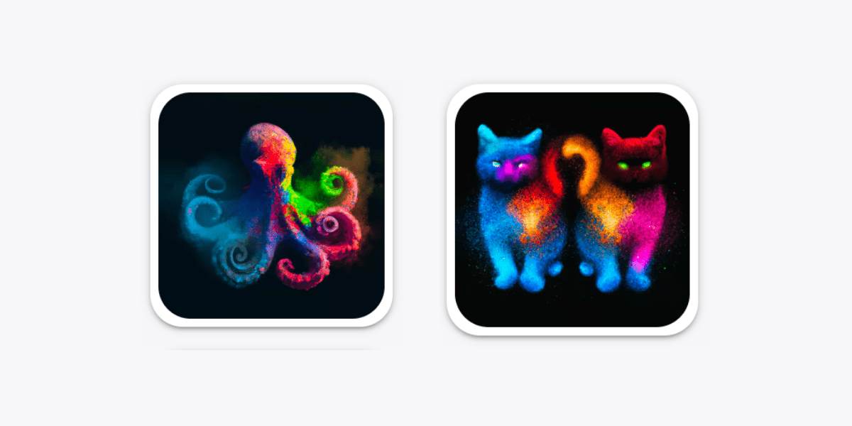
Color Explosion Style
Color Explosion style app icons are a type of app icon design that is characterized by vibrant and bold colors arranged in an explosion-like pattern. This design style often involves the use of gradient fills and layers of shapes to create a visually striking effect that catches the user’s attention. Color Explosion style app icons can be used for a wide range of mobile applications, from entertainment and gaming to productivity and utility apps.
This design style is very used for how it can give a dynamic and energetic feeling to the app icon’s design, while maintaining it truthful to the app’s brand. The use of complementary and contrasting colors in Color Explosion style app icons can create a sense of depth and dimensionality, enhancing the overall visual impact of the design.
Memphis Style
Memphis style app icons are a type of app icon design that is characterized by the use of bold geometric shapes, bright colors, and playful patterns. This design style is inspired by the Memphis Group, an Italian design collective that was active in the 1980s. Memphis style app icons often feature a mix of organic and geometric shapes, with asymmetrical compositions and bold color combinations.
This style is popular for its unique and fun aesthetic, and it can be used for a variety of mobile applications, from gaming to casual social media and lifestyle apps. The Memphis style can also incorporate elements of other design styles, such as pop art and 80s retro design, to create a unique and visually striking overall design.
Clay Style
Clay style app icons are a type of app icon design that mimics the look and feel of sculpted clay. This design style often involves the use of bold, vibrant colors, and a sense of playfulness. Clay style app icons can be used for a variety of mobile applications, from gaming and entertainment to productivity and utility apps. This design style is popular for its ability to create a unique and visually interesting experience for users.
The clay effect can be achieved through the use of shading and texture to create the illusion of depth and dimensionality. The use of subtle shadows and highlights can enhance the clay effect and create a sense of realism. The overall design of clay style app icons is often simple and minimalistic, with a focus on creating a cohesive and visually appealing overall look and feel.
Now, if you want a more concise version of this information, with added styles, we have provided this poster where you can identify the most commonly used styles in app icons.
You can also find additional icons on our Iconshock website, a site that features over two million icons that are designed by professional artists and available in different styles. Here you can find a wide range of isometric icons in different categories, such as business, marketing, travel and more. You can select the icons you need and download them in various formats, such as SVG, PNG and AI, which makes them suitable for different projects. not only that offers a vast collection of icons for various purposes.
On Iconshock you can also find flat icons by using the search bar or browsing the site’s extensive library of icons. To search for flat icons, simply type in relevant keywords such as “flat design,” “simple icons,” or specific terms related to the industry or topic of interest. You will find a flat icon collection that includes a wide range of designs, from basic shapes and symbols to more complex illustrations, making it easy to find the perfect flat icon for their project.
And you can even find other icon styles on Iconshock, like the material style which are a popular design style that uses bold colors, simple shapes and shadows to create a clean, modern look (see the examples below). To search for material icons on Iconshock, users can type in relevant keywords such as “material design,” “bold icons,” or specific terms related to the industry or topic of interest. Alternatively, users can browse through the site’s categories and select the “Material” category to view all available material icons.
How to Get the Perfect App Icon
In today’s digital age, having a very striking app icon is crucial to attract potential users and clients, and stand out in nowadays congested apps market. As we have mentioned, the app icon serves as the first impression and representation of your app’s identity and functionality, and it also plays a significant role in attracting and retaining users. Therefore, creating just the perfect app icon is important for the success of your app. Following, we will discuss some of the most essential factors you should consider when designing your own app icon and provide tips and tricks to help you garrantee its success:
Colors that Work and Colors that Don’t
Choosing the right color scheme is crucial when designing an app icon. Colors can convey different emotions and messages, and can make or break the effectiveness of your icon.
Colors that work well for app icons are usually the ones that are bright and eye-catching, such as red, blue, green and yellow. These colors are eye-catching and can create a sense of excitement or urgency, which is important in grabbing users’ attention. It’s also very important to also consider contrast when choosing colors, high contrast colors (such as black and white) can make your app icon stand out and be easily recognizable on users’ devices.
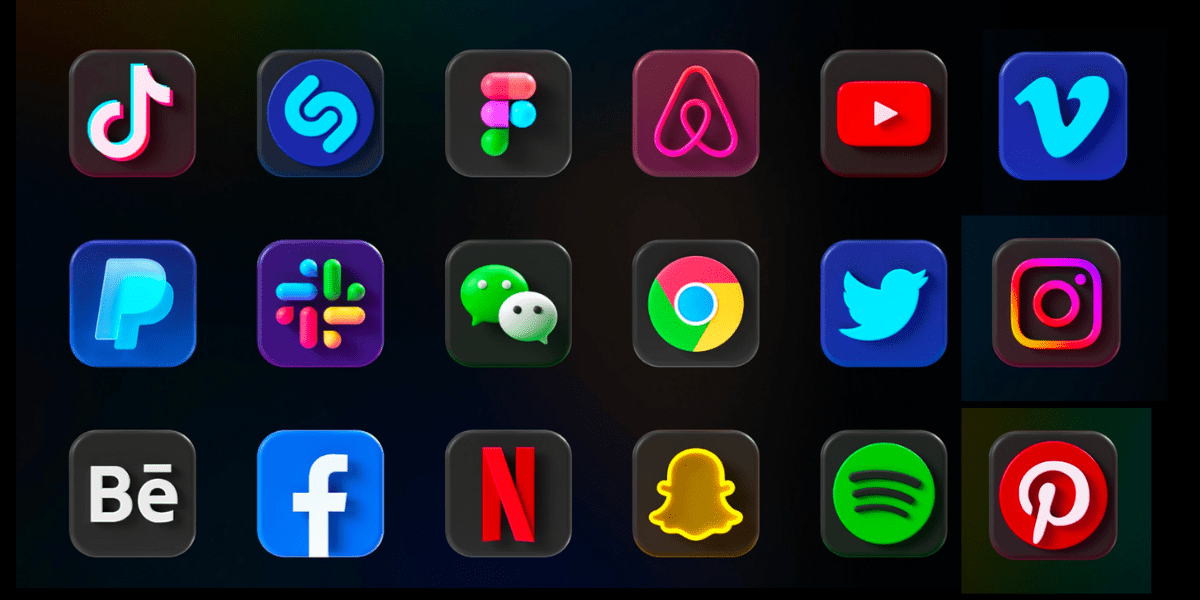
Slack and TikTok have great app icons that use colors effectively. Slack’s app icon features bright, visually striking colors that suggest vibrancy and activity, aligning with the app’s purpose of communication and collaboration. Meanwhile, TikTok’s app icon uses black and bright pink colors to create contrast and catch the user’s attention, conveying a sense of fun and creativity in line with the app’s purpose of creative expression.
On the other hand, colors that don’t work well for app icons are usually dull or too similar in hue. Brown, beige, and gray are examples of colors that may not be effective in grabbing users’ attention or communicating the app’s message. Similarly, using too many colors or colors that clash with each other can make your icon look chaotic and unprofessional.
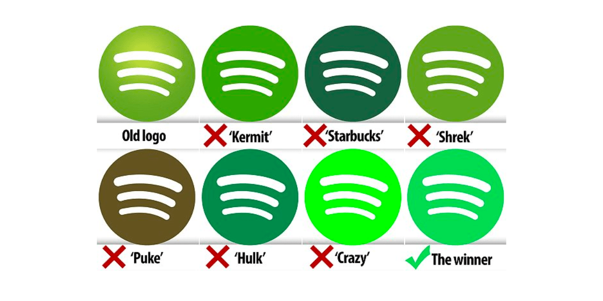
Examples of app icons that don’t use colors in a perfect way can be both the old Instagram icon that used a gaudy brown and blue color scheme, the original Snapchat icon that had a kind of mismatched yellow and white color scheme, and finally the old Spotify icon that used a very dull green color.
Using your Brand’s Visual Identity
Using your brand’s visual identity is crucial for designing app icons. It needs to convey the essence of your brand and value proposition of your app. Consistency is key to building brand recognition. This can be achieved by using your brand’s colors, fonts and visual style in your app icon. It also helps to build trust and credibility with your target audience and market, making it more easy for your clients to recognize and engage with your brand’s app. Maintaining consistency across all touchpoints builds a strong and recognizable brand.
Should It Be 3D or Flat
When designing an app icon, deciding between a 3D or flat design is a crucial choice that depends on the app’s purpose and brand identity. A 3D design can create depth and realism, appealing to apps with advanced features or graphics. Flat designs, on the other hand, are minimalistic and easier to recognize, adaptable to different sizes and resolutions. The choice should consider the app’s audience, purpose and brand strategy. Ultimately, designers should create an app icon that accurately represents the app and resonates with its intended users.
Designing good icons is very important when showcasing products or apps, as seen in the case of ProductHunt. ProductHunt is an online platform where entrepreneurs and creators showcase their innovative products, ranging from mobile apps to hardware gadgets. One of the key features that make ProductHunt stand out is its use of icons to sell products. A well-designed icon not only visually represents the product but also communicates its value and key features quickly and effectively. This helps the said product to stand out from others and create a memorable and consistent user experience within your users. Therefore, designing good icons can play a crucial role in attracting and retaining users, as seen in the success of ProductHunt.
When it Can Be Too Complex
Sometimes you can get stuck when designing an app icon, and that is completely fine. When that happens it’s important to step back, relax and just simplify your process. One effective approach could be to focus on the app’s core functionality and purpose, and design an app icon that conveys that exact message clearly and concisely. Another helpful approach could be to limit the number of elements used in your icon design and to stick to a consistent color palette and visual style. By doing this, you will be simplifying the design and the app icon will be more likely to be easily recognizable and memorable. Additionally, asking for feedback from others (such as colleagues or users) can provide you with valuable insights and help you refine the icon’s design.
Magic Creator
As we mentioned before, Magic Creator is a powerful web app from ByPeople that harnesses the power of artificial intelligence to generate stunning designs for logos, icons and illustrations. With Magic Creator, you can effortlessly create gorgeous designs for your product by simply typing in the name of your product and selecting one of the twelve unique design styles available.
The advanced image system of Magic Creator allows you to download your designs with or without background images, giving you full control over the final product. If you’re looking for inspiration, you can check out the wide variety of stunning icons generated by Magic Creator by clicking on the “see more examples” link.
Features and Functionality
To generate unique icons for your project using Magic Creator you have to follow a few and simple steps:
- First, you have to sign up or log in into your CreativeToolKit account to have access to the tool
- Then, simply enter the name or keyword of the product or concept you want to represent. You can describe your idea of the icons you have in mind on a text box. Here you have to keep your idea’s description simple in order to get better results. You can also choose how many design options you want to get, from 1 to 10
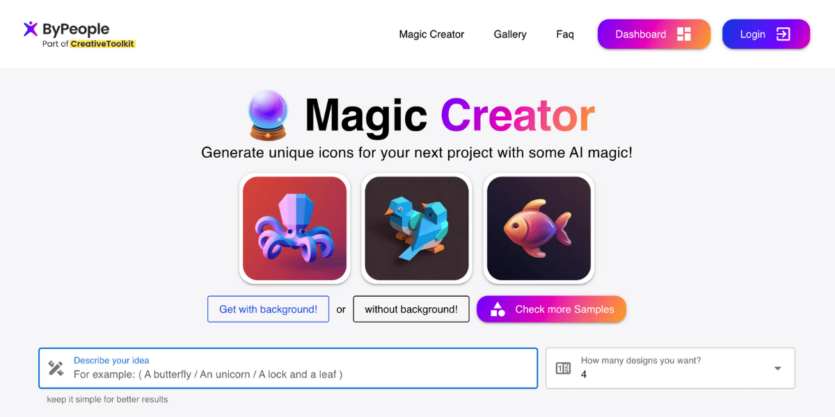
- Now the tool will automatically generate a range of design styles, including the ones we discussed above on this article. You can choose from twelve different design styles, each with its own unique features and characteristics. Here you can only choose one style, so if you want to look at your idea with different styles you can always go back and just change the style.
- Finally, once you select a design style, you can save and edit your icons with the many additional features Magic Creator has. You can customise the design further by adjusting the colour scheme, font, and other elements, you can remove their background, hire a professional designer, and more.
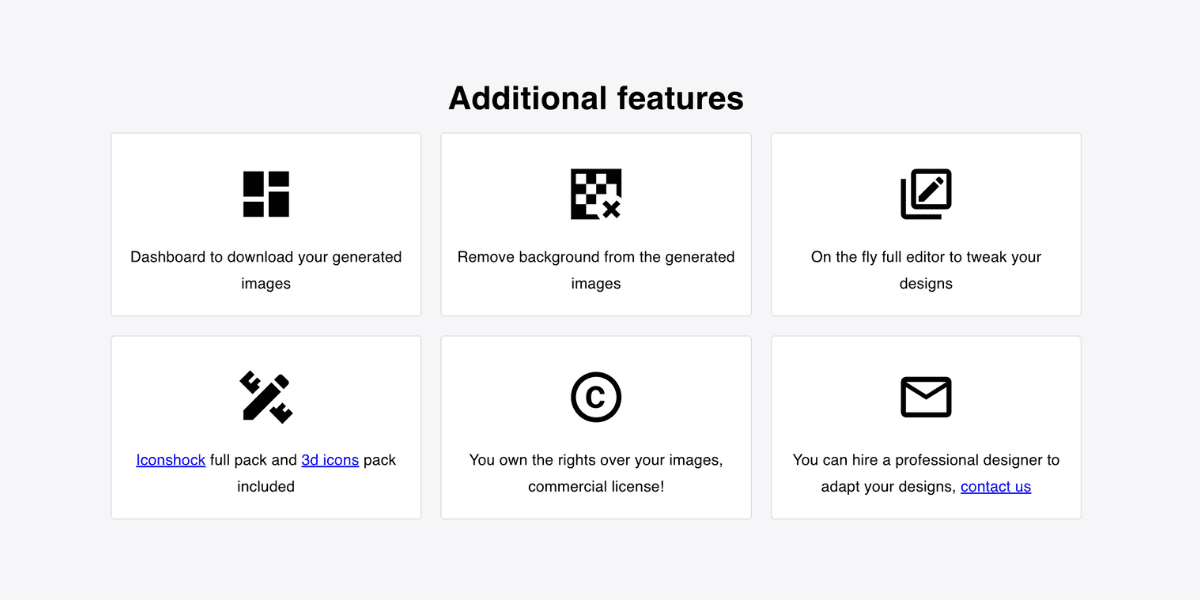
Magic Creator also includes a vast library of stunning icons and illustrations generated by the tool. Users can browse these examples for inspiration or use them as a starting point for their own designs. The “see more examples” link allows users to explore an endless variety of high-quality design options.
Quality and Pricing
Magic Creator is a cost-effective solution that generates a precise number of high-quality images for your design needs. The system uses a credit-based system, where each credit is roughly equivalent to one image, allowing users to generate a large number of designs at an affordable price. With Magic Creator, there’s no need to hire a professional designer as the system generates the exact number of images needed, saving both time and money. The credit-based system also provides flexibility, allowing users to purchase credits based on their specific needs. By utilizing Magic Creator, users can generate high-quality designs without breaking the bank.
In conclusion, we can define that icons generated with AI optimize time and can be more precise than those designed traditionally. However, it’s important to consider the instructions given to AI to generate the design; that’s the key to making the tool work and not produce something that doesn’t function. Therefore, throughout the article, we emphasize the importance of understanding the brand, the purpose, the values, to have a clear identity that will be conveyed to the AI and generate a design.
This is confirmed by the opinion of several experts who claim that, when using AI, outlining the structure of a design is crucial, especially when it will represent an application. As mentioned earlier, it is the first image the user will see of the application, meaning it’s the first impression. Additionally, we remind you that we have a perfect tool for this type of inconvenience that will facilitate the process of creating and developing your application.

Juan Pablo Sarmiento
System engineer from the National University of Colombia, with special interest over entrepreneurship, marketing, productivity and well-being.
Several projects and startups launched in over 20 years of experience.
Best Seller Deals
Check out time-limited deals on software and designs packs