Still having some new years eve nostalgia? Mistakenly filling forms and checks with 2010 date? , then this is the post for you!. We have worked very hard not just to list, but to analyze thoroughly the most important tech related news from a design perspective. Everything from Smashing Magazine’s financial stunt to Groupon’s rise to billion dollar stardom and a little bit of Apple in between. If you want to predict what will happen this year, look no further, it is here where you will find all the clues you need. The best way to predict the future is to know about the past, how about that for a catchy phrase?
Talking seriously, we worked our ass on this article and here it is, the most complete and extended review of everything we left behind in 2010. Don’t worry our dear friend, because the date thing happens to all of us, enjoy!.
Google meets Pacman
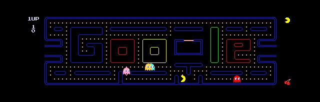
- To commemorate Pacman’s 30th anniversary in may 2010, Google made a fully playable doodle-game entirely on HTML5.
Touch design goes mainstream with Angry Birds
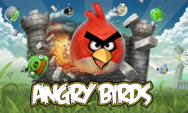
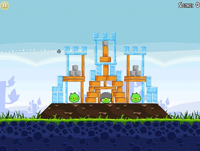
Young Finnish video game developers Rovio Mobile had high expectations for their 2009 project “Angry Birds”, but we bet they didn’t imagine they would invade the world just a year later. “Angry Birds” is a simple game where players use the touch screens of their iPhone, iPod touch and iPads to throw a variety of mean birds with a slingshot at a loggia of obnoxious green pigs that have stolen their unhatched eggs. In an era where 3D games become more and more realistic and machine demanding, the graphic style of “Angry birds” is cartoony and deprived of any flashy shines or 3D effects and offers an arcade side action game play.
The idea itself sounds pretty crazy and overly simple. But that straightforwardness and simplicity is precisely the game’s virtue. This is a game that exemplifies Mies Vander Rohe phrase of “less is more”.
So what is the key of the giant success of this project developed by a 17 employee studio in Finland? , the answer is the design. “Angry Brids” is the perfect example of platform-specific design. The game intelligently harnesses and thrives on the control method offered by the Apple touch devices. The user has an intuitive, almost immediate learning curve, as you only have to touch, drag and release. The mechanics of the game remain the same at each level, and the only significant change is the complexity of the structure protecting the pigs. That simplicity, aided with hilarious sound effects and charismatic characters are the reason of millions of fun-wasted hours a day. This game is so intuitive, that even cats can play it.
The pigs shelter in structures that you have to tear down catapulting a different bird at every try. The objective of the game is to eliminate every pig in the level by hitting them directly with the bird or burying them under the destroyed structure. To this date, the full paid version of the game has reported more than 7 million downloads, and almost every roundup of the year places them in the top three most downloaded apps in the world.
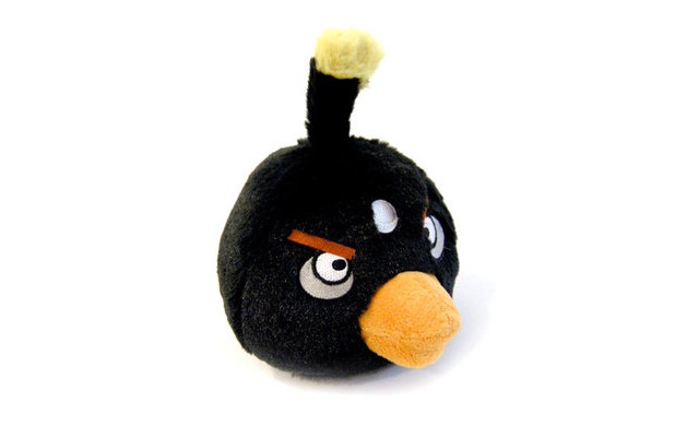
The player is allowed only to use the red bird at the first stages, but additional birds are available as the player advances through the game. Rovio has given each bird a distinctive personality making us perceive them as real characters, rather than simple ammunition. In contrast to the villains of the game, the birds have been designed with individuality in mind, giving each bird different features so the player relates with their side. They have taken special care in designing enjoyable, charismatic birds with special distinctive powers, each one tinted with a different hue according to their ability.
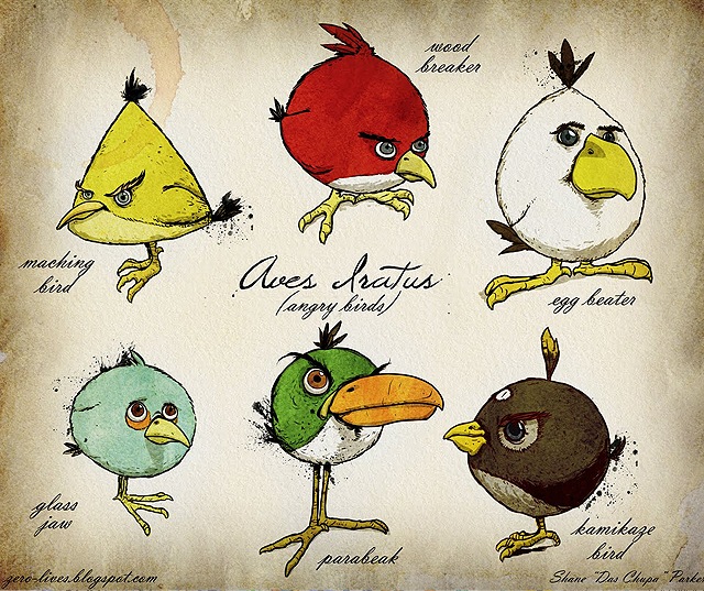
Illustration courtesy of Zero Blog.
For example, the black bomb bird has the ability to (you guessed it) turn into a bomb. The blue bird can separate into three smaller birds, so on and so forth. In contrast, the pigs are rather homogeneous, to balance the player’s affection towards the birds uniqueness and diversity.
The bird’s abilities give an otherwise simple game an added level of strategy, since you have to use wisely each bird to knock out the Pigs defenses.
The scenery is overall very simple, built upon basic primitive shapes like squares, rectangles and circles, and with no more than 5 colors. But this otherwise common background is surprising original due to the game’s incredibly fun physics. Objects explode, rebound and crumble in a mix of real life dynamics and Warner Brothers gravity style. And each stumble and break is accompanied by hilarious sound effects and a maniac music score.
So do you want to play Angry Birds, but you don’t have a smart phone? If you are a non iPhone user and are intrigued as the rest of humanity about this phenomenon, Rovio has made a PC friendly version for Windows XP and Windows 7. You can download it at www.appup.com.
Adidas wins the sportswear design battle at the world cup
When Netherlands and Spain clashed in South Africa last year, not only was the world cup at dispute. The two most important sportswear companies in the world were battling for the huge publicity that represents dressing the champions and having their brand on the front page of every newspaper of the world.
The World cup is not all just about soccer, sportswear companies invest millions of dollars in technology and marketing in a quarrel of their own. The better the teams they sign, the more exposure they will get for their brand, and not to count the prestige and respectability. Whatever kit that manages to win the world cup will boost brand sales exponentially and gain enormous popularity.
Adidas spent 200 million dollars in marketing investment signing 12 of the 32 teams at the world cup, including top world cup champions like Argentina, France and Germany. Nike signed 9 teams, including the all time favorites Brazil.
“In my opinion this industry is clearly product-driven and the product is innovation. Innovation, in my opinion, is the key to success.” says Herbert Hainer CEO & President of Adidas. Herbert continues, “we have to bring out one complete new innovative product every season, and so far we have even exceeded this promise. We are bringing permanently new, innovative products to the market, and I think this is one of the key success factors for us.”
Nike shocked the business world in 2007 reporting an 11 billion euro revenue year. Adidas has bounced back departing from their most fierce competitor marketing wise, creating campaigns that do not focus on the individual, like Nike’s Wayne Rooney and Christiano Ronaldo spots, but rather embrace the idea of a collective team. This has proven successful strategy to grasp consumer choice at the world cup, were the ambient is one of festivity and united jubilee.
Another differentiating move is their design. Nike has favored flashy and impossible to miss products, (because of the high contrast colors used in their boots, it looked in some games as if every player used Nike boots) while Adidas has went on to choose sober, more minimal shapes and colors favoring functionality. They have developed a special boot for this world cup, which they claim is the fastest and lightest boot in the world. And the cards fell on their side as none of the main stars they signed to use the footwear suffered alarming injuries, and the maximum goal scorer of the cup wore them.

Before the world cup, Nike was winning this gladiator battle of brands. Despite Adidas investment of 75 Million pounds to be the World Cup Sponsor, Nike’s strategy of flashy boots and high profile individuals was paying off. Their brand showed so much in previous world cup specials, specially through the buzz around Christiano Ronaldo, Rooney and Didier Drogba that they seemed to be the company officially sponsoring of the tournament. The Nielsen firm reported that Nike had a 30.2% of the competitor Buzz against 14.4% of Adidas. And the highlight of Nike’s campaign came with their multimillion dollar spectacular commercial “Write the Future” that knocked more than seven million views on YouTube in only ten days, but eventually three things turned the table.
First, the spectacular advert “Write the Future” directed by Alejandro Gonzales Iñarritu (Babel, 21 grams) turned to be a curse, as one by one all the players featured in the ad had awful performances, and were left out at the first stage of the cup.
Second, Adidas responded Nike’s ad with an awesome commercial of their own, that remixed the legendary Cantina scene of the first “Star Wars” movie. The union of soccer and Star Wars proved to be a fail proof bet to generate buzz on the net. Those keywords combined just popped and the idea was successful.
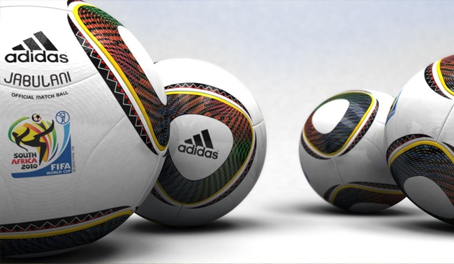
And then, it was the frigging ball. The ultra sophisticated ball made of 3D-don’t-know-what’s that Adidas so proudly bragged about was a sportive failure. Everyone, and not only the goalkeepers complained about it, comparing it to a beach ball because of its extreme lightness. And this general discomfort and the gaffes performed by goalies (don’t ask Robert Green) contributed to make Adidas the most talked about word in the media and social networks during the tournament. This boosted the brands’ buzz and aided with the Spaniards last minute victory at the final made Adidas the absolute winner of the brand war. This in example of how negative buzz is sometimes better than no noise at all.
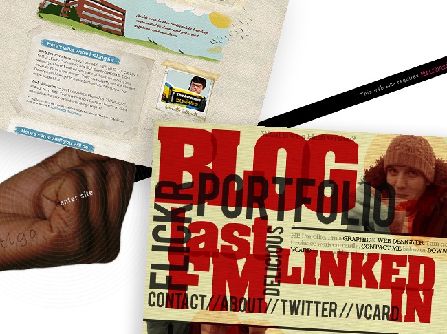
Is Flash being kicked out from web design?
Apple has been banning Flash from their devices for a long time know, dating back to the launch of their first iPhone. And the final blow happened when Apple announced they would officially kick Flash out of their so called magical device, the iPad.
We’ve all heard the rumors that Steve Jobs has referred to Adobe as “lazy” and called Flash as a CPU hog and “buggy”. Whatever those affectionate words are true or not, if you analyze the quarrel from a market perspective and a technology standpoint, it was really natural from Apple’s point of view to give up Flash support on their beloved mobile hardware.
Beyond the statements from Steve Jobs, where he points out that Flash is a true battery drainer, and that it introduces reliability and security issues into Mac products, there are two solid reasons that made the Cupertino giant take the decision of departing from their old friend Adobe.
First of all, Adobe is dying to make programmers adopt Flash as the main development platform for Apple’s mobile devices. And obviously Apple won’t let that happen in a million years because that would simply be an error, at least at the current state of the market, to allow a third party layer of software come between the platform and the community of developers. With the current app store model, only Apple has the right to approve or disapprove what runs on their products. This way they ensure quality and market share. By enabling Flash products they would give away that complete control. This will cut their revenue, and permit an array of sub standard apps to invade the market. Not to mention that if developers work dependent on third party libraries and tools, and Apple were going to include new features in their products, they would have to wait for Adobe to make updates to make these new features fully available. Nobody wants to be at mercy of their competitors. That will be like buying a gorgeous expensive house and giving the only set of keys to the neighbor.
- In the popular game “Subterranean Terrors” you aim and fire your weapon with the mouse and move the character with the keyboard. This control style is present in the majority of Flash games. How can you replicate this on a touch interface?
The second reason has to do strictly with interface design. Flash was created with mice in mind as main controllers. If Flash really sucked up batteries and drained machine resources, those issues although grave would be somehow correctable. But no matter what Adobe and Apple do, individually or in conjunction, touch screen devices cannot ever accommodate to actual flash sites. Actions like hover on, right menu clicks, and mouse over are incompatible, insolvable and untranslatable to the new world of touch interaction. Note that I’m referring to actual existing sites, that arguable 85% of top web sites that Adobe cites to be missed by Apple mobile device users. Flash Apps from now on have the dire task to evolve to touch control if they want to survive. Touch is the future of mobile devices, and will be implemented not only in Apple products.
- The lack of Flash left lots of blank spots in Steve Jobs iPad presentation to the press.
Sure Apple could make Flash content visible, but that matters little more than a ring made of toilet paper if it doesn’t work. Flash thrives from cursor control. Without it it’s just a wild car with no steering wheel.
What HTML5 brings to the design table
- This outstanding animation was made by Joseph Huckaby and Mark Ferrari using true 8 bit color cycling with HTML5.
HTML5 is the fifth revision of the basic language on which the entire World Wide web is built upon. It has caused enormous enthusiasm in the tech industry because it represents the first true step towards the so called era of the “Semantic Web” and incorporates besides other fantastic stuff, new tags like 2D and 3D canvas, drag and drop functionality, video and audio.
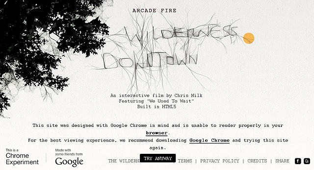
- Google and the fantastic Canadian band Arcade Fire have partnered to create one of the most jaw dropping experiments in HTML5 to date. In this interactive video shot by Chris Milk, the music and images go accordingly to the movements of your mouse, and most impressively… the action occurs in the neighborhood were the USER, that means YOU! spent their childhood.
Adobe Flash has certainly been until now the most preferred browser-based application to view rich multimedia interactive content. But without a doubt, Adobe has to be worried at what the future brings for their beloved cross-platform runtime. HTML5 is not a real contender right now to what Flash does, but, it is the first stage of the greatest evolution the web is going to experience in the next three years. YouTube, Vimeo and now Brightcove have already began migrating their video content from Flash to HTML5, taking advantage of all the out of the box features that HTML5 brings, specially the ones pertaining to video streaming.

- This is not a screenshot of MS-Paint, but a pixel perfect copy entirely made in HTML5, CSS and JavaScript by Christopher Clay.
Apple has been one of the principal advocates of the development of open standards, since they have key interests. One is to influence the WC3 board in favor of implementing their proprietary H.264 codec as the standard for video web.
“…If HTML could reliably do everything Flash does that would certainly save us a lot of effort, but that does not appear to be coming to pass. Even in the case of video, where Flash is enabling over 75% of video on the Web today, the coming HTML video implementations cannot agree on a common format across browsers, so users and content creators would be thrown back to the dark ages of video on the Web with incompatibility issues.” Kevin Lynch, CTO of Adobe
The other key interest of Apple in evolving HTML5 is to make Flash obsolete. Adobe knows that the advent of HTML5 and the Apple ban of Flash on the iPad can be a death certificate in the near future if they don’t move quickly. Though Flash is pretty important in the way Desktop PC’s experience the web, this importance on mobile devices is certainly very different. Flash gives support to every mobile device manufacturer expect of course Apple, through their Flash Lite version. But, this version of Flash is based on a previous version of ActionScript, that meaning that in reality mobile devices do not support Flash content after 2005. And to be true, whomever has tried Flash sites on mobiles phones knows how limited the experience is. So until now, Flash isn’t a full reality to mobile devices. The mobile web is all about open standards, processing optimization and touch interfaces, all areas were Flash falls short. That is in part, why the absence of Adobe’s technology hasn’t affected sales on Apple’s mobile products. The world is attending with eyes open this transcendental power struggle between technological giants to impose the web standards of the future.
“New open standards created in the mobile era, such as HTML5, will win on mobile devices (and PCs too). Perhaps Adobe should focus more on creating great HTML5 tools for the future, and less on criticizing Apple for leaving the past behind.” Steve Jobs
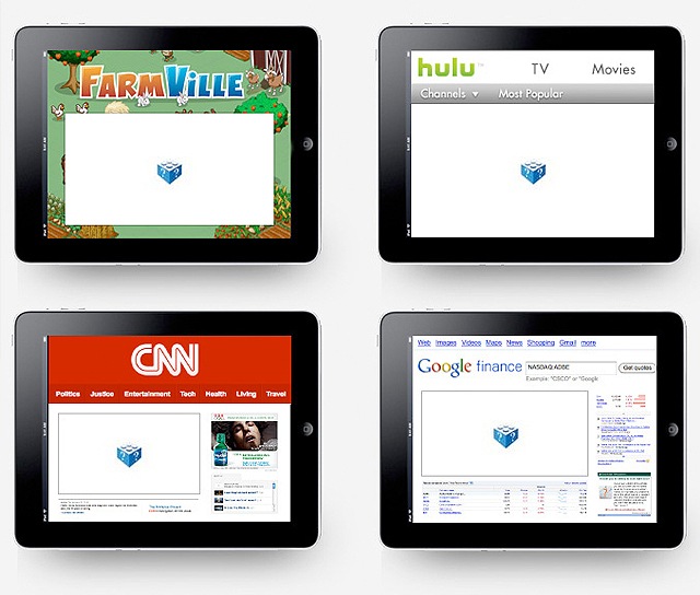
The iPad and designers
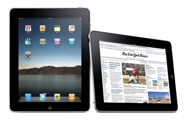
What can possibly be said about the iPad that hasn’t been said already? Mr Jobs, I hate to be writing this down now, but I have to shout out that you were right. Your giant iPhone is magical, you have made 11 million users very happy and gave humanity an indispensable tool to do things that we didn’t really have a need for.
Let’s take a small leap in time and go back 15 months. News giants have been debating new distribution and revenue options for quite some time now, since the digital era has ironically undermined their income while exponentially growing their readership. A few years ago, Amazon threw the Kindle in the wild and the world miraculously saw how the experiment worked. Digital distribution and consumption of news and literature proved to have a growing, optimistic future. The Kindle was exactly the guinea pig Apple needed to bet on their gadget confidently.
The market proved to have a gap between smartphones and laptops. Everyone saw it, but Apple was in the best position to exploit it due to their recent success with their touch phones and MP3 Players. They had all the hard work developed already; the OS, the distribution channel and the technology.
They made the most of that head start against all other technology power houses and adapted their already existing gadgets to a new size. That was all to the wonder. The iPad was the right gadget at the right time.
The iPad itself was a bit like a Kindle on steroids. It was infinitely sexier, and could not only offer news and books, but throughout the App Store model of distribution, the sky is the limit; you could can play more than 50,000 games, check your blood pressure or make your business presentations all from that little 10 inch screen. Couldn’t you read books already from your laptop? Yes you could. Couldn’t you access the Internet from a cell phone? Yes, of course you could. But you couldn’t do it from a touch screen that weighted less than 2 pounds, was less than an inch in depth and that had an interface and a control mechanism so natural even your pets can understand. There is a reason why the iPad is the most fastest selling electronic device of all time. (3 million sales in 80 days and 11 million sales in less than than a year.), it just works.
The iPad has been marketed primarily as an recreational and browsing device. But since the very announcement of the first of Apple’s touch devices, finger control sounded like an interesting productive possibility to the field of art and design. The New Yorker took a very daring move, being the first to publish a cover made entirely on an iPhone by Jorge Colombo using the Brushes application.
Also the iPad was the next step, giving artists a larger canvas and more processing power to experiment with touch interaction’s possibilities in graphic art creation. Touch interaction brings digital sketching the closest it’s been to analog traditional sketching. The natural intuitive feel and ease of drawing with your fingers has never been brought to the realm of the digital. Pen tablets have brought in the past a way for artists to bring their bag of abilities to the computer, but finger painting has just arrived and we can’t wait to see what crazy things that can be done in the near future.
Apps like Adobe ideas, Layers Pro, or Autodesk Sketchbook bring the natural feel of doodling on a moleskin right to your iPad, plus the possibility of using layers and exporting your creations as vectors. As a designer, this can be the first app you are likely to fall in love with.
The iPad’s screen size, and the fact it still doesn’t run the mayor creativity suits diminishes it’s power to be used as a full time productivity tool as a laptop. Ipad is aimed more as a useful mobile aid, where you can research, organize and sketch. Apps like imockups and the bit expensive Omnigraffle are fantastic to build up wireframes and present them to clients for iteration.
Up until know, designers presented their work on their laptops or uploaded the files to the web. The iPad brings presentations to another level, making it the most versatile presentation hardware you’ll find. You can connect it to a vga projector and stream your latest creations to a large panel of people, or make impressive one-on-one shows with the iPad display. Job hunting, and work presentation can’t be more spectacular that on this sexy device.
Google helps us design with new font apps
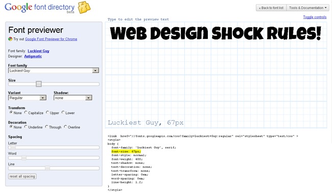
- Screenshot of Google’s extremely awesome font previewer. You can proof check in real time any of the the fonts available in the directory, and grab the code as if you were embedding a YouTube video. It’s that simple.
Steve Jobs is rumored to have said that Google’s “Do no evil” corporate policy is Bullshit. I don’t know if Google’s incursion in the phone business with the Nexus One is what pissed Apple off. I don’t really even know if the rumor is at all true. But as a simple user, you can’t help but be at least a bit suspicious at Google’s moves. I mean, anyone that has read a comic book knows that too much power accumulated in one person can turn pretty bad. (Green lantern anybody?)
Google knows what we search in the web. Through your Email, Google knows who your friends are and what do you talk with them. Google reads your documents. Google takes photos of you, of your house and your neighborhood. Google knows where you are right now.
Come on! If that is not scary then what is!. Now Google wants to give you a “little hand” with your fonts. Among all the new and varied services that Google has launched this year we find the Google Font Directory and Font API to be the most striking and useful at first glance.
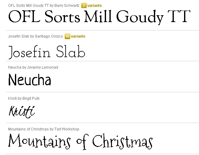
- Google’s font directory features the list of all fonts they are hosting for use with the @font-face attribute. There are not so many fonts right now, but that is changing as the use of the directory spreads and more and more designers submit their creations to the project. The font page is pretty minimal as all Google products and displays a summary. Some fonts even have Greek, Cyrillic and Latin character support which is commonly only a feature of expensive pro fonts.
Now they have made a Font Directory where anybody with a little HTML knowledge can easily test new fonts and use them in websites via the @font-face attribute in CSS. @font-face is a CSS rule that allows you to download a particular font from a server to render a webpage if the user hasn’t got that font installed in their local drive.
The @font-face attribute has been around for some time know, but the reason it has never gained wide use is due to licensing issues. Now the Google Font Directory provides developers and designers with free commercial cleared high quality fonts. Every font included has all the characteristics of ordinary text, plus some advantages, as crisp detail when zoomed and extended accessibility using screen readers.
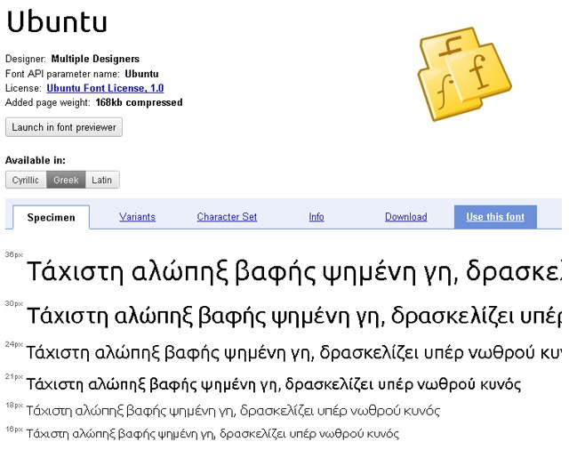
- This is a screenshot of the Ubuntu font parameters. The majority of fonts available are of the highest quality, with great aliasing and crispness.
Even the big fish jumped into Google’s new wagon. To showcase the Google Font API, Smashing Magazine has re launched their site using the open source Droid font hosted by Google. Some will ask why is all the fuzz about, since anybody can use any font while creating a website in Photoshop and saving the text as an image. Well, if you do that please go away this blog immediately!…
Nah, we are just kidding. Don’t go. If you do, before you leave us please note that Image text is a very unprofessional thing to do. Amidst many reasons there are two fundamental; Images are heavier than text, thus adding loading times, and text in images isn’t indexable in search engines. Not cool at all.
At the end, this very helpful tool for the community, could be simply a key move in Google’s mobile dominance strategy. The Android OS only has the Droid families of fonts and this might turn to be a convenient way to make fonts accessible for mobile phone developers. How Google of them!
Oh, by the way, if you got hooked with the tremendous alternatives that @font-face can bring to your designs, we recommend you check out our full implementation tutorial with over 100 free fonts.
Twitter re design
If you saw David Fincher’s movie The Social Network, you could see how difficult it was at the beginning for Zuckerberg and Saverin to find the right time, and the right model to monetize Facebook. Twitter has had that same problem right from the start and still haven’t found the sweet spot even to this date, despite having almost 200 million users worldwide and a %1300 plus user increase in 2009.
Twitter’s revenue comes from the licensing of the tweet stream to Google, Microsoft and big marketing companies. That info is pure gold and Twitter must be earning big bucks with it. But they have not yet harnessed the full revenue potential of such a mammoth.
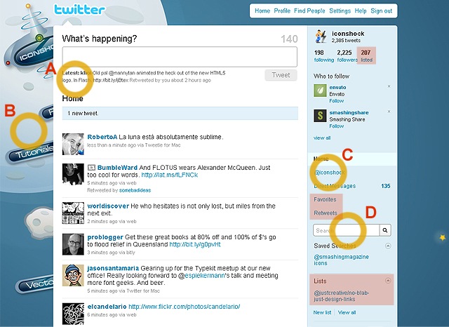
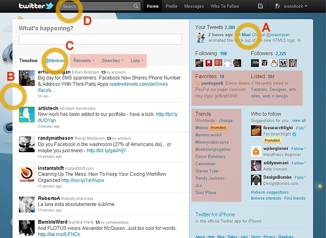
- Check these two screenshots of the old (above) and new Twitter, and compare how the different sections have been rearranged, (a.last tweet, b.background, c. retweets, d. search) and how some sections like favorites and lists have expanded. (red squares)
Twitter is one of the top 3 social networks in the world, and still they have a hard time monetizing because of their very nature. It was designed to be a platform for extreme minimalism and cool. And minimalism and cool don’t mix with ads. Twitter’s retention rate is less than 40% and most of their users don’t even visit the website to use the service, relying instead on third party apps like Tweet Deck.
Twitter didn’t go through a complete makeover just to please the fans that didn’t like their logo. Twitter is morphing and experimenting in ways to find the perfect balance between cool and sky high revenue. They transformed their almost too simple interface into a solid app full of options that maximizes the power of the service and aims to remove the need for third party software. That in the hopes of attracting users to stay longer at their site, thus generating more possibilities to sell advertisement, just like Facebook does.
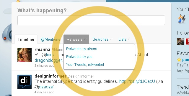
- In Twitter’s left pane, you can find the tweet stream as usual, but the @mentions, retweets, lists and search options have been placed discretely on top of the stream as simple rollout menus.
Other UX changes include moving the tabs on top of the Twitter timeline, rather than keeping them on on the right panel. They also deleted the archive tab, and added the ability to see pictures and watch videos inside the twitter interface. Now Twitter has added easier list management and an infinite tweet scroll.
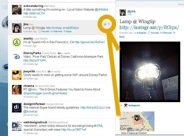
- Now, when you click on a tweet, it expands in a panel to the right revealing related tweets and corresponding hashtags. In the image above, we see how this tweet has picture and geolocation information attached that we can display as well.
Change have not come without protest though. Many bloggers have criticized the new design as a space hog, specially difficult to handle on small laptop screens. All the love twitter users have spent in designing custom backgrounds has been lost in some degree, as the new design occupies almost the entire screen not leaving much background to see. Many also find tedious that such a huge area (the entire right panel) has been left exclusively for displaying profile information and tweet history, options that you don’t need to have an eye on all the time, thus leaving too much unused space.
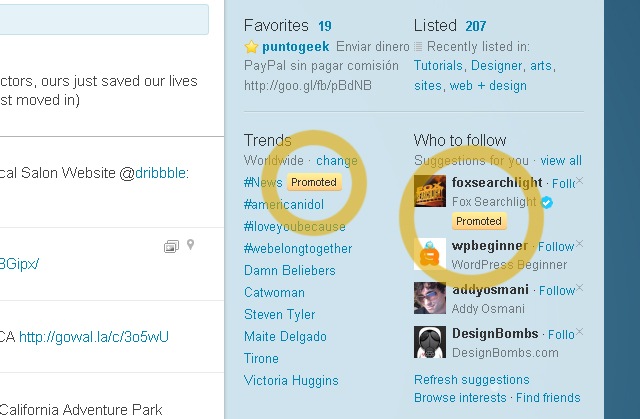
- Almost the complete right panel has been cleared from important functions in order to display promoted tweets as a way of generating income. The paid ads are posted as “promoted” Hashtags and users to follow.
The Twitter website still doesn’t do everything that third party apps do. Features like Reply or tweet scheduling are absent. But they are damn close. And eventually, they will catch up. The new design accomplishes the objective of making the average user hang out more time on the site. More time equals the possibility to deliver contextual, sponsored tweets. That means more revenue.
Hopefully that means less crashed whales for us. (You can find more information on the new Twitter, on our past article New Twitter design guidelines)
MySpace redesigns their death certificate
MySpace, oops, sorry. My___ is kind of a wandering zombie in the web. They have about 45 million active users, and many record labels still use the service as a platform to showcase music. And yet the brand seems to be six feet underground.
Many things have helped in the demise of this one time giant of social networks. First there was the “featuritis” of the site, then came Rupert Murdoch, and later came the final blow, Facebook.
In 2010, MySpace decided to make a last effort to save its sinking ship. Taking under consideration the huge backlash from fans and reviewers about their unattractive user interface, the first thing they did was to do a little paint job to their corpse. Rupert Murdoch doesn’t want to give up. They want to make a final attempt to salvage their existing user base, that although falling in a vertical slope, still represents hugely significant numbers. They claim to have 100 million users (take that with a grain of salt) and $450 million spent by other companies in advertisement.
MySpace was a true virtual realm were all kinds of people hung out with friends, listened to music, flirted and blogged. MySpace embraced almost everyone and everything. Now, their new strategy is to narrow the focus on the true believers, on what they call generation Y. They want to provide music and movie related entertainment to the segment of users between 15 and 35 years old.
They are also going to try in this reload to differentiate completely from their nemesis, Facebook. They state that their site is not about connecting with people you already know, but rather about connecting with people of similar interests that you don’t know. Hmmm. Can’t you do that already in Zuckerberg’s site?
Well sure, but not in this cluttered bling bling My___ fashion you can’t!
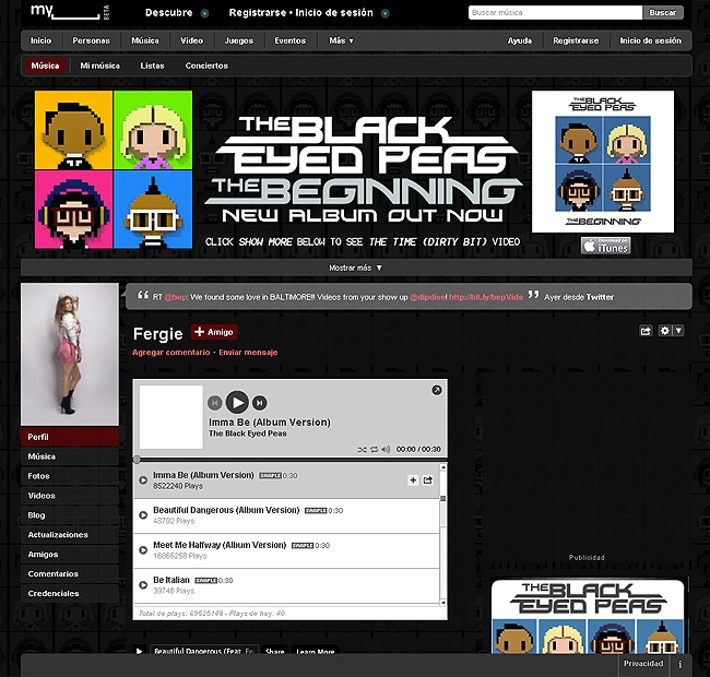
When you visit the new MySpace design, you see a much cleaner and contemporary design at first. Their homepage pops out with news everywhere, but it’s overall appealing. The bling bling shit starts to rain when you visit the profiles and find out that they just reorganized the mess they already had before.
MySpace’s design is the first thing to blame for their demise. And by design I mean lack of. Back in 2004, they were a huge hit due to their fully customizable profiles. Any person could stick their hands in the code and change each profile’s appearance. People all over the world went nuts and engaged in a orgy of color, sound and form resulting in millions of happy pages with non complaint HTML, that produced browser freezes, poor accessibility and security breaches. The jolly democratic experiment turned into an overly cluttered, non consistent site that became just impossible to navigate. Kind of the opposite of the success of Facebook. Facebook users don’t want to mess around with any HTML or customization whatsoever. The clean and simple Facebook interface represents the perfect canvas for flirting, gossip, and socializing, that’s what the average web denizen is looking for in the first place.
In our opinion, Rupert and co. are kind of repeating the same mistake, revamping the site with a superficial re arrangement of what they already had. They are not acknowledging that their problem is one of concept and essence, not repairable with shallow makeup. Sure it looks a bit cleaner. But at close inspection it’s just the same inconsistent madness. The changes they’re adopting might not be meaningful enough to save them from disappearing. MySpace’s ad revenue is expected to drop to $297 million in 2011. Their not exactly dead, but not very healthy either.
In the current state of the web you have to generate momentum, be accessible and be original. All things that My____ isn’t.
Digg redesign dug
We all know Digg. I guess that at some point of our lives, we all stared at their site for hours and hours praying for our lonesome posts to show up on their front page. I know, it never happened. But we didn’t care anyway. Content on their site was so good that it almost felt like procrastination was productive.
Digg was once the world’s most respected news aggregator service. Digg features content submitted by users and classifies it, feeding it into different sections of their website. If you like a story you “digg” it through the embedded button on the post or pasting the link directly into the Digg board. Each vote adds to its digg counter. It was the best place in the early blogosphere to discover and share content on the web.
They went slightly ahead of their main competitors, say Reedit and Stumble upon because of their clear and appealing design, and a voting system that managed to place posts from big online moguls alongside content from the most obscure blogs. Their system was somehow transparent to the public, unlike Reddit’s cumbersome and unfinished feel and Stumble Upon’s lengthy and cryptic submission process. (Although we have to say that Digg’s transparency has been put into doubt. Check this article from Forevergeek)
But as time passed, their platform, although beautifully implemented, became pray of “power users” a.k.a marketing bastards, that regularly fill Digg’s front page with formulaic content. We think in part this happens because unlike in the reedit site, the ability to “bury” a post is not as pronounced in the design and in the algorithm as the ability to “Digg”, That gives power diggers too much control.
On August 2010, Digg presented their fourth revision, the one that has infuriated the world, and has taken the company from one of the top dot com players to a startup condition again. Is that possible anyway?
For their new Digg 4, they gave a little extra “sparkle” to their logo and headers, and took a huge bet at integrating the site with Facebook and Twitter. In fact, the whole Digg redesign is a smashup between many features and concepts from Twitter and Facebook. Now you “follow” and have “followers” like in Twitter, and have a “My News” feed and a “Top News” feed similar to the “Home” and “Profile “ tabs in Facebook.
“My News” is the new default homepage for Digg users. It features Digg stories, diggs and comments of the people you’re following in real time. Although you can easily change the default page to the old view with top stories from around the world, users resented that the new Digg had such a shift of focus from global link sharing to a more social, niche structure. Digg was an information centric platform, and its users were comfortable with that. Digg has turned to a more social media experience, giving more importance to the information that is passed on by our intimate social group rather than to the global zeitgeist. We think this is a great improvement to Digg, and a accurate lecture of where the web is evolving. We can’t deny that this social media approach is also accurate regarding to what capital venture investors also want. That figures.
All the Digg backlash is proof that no matter how good change can be, people are prone to repel drastic redesigns. Discontent users have opposed heavily on the comment boards and even began a campaign to fill the top news feed with articles from competitors Reddit. Hardcore users cannot conceive their beloved site as a pure social network.
We can’t deny the great improvements this revision has. The submission process has improved drastically as you only have to paste your url in the submission box and fill out the description. Now you can even automatically submit your RSS feed. That is awesome. And in general the whole new design seems cleaner and sturdier. Digg’s sin is to grow form a content submission site to become a mutant somewhere between Facebook and Twitter.
Email’s simple design hangs on one more year
Anyone older tan 25, fierce relics of a distant past, know that email is THE symbol of the digital era. It changed communication forever, as it shrunk distances between people as never before. Not so romantic as a letter, but infinitely faster. Many of us “oldies” must recall the anxiety of sending our first E-mails back in the 90’s. It definitely felt like doing something really futuristic.
Since it’s creation, 35 years ago by Raymond Tomlinson at ARPA, E-mail has been criticized as sluggish, unnecessary and cumbersome. But no matter what naysayers call the message sending system, at 2011, it is still the most used communication platform in the world. It’s success is based on the simple design, exactly like the snail mail model that lasted for 3000 years; you write a message, you send it. Your recipient receives it. That’s all to it. There are almost 1.4 billion email users in the whole world and almost 300 billion E-mails were sent in 2010. Those numbers are Impossible to hide under the carpet.
Email is effective. simple and intuitive. That doesn’t mean it can’t improve. Google took the first step at the bat to change Email with Google wave. Wave was supposed to make email more collaborative and instant. This new platform was marketed as a radically different form of communication, one were you could drag and drop files to a conversation, collaboratively edit a document at real time, and add conference calls. As you could see at real time what the other party was typing, you could make your reply without the other message even finishing. Wave also had a translation function on the fly.
Most tech journalists called Wave an “Email Killer” and a “Twitter Killer”. It was launched with such expectation, that Invitations to Google Wave were a coveted item that reached bids of up five grand on eBay. But in little time the service proved to be excessively daunting. The user interface was intimidating and not pleasing to look at. As anyone could jump on any conversation and you could open new parallel conversations with other contacts, you can guess that Wave became incredibly overwhelming. It was a real challenge to understand and follow thoroughly each conversation as text appeared in each window as crawling, invading real time ants.
The world didn’t find a use for this mammoth chat and the service closed in August 2010 after only after 15 months in service.
“The use cases we’ve seen show the power of this technology: sharing images and other media in real time; improving spell-checking by understanding not just an individual word, but also the context of each word; and enabling third-party developers to build new tools like consumer gadgets for travel, or robots to check code.
But despite these wins, and numerous loyal fans, Wave has not seen the user adoption we would have liked. We don’t plan to continue developing Wave as a standalone product, but we will maintain the site at least through the end of the year and extend the technology for use in other Google projects.” Urs Hölzle, Senior Vice President, Operations
The failed Google Wave has not been the only one to attempt an E-Mail takeover. Social Networks, specially Twitter and Facebook are turning into communication alternatives that fill in for some of the shortcomings of Email.
While E-mail is still the dominant form of digital communication, all mail services, including the three dominant, Yahoo!, Hotmail and Gmail, have reported a drop in the number of people that visit their sites. Social Networks are growing three times faster than email and only 11% of teenagers claim to use Email to relate with their friends.
E-mail was designed to send your messages in a split second, and information was meant to be consumed in bursts as it arrived to your inbox. Social Networks communicate at the instant, and deliver information in a non linear, ever flowing stream. Email was designed in a time when you had to log on and off to the net. Social Networks are designed in an era of mobile communications, were you are always connected.
Social Networks are gaining usage over email because they are the cause and the effect of how the new generations of digital natives process information. The invention of writing came when human civilizations expanded and the amount of information they had to handle was so much that they could not longer rely on pure memory. The advent of writing changed our cognitive processes and had a significant impact on our memory retention, just as the internet is changing the we relate to each other and diminishing our verbose ability. For better or for worse.
Social Networking is made upon tidbits of un interrupted information. You tell to your friends in 140 characters what you are having for lunch, you post on your profile that you are attending to your best friend’s party and you click on a “like” button dozens of times a day. Attention span is sparse as so much information flows at the same time, making hard to figure out what is really important. With the communication model imposed by social networks, contact is instant and permanent. Call it noise if you want to be rude to Mr Zuckerberg.
Email is a terrain for more thoughtful, formal communication. The mere act of sitting down and writing a message gives it an inherit importance and creates the expectance of a response unlike with a Tweet. Sending documents, billing and exchanging important information are tasks that are better suited for Email because of its archival and linear structure. Although Spam is somehow a forgotten and manageable problem these days, email is showing its age and has a lot of room for improvement.
When you look at an email address you can’t possibly know anything about the user. (well, maybe just a little.) It is very difficult to find someone’s E-mail just having a name. Social Networks on the contrary, provide tons of information and make contact very easy. Another main flaw of Email is that you don’t have a recipient’s confirmation. When you send a letter, it is completely impossible for you to know if your recipient has read it, and that’s why we all have used and got away with the “black hole” excuse for not replying to a email.
Every technological advance ultimately succumbs in favor of another better invention. Email has lasted so much because it is almost flawless but it ultimately will be replaced by something flawless. But for the time being, Email is going to stay, no matter how hard Facebook tries to kill it.
Instant messaging, Facebook and Twitter are all great for informal chit chat and superficial conversation, but if you handle important information that you would want to retrieve, keep records and such, e-mail is better and more effective than anything else.
Microsoft explorer strikes back with a new design
Many simply stopped caring about Explorer after IE 6. Microsoft’s forgettable releases IE6, IE7 and IE8 have turned into Internet jokes because of their numerable security flaws and unstable performance.
Microsoft’s motivation was no secret. They had to develop an improved product that could bring them back in the browser war. Their most immediate objectives were to adhere to Web standards and embrace HTML5, improve Explorer’s performance compared to previous releases and be friendly to Developers and designers.
Against all odds, they have succeeded in every objective. Chrome and Firefox have to be biting their nails in angst right now, more so if you realize that the rock solid stable and polished Explorer that was unveiled last September is a Beta version.
Under the hood, Microsoft Explorer is designed to take advantage of modern hardware calling on your graphics processing unit instead of laying all the work on the CPU, which translates in rich and fast graphics while leaving plenty of main processing power free for other tasks. Explorer’s support for hardware acceleration is the biggest performance boost they could give, an advancement that competitor Firefox is also testing with their version 4 beta.
The UX design itself is intended to give content an undisputed priority over the browser’s presence. Tabs, buttons bars and all things of the sort have been left out, somehow reminiscent of Chrome, but in a much more elegant fashion courtesy of the “aero” look. There’s no branding beyond the logo on the Taskbar button. There’s no text or logo in the title bar, anything that leads to user to know they are running Internet Explorer is absent. This is a browser designed to be the less obtrusive as possible. Even the back and forward buttons are designed to blend in the page through CSS. That is cool. Explorer’s minimal design also gives designers extra real state to extend their canvases and introduce new visual possibilities.
This version of Explorer is not without glitches though. For those skin designers and customization freaks out there, I hate to tell you that Explorer has zero options for this at the time being. This in the spirit of letting the content be the main attraction, but maybe they will implement this feature in the following release if the customer base complains enough.
Another potential deal breaker for many is privacy. You can surely block elements of web pages, like those pesky browsing metrics bots, but you have to do so on a site-by-site basis. At present time there isn’t a dedicated ad-blocking add-on.
The good news is that explorer 9 is not going to be the ogre for designers anymore. Up until now, most web pages looked fine in every browser except Explorer. Web developers had to use many unorthodox and scary workarounds as the infamous box model hack or use conditional comments to make websites fully available on Microsoft’s browsers. IE9 is certainly different in that respect, as it presents a fully complaint HTML5 and CSSS product. So most likely what you design for the other browsers will work here too.
A glimpse of the possibilities designers have with these cross platform, cross browser technologies can be seen in The Endless Mural Proyect, a project led by New York digital artist Joshua Davis, that functions as a collaborative online art piece, where anyone can make a contribution to an infinite canvas. HTML5 and hardware acceleration are the wave of the future, and IE9 is capable of riding it fine.
New iPhone 4; when design and marketing clash
Can there be a more disastrous start than iPhone 4 irruption into the market?
First there was that viral photograph on the web that showed that an unreleased unit was left behind at a bar in Redwood City, California by an Apple engineer.
The people that found the iphone posted photos of the device and stated that they were willing to give it to the best bidder. Rival blogs Gizmodo and Engadget were of course very, very interested in the opportunity to be the first to test dive the smart phone, and it was Gizmodo who finally won the race and bought the device for an undisclosed sum, that many rumor was between five and ten grand.
We bet you can’t guess what happened next; The darn iPhone didn’t power on. Bummer. I guess that’s what happens when you buy a stolen prototype left at a bar. It was bricked remotely with Apple’s Mobileme service. Despite that “little” drawback, Gizmodo did take tons of pictures inside an out of the device and posted a thorough review speculating over the features and making the most out of what their hands on experience. The post did turn out into a giant success with more than 3 million hits on the first day. Apple couldn’t keep quiet anymore and asked Gizmodo to return the stolen device. Gizmodo accepted, but on the condition that the Cupertino boys declared in writing that the phone was in fact their lost toy.
How about that as the start of a marketing campaign?
The most absurd thing is that such a mess turned in the end as a positive move for Apple. All the buzz and speculation about the incident and the campaign on twitter to avoid Apple from firing the poor engineer overshadowed the launch of the iphone’s possible competitor, the Droid Incredible.
The story is seeming like a movie already isn’t it?
When Steve Jobs presented officially the iPhone 4 a couple of months later, the world didn’t remember the incident and just drooled over the new design and the fantastic specs. Multitasking, that elegant and slick case and the promise of facetalk, made the phone look like out a gadget from the Jetsons.
Apple and AT&T’s servers overloaded on the first day of pre-orders, and hundreds of freaky die hard fans waited in line outside of Apple stores a week before the phone is actually available.
Then began the second chapter of this marketing nightmare for Apple. When the iphone finally went to the public, may people started to report grave failures in the reception. Swarms of users al over the social media spectrum began to state alarming numbers of dropped calls that obligated Apple to make an official pronouncement that the problem was real and had to do with the antenna design.
As the antenna was located around the phone, the hand grip on a bare device could block the signal. Time has proved that the claims of poor reception were largely exaggerated, and that you had to handle the phone with a real bear grip to break the signal. Apple obviously knew this, but in a wise PR move, they humbly offered to isolate the antenna and spend 175 million in free bumpers to every customer.
That settled the issue for good, as iPhone’s great look, aided with the exceptional retina display and the improvements in its O.S. buried the bad press and finally catapulted the iPhone 4 as sold out success. The iPhone is an historic example of how a grave industrial leak, and failures in design can still be turned into successfully selling product. Apple somehow managed to prevail amidst a odd ball scenario with everything against them.
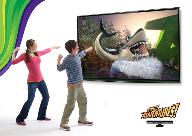
Kinect and the UI design of the future
When Nintendo Wii appeared in the market in 2006, it didn’t rock because of their huge amount of available titles, in fact there weren’t many. Graphics-wise, Nintendo was also behind competitors Play Station and Xbox.
Wii was a success because for the first time, players got inside the games they played via Nintendo’s motion-controlled gaming interface. The sole act of playing ping pong by actually hitting the ball with your hand instead of pressing buttons really was astonishing. Wii changed gaming forever.
Four years later, Microsoft answers with their much anticipated Kinect, (formerly called Project Natal) a system designed to take out gaming from the young man couch potato market and expand it to people that are traditionally unlikely to play video games. How are they expecting to do this? Erasing any obstacles between the player and the User Interface. No controllers, no learning curves. The player’s body is the controller.
This premise presents the next stage in how humans relate with computers. Suddenly Minority Report is closer that we think. Microsoft’s engineering marvel has huge potential for application development far beyond gaming. Imagine car reparation training. Ever wanted to learn a martial art? We are just seeing the beginning of a real revolution. If your body is the control, anybody, from a two year old girl to a grandpa can just step into the plate and take charge. People will just do.
This new experiment in user control is way too ambitious to see it’s full repercussions at this early stage. The people that have tested the Kinect system know that although it’s astonishing when it works, overall it feels like an unfinished product. Not every game adjusts to this new controller paradigm. The lack of feedback ruins some experiences. That is especially true with car simulations.
The system also has slight lags between the user’s movement and the game’s response. Kinect also needs too much physical space, and we think that it’s a bit overpriced. But it’s impossible not to see the potential of such an experiment in User Interface Design. These first approximations show us how different it is to design for this kind of interaction from the traditional mouse cursor. Menus and buttons have to be bigger than normal, and extremely distinctive. So long we’ve seen two selection mechanisms, one where you hold your hand on the button and a circular loading bar appears with a 2 second countdown. The other is holding your hand and doing a swipe movement. Other innovative and clever implementations will appear as developers continue working with this new technology, building improved interaction from the inaccuracy and impracticality of these first attempts.
Kinect is the next best thing. But not today.
Groupon; when simple design means big bucks
2010 showed the world how giants like Google also bleed like the rest of us. It also proved how brilliant simple ideas can grow from nothing to become billion dollar enterprises.
Groupon is a group buying platform that offers a huge deal a day, say 30% to 70% discounts and functions in the worlds most dens geographical markets. (United States, Brazil, Japan, Mexico…)
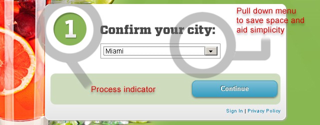
Their UX interface is attractive and at the same time clear, with big typography and a colorful but inviting scheme. Their log in and log out process is quick and inviting, unlike traditional check in platforms that turn to be intimidating and uninviting. Their business model consists in offering a promotion called “Groupon” per day in each of the markets it serves. A “Groupon” serves as an assurance contract. If a certain number of people sign up for the offer, then the deal becomes available to all, and if on the other hand, the pre determined minimum of signups is not met, no one gets the deal that day.
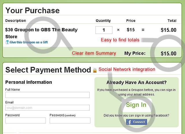
Groupon makes money by getting a cut out of the deal from the retailers. Unlike traditional classified advertising, it doesn’t cost the seller anything to participate.
In April 2010, the company was evaluated in $1 billion. Surprisingly, by November, only seven months later the company was worth $6 billion. This skyrocketing evaluation means that the average value of growth is more than $20 million per day. That makes “Groupon” the fastest growing company in history. Yes you have read well. IN HISTORY.
The company is so confident of their rise, that they had the guts to turn down a $6 billion offer by Google. They group selling bunch actually dared to spit the giant on the face. Groupon now has more than 3,000 employees and their eventual IPO will be the most anticipated public offering since Google’s.
Nobody could have predicted that Groupon and the group buying business model would explode like it did in 2010, not even the company founders. Local business and advertising has been changed forever because of the huge numbers of potential customers that the web can handle. Beware that we have not yet seen the full potential of the Groupon phenomenon.
Smashing M. blocks the design community for 24 hours
Smashing Magazine is a top 1000 website that attracts millions of users a day. Some sources say their monthly revenue is around 60 grand, while others say it’s almost 200 grand. Either case, that means a LOT of money. Their income is primarily due to targeted advertising. But they also use their platform to sell the famous Smashing Magazine book that compiles the best of their yearly posts.
On March 2010, Smashing Magazine editorial posted an open pledge for financial help. They stated in a very heartfelt and honest letter to their audience that they had invested in a larger staff, moved to a new office and acquired higher costs and thus, needed money to stabilize.
“We must admit that the situation is quite complicated right now. We have recently moved to an office and we hired more people, and we invested more money and other resources into more profound, in-depth articles written by professionals and high-profile designers and developers. Last year we have invested a lot in the Smashing Book and although the revenue was OK, the costs were huge and we had way too many unexpected costs and problems along the way.”
Smashing Magazine has been the king of design related information since 2006. The project took very little time to take off because of their regular, easy to read, extremely engaging content, plus a clean and minimalist design. As the website has popularized at ridiculously enormous numbers, their content has ignited controversy, signaled of lowering the quality bar and being excessively reliant on lists and countdowns.
Despite the polemics, It is undisputable that Smashing Magazine is the biggest outlet of design related information in the whole web. The spectrum of content has grown to embrace other interests as well, as business and marketing, always maintaining a good level of engagement with their public, and providing useful and interesting posts at a regular basis. I think there is not one of us that hasn’t been saved by a tip found on Smashing Magazine. Their business model have always been one of providing free content, earning revenue through advertising.
The reason why Smashing Magazine is present in our countdown is because their pledge provoked an intense and fiery debate over the validity of the free content model and specially, over the method used by Smashing Magazine to attract readers attention.
Smashing Magazine froze all their content for 24 hours, and redirected every article to a page were users could buy an emergency product, a 12 post compilation PDF about web design for $9.90.
The world of design was shocked as their main source of digital information was shut down to ask their readers for money. So many people use the blog, in fact millions per day, that impact has huge.
Almost the whole world functions these days relying on information that is trusted to the cloud. Gmail, Wikipedia and Facebook control vital information for the world to spin. All these services are free. The Smashing Magazine example points out a serious question. What will happen if Jimmy Wales shot down Wikipedia or Zuckerberg shut Facebook for a day? What if Gmail went out of service?
There is above all, an inevitable moral responsibility in a corporation that serves information and is entrusted by millions of users. Governments have to be aware of this and begin to discuss about it.
Smashing Magazine is all about design. Their archives have tons of articles about business and design planning by respected professionals of the field. In fact, they are respected professionals themselves. It is very unlikely that they made clumsy planning and got themselves trapped in a tight financial corner. In fact, when you do get to that point in a business, there are various strategies to follow. What Smashing Magazine pulled off was disrespectful with the very same audience they depend on. They practically bribed their audience bullying to shut down the site if people didn’t cooperate with the “cause”. In proper corporate practice you cannot just claim to have serious financial issues, shutdown the website to force sales of a PDF and re launch the website the next day with a disclaimer stating that there wasn’t really much of a problem in the first place.
What Smashing Magazine did is the exact opposite of how you have to manage PR in a big company. Such a move hurts the reputation and consumer trust in a brand. But the web handles such astronomical amounts of potential viewers, that any user they might have lost will be replaced by three more that didn’t even hear about the incident. The obnoxious stunt did go their way, because they won tons of free publicity, many people bought the PDF and things went back to normal. But the sins are already committed. They are taking for granted the trust of their loyal readers, undermined their free content model an treated it as charity. They purposely confused their audience. Only time will tell if their reputation will be damaged in the long term.
Minimalism, Comic Sans and retro design
The complete democratization of creation, and the difficulty to adopt proper distribution and revenue models are two of the most fundamental changes that the digital era has brought to artists and designers.
Now like never before, artists can produce works and evolve their styles having access to tools unimaginable to other generations. But as the digital era gives the opportunity of unlimited creation, at the same time the web is so huge that it is still very difficult for artists and designers to get distribution for their work, and without distribution we all know there is no revenue. Large scale distribution is still in hands of a few conglomerates that amidst an economical crisis aren’t willing to bet for ground breaking originality, and stick instead for safe secure formulas. Don’t you feel in the 80’s when you turn on the radio? Why are there so few movies circulating in theaters? SO many remakes? Why did we get back to 3d, a long gone discontinued technology?
This affects every art in a slight different way, but the panorama is more or less the same throughout. Some say the distribution problem is not the only one to blame for an evident lack of originality we are suffering these days. Some say the crisis of the education system world wide, and the high level of distraction new technologies offer are part of the problem.
These issues affect web design too. Web design is a very new discipline of the graphic arts, that unlike others, is dependent on an ever changing and evolving output medium. Web design’s aesthetics have never settled down, as the rules have been regularly redefined as the web has advanced.
In the last few years, technology has advanced to a point were designers have been able to use the medium as a mean of true artistic expression, liberating from rigid structures and bringing to the browser possibilities that we are only beginning to explore. Last year we could see was how many early twentieth century artistic movements have influenced web design and turned into trends.
Minimalism, a concept attached to the first half XX century modernism, has been approximated by web designers that have thrived on its principles and exploited them. The importance of negative space, the austerity of elements, and prevalence of functionality are all concepts that we can trace trace back to Mies van Der Rohe, Kandinsky and the Bauhaus. These principles of past movements have flourished in the first decade of this century, influencing everything from our cell phones to our computers, from tv branding to the latest browsers.
The past is in fact kind of a mayor reference for today’s aesthetics. Suddenly we are seeing how pastel colours and tones popularized in the 40’s and 50’s are taking place again in advertising and clothing collections. A lot of today’s logos surprisingly look contemporary if put fifty years back in time, with heavy use of serif adorned typography and art deco patterns.
The aesthetics of the web also is turning back on itself, rediscovering traits despised in its very same short history. Comic sans for example, has been one of the most popularized fonts since its inclusion in mid 90’s in the basic pack of fonts in Windows Operating systems.

The font was initially designed for informal comic style dialog bubbles. But as Windows operating systems came world wide popular, and people of all tech and design skills began to play with the software, Comic Sans proved to be the most appealing and friendly of the fonts available at the time. This lead to a funny, sometimes offensive and always fun overuse, ranging from wedding invitations and school signs, to ambulances and gravestones. The font has appeared in the New York Times, and even Canada issued a special commemorative 25 cent coin featuring it.
The font has been despised for many years by designers because of its alleged spacing problems, vulgar feel and puerile look. Well, 2010 saw the bashed font’s revival, even if it was only for a few months. Nobody actually began using the font, but many designers did publish innumerable posts defending the typeface, enlisting its silly and juvenile design as values to be exploited.
That’s all folks!
Hope you have enjoyed this post and relived the very convoluted year 2010 was. So many things seemed to happen in the world last year, and yet there is a sensation in the air that the events are just part of something greater. Don’t you think?
The iPad 2, Facebook’s and Groupon’s IPO and the tons of developments with Kinect are just some of the exciting things 2011 will bring. So grab to your seats and prepare for one hell of a year, if the Mayan predictions aren’t true that is.