


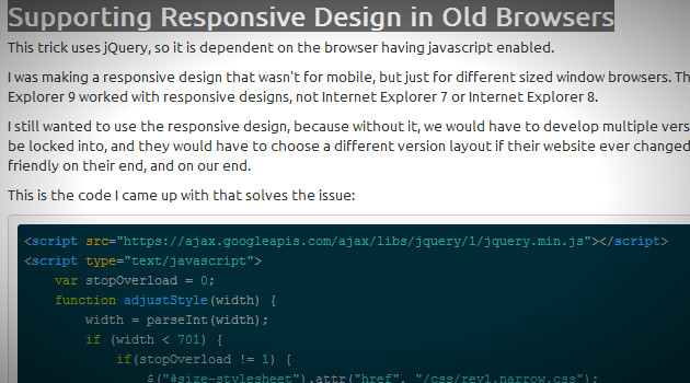


How to Pick the Right Icon Sets for Your Design Projects
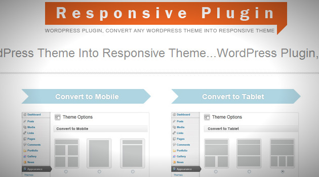
Icons in graphic design have emerged as a tool that helps reduce the use of large amounts of text or illustrations in a design. Additionally, icons almost always come in sets, as their thematic similarities in size, lines, colors, among others, make them versatile and easy to handle, allowing them to complement or form the structure of a design. These have helped thousands of web designers make their users' experience easier and more enjoyable. Icons indicate things that may not look aesthetically pleasing in words, and as always, a user's first impression of the page they are visiting is what matters. For this reason, experts like Erik Messaki (2020) consider that while many users love icons, others find their use unnecessary and excessive due to lack of simplicity, detail, sense, among others. Therefore, it is crucial to know how to choose the right icons for your website or design project where you are using them. In this article, we will explain the characteristics of icon sets and how to choose them correctly. Types of Icon Sets in Graphic Design Flat Icons Simple and minimalist icons with clean lines and limited colors. They are often used in modern web design and user interfaces. These types of icons are the most common. You can find this type of icons in the "6000+ Unique Flat Icons Bundle" which includes over 38 categories of icons divided into different themes. One of the advantages of flat icons is that they allow for different thicknesses and shapes to be used during their creation, depending on the desired visual aspect. Similarly, flat icons have many advantages. According to Activate Design, this type of design allows them to adapt to the user's screen size when used for web development. Since they have less graphical content, the scaling occurs faster, allowing the webpage to load more quickly. Just as it has advantages, it also has many disadvantages, especially in terms of creativity. Flat icons limit designers because their creation is more tied to geometric shapes and practicality rather than being purely aesthetic beyond minimalism. Material Design Icons A set of icons developed by Google, following their Material Design guidelines. They are characterized by bold colors, subtle shadows, and a sense of depth. The symbols are available in three styles and four adjustable variable font styles (fill, weight, grade, and optical size). An example of this can be found in this package "6300+ Vector Material Design Icons, Colored & Solid" The pack features pixel-perfect icons in colored and solid fill variations that can be used on their own or as active/inactive states, and every icon included comes in vector Ai & SVG file formats, as well as 5 PNG sizes, and a commercial license is also included. But what are the advantages of these icons compared to flat icons? These icons, in addition to providing a broader user experience, give designers the ability to have more structure in their designs (Cameron Chapman). However, one of the major disadvantages of using this type of icon is that, being associated with Google, they tend to work perfectly on devices that use this system as their base. On other devices where it is not the native system, they may work, but not as effectively as on Android devices. Glyph Icons to Represent Data Glyph icons are monochromatic, usually single-color, and often resemble simplified versions of objects or concepts. They are commonly used in UI design to represent actions or features. By using these icons, importance is given to negative space, which creates a sense of volume and depth. These icons are considered subtle; they are not flashy but are effective in terms of functionality (Medium) They are not cluttered, so they do not overwhelm the user, and they look crisp at any resolution. An example of this is this package "1500+ Interface Line Icons Pack" The pack is super lightweight, and the icons are designed in line icon style. Every icon is delivered in separate SVG vector files as well as 2 Figma files for 24x and 48x sizes. Additionally, you'll find 36 PDF files with every icon category grouped for convenience. Outlined Icons that Allow Small Visual Changes Similar to flat icons but with outlines instead of solid shapes, providing a more subtle and versatile appearance. They work well when accompanied by other elements, meaning, unlike solid icons, outlined icons allow them not to be the center of attention in the design but can be handled with other graphic elements such as text (Radian Digital) An example of this is this package "330+ Customisable Animated Icons Pack". This collection works on all major browsers, including Chrome, Safari, Firefox, and Edge. All icons respect the reduced motion operating system settings, perfect for website and app design, handcrafted and hand-coded. Vector Icons that Do Not Lose Quality Icons are created using vector graphics, which means they can be scaled to any size without losing quality. They are highly versatile and widely used in various design contexts. This type of icons is formed by points or nodes on a digital canvas, which are then connected with paths or curves, creating a network of geometric shapes. This means that the designer can have control over the shape of the icons, and these won't degrade the quality of the design, meaning they can be edited or reverted without losing details. An example of these icons is this package "12,500+ Vector Icons, 111 Icon Categories" From my experience working with icons, vector icons offer the most flexibility and creative control. Working with this format makes them editable and scalable, with infinite resolution. They are also less heavy, which means they don't add unnecessary weight to web designs. Another advantage is the sense of realism that can be applied to these icons, which makes the user experience more enjoyable. Line Icons Icons are composed of simple lines and shapes, often used in minimalist design styles. They can convey information effectively while maintaining a clean aesthetic. These types of icons are classic and serve for a simple and tidy aesthetic. An example of this is this package "Fancy Icons: 11,000 Vector Line Icons for Figma" The collection features 4 icon styles including Line, Duocolor, Duotone, and Solid Fill, perfect for Active/Inactive states; Light & Dark versions, and over 20 icon categories with everything you'll need: UI interactions, arrows, date/time, chat, security, sports, weather, IT & engineering, finances, and many others. Illustrative Icons with Different Styles Icons designed with more detail and artistic flair, often resembling illustrations rather than simple symbols. They are great for adding personality and visual interest to a design. An example of this type of icons is this package "50 Amazingly Designed Retro & Vintage" The package features 50 different vintage elements that can give your new designs a stylish old-school appearance. Each icon has been carefully crafted by design experts at Iconshock, ensuring cutting-edge quality where every pixel has been placed with care. Combining icons with illustrations is a strategy to make a visual impact and help users achieve a sense of realism and tangibility with what they see on the screen. Illustrations have their significance in that they reconnect us with the visual experiences we had as children. (Big Human) In other words, it is easier for a person to recognize an image than a symbol made up of lines. 3D Icons for a Real Experience 3D icons are rendered in three dimensions, providing depth and realism. They are less common than other types but can be effective for certain design needs, such as product visualization or gaming interfaces. Additionally, they make the design feel more real and tangible. An example of these types of icons is this package "150+ Animated & Still 3D Icons Set" These icons are made in Illustrator, tailored for various niches and projects, including marketing and advertising, web design, print media, presentations, infographics, resumes, and more! These icons feature ready-to-use versions and editable versions, where you can easily customize their colors through Adobe Photoshop to match your brand's or project's color palette. After understanding the types of icons, it's important to understand their utilities, as this defines how we will choose the icon sets we need. Uses of Icon Sets in Graphic Design Created with ByPeople Composer User Interface Design (UI) Icon sets are widely used in UI design to represent different functions, actions, and features within digital interfaces such as websites, mobile apps, and software applications. They provide visual cues that help users navigate and interact with interfaces more intuitively. In this case, there are three categories: Universal icons – For example, on a website, the homepage is represented by a house icon, which clearly indicates its function. Conflicting icons – These have different uses depending on the context. For instance, a heart icon often represents favorites on a wishlist. While we may not immediately associate the heart with a wishlist, we do connect it with something we like. Unique icons – These represent specific themes or topics on a website, ensuring that users understand the same language used on the site. Mobile App Design Icon sets play a crucial role in mobile app design, where space is limited and visual clarity is essential. Icons are used for app navigation, menu items, buttons, status indicators, and various other interface elements to ensure a seamless user experience on smaller screens. For mobile applications, creating and using icons that are not too complex to understand is crucial. Most users need a symbol that universally represents something. Otherwise, you might end up with an inbox full of users repeatedly asking where certain functions of your app are located. For example, if you’re designing an app focused on dogs, use icons like paw prints, ears, and snouts—elements that 80% of the population would associate with pets. Print Design Icon sets are also used in print design for brochures, posters, flyers, infographics, and other marketing materials. They help convey information succinctly and add visual interest to printed collateral, making them more engaging and easy to understand. Presentation Design In presentations, icon sets are used to illustrate key points, highlight important information, and break up text-heavy slides. They make presentations more visually appealing, engaging, and memorable for the audience. Brand Identity Icon sets can contribute to a brand's visual identity by incorporating consistent styles, colors, and themes. Custom icon sets can be designed to reflect the brand's personality and values, reinforcing brand recognition across different touchpoints. Data Visualization Icons are often used in data visualization to represent different data points, categories, or concepts in a visually appealing and easy-to-understand manner. They help make complex data sets more accessible and engaging for viewers. Infographic Design Icons play a central role in infographic design by visually representing statistics, facts, and concepts. They help break down complex information into digestible chunks, making infographics more engaging and easier to comprehend. Email Marketing Icon sets are commonly used in email marketing campaigns to draw attention to important sections, such as calls to action (CTAs), social media links, and content categories. They help improve the visual hierarchy of email layouts and increase click-through rates. Understanding the utility and relating it to the types of icons is vital. For example, in web design, it's not recommended to use illustrated or 3D icons because it would detract from the aesthetic and functional sense of the design. When errors are made in choosing icon sets, it's not just about selecting an icon, but also about maintaining a consistent graphic style when they are grouped together. Common mistakes are often made when selecting icon sets because, in addition to design, functionality is also essential. Icons need to be vectorized, editable, in a format compatible with certain programs, etc. This is a beginner's mistake when searching for icons; we don't read the package characteristics and simply rely on visual appeal. Later, we realize that it doesn't work for us, and we end up with an unused set of icons. Advantage of Using Icon Sets Created with ByPeople Composer How to Choose an Icon Set According to Its Use In broad terms, when choosing an icon set, the first thing you need to do is identify all the icons you know you'll need in a project before selecting a set of icons. So, the first thing you'll notice is the category, and after that comes the consistency within the category or selected icon category, whether it's in size, color, lines, etc. Additionally, they should maintain geometric symmetry. Another important point to address in visual terms is negative and positive spaces. If the icon is not well balanced with the negative space, it will blend in at small sizes, becoming a blur. This can be easily checked: simply step away from the icon and see if you can still see it from that distance without losing quality. Furthermore, color contrast should make sense, both in color and shape; they should maintain a consistent graphic style. This ensures that in the sets, no icon stands out more than the other and they can be used together. Now, according to their use, as we have mentioned throughout the article, it's important to understand that icons, and especially sets, should align with their functionality. For a brand identity, for instance, something flat is not sought after; rather, something eye-catching and captivating is desired. In this case, an illustrated or 3D icon related to what the company wants to communicate could be chosen. Format is also crucial for executing projects with icon sets because creating a logo with PNG format icons is not the same as with EPS. The former may distort, while the latter maintains its shape. Therefore, having explained the points to consider when choosing icon sets, let's move on to the most common types of formats. Icon File Formats SVG (Scalable Vector Graphics): SVG is a vector graphics format widely supported by web browsers and design software. It allows icons to be scaled to any size without loss of quality and is ideal for use in responsive web design and high-resolution displays. PNG (Portable Network Graphics): PNG is a raster graphics format commonly used for icons on websites, mobile apps, and other digital platforms. While PNG files do not scale well, they support transparency and are suitable for icons with complex designs or details. ICO (Windows Icon Format): ICO is a native Windows icon format used for displaying small images or icons in various parts of the Windows operating system, including desktop shortcuts, file icons, and folder icons. AI (Adobe Illustrator): AI is the native file format for Adobe Illustrator, a vector graphics editor. Icon sets distributed in AI format allow designers to easily customize and edit the icons using Illustrator. EPS (Encapsulated PostScript): EPS is a vector graphics format commonly used in print design. EPS files are editable and can be scaled to any size without loss of quality, making them suitable for printing at various resolutions. PDF (Portable Document Format): PDF is a versatile file format commonly used for sharing documents and graphics. PDF files can contain vector graphics, raster images, and text, making them suitable for distributing icon sets that need to be easily accessible and printable. PSD (Adobe Photoshop): PSD is the native file format for Adobe Photoshop, a raster graphics editor. Icon sets distributed in PSD format contain layers and editable elements, making them ideal for designers who use Photoshop for their design work. Icon Sets for Your Projects Vector Icons Set – 1500 Color Icons, 30 Categories, 5 File Formats This icon set comprises a collection of vector icons, featuring 1500 color line icons across 30 icon categories, including medical and healthcare metaphors, weather, economics, web, along with fully editable vector sources in three file formats, as well as two rasterized file formats ready for use. These types of icon sets are suitable for websites, presentations, applications, infographics, print templates, among others. They come in AI format for Adobe Illustrator, as well as EPS and SVG files. 3D Labels & Stickers Pack for Figma & Blender, PNG Files Included This is a collection of amazing 3D style assets for you, featuring a set of 3D labels, stickers, and icons with fun comic-style speech bubbles and sound effects, sale labels, crypto-themed designs, 3D icons with medals, crowns, and trophies, vehicles, boxes, clocks, and more. You will receive 5 sets of 3D designs with high-resolution PNG files ready to use, with transparent backgrounds and print-ready. These are perfect for both digital design and print. They also come with Blender or C4D 3D source files for each design, which can be modified to fit your projects. Accounting & Finance Icons Pack – 700 Icons in 14 Different Styles This collection features 700 accounting and finance-themed icons that can be applied to desktop and web projects and customized. They are delivered in vector format, in color, and editable. It includes a high-resolution export of each icon in raster formats that can be dragged and dropped into designs directly. This icon set has 14 different icon styles, including line, glyph, filled round, flat round, long shadow, low poly, and many others. Each one is delivered in four vector formats so they can be opened with the necessary software. It includes Ai files for Adobe Illustrator, CDR files for CorelDraw, as well as EPS and SVG vectors compatible with vector editing. Additionally, it is delivered in 20 PNG sizes and organized layers. 3D Icons Pack – 650 PNG & Blender Icons for Tech, Marketing, Crypto, Business & More This icon set offers premium-quality 3D illustrations and scenes with over 650 designs in seven distinct styles that you can use for web and mobile UI/UX design, social media graphics, advertising, presentations, videos, branding, packaging, and more. They are delivered in raster image files for high-resolution use, as well as editable source files that can be modified. These icons are provided in high-resolution PNG files with transparent backgrounds in color, ready for printing. Additionally, 3D files in Blender format are included for these icons, which are editable for use in projects. Vector Icons Pack with 1380 Icons in 3 Styles, Vector Sources Included These icon sets contain 1380 icons each, with vector sources and ready-to-use files in three different icon styles, including color, line, and solid fill, which can be used for active and inactive states. These elements can be used in UI designs, for decorations in your presentations, infographics, and printing templates, along with twenty icon categories ranging from business, travel, sports to health transportation. These icons are available in four vector font file formats: Ai, EPS, SVG, and PDF, which can be worked on in Adobe Illustrator, Inkscape, and GIMP. Popular Applications Icon Set High Quality Finishing Here's another great set for you guys, this time a complete set of icons featuring the most popular applications nowadays, it includes some interesting applications such as Dribbble, 280 slides, Android, OSX, Dropbox, Google Plus, and many more. This set was created by the design team behind Iconshock, the artists of the Shock family. 204 Google Plus Interface Icons, Including Several Sizes (Pixel Perfect) This icon set features Google Plus interface icons ready for download. It includes vector fonts in PNG as well as pixel-perfect PSD fonts in color and gray versions, in different sizes. These icons are created by our team, which gives an even more special sense to this package, it has been crafted for your design projects, infographics, web applications, among others. From large vectors to pixel-perfect versions, each icon has been created by pixel experts to guarantee a high-quality product that you can truly enjoy. You can find the large versions in two different sizes and color/gray versions; as for the pixel-perfect versions, we have included the original PSD files so you can work with them freely. 150 Valentine’s Day Icons: Pixel Perfect Vector Icons for Lovers This collection is perfect for projects related to love or friendship. It's a package of vector icons in color line style, with pixel-perfect creations, PNG files in five different sizes, and fully editable vector files in Adobe Illustrator. This package is ideal for adding effects on special occasions or for cards, posters, or infographics related to the theme. Vector Stock Logos Pack, 500+ Editable Logo Templates in Ai & EPS Formats This package contains a collection of over 500 vector logo templates, each delivered with fully editable vector sources that you can customize to your liking: change shapes, scale up & down, recolor, add and remove elements, and more, all without losing image quality. Each logo is delivered in Ai format for Adobe Illustrator as well as EPS for other vector editing software, and they are fully layered & organized. They also include a high-resolution PNG file, 4000x4000px, with a transparent background, print-ready at 300dpi, that you can add to your projects and use these designs straight out of the box without the need for editing. Essential 3D Icons Pack – Files for Figma & Blender, Includes Transparent PNG Check out this new collection of 3D icons featuring a set of 100 editable icons in 2 different view perspectives (front and isometric) with all the essential metaphors for interface interactions as well as food icons and illustrations that you can use to decorate your projects, use as primary elements in your digital compositions for backgrounds & illustrations, or place in your templates for printing business cards, flyers, posters, and more! You’ll find gears, calendars, notification bells, magnifying glasses for search functions, doughnuts, bottles, cups & many illustrations more! In conclusion, we can affirm that icons are highly practical and serve numerous functions essential in the world of design to execute projects. Additionally, Icon Sets are particularly useful for designs requiring uniformity, dynamism, functionality, and aesthetics. It's worth emphasizing that creating sets isn't just about achieving visual aesthetics but, as we've mentioned throughout the text, ensuring that formats and structures are compatible with other types of software is crucial for the success of these packages. Created with ByPeople Composer As you can see, we have thousands of options here that cover most of the utilities that icon sets offer, whether you're a graphic designer or just an enthusiast. They will be practical for any occasion. It's also worth understanding that we coexist with icons, as we see them everywhere, from our phones to the signs we see on the street. Don't forget the communicational and design importance of these graphic elements.