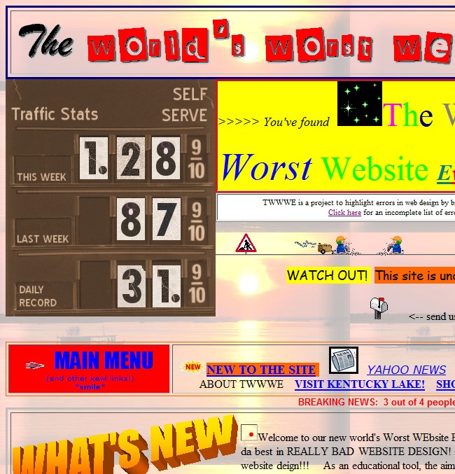
What makes a website to be featured among the worst places on the internet?, that’s a question that may seem a little bit narrowed for many ones, as people usually focuses more in functionality than in developing user-friendly places (not just bad-ass corporative facilities). It seems that even in 2010, there are people that haven’t realized about the major part that good design plays into the success of any web company, and they keep concentrating all their efforts in hiring programming engineers and SEO services.
On this article we will launch some sparklers into the dusk to figure out the signals that you need to be aware of when facing a bad web design, we will help you identify the main faux-passes to avoid when designing a website by witnessing some examples along with a clarifying explanation on each case.

Icon by Iconshock.
At the beginning of this article, we defined our research parameters according to one of our previous post “30 deadly sins of the web design business”, we suggest to read that post before digging into this showcase, you will find some great references regarding how to make a kick-ass website and the main errors you need to avoid. We selected the sites based on the most relevant web design sins:
- Cluttered layouts (everything is just a mess)
- Excessive words (talking literally 5h1t)
- Dark backgrounds with too much text over
- Bad appropriation of lists
- Scattered information
- Difficult navigation (you’re not designing for a genius nerd)
- Non-easy to read headings
- Using multiple pages for single posts
- Too much ads across the page and more sins that must be definitely avoided when developing a website.
After defining the standard values that might help define a web design as “bad”, we proceeded looking for the main sources to gather the needed information. We used Google Instant Search (one of the few good things that Google has made during the recent months) to navigate across the main results; we input a series of key words, including “web”, “design”, “websites” “big f%ck1n6 deal” and etc. Then we decided to redirect our search to the main directories that are focused on listing the top sites of the web, including the Alexa ranking, Web100, Fortune and more.
The reason why we opted for checking the main web rankings is because well, it’s understandable that your Kansas’ auntie owns an ugly website, because probably some guy at the town helped her out by putting everything in Publisher and using pure Papyrus and a yellow background. It’s also an innocent sin find some high school kid releasing his personal site made in Flash and oversaturated of animations and GIF elements.
So the judgment that we’re taking on this article is against the major websites, those that have reached major audiences and/or posses the money facility to develop a fancy and elegant website, but instead, what we see is that they’ve got trapped in the past with poor designs, bad typeface management and doubtful color palettes, which only exposes the fact that they’d rather spend thousands of dollars on new curtains than on the revamping of their websites.
Now it’s time to begin with the roundup, we’re about to list some of the worst web designs (we apologize for any further eye damages) of major companies, social networks, blogs and similar, we will explain the main flaws in each design and how to make them look less Ugly Betty, along with a similar site that has an actually good design so you can make a comparison and see who’s messing things up when it comes to design.

Icon by Iconshock.

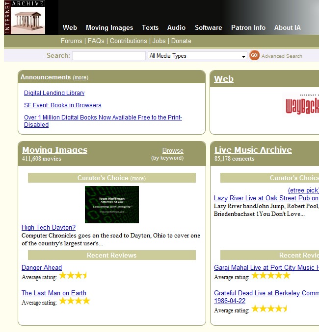
For our first nominee we have selected Internet Archive, please come upstairs to receive your award. After more than 10 years of its foundation, the site has become one of the most helpful internet databases around. Gathering thousands of images, sounds and text references, this site has been helping students, teachers and researches for more than a decade (damn now we see why the library was getting lonelier lately).
The thing with Internet Archive is that its design got caught in the nineties, with the classic blue underlined links that every dummy was able to implement, lots of rounded square boxes, a boring alignment with everything placed towards the left and a cliché sepia palette taken from the basic MS Paint color box.
So what can we do to make this site look less uglier?, let’s start by hiding the blue underlined style of the links, that was cool 10 years ago when Doctor Drake Ramoray was still hot, but not anymore, instead of that you can:
- Play with hierarchies, determine what’s more important in your design.
- Use italics, it’s an elegant and simple way to fancy any typeface.
- Bold typefaces can often work when properly used.
- Any color but #0645AD.
Secondly, the rounded square boxes could be a good resource when used properly, but when everything gets boxed inside these elements, the diagramming starts looking heavy and boring, this is a mistake that many amateur designers commit because they’re so chickened out that they prefer to play it safe. As for the alignment, it’s better to vary once in a while, leaving some texts centered, others aligned to the right, remember to make a proper use of kerning and tracking and just be more risky in the process.
One of the most important things is the typeface. During the nineties, many sites where made in Times New Roman, Arial or Comic Sans, well the truth is that they were not many available fonts and at the end the decision was between these 3 famous fonts or Courier New and Bank Gothic. We have nothing against these typefaces, but it’s time to make a change, there are even software that let you design your own fonts, but if that’s to much for you to think about, then navigate across the internet to find some pretty cool fonts. We suggest you to take a look at Dafont and the Google Font Directory to get really inspired.
Don’t bound yourself to the same 28 colors that Paint offers by default, because you’re not longer a kid with zero color theory education, tough it’s important to say that many nice websites are designed using only these colors. There are many tools to work with color, both in programs as online. Some examples are the Color Artwork tool in Illustrator, Kuler in Photoshop and Color Schemer for those who want to work online.
Better design: The FWA

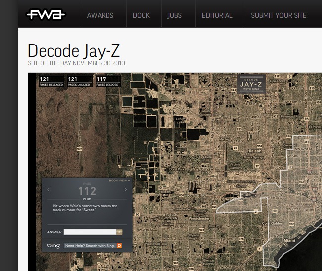
If Internet Archive is an example of bad design, The FWA is a reference of a better design within a similar thematic. Both sites work as directories, but this one has a better design that incidentally when it still needs some improvement (even Jessica Alba could look better), this site looks way nicer than the other. But how is it possible when both sites need to diagram the same amount of information in a similar space?.
Flash is not dead
On this tuff days, when everybody is watching the epic clash between Flash and its several contenders (HTML5, jQuery…), we want to state that at least until this moment, Flash is still alive, and only the apocalyptical 2012 will reveal its destiny. FWA is a beautiful directory to find inspiration in a fast and easy way, and that’s the reason why we catalogued it as a better design respecting Internet Archive.
They went for a more risky structure, that helps to organize the information more clearly. The information is divided by strong color blocks that though present a gradient, they’re not too loud. If you pay attention you will realize that the color plays an important role on the diagramming as well as the screenshot of the different Flash websites that are included on the site, just try to imagine this site in sepia and the design will suffer a lot.
So what’s the difference between these two sites?. First we have the diagramming, which on the first case is horizontal and cluttered, while in FWA’s case they decided to work vertically (it’s true that there’s a lot of waste for not using the side areas) that fulfills the objective of providing and organized and consisted frontpage.

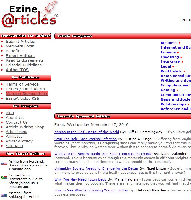
Ezine is the place to be if you’re writer, either amateur or expert. Hundreds of people send their articles to Ezine, making the site richer very day. The amount of topics is quite extended, from finances to cooking, you will find a lot of references to clarify your doubts. Ezine is permanently up to date, with new fresh contents being uploaded every day, so don’t worry about finding Watergate documents as the hot topic of the day.
But we are talking about design, and that’s something that the people at Enzine seems to not be worry about because they’re too busy hanging around and having fun. Let’s start with the site’s logo, it’s awful; a vectorized pen with an ugly shadow behind it, a bad looking font with an unpleasant gnawed stroke line and finally a big trademark symbol.
As for the headings, there are two capital sins in them. The first is the use of gaudy gradients, that’s something that not many people enjoy on these days. If you’re going to use gradients, make sure that they’re not to loud, a black and white or red and grey gradients are not cute, instead of that work with duotones, be as subtle as possible and your designs will look better. The second mistake is the use of strokes, we have seen many sites that make a fantastic use of strokes (we all love Juicebox and Reptilia, just kidding, hahaha), but in this case you can tell at simple view that the stroke was utilized to provide strength to the headings, do not use them both in frames and text, only use it in one and preferably in none of them, only when there’s a thoughtful reason for using it, you will be making the right choice.
The same mistake of the previous site occurred in Ezine, every single text has been aligned to the left, and that’s just lame, you need to take risks during the design process, because a standard diagramming can be easily done by an engineer (not offence) and you need a designer to make the beautifying process.

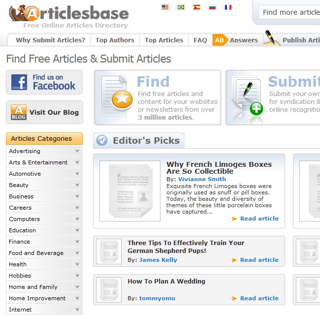
Both Enzine and Articlesbase have a similar purpose, provide to people quality articles distributed in specific categories, both pages allow people browse information and submit their own contents to enrich the data provided to the community, but there’s a neuralgic difference between both sites and that’s the graphic design.
It’s all about icons
Making a nice looking website is easier than it seems, you just need to have the fittest ingredients and use them well. Just some crispy borders, an intelligent appropriation of clean spaces and some fancy icons to prepare the sweetest web dessert for your visitors.
The difference can be noticed at simple view, Articlesbase has a more friendly color palette full of light gray tones, white and light blue, and dark tones for the typeface facilitating an excellent reading. The two sites offer a similar structure, but Articlesbase makes a better use of clean areas and hierarchies (first comes the boxers and then the pants) while using different font sizes and making a great implementation of gradients.
This example shows that even with a good diagramming you could end up with a bad design, because as with a burger, only bread and meat can taste good, look good and be nutritional, but if you add sauces, onion and cheese, you will have an even better meal. The same happens on design, among the things that you need we include:
- Having a clear structure, that will facilitate the reading for the people.
- consistent color palette, that everything feels compacted.
- nice use of typefaces, because it’s not the same to use Helvetica than Papyrus.
- Hierarchies, because the about us section cannot have the same size than the follow us link.
Bad design: Useit

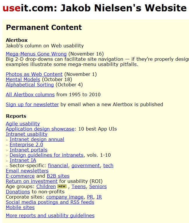
Jakob Nielsen has been called “The King of Usability” (Internet Magazine), “The Guru of Web page Usability” (The New York Times), “The Next Best Thing To a True Time Machine” (USA Today), “The Smartest Person on The Web” (ZDNet AnchorDesk), “The World’s Leading Expert on Web Usability” (U.S. News & World Report), one of the top 10 minds in small business (FORTUNE Small Business), “The World’s Leading Expert On User-friendly Design” (Stuttgarter Zeitung, Germany). Dr. Nielsen founded the “discount usability engineering” movement for fast and cheap improvements of user interfaces and has also invented several usability methods, including heuristic evaluation. He currently holds 79 United States patents, primarily on ways of making the Internet easier to use.
OK so we have to admit that Mr Nielsen is an authority in the web market, he’s like the Yoda in the web optimization genre. The guy has many valuable lessons to teach graphic and web designers, but there’s definitely something that designers need to talk about and it’s precisely design.
First of all, why do you have to use an ugly cheese yellow and a pale turquoise to optimize the loading times?, and it’s so imperative to wear yellow in the search bar?, it’s just not right. You can understand the fact that for Nielsen it’s everything about optimization, but a better and thoughtful color palette won’t affect the optimization dramatically.
Because we know that Nielsen wants to keep the loading times to the minimal, the changes must be minimal. The typeface could be changed for a much better typeface such as Helvetica. Also the color palette must be made out of complementary or triad tones (that just means using three similar colors) so it looks better than the current.

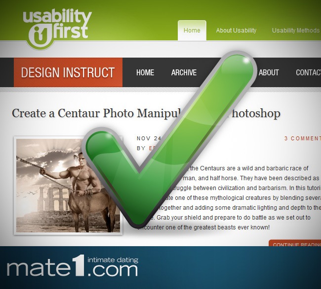
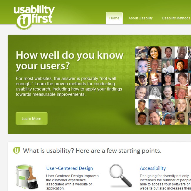
So Mr. Nielsen knows about web optimization, nobody can refute that fact (not even Mr. Steve Jobs), but also no one can state that his site does not have several graphic problems. We decided to look for other websites whose theme of interest was web optimization and after digging for a while we found Usability First which is an example of good graphic design.
Usability and design should play along
Nobody can argue with the fact that useit is the mother of all websites in terms of functionality. But why it’s necessary to make something ugly to tell that it’s functional?. You can prepare tons of sandwiches for your kids with a single tuna can, so you’re being functional but also delivering something tasteful.
If it’s true that optimizing is like taking a ride on your bike instead of using your car, but now you can buy electrical vehicles that can also optimize your expenses (maybe in a lower scale) and are much comfortable than a bicycle. So what we want to say is that it’s probably that because of its design, the people that have no clue about who Jakob Nielsen is, will decide to read Usability First.
- Usability First has plenty of good qualities that makes it an example of good web design such as:
- Beautiful website, the identity is strong and well developed.
- The color palette made out of white and green is lovely
- A proper use of gradients and textures.
- The logo integrates in a simple but effective way with the rest of the page
- The typeface management is very good.
- Good quality icons are also utilized
- The links are presented in an elegant and clean way.
When we visited the page for the first time, the loading times where quite acceptable, taking no more than seconds to fully load. According to the experts, if a site does not load after 10 seconds, practically every visitor will leave the site immediately.

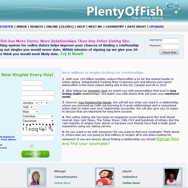
So what’s Plenty of Fish?, it’s one of the market’s leaders in the online dating business, with more than 135 million costumers (who said that the only way to hook-up was at the bar?) utilizing its services, the company has experienced a permanent growing since its foundation. Many people that are looking for love or just something casual are often visiting Plenty of Fish to see if they can find their soul mate.
But once again, we need to worry about the graphic design of the page, this site does not have a terrible design, but there are definitely some flaws that should be fixed. For start let’s talk about the global image, when you take a look at the logo and header in general you’ll probably think “OK this site has some interesting design”, but then you continue scrolling and you start finding poor typefaces, no other background but a plain gray filling and a series of profile boxes with a lot of wasted areas and distorted pictures (you must never distort a person’s picture unless it’s absolutely necessary!!!). After studying the entire site, we came out with the following conclusions:
- The menu typeface needs to be changed for a lighter font, easier to read and eye-friendly (people won’t appreciate finding your favorite band’s font all over the place).
- The magenta text over next block must disappear, it’s just a bad combination.
- The next section it’s acceptable, valuable information and the sign in box works.
- The designers should apply some fancy style to the typeface
- Place more information or reduce the size of the box and just make it look less childish.
- Do not make it by your own, hire a professional for the love of God.

You’re not going to believe how much time we spent trying to reach a well designed dating website, we tried everything, from CSS directories to SimilarWeb (not even Inspector Gadget would be able of doing the type of research that we performed) and the results kept throwing poor-designed sites. Finally we discovered mate1, a high ranked dating website that despite of having a PR5 is not easy to find with just following standard searching parameters.
The first impression is what matters
If your business is going to be love, then it’s important to state that besides the Beauty and the Beast, all romantic stories begin because both people find something attractive on the other (maybe it’s that fancy Mercedes Benz that you have) and that happens only if your site allows people to rate photographs, upload the ones of their own and more, so make sure that the members of your community are able to make a really good first impression.
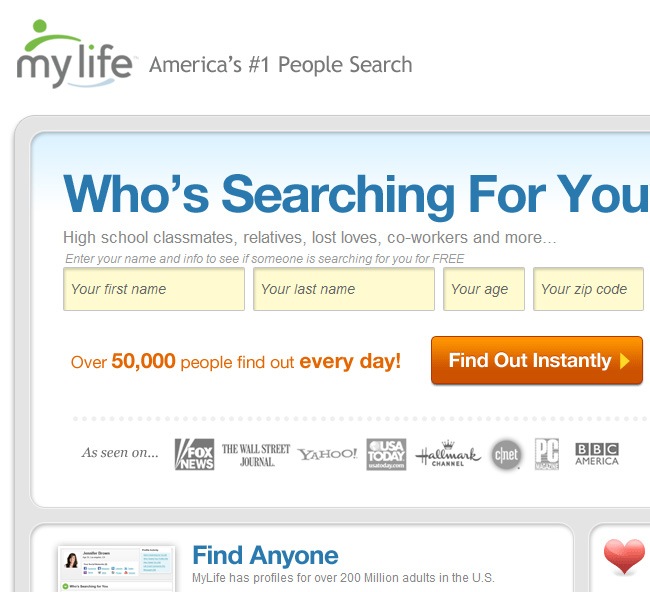
My Life is not the panacea of web design (there’s not a single website that deserves that designation though several are very close), but it’s probably one of the few decent designs inside the dating family. We can list certain aspects that provide to this site its identity:
- It uses a sober color palette
- A lovely photograph below the header
- Easy to read sign up box.
The information displayed is similar to Plenty of Fish, but they do not show pictures of their members, that only happens once you enter the site.
The difference between both sites is quite obvious, My Life manages a more adult design, very web 2.0 with big fonts, pixel buttons and crispy icons, while Plenty of Fish looks even naive, the same space is used completely different whilst offering practically the same type of information. It’s not necessary to fill the frontpage with user’s pictures when you can recur to only one and powerful image.

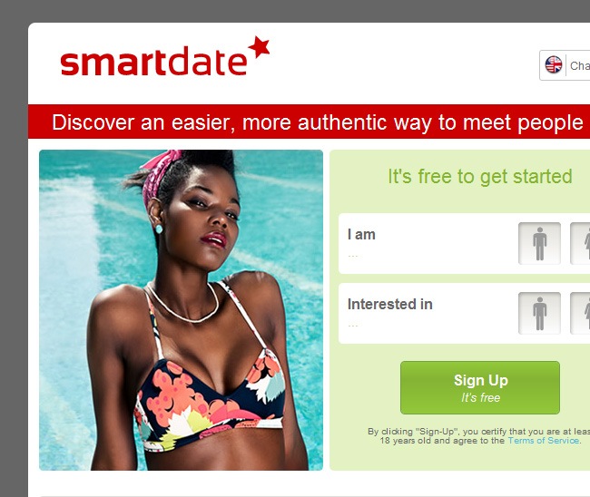
Smartdate is another well-designed dating site, not flawless but definitely not ugly. The color palette is a little too innocent, but still works, as well as the typeface; regarding the logo, it looks more like a chain store symbol with the star and everything, but once is placed within the context, it can actually work and communicate the right message.
So as you can see, the dating sites are just part of another case of poor investment for the design and all the focusing directed to functionality and mostly making money. We like to invite these people to rethink their designs and we assure you that your visitors will increase in a very short notice.

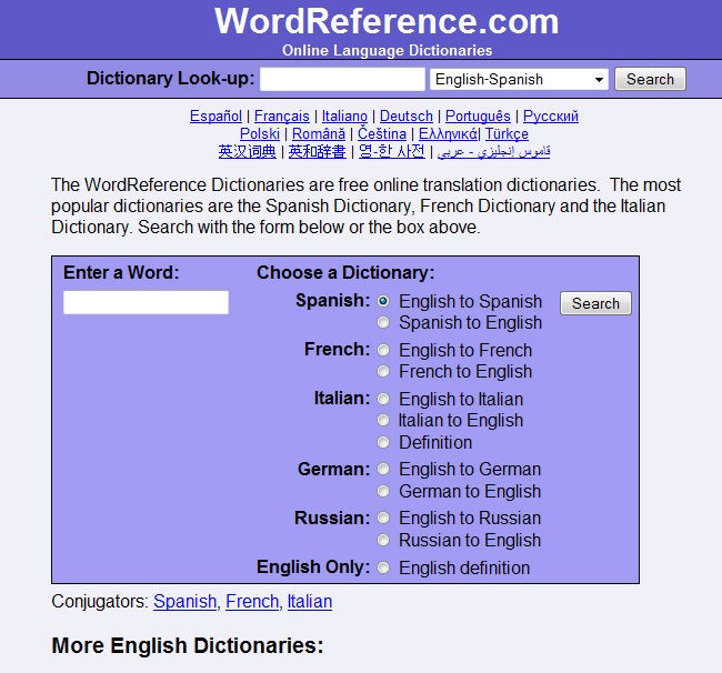
WordReference is one of the most helpful websites on the internet, helping thousands of people to find an interpretation with their translation problems (except translating from elfic to Aramaic). The site offers several translation options and languages, including English, Spanish and French, allowing people to easily understand what they’re reading.
But if we change the subject and start talking about design, WordReference becomes a major problem for any web designer. For start, almost every part of the site is written in Arial (the font we all used during our high school years), including the logo, and that’s just not right, because it seems like if somebody decided to make the site with the first font of the list and did not actually made a carefully preparation.
Changing that Arial font will be a major improvement on the site, we’re not talking about a super trending typeface, but definitely something more appealing than Arial. The search button for example must be changed for a custom design instead of the standard web 1.0 style (a good design does not imply sacrificing functionality). The site looks more like a Word document than a website, maybe playing with kerning, changing sizes and stuff will work.
Finally a new color palette will be an awesome choice. From purple you can go everywhere (that’s not a permission to choose pink), but please do not fall into gradients and things like that, just something more cheerful without getting all happy little dwarf, with those changes you will have the necessary elements to improve WordReference.

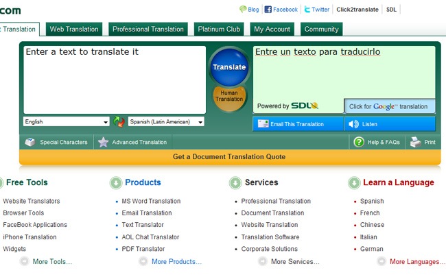
The translation panel itself is really nice. Many options, Google link and even the chance to directly print the text. This is one of the most evident cases of taking advantage of spaces, because in a smaller area they were able to put more information than Wordreference and in a lovely way, perhaps the only thing that’s not completely great is the pair of translate buttons, the gradient is maybe to exaggerated, but for the rest of the website, there’s some pretty cool graphic design on it.
There’s not to much to say besides that, only that in specific tools such as translator, the ideal is to keep things as simple as possible, because people are not there to have fun, they’re there with a very specifical purpose.

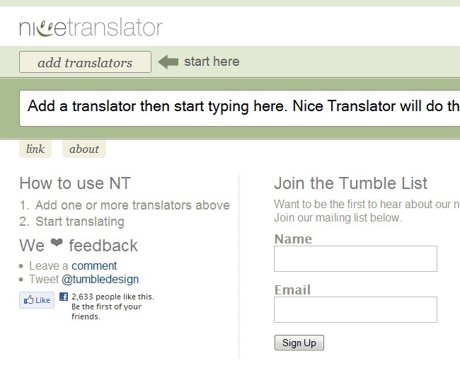
Another nice choice for satisfying your translation needs is Nice Translator, a nice website where after completing the subscription you can add one or more translators from the library and then start translating. The only way to review its truly potential is by looking it for yourself, because we can tell you a thousand words about the Titanic but nothing like one Kate Winslet’s photograph.
The design it’s simple and elegant, it features a lot of green areas along with huge clean spaces on top of the white background. Unfortunately there’s not a brilliant translator design on the internet, just some decent places that at least made the job of hiring a designer, but there’s still a lot to work on before we can truly say that there’s some nice design within the translators field.

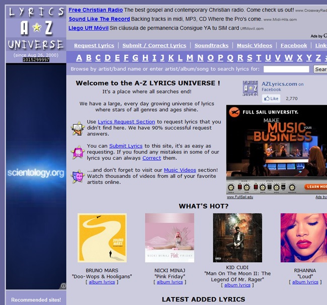
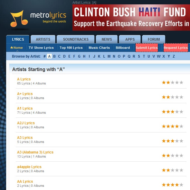
For all the music lovers that just can’t afford buying every single music record to check the booklet and the lyrics of their favorite musicians, there’s A-Z lyrics. From Hip Hop to Southern Rock, you will find an extended amount of lyrics featuring all your favorite artists, allowing you to start screaming out loud every single part of the latest Kanye’s song.
- A-Z lyrics has a similar problem to the one encountered in Wordreference, and some of these problems are the following:
- The color palette is just not the best option, there are tons of colors so what’s with the obsession with purple?!!!.
- The logo needs definitely some changes, because that yellow star looks bad (it’s there a chance that this star is actually a clipart?)
- As for the typeface, there are plenty of quality and rocking fonts to utilize instead of this one.
There must be a new diagramming plan because despite the fact that the current design makes the information easier enough to look for, it’s just too messy for the visitor to enjoy the staying (so girls won’t be able to sing My Chemical Romance lyrics due this annoying purple), and that’s why we have personally seen many people entering to copy the lyrics and then read them from Notepad or Word. An excess of information can generate a lot of clutter which is just too problematic for the regular visitor.
Maybe incorporating some animations, sliders and stuff will beautify the content of the site, come on this is freaking internet, you should go nuts and give a really awesome experience to all the persons that are about to visit your page. What about looking at animated lyrics in a karaoke way?, that would be an aggregated value that invites the people to stay in the site.

With just comparing the logos you can tell the difference between these two sites. Metrolyrics has a simple and elegant design, with a way much better typeface and a simple key not as a symbol. Using a black, blue and orange color palette was a big yes, those three colors usually look well together, and they were properly implemented along the site.
The way to browse lyrics is clear and easy to understand, well orientated lists with a proper font size complete the general site’s diagramming, which is a major improvement compared to A-Z lyrics.

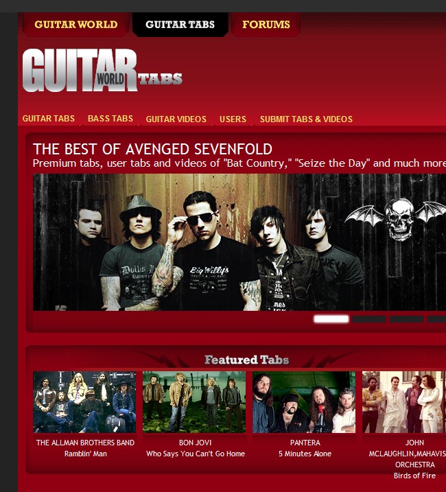
On the other hand we find Guitar World Tabs, a place that opted for a simple but yet colorful interface, sans-serif fonts and a medium sized, minimal header. There seems to be a problem with those websites that are focused in very specific themes, and the problem is that they think that the only way to deliver a good design is by following the trends, but come on, do you really thing that bling bling is a valid web design option?, or filling with Thrash Metal elements a box will make your design catchier?, the answer to both questions is no, just think about P. Diddy, whose clothing line is one of the most elegant and classy brands in the world, despite the fact that he would love to be always wearing sneakers and basketball shirts.

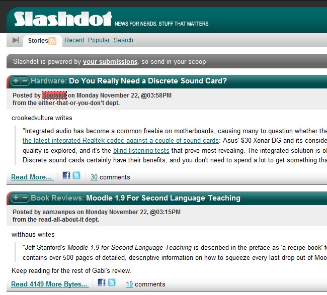
In terms of content, Slashdot is just great. Pure geeky-like contents, including software releases, book reviews, technology articles and many more that will take this site to Sheldon Cooper’s bookmarks. The community is an important part of the page, contributing with their comments and submitting their own articles, which makes the sharing experience a very pleasant time. You can create an account to start posting your contents and get your site promoted in the process (because that’s how the internet truly works).
But what happens with the design?. At least these guys did not fell for the famous purple tone and instead they decided to go green. The color palette probably works well, but the gradients are just too obvious and that’s not longer in use by designers and artists, it makes you feel like the time when having a cell phone was for the rich guy of your class.
They went with a safe diagramming, square boxes, a right bar with additional information and a small header. But let’s take for example the logo, it’s just a standard font placed well and followed by the excerpt. Maybe a little bit of risk will work, what about breaking the rules and turning everything a few degrees to the right?, that will probably work because until this moment, the site could be easily placed as a brochure instead of a website.
Finally we have found that on this case the best design is found on the footer, whilst the header has a very regular style, it tends to be boring after looking at it several times (as when your girlfriend uses the same blue sweater over and over again).

So, this research also took us more than expected, it’s unbelievable that there’s not a single geek news website on the internet, we assume that this is the reason of why the Big Bang Theory gang usually wears such an ugly clothes, geeks only care about gadgets and having the latest programs, add-ons and apps, but they don’t pay attention to graphic design, if something has a good design, that’s fine, and if it does not, well whatever, never mind.
Why do programmers forget about designers?
Why almost every nice and smart girl is unattractive?, is there any rule that dictates that you can’t be pretty and a nice person at the same time?, because that’s what seems to be happening with web developers, their websites are obviously the most functional ever but at the same time they’re among the poorest designed around. Hey programmers, there’s a whole new niche of graphic designers out there ready to assist you at very reasonable prices, so call 1800-graphic-design-rocks and ask for assistance before you continue hurting people’s eyes with functional but unattractive interfaces.
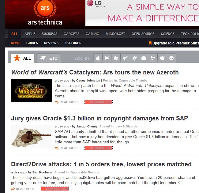
Ars technica tried to show a decent interface, and of course that they came out with something better than Slashdot’s.
- The articles have a more newspaper look, which makes the lecture more comfortable and easy to do.
- The menu is more organized and the colors sober and elegant, but even with all these positive points, there’s still a lot of improvement before this site turns into an actually well designed place.

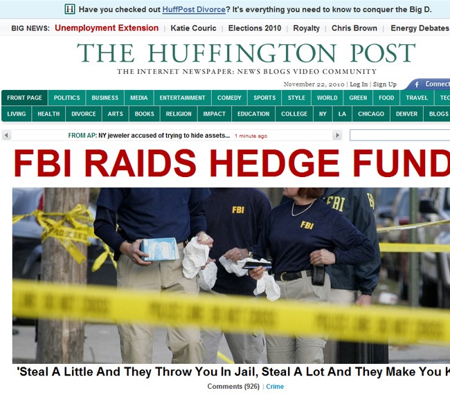
What The Huffington Post is making for the online community is just great. Plenty real time information regarding all the major topics, including politics, business, technology and more that can be easily read from any computer. The information given by the editors is often solid and consequent with the real facts, raising the confidence of the site’s visitors, this means that the site talks about real issues to real people, like every newspaper must do.
The design is not awful, but it’s also not great, just a regular design that goes by without any glory or shame.
- For start the design over emulates the real life newspapers, forgetting about the fact that the journal was designed to operate directly over the internet.
- Using red in such a big font caliber is dangerous (imagine what would happen if a bull notes it), because it’s usually related with sensationalist newspapers, and that’s not what this paper is about.
- It’s not enough with imitating a classic printed version of a newspaper, people need to take advantage of technology by placing interactive objects, playing with the diagramming and more.
Most of today’s monitors can handle larger resolutions, which means that this huge gray background is not the wisest decision to make unless these guys are designing for their nana who owns a 11 inches monitor with Windows 95. The rest of the site works well, like a common newspaper only that in digital version, the main revisions must be considered from the primary picture and above.

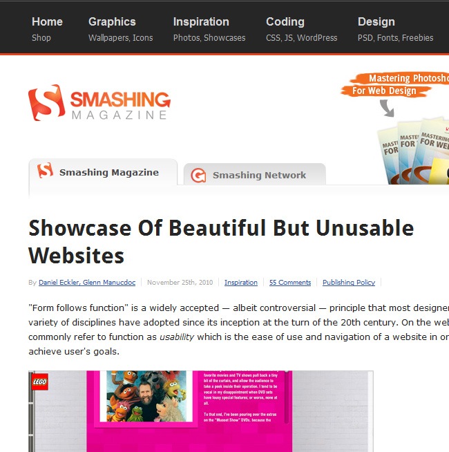
Smashing Magazine is probably the most recognized design newspaper on the web. If you’re a designer, then Smashing is the Moses that will guide you through the dessert of bad design and eventually lead you to the rivers of quality graphic design.
- The site itself presents an enjoyable design, visiting Smashing is always a great experience.
- They follow effectively the rule of light backgrounds / dark fonts, which is the best way to maximize readability on any content website
- Proper utilization of font sizes, not too big to become annoying and not too small to be read with a telescope.
- Good selection of pictures, well edited and selected according the different themes.
- Nice diagramming, the structure is very simple and organized.
Despite of being extremely clean, the site does not look poor or disorganized. One of the big problems that we often see in young designers is that they get desperate when a design is as minimal as Smashing’s, and they end up filling with gradients, vectors and images until they simply ruin the soup, making a extremely spicy design that no one can actually enjoy.
Think white, think clean
Both sites had an enormous amount of information, because they’re magazines and people are there not for the images and the promotions (well some people are) but for the lectures, they want to find quality and fresh contents to read while they’re at their lunch time. The difference is that The Huffington Post simply placed all the information without any thoughtful diagramming, while Smashing Magazine did, they thought about cleanliness and legibility, which can be noticed at simple view.
Once you decide to release a blog, you need to avoid cluttering and bad taste, which is something that comes up in many of the sites featured on this roundup. If your site is going to have extended quantities of text, then the background must be simple and elegant to facilitate the reading, otherwise you can get a little riskier with color and general design.

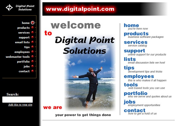
Digital Point is a major web company that offers many services, including database consulting, data conversion, seminars & training a several products to help companies optimize their business, which in common words means helping web companies to make more money than currently.
But what can you think of a major company like this one once you visit its website?, well one of our first thoughts was “these guys must have used a lot of SEO to get PR3 because the page’s design is just not good”. From top to the bottom, this is what we think about this webpage:
- The web address was written in a white typeface with a red outer glow, bad idea dear friends.
- The bevel effect on the happy guy’s photograph. The picture itself is just extremely cliché and the effect simply does not help.
- Using a black column that gradients to white is another mistake, make it black and white, do not mix them like if you were insecure of placing independently two different parts of your site.
- The red buttons of the menu work fine, they give personality to the words that describe the menu element.
And what about using a different color and font on the right column?. You must avoid that kind of mistakes, without even mentioning the Times New Roman that is present across every single article of the page. We can conclude that variety in web design does not always mean good taste, because sometimes the simplest things can be also the prettiest at the eyes of the people. So, the only thing we can say is that the person who made this site tried to make brownies, but the result was just a bunch of ingredients spilled all over the place

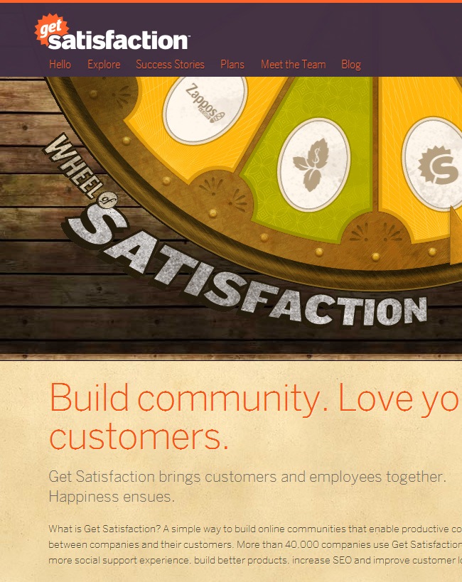
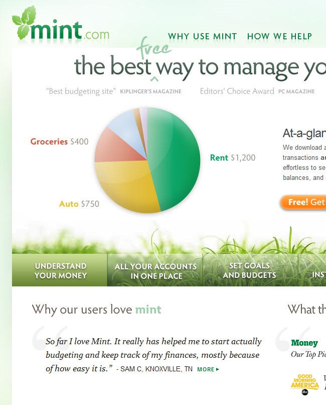
If your company is offering web services, the minimum expected is that your site has a decent design, so the customer sees that you’re a serious company that actually know what is doing. But after seeing Digital Point, those burritos we ate at lunch started messing around with our stomachs, fortunately we took an Alka-Seltzer and GetSatisfaction showed up along with Mint.
Most people don’t go further than the frontpage
This is a big truth in web, people are just to busy to spend their time browsing across different tabs and windows, which is one of the reasons why single-page websites are so popular these days. But when there’s definitely no way to place all your information into a single page, then you have to put all your effort in making a stunning frontpage that’s able to grab people and drown them into the rest of your site, which is something that GetSatisfaction and Mint have definitely done.
The roulette implemented instead of a slider was a brilliant idea, every graphic designer must know that combining good graphic design with advertisement is the best thing that any web designer can do. The vintage palette is beautiful as well as the typography handling. A small text block with a fantastic vintage design was all that they needed to provide the essential options to their visitors.

Mint’s is one of America’s best financial websites, offering quality services to help people manage their money and organize their budgets. Mint has been elected by several companies and individuals, who have found themselves watching their incomes increasing in a very short notice. You will find many places like Mint, but there are only a few that not only offer really helpful services but also are about selling themselves through a fancy and simply beautiful website.
- The design is very sober, with a nice color treatment all over it.
- Well application of typography, beautiful and easy to read.
- Stunning but yet simple logo design, those are often the greatest
Everything have a green vibe that simply it’s coherent with the site’s name, which is very important because for example, a website named Coffee with a blue interface will probably bring a lot of confusion to people.
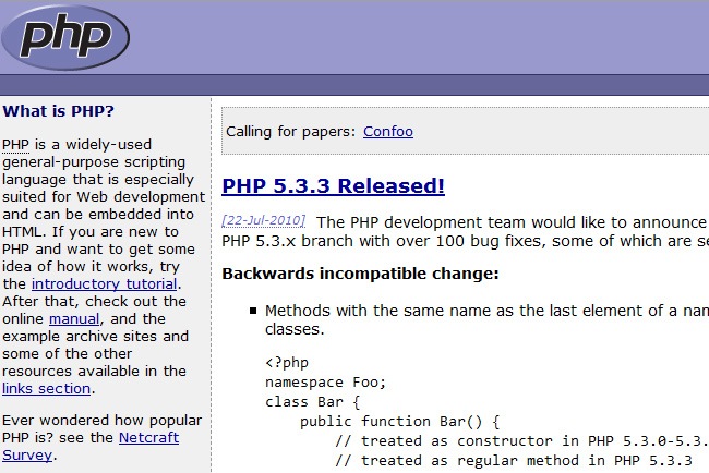
Bad design: PHP

It’s funny when things like this happen, a powerful tool like PHP having such a poor design on its website. For those who are not familiar with the term PHP, it’s a powerful scripting language specially designed for web development and embedding into HTML. It’s imperative for every good web developer to perfectly handle PHP, otherwise the person will be quite limited whilst designing.
- The website’s design is just too generic. 2 secondary columns and a central section where the main information is located, that’s it.
- Everything seems to be written in Arial, Tahoma or something like that, which on this case partially works because people needs to be able to perfectly read every content of the page.
- If you take a look at the menu, the typeface utilized is too small for people with visibility limitations, so that must be fixed asap.
And the problem named purple keeps showing up, are we having a Barney crisis or what?, because if that’s the case we must send a huge please to every single web designer exclaiming that it’s time for a change. Don’t you know about any other color besides purple?, because if that’s the case you can go out and take a look to the sky, there are dozens of colors out there to get inspired with.
Besides that, the site en general could walk through a revamping process, hopefully some day the guys from PHP choose to do it and bring their portal to the new era of the internet, because it could be not enough with having such a powerful scripting tool, every good cocktail looks better with the little umbrella on top of it.
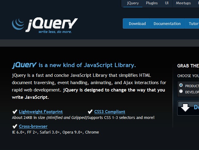
Better design: jQuery

Both are programming languages (well jQuery is specifically a library) and they both have their own websites, but the difference between the two of them is just evident. PHP limited to define a functional website, with tools and information to help the developers, while jQuery not only did that but also carry about making their site look nice.
If your product still rocks, then your image must do it also
PHP and jQuery are still part of the beloved ones of engineers and web developers, but just because they have an ensured fan list, they cannot be indifferent with their websites. It’s not like they have to have animated websites, with sliders and everything, but some nice colors, nice fonts and organized structure can help a lot.
jQuery sites features an elegant and minimal color palette made out of black, white and blue (it’s just a bulletproof formula) along with a functional and not totally classic diagramming. So this is a clear example of how two similar sites can yet present good and bad designs, this is a thumbs up for the jQuery team, nice work guys.

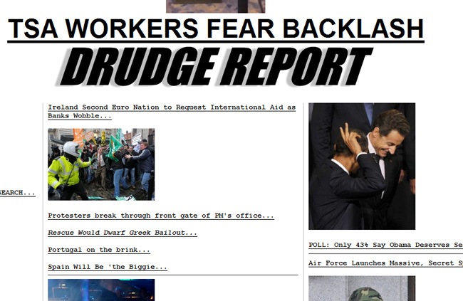
A site dedicated to posting the latest news regarding politics, economics and just everything related with working-class heroes, on this site you will find all the information to be up to date with all the global events, political changes, economical crisis and more. You can think of this as the major web newspaper for all syndicates around the globe.
But what about having a good design?, that’s something very important to talk about too. There’s almost zero design on this website.
- Everything is just spread across three basic columns without any further diagramming.
- You can certainly read all the articles, but not in a comfortable an easy way, and if that’s the way it’s going to be, then we won’t join any syndicate but the one that fights for better web designs and interfaces.
- The title appears to be done using some WordArt effect, which is not the brightest decision given the great amount of effects and typefaces that are being released every day.
The rest of the site is written in Courier New!!!, that’s just unbelievable on these days, because that’s a system font that was used during our parent’s days and is still implemented on scripting languages, but not in graphic design unless you have perfectly defined what you want to do with that typeface.
All the pictures are just placed in there with no special preparation, just like a high school job made out in Publisher or PowerPoint, we must say that these are not times for being so neglected when designing a website. This is a viral case that definitely requires a revamping process immediately.

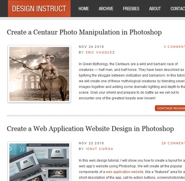
What an abysmal difference between two white-background websites. You will probably not believe that the exactly same soup can taste this different, while the Drudge Report tends to get chaotic and cluttered, Design Instruct has a perfectly planned design, with an accurate management of spaces, typeface and pictures.
The beauty of simplicity
Jacob and Isaac Gube are the founders of Design Instruct. They’re a web developer/web designer and graphic designer / photographer respectively, also Jacob is the founder and Chief Editor of Six Revisions
What they have done for Design Instruct is great, just a patterned line and some subtle borders were needed to make a beautiful website, filled with clean areas and useful information for designers and developers. This site is a clear example that proves that a burger tastes better with less pickles.
Instead of using simple or dashed lines to divide the articles, these guys designed a simple and lovely line style to separate each article of the page. The pictures have also a lovely treatment, with a subtle photo paper effect applied to them. The font highly contrasts with the background, having red and black utilized on the typeface. We think, that using more than one font could often end bad but on this case it was a bull’s-eye decision.
So it’s important to pay attention to the tiny details, because those are the ones that at the end will make the difference between a good and a bad design, just like our grandmas, remember that the secret is not the brand of the rice, but the way you use the condiments.

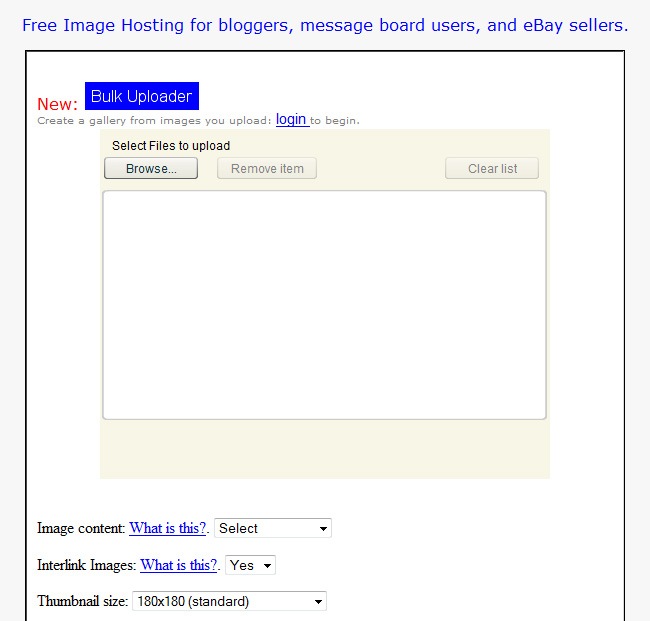
Nobody can’t deny the fact that the service provided by ImageVenue is excellent, free image hosting for bloggers and more. You can classify your image’s content according to the theme (adult rated, familiar), there’s also the possibility to interlink images and define the thumbnail size, everything is done without affecting the picture’s quality.
But just because you are offering a useful service does not mean that you can spend no money on the design, we won’t stop insisting on this point until people understand that it’s imperative to have a good design in order to be more competitive in the web business. The site is just empty, what’s with the Greece picture on the left corner?, are they trying to sell cruisers around the Mediterranean?.
- The menu has also problems, first of all they decided to use the standard hyperlink design with blue underlined text (get over it, the nineties are long gone!!!).
- Secondly they did not put any background, just pure white and the only element in the entire site is the tool block where you can work with your pictures and upload them. The problem is that tool has almost zero design, just the basic interface that every person can understand.
It’s difficult to make any suggestions to the authors of the site. The tool works well and they’ve probably seen the money flowing through their pockets, so that part is covered, but without any design to criticize, we cannot provide any guidance regarding how to improve it, the only thing we will say is, please put some design crumbs on the site and everything will be better than now.
Better Design: Behance

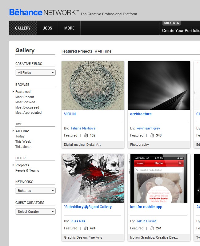
Behance is one of the most important design websites around, with thousands of new users joining every day and sending their designs to the page, this is a must-seen place in case that you’re looking for inspiration and want to let other people know your work.
The site features a sober design, where the image takes all the importance without completely overcoming the information, which is displayed with sans-serif fonts, black and blue and occasionally on top of frame boxes. Both sites are dedicated to provide image-related services, but Behance does it in a very fancy way, its interface is just one of the loveliest on the design field, so quit using MySpace because Behance is the real deal to launch your designer career.

Berkshire Hathaway is one of the largest conglomerate holding companies on the USA operating from Omaha, Nebraska, the company primary function is to oversee and manage a number of subsidiary companies. The conglomerate operates enormous transactions (not thousands but millions of dollars) and it’s constantly looking to expand its interests.
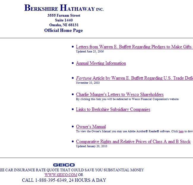
A question pops up when we know about the relevance of a company like Berkshire Hathaway, why do they have such a plain boring website?. With the financial capacity of the company, they could have easily contracted a major design agency to develop a really good website, but judging by the appearance was definitely developed by someone with no major knowledge in web design and probably the only thing this person did was to place some elements within a Publisher file and then uploaded it while he went out to grab a burger.
- The only evident diagramming element that’s noticeable on the site is a series of horizontal lines dividing the information, a solution that though works, is just too facile to be on a site of this importance.
- Two columns in one part followed by a centered text block is all the diagramming present on the page.
- There’s a Borsheims logo on the site that’s larger than the company’s itself, big mistake.
When you’re a major company, everybody will pay attention to every single step you take, just like in high school when everybody used to emulate the older guy on the class, the smaller companies will think that because Berkshire Hathaway has such a simple site, they shall do the same. So we suggest to this company that they’re in time to redesign their site and become the next big deal in web design.
Better design: Apple

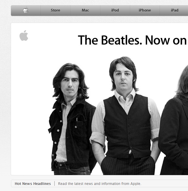
One of the biggest corporations in the world, Apple has become a heavy contender the technology market, principally during the last decade with the release of stunning inventions such as the iPod, iPhone and most recently the iPad. But they don’t stop with only releasing fantastic gadgets, but they also care about their image, and its website is a clear example of that.
Seriously, do we need to talk about Apple’s design?
Just to say anything and dissimulate the fact that we absolutely love Apple, let’s talk a little bit about its website.
- This is a brilliant example of minimal and sophisticated design.
- The color palette could not be any simpler, pure black and white with just a little bit of color.
- All the information is well diagrammed and … on this point we must stop because the article will be not longer enough to talk about a brand like Apple. We can only say that if Andy Warhol was alive, he would be pleasantly surprised.

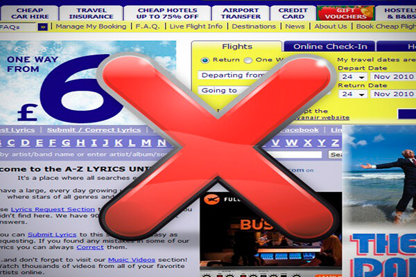
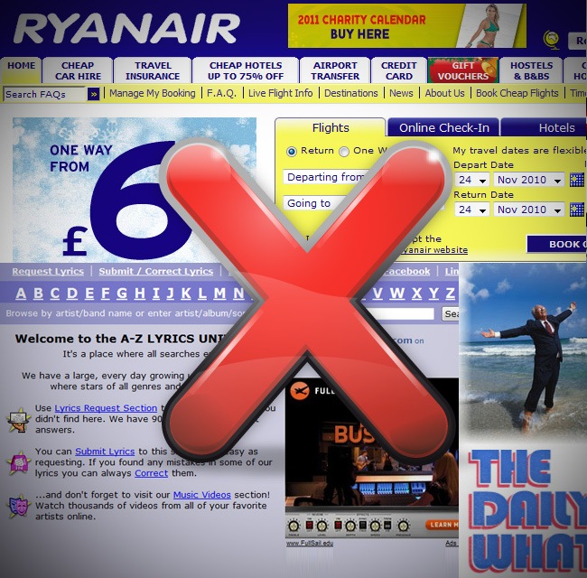
Ryanair is an Irish low-cost airline with its headquarters located at Dublin Airport, Ireland. The company covers over 1,100 routes across Europe and Morocco from over 43 different bases. Ryanair is currently the largest airline in the world in terms of international passenger numbers. The company is struggling during these days with the major economical crisis that Ireland is experiencing, Britain is ready to loan millions of pounds to support the country’s recovery and it’s probably that Ryanair will face some major problems during the upcoming months (they must be regretting of the time when they mocked off British Airways)
So being low-cost implies having a website of this caliber?, saturated with advertising, information and God knows how many links are on the homepage. There’s a major web design sin noticed on the site, and it’s the overuse of gift elements, the site looks like a party and you can’t just read peacefully the part that you’re actually interested in.
There are definitely some doubts about using a dark blue font for everything, it’s not a bad color but when is used in larger amounts it could make a site look unprofessional, so it will be better to use black in some parts or different grades of blue, not always the exactly same tone.
Heavy strokes, obnoxious yellow blocks and poor designed icons are just some of the problems that we also found while researching this site. For the strokes problem we suggest to utilize lighter lines, maybe play with shadows and just make it look more friendly; yellow must never be used as a fill color, it’s very unfriendly for the eyes, reducing the saturation and play with the brightness will generate a big improvement. And the icons problem well, there are many great companies such as Iconshock offering quality icons, they should take some time to buy some of them.

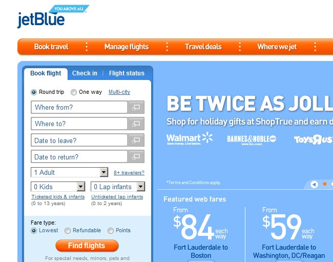
There are not many airline companies with good webpages, because designers were driven away by big prizes and discounts. It’s tentative to called these sites kitsch, but maybe is just marketing strategy. Southwest has a neat interface, with a lot of Helvetica-like fonts, brilliant buttons and everything without having to hide the information regarding the discounts and prices.

So it’s evident that you can still show all your discounts and flight prices without having to show an annoying design, it’s just a matter of hiring a professional designer who can actually organize all the information so people can easily read it and at the same time stare at a beautiful design.
If people love your site, they will trust your planes’ engines
The sentence speaks for itself; when you’re behind a major company that provides an exclusive service to people, it’s important to create a trust relation between you and your audience, and on this case the best way to start is through a well planned graphic design. Many airlines have sites that are the living image of what they actually are, chaotic companies that resell every ticket more than twice, filled with delayed flights and deceitful ads to grab clients.
Using friendly colors, sans-serif fonts and leaving clean spaces is the best way to make a site where numbers and data take all the leading role. Just try to imagine Ryanair with JetBlue’s color palette and typeface, it will witness a major improvement on its site.

Craigslist is a centralized network of online web communities, featuring free online classified advertisements that oscillate between jobs, for sale, housing, personals, services, community, gigs, résumés, discussion forums and more. The company started in San Francisco Bay during 1995 when a guy named Craig was sitting on his couch and suddenly thought “Dude I want to go to a concert today but I don’t want to go outside and get the newspaper”, so he decided to develop a supporting site to tell people about current events, then the site began to expand to other cities and at the present time they have reached cities like Paris and Sao Paulo.
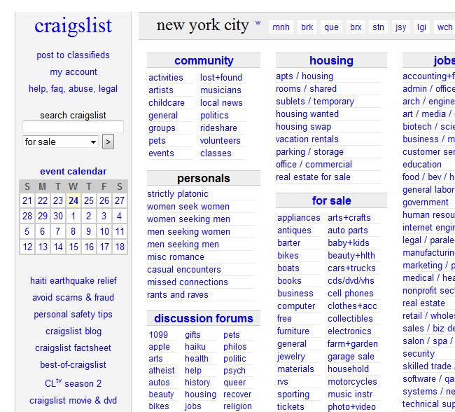
But something has no changed since 1995, the page’s design. The same column diagramming, blue links, Arial font and just a Word-like style with no taking advantage of the internet’s power. And let’s not talk about the inner pages, because in comparison the homepage is a masterpiece. Well we cannot be just critical, a good point to mark is that it was a nice choice leave all the text over a white background because the legibility is optimal.
This is not a social network, so the solution is not to make a Craigslist version of Twitter, but it’s true that the team needs to grab some references from the largest web 2.0 web places and develop a better design for this site (you just can’t keep the same make up for more than a decade). The most important thing is to maintain an organized diagramming, because without it the ads will be difficult to find, once that is resolved, a subtle texture for the background and some fancy design elements will complete the process.

Do you remember the newspaper classifieds that our parents used to read?. They were all black and white, with very few lines where everything was explained, because you were charged for every additional word or phrase, and that’s why people learned to be really concrete with their sentences (maybe that was the beginning of things like lol and XD).
Additionally the newspaper limited to use the minimum amount of space to place the maximum amount of words, so it’s logical to think that the diagramming was thought to fulfill this purpose. But now that the internet has arrived, the areas have increased, as well as the color possibilities that drastically were dominated by black and white during the dawn of printed media.
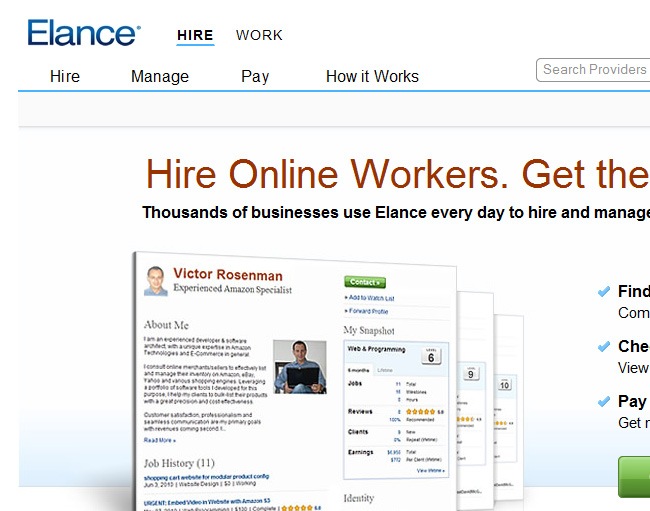
Elance has a very clean website, where information is much lighter without losing consistency, so people will find the same viral information without being strafed with tons of tiny letters and announcements.

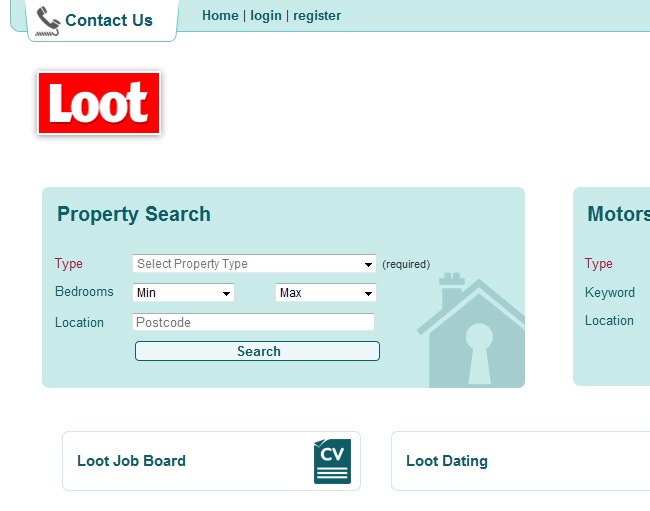
Loot knows how to take advantage of the crescent screen resolutions (1024 x 768 and larger) because they were not bounded by a vertical format, so they were able to place the classifieds, add a search form and a entire right section with featured ads, including the latest and most viewed of the previous days. Everything is diagrammed on top of a white background with the exception of a few cyan boxes.
The lesson to learn on this case is that no matter how much information you have, there will be always a way to make it look prettier and organized without compromising a single word or sentence.

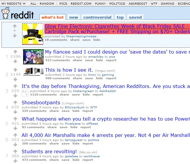
Reddit is a one of the most recognized social news websites, where people can browse and/or submit links to web contents or submit self-posts that contain unreleased, user-submitted text. The rest of the community can vote the posted links “up” or “down” taking the most successful links to Reddit’s front page. Another thing to mention is that users can comment on the posted links and reply to other comments making a whole interactive community. Reddit users may create their own topical sections, named subreddits, and then submit their links and comments.
Reddit’s case is one in a million. A extremely successful social network with an even more incredible poor design in comparison to places like Tumblr, Digg or Stumbleupon. The design is too generic, with links listed vertically, a header with the principal navigation links and the site’s logo, that’s it. This is like watching the ugly girl from high school beating all the hot chicks in a popularity contest.
There are several reasons behind Reddit’s success, but we are not here to discuss them but to make a statement regarding web design. The interface found in Reddit is just not good, it looks more like a mockup than a completed design, the mascot is not bad but on these days, there are a thousand better mascots supporting smaller sites.
What can be done in the behalf of Reddit and save it from the designers’ ostracism?, well for start the interface must be redesigned to be more “web 2.0 (though 3.0 is coming)” and not just a bunch of links listed vertically; developing a personal typeface will give a lot of identity to the page, as well as choosing a custom color palette (based on what we have seen, the fittest color palette will be probably made out of red and grayscale tones). Further ahead the site can live by itself, just a thoughtful revamping and Reddit will be ready to live another 5 years at least.
Better design: Digg

What can we say about the new Digg?. Since its release, the amount of complains from customers and casual visitors have increased drastically, which is a case-scenario that usually shows up when a popular site changes. That’s a life rule, people are afraid of changes because they prefer to keep things the way they are, but once they get used to, things can get really great.
Don’t blame the design, because it rocks
Digg’s new design has a lot of beautiful things, which is what we actually care about on this post. Among the major improvements that Digg has experienced on its interface we can mention:
- The top bar was upgraded with a better design and functionality
- The color palette is now more inspired in social media places.
- Digg’s button is more crispy, which obviously denotes a good work from the design team.
- Another great improvement comes regarding the diagramming, which is more organized and facilitates a lot the navigation.
We released a while ago an entire article in Tutorialshock about the New Digg features, which we suggest you to read if you want to know all the things that actually occur behind the revamping of a huge page such as Digg, you can find it within Tutorialshock’s files.

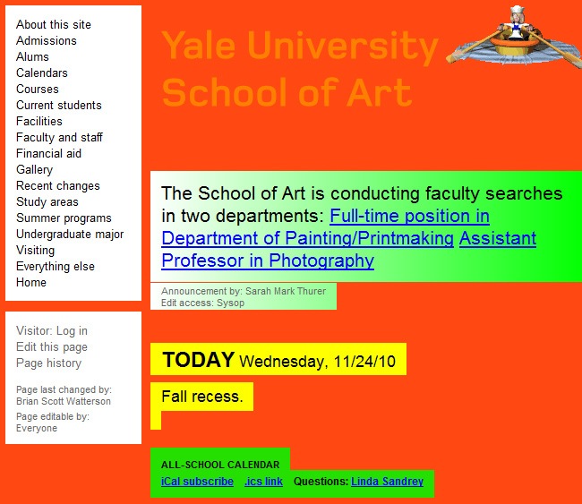
According to the about section, this website is the continuously evolving effort of several people from many disciplines within the Yale School of Art and its wider circles. It’s also a wiki, which according to their definition means that every graduate student, staff person, and faculty member of the School can make modifications to the site’s content or add to it all the time.
We have met artists on the past, there is actually a group of them working in Webdesignshock at the present time, and none of them showed a happy face after visiting the site, they were astonished. The best thing to do is maintain the hope that this site is a prank, because if not, Yale School of Art is definitely one of the universities where we suggest not to send your kid.
At risk of sounding offensive, the design of this site is definitely making a lot of damage to Yale’s image, especially to its School of Art, because though it’s good to let the students experiment, what they’re doing is a strange performance where everybody’s eyes are being affected. What kind of tortured artist decided to use an intense red background with yellow and green gradient block texts on top?, this must definitely be a prank, and a very good one.
To complete the prank, they implemented a couple of gif images and destroyed the grid, so it’s difficult to establish what kind of diagramming is behind the site. We like to applaud these guys for the prank but if it’s not, we like to invite them to read the rest of this entry and find out how to make a proper and decent website.
Better design: MICA

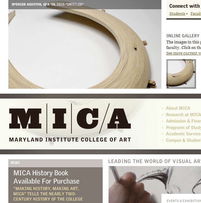
The Maryland’s Institute College of Art has probably the most beautiful Art School’s website ever.
- The diagramming is genius, not just a regular 3 column style.
- Colors look awesome, a mix of vintage and modern tones has been implemented.
- Typography has been used properly, with nice use of color and sizes.
- There seems to be a little Bauhaus reminiscence on its structure, with strong elements and a bold typeface utilized on the logo.
If you’re going to teach art, then start by making it right
How can you say that you are a cinema expert when you’re favorite movie is The Scorpion King 2?, how can you dear to direct an Arts School and at the same time be in charge of a really ugly webpage?. It’s logical that the site you’re running displays a proper aesthetic that actually lets people know what you’re offering. It’s just absurd to think you’re an architect when you turn out a model made out with Play Doh. It’s certain that artists are not graphic designers, but they most have a strong sense of harmony, both in color as in structure. So bottom line, if you want to start your own Arts School, start by making a great website to promote it.
We don’t want to jeopardize Yale with our critics, but being the gigantic college that is, it’s just sad to see their page and it’s evident that their team should lay down their heads and take a look at MICA, which could be a less recognized university but with a website like this, it’s just a matter of time before it becomes one of the most prestigious schools worldwide thanks to the quality of its work, probably of the same quality exposed by their students.

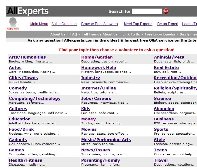
Since 1998, All Experts have been aiding people to find the solution to all the major questions from different topics, including technology, health, science and even fashion. You can dig into the directory to see if someone had your same doubt and it was resolved or if the question has not been asked yet, it’s possible to ask it yourself and wait for an expert to answer it.
But there’s a problem that none expert has solved yet, and it’s the design. It’s intriguing to see these amount of professionals and experts helping people out and not a single designer suggesting that the site must be revamped, is there not a single brave designer with the guts to say “Hey this site must be redesigned immediately”?.
- The first error is the sad palette made out of pure cold colors, grays, blues and purple with just some red sparklers.
- The general design reminds us of the old school AltaVista or Geocities, which in other words signifies that they never took Morpheus’ pill and decided to stay in 1995.
- The inner pages present a similar problem, a basic diagramming with white background and listed elements featuring the subcategories.
- The separation between words is given by gray and white text blocks which as we said, does fulfill the mission but in the most obvious way.
For concluding, the site can maintain its current diagramming but with a typeface adjustment, new color palette and why not some social icons to connect the experts with the world in more than a single way.

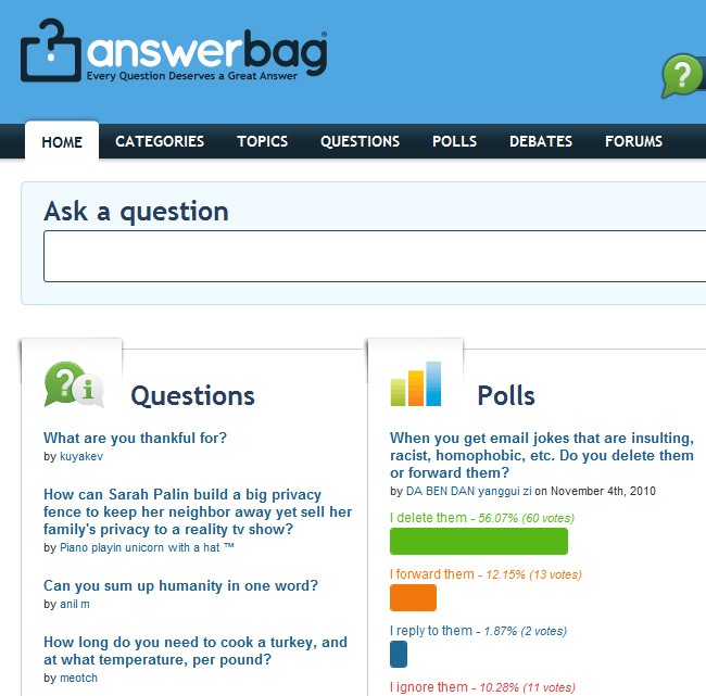
Because every question must have an answer we find answerbag, a place dedicated to solving every person’s doubts in a clear and well structured way. The site features a questions section where people submit their questions and the community itself postulates the fittest answer available. Among the other sections we encounter polls and debates that amazingly complements the content of the site.
As for the design, it’s simple, well organized and definitely as saturated as Ask Experts, which is too chaotic to have a pleasant navigation. Think of this site as if it was a designer’s dress and Joan Rivers the judge, she will always say that less is more, and that there’s no need to pimp up your site exaggeratedly because the beauty speaks for itself.

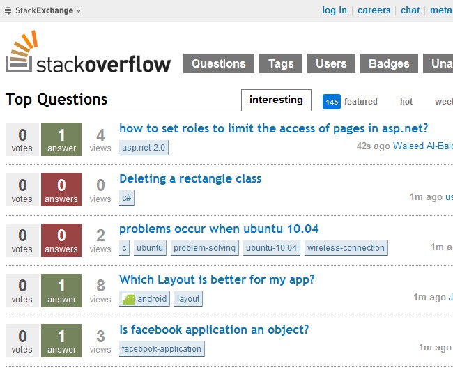
Stack Overflow is another amazing site that tries to resolve everyone’s doubts. You can browse throughout different user profiles, unanswered questions and tags to find your points of interest. So if you are tired of always burn your brownie’s mix, you could ask for assistance and find out what’s going on with your recipe.
- The design team behind this site decided to played it safe with a clean interface
- Lovely white background that facilitates a lot the reading exercise.
- Big fonts so everyone can read the content with ease. T
- The color palette is a little bit to sparkly, but at the end it’s not obnoxious and the navigability gets really enjoyable, so you will not only being answering your doubts but also staring at a well-designed place.

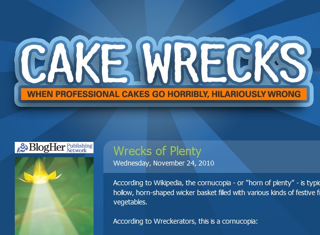
One of the most amusing places of this countdown, Cake Wrecks sends the bakers to the lions by showing their worst moments on the baking art. After taking a short trip across this page, you will think that sure you’re ready for creating a beautiful cake. The examples are just great, it’s unbelievable how people can mess up something like a cake.
- So what would think this blog’s authors when the mocker gets mocked?, because now they’re part of the worst websites countdown and not as a good example, which teach us that knowing about cakes does not imply having web design consciousness and this a clear example of spilling the cream whilst trying to make a straight line.
- What they used for the background is not bad all, on the contrary, implementing radial objects with duotone color palettes is still a valid design solution, the problem happens when the element does not cover the entire site but only a part of it,
- It’s funny that the designers made the artwork fade on the sides but not on the top and the bottom.
- The logo is acceptable, there can be some improvements on it but let’s just say “who is a cutie logo?”.
The rest of the site passes the exam with a very low score, the diagramming could be way more interesting, the images showed in a slider or something nicer than a regular vertical scrolling system, a photo treatment to the images will also be a good added value. Fortunately we’re not into the baking business because, grandma’s cakes will be the only ones safe.

Although this blog does not actually talk about cakes, we put it as an example of better design because they both are very personal websites that deal with specific topics. One site is talking about cakes and the other is taking the chat to the design universe.
When a revamping ends well
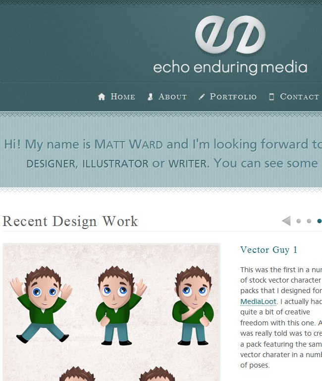
The previous version of Echo Enduring was not as great as this one, and that’s why the revamping occurred. There’s a great article on Iconshock’s blog about the steps that you need to consider when making the revamping process of a website, you should take a look to it before starting a redesign. The most important things is to make a few tests to see what people considers that you need to adjust in your site, probably the smallest detail is the one people wants to be changed the most and you haven’t realized before asking them.
While Cake Wrecks has a more vivid palette, Echo Enduring has opted for a sober color gamma and decided to create impact via the design. Cake’s logo is loud and probably exaggerated, whilst Echo Enduring’s is more elegant and yet attractive thanks to it’s exclusive design. Echo does not sacrifice it’s image for some extra bucks, so you will not be bombarded with annoying publicity when visiting the page, the font is also easier to read thanks to the fact that the page is respecting the white background / dark font rule.
They thought about wider resolutions, and you can notice it because they made the site grow to both sides but without moving the information, which means that the person with a bigger screen will only see a larger background but the same information that a person with a 14 inch screen will notice.

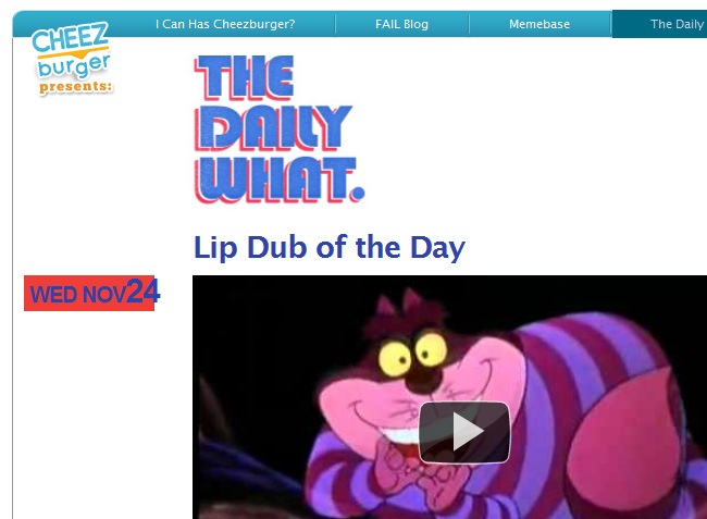
Just every weird video, article or cartoon that comes up gets featured on The Daily What, a place full of inspiration for those who want to see something different to the usual stuff. Many designers love visiting the place to get inspired or just have a regular fun time.
The kind of blogs that are basically made out of one after another YouTube links usually lay down all the diagramming on the videos with no further arrangements. This happens on The Daily What and on many other blogs, a lame vertical scrolling system with some advertisement at the right side of the page.
A thoughtful diagramming will make this site look way less underground without sacrificing the quality of its contents, along with this the redesign of the logo it’s necessary because the original does not only look pixelated but too retro, which sometimes looks good but not on this case.
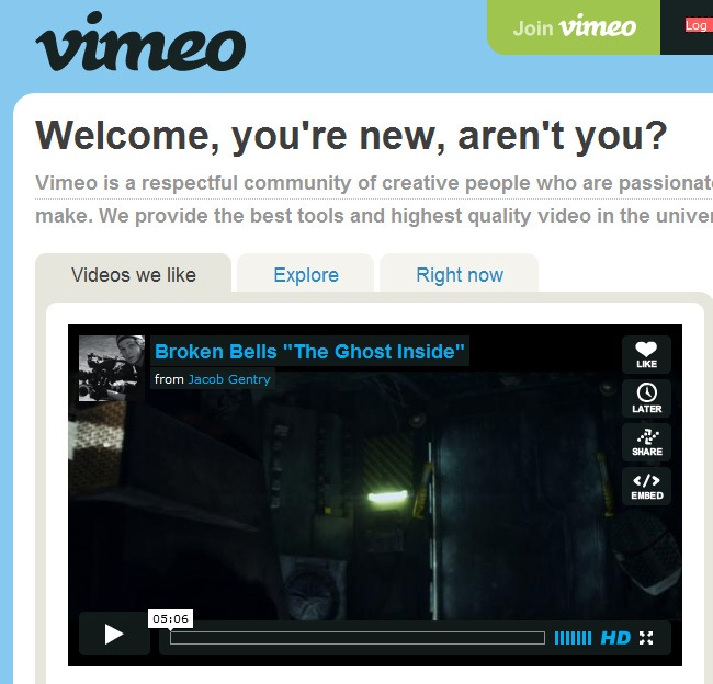
Better design: Vimeo

Usually designing for video places such as YouTube means that you can’t do any much but organize the previews properly, create a nice GUI for the users and make a catchy logo that people will always remember, all the rest will be covered by videos, because they’re the ones that will eventually connect the home run once the site is set.
Vimeo is the most gorgeous site to search for creative and innovative audiovisuals from artist all over the world. You can find several styles, including motion graphics, claymation, conceptual cuts and more, but in any case, if YouTube is the source of the funniest and more mainstream videos, then Vimeo is the place if you want to see more than bubblegum pop girls and street fights.
By just looking at the footer, you will understand why Vimeo is catalogued as one of the most beautiful sites on the internet; without having to be filled with illustrations and fancy animation, the style speaks for itself, great color palette, lovely typefaces and clever utilization of clean areas. So what we can conclude is that if you add to a well-designed place some high quality content, you will have a masterpiece.

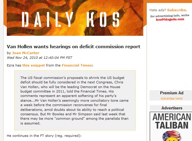
Since 2002 Daily Kos has become the premier online political community with a total of 2.5 million unique visitors per month and more than 250,000 registered users. It’s at the same time a news organization, community, and activist hub. Among the prominent figures posting diaries on the site are the former president Jimmy Carter, president Barack Obama (while senator), Senate Majority Leader Harry Reid and dozens of other senators, congressmen, and governors. An even more exciting fact than that is the amount of regular Americans that have been using Daily Kos to shape a political world apart from the exclusive domain of the rich, connected, and powerful. From the hippie at the corner to the gangster rapper down the store, this is a clean area for everybody to join the discussion.
- This is a rescueable case, the patient is just a little ill but with the proper design treatment can be brought back to life.
- Talking in general design terms the issue is not terrible, it has only a few mistakes like having a middle column featuring all the advertisement and a Facebook box, which divides the main blog column with the links section.
- The site tends to look suffocated, like a vegetables soup full of ingredients, there’s just too much information to process and a few time to do it, so it’s imperative some sort of categories and a better exploitation of the space, because right now it seems to be designed for 1024 x 768 resolutions and most monitors are now able to support larger screen sizes.
- The colors are well chosen, as the typeface, if they want they can go a little risky with the tones and maybe fill with a bright orange some parts of the design to integrate it with the header, which has plenty of orange tones on it. So this is not a makeover, just a “Pimp my Site” job.

OK so there are some really bad designs in politics (let’s not even talk about a certain candidate who almost kills the entire graphic design nation with his website) that don’t show any respect for the color rules and diagramming logics, but there are also quite a few websites that are living on the XXI century, which means that they are aware of the importance of a good designed website, where all the fans can read the latest news and have a pleasant experience.
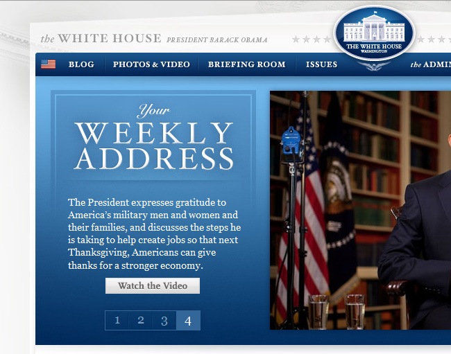
The White House’s site went through an intense recovery surgery where graphic designers, developers, programmers and even hair stylists intervened on its recovery. Ladies and gentlemen, boys and girls, give it up for our next guest, we like to introduce the new White House’s website.
There’s no republicans or democrats here, only good designs
When designing political websites or official pages for politicians, it’s important to realize that they will usually have an established color palette (mostly white, red and blue) and you will have to work with that, fortunately there will be a few cases when the color palette suggested by the person will be too insane for a designer even think about using it. Try to respect you
r senator’s thoughts but at the same time, look for an identity, try to make the site outstand in front of the others, even if it is with just a simple logo or a phrase.
A precious design, with a lovely combination of grayscales, bluescales and color photographs beautifully joined together into an uncluttered interface, with excellent typefaces and readability.

- Census 2010 has a good design, with the American flag’s colors all over the place, though red is only present on the logo.
- The diagramming is made in a 3 columns system with independent boxes that display different information.
- There’s something pretty cool about these two sites though it’s not directly related with graphic design, and is the fact that the page is available not only in English but also in Spanish, which is a huge thumbs up for the design team because they removed a lot of restrictions by offering the site in a second language.
It’s important to avoid the obvious solutions, like using boxes to place each button and link on the menu; a simple divisor line can separate the links with a single box placed behind them. So remember that the greatest recipe is the one that decided to add an extra ingredient to the formula instead of increasing the quantity.

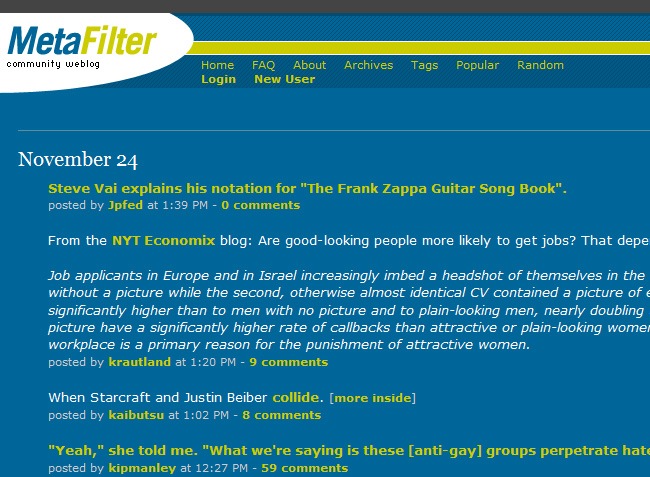
One of the most popular weblogs around, MetaFilter has evolve into a big web community where everybody can send and comment other people’s articles after completing the signing process. There’s an extended variety of themes, defined by tags, though must people usually prefer to navigate by popularity or in a random way (that’s the best way to find out the latest Lady Gaga’s gossip). The site is definitely a good source of up to date information and news, and funny things like finding Starcraft and Justin Beiber into a single article.
This is another rescueable case, because they’ve already established a great color palette composed by green, blue and white. The problem relies on the diagramming, which is very poor. The header and footer are barely functional as well as the right bar, but the posts are just put in there with no bounding boxes or something that organizes them.
So what do we suggest?, simply take full advantage of the color palette and set up a better diagramming, maybe with bounding boxes, maybe with something else, the thing is to make the page look a little less cluttered and more eye-friendly so people can actually enjoy the visit.

There’s certain type of websites focused on real time activity such as Digg and StumbleUpon, which means that the own community is the one in charge of posting contents, sending news and basically keeping the site fed. Usually this places fall in the error of covering all the site with text, leaving zero space for design elements and stuff, which is a serious mistake because the site will have no difference respecting another site of the same type.
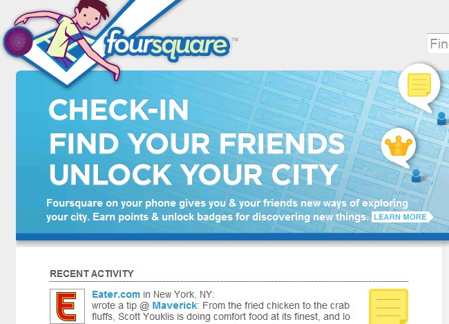
Welcome to Amazing Race for city lovers, Foursquare takes people to a discovery experience where they will find new things around their city whilst earning points and badges for doing it. The site works as a mobile application for iPhone and other devices.
- As for the design, the logo is pretty cool, with some random Dude icon playing what it seems basketball.
- Nice color palette and typography, gives a lot of identity to the site.
- Lovely icons and a Twitter-like interface that definitely gives the site a social network appearance.
- They could’ve got a little bit riskier with the background, because that plain gray is not very convincing.

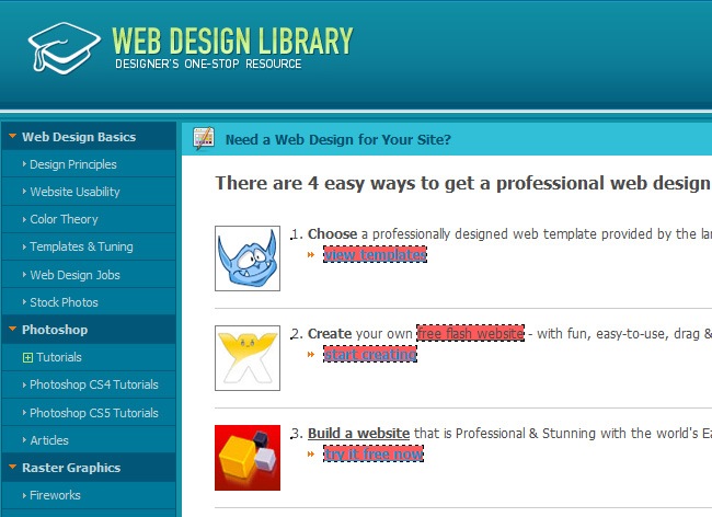
This is a similar case, a well chosen color palette with a poor design planning. Web Design Library is a must-seen page for every graphic and web designer out there. From tutorials and resources to web promotion tips (every trick that designers need when Photoshop is just not acting as they wish), this site has almost every design topic covered. Registered users will have access to an stunning amount of articles, tips and resources to become a better designer day after day.
- But as for the diagramming, they were not risky enough for being a designed-focused company.
- They used the classic left menu bar, central information and right bar for advertisement and social network icons.
- Same thing for the header, a very humble logo that could be looking a lot better if the designer wants it.
They can maintain the same color palette and play with the diagramming, get out of the standard nineties grid and generate something crazier that does not sacrifices the legibility. If they want a biretta to be their logo well, let the designing begin and give us a better logo, more eye-catching and wild than the actual. That the people who are reading the tutorials find them implemented on the site, because it’s like watching an algebra teacher limiting to work with sums and subtractions.

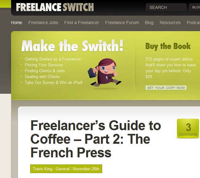
Just beautiful, Freelance Switch owns one of the nicest, organized and attractive design websites. The way that they managed to integrate lime green, brown and monochrome is admirable, because it’s not easy to join together a palette like this one (it’s like trying to put some mustard into a salad, that could end up being a delightful plate but only if it’s done by a professional).
It’s risky to use big fonts in web design, because it could seem amateur and not tasteful, but if you do it right, you will make a great right-guess. Using effects on your fonts is another important topic, because many people get really abusive with glows and shadows, smashing the beauty of the font, but when an expert designer takes the job into his hands, you will get something like the “Make the Switch” title.
So it’s very important to think about your audience, because in graphic design it’s essential to have a top quality website to show people what you can do. If you are managing a social network, then it’s important to use clean interfaces, sans-serif typefaces and suitable colors that do not drive away the audience (colors such as blue, green, gray and white work great on this case). Bottom line, you need to define your target and then start sketching.

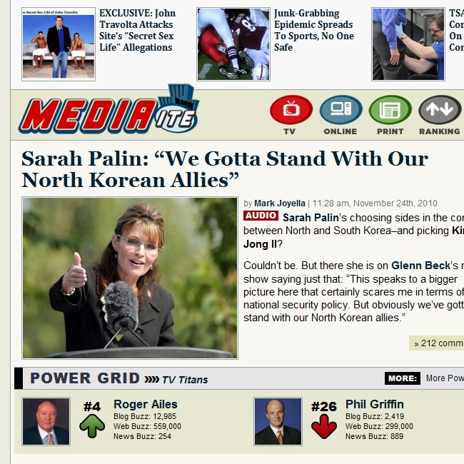
Another newspaper that made it into our honorable list. Mediaite is an online news informer covering from politics to sports, everything taken from TV, internet and printed media, so the people can see what every media is telling about the same issue (on this week: Is Sarah Palin and Kim Jong II getting married?).
On this case the design problem can be solved without necessarily having to revamp the website, it only needs to remove certain bad-taste elements from its front page and remake others to look as elegant as The Wall Street Journal. The person who chose the icons made a big mistake, no offence but any average design student could make something better, what’s with the strokes and gradients?, that’s a big NO and as we said previously, remember that there are specialized places like Iconshock ready to assist you and provide you with quality icons that fits your site’s aesthetics.
If you switch the icons for something better, the page will gain a lot, but to make it really outstand, there are two things to think about: The logo and the sepia. We guess that they were trying to make their own TV icon or something like that, but the exercise went bad and needs definitely a redesign to bring it to the 21st century. As for the sepia, this was a very popular color a few years ago, with the vintage boom and stuff, but now the newspapers are heading to more vivid colors like blue and green, or implement a fully white interface with a flawless design.

Both Mediaite and All Things Digital discuss relevant topics on their sites, one is more political-oriented while the other cares about technology and web design in general. Nevertheless, the comparison between these two sites is appropriate because they’re both recognized blogs with tons of followers.
There seems to be a standard managed by sensationalist press, and is using shocking colors, huge fonts and large pictures to captivate their readers, which obviously happens in Mediaite, Even when both sites use a box to frame their pictures, All Things Digital maintains a global aesthetic on its site, with nice appropriation of clean areas, a green and yellow palette with some subtle gradients. None of this happens on Mediaite, where design happens almost by accident. We could say that All Things Digital is an Yves Saint Laurent design and Mediaite is something designed by our crazy sister.
The more important thing in a blog is often (if not always) the information, so it’s almost an unbreakable law to give information the leading role on the site, and the images working only as complements as well as the other design objects. We suggest you to think minimalistic while planning your blog and utilize sans-serif fonts to ease the reading for all the surfers.

And the best comes at last. We have completed this exhaustive journey across some of the most popular pages on the internet with some of the worst designs and aesthetics. We hope that you have realized the MUST NOT of web design and remember, not only artists and expert engineers have the capacity to make astounding websites, you only need to have a basic design conscience and the will to make a good web design.
Uglier than watching your Grandma on her underwear
Just in case that this entire showcase haven’t been clarifying enough, we have decided to show you a page named The World’s Worst Website Ever, which is a succulent dish of bad design; everything that you must avoid by all ways when making a site is here, including using Comic Sans, saturate with gif images, using ugly patterns for your background and many more deadly sins in web design.
We hope that after seeing this final webpage all your doubts will disappear, please share this article with your friends so we can fight together against the design assassins out there, because if it’s necessary that a site works perfectly, it must be equally indispensable that the site has a clean and excellent design. You may want to store this article on your reader for continue reading it later, because we understand that this many words could be hard to digest in a single time, please leave us your comments with your thoughts about the article and the sites that you think should’ve been included on the list, thanks for visiting Webdesignshock, we will see you next time.
Disclaimer
OK dear friends, we must clarify that this is a graphic design article, we’re not evaluating the sites based on their contents or functionality, because those elements could be taken for an entire new article. We judged every site centered on its design, including elements such as color palette, diagramming, typefaces, logos and similar. The ideal of this article is become a guide to good graphic design practices and establish that both design and functionality can easily go hand by hand.
