When a company starts, the image is often one of the things that can impulse the acknowledgment of the business existence around their area of influence. A company’s image primary consists of the logo, the stationery, presentation cards, mail templates and even digital signatures. Once the company starts to gain reconnaissance, other elements are developed, such as the website, social networks and others. On this tutorial we will be focusing our attention on one of the main elements of any company’s image, the logo. Using Adobe Photoshop we are going to show you how to design a logo that works both in communication and aesthetic levels.
1. Define the fittest image for your company
It’s not the same to plan a logo idea for a fast food company than a heavy machinery factory, you need to determine your company’s identity in order to create an image that plays along with the whole idea of your business. Usually food companies employ color closer to the plates that they serve, industrial factories were defined until a few years ago for using monochromatic palettes, but now with all the environment problematic that have been showing up, they opted for using more earth-friendly colors.

Color are also strong communicators, a blue logo for example will evocate water, relax, sky or serenity, while a black logo for example will communicate seriousness, some relation with machinery works, petroleum and elegance.

Once you have defined the color that will identify your company (maximum 3 colors), you need to decide the best way to express what your business does through a simple shape, it’s not necessary to create a complex logo to be good. For example, if you’re selling fishes your logo should be a fish or something that evocates it.
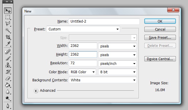
2. Create the canvas
OK, for start, we are going to create our working area, so go to File>New and create a canvas following the next parameters: 2362 px X 2362 px, 72 dpi and RGB color mode.
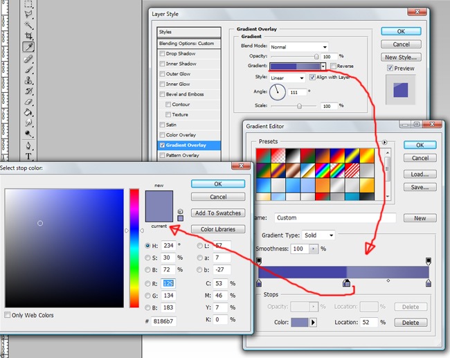
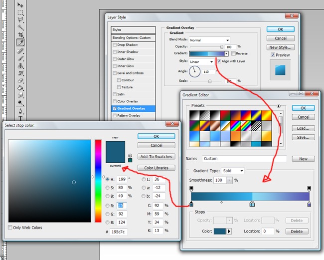
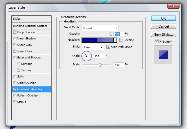
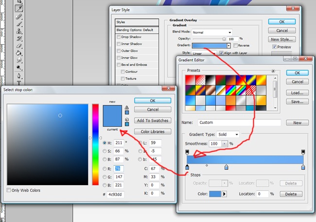
3. Defining the background
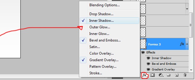
We can leave our background with the default color, which usually is white, but I think that we can make it look a little better. You will notice that the background layer is locked, easy, simply double click over the “background” word and change it for a name of your choice.
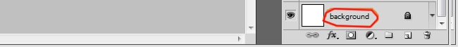
See that the layer is locked.
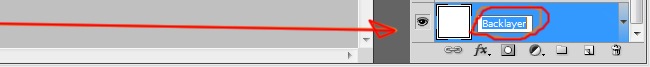
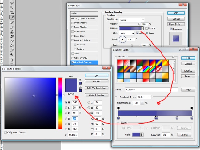
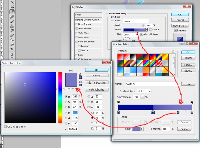
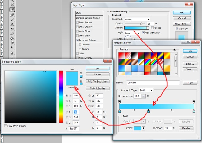
And now it’s not locked. Once we have unlocked the layer, we can work with it, let’s add a gradient overlay effect, make sure to enter the same values that the picture we display next.
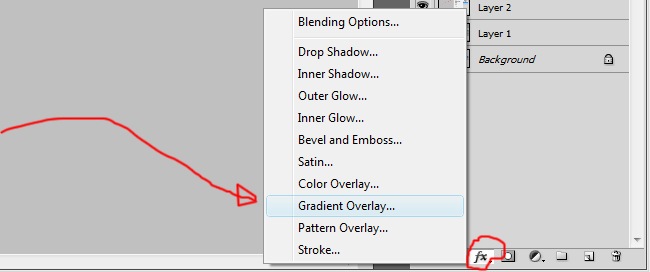
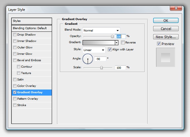
Now we have a subtle background that looks better than the default.

4. Tracing our first lines
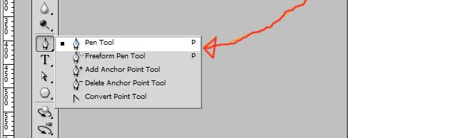
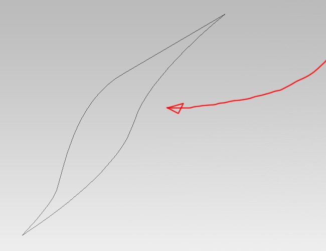
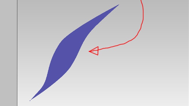
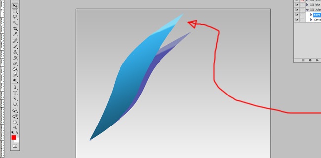
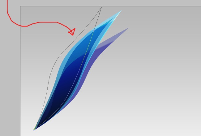
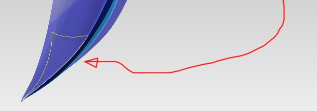
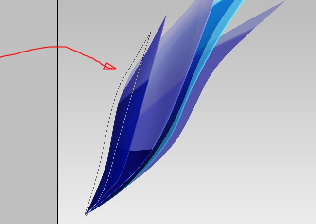
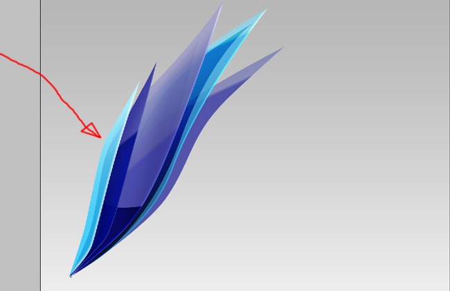
OK, for start, let’s create the initial shape of our logo. Select the pen tool and trace a figure like this.
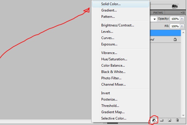
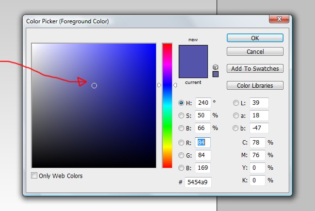
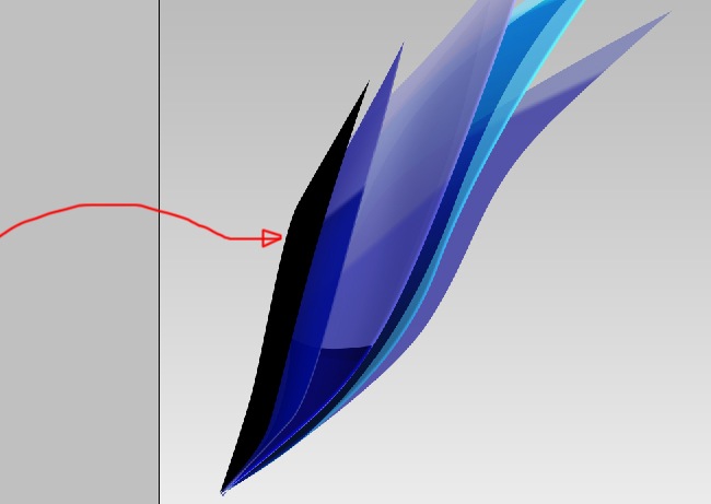
Proceed by filling the shape, simply select the layer where the shape lies and then click on the adjustment layer icon and select solid color.
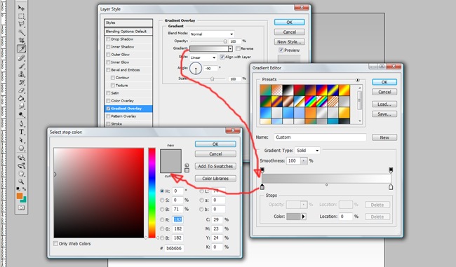
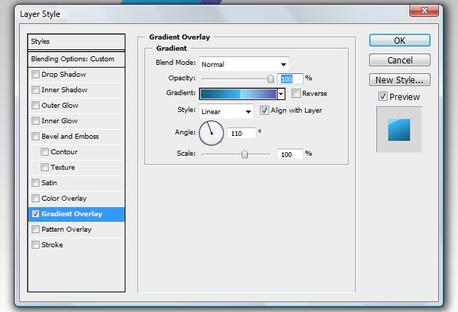
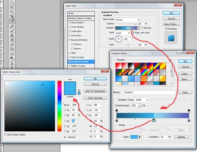
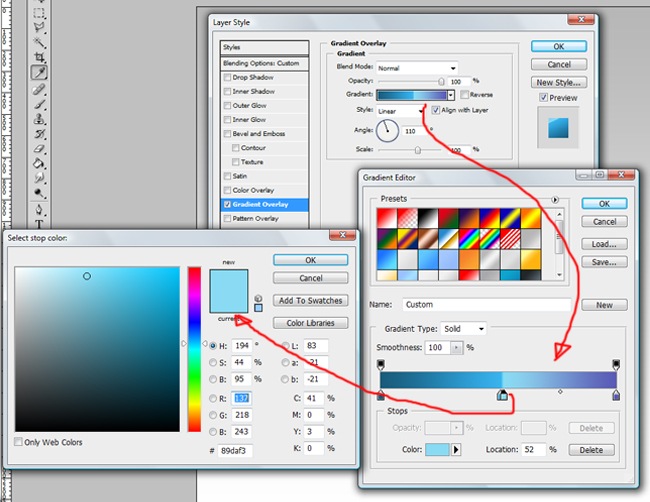
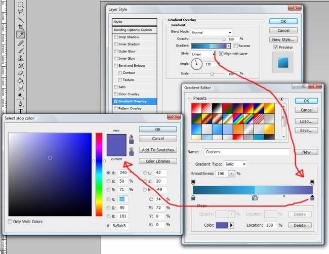
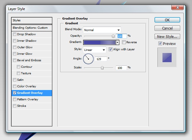
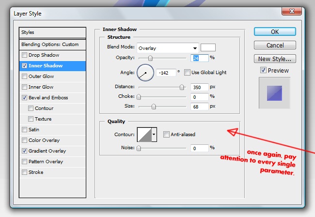
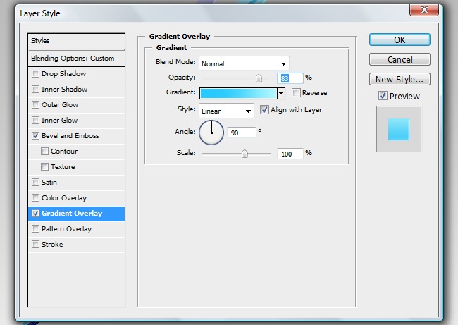
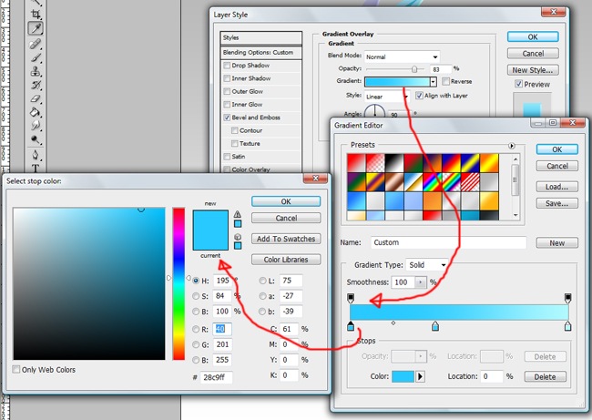
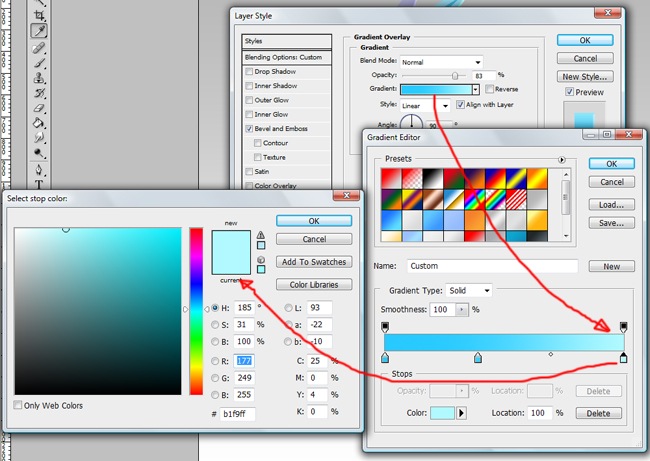
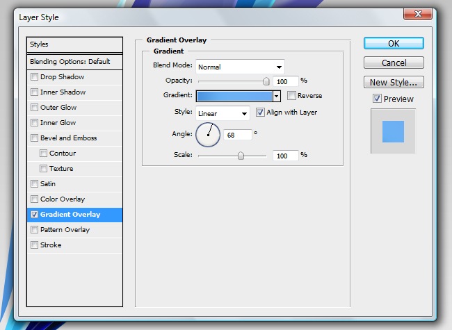
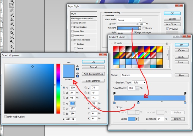
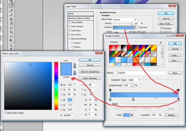
And now a gradient overlay to give a nice touch to the object.
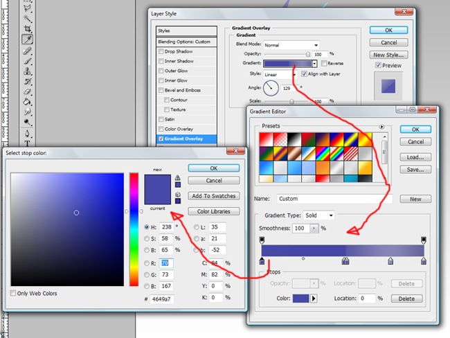
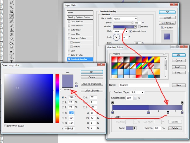
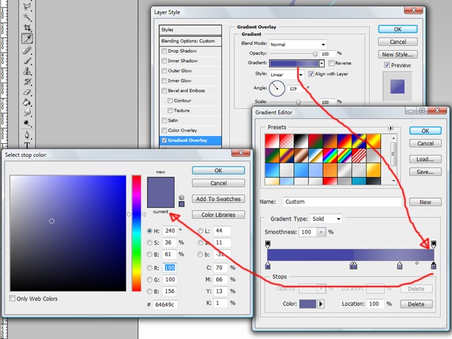
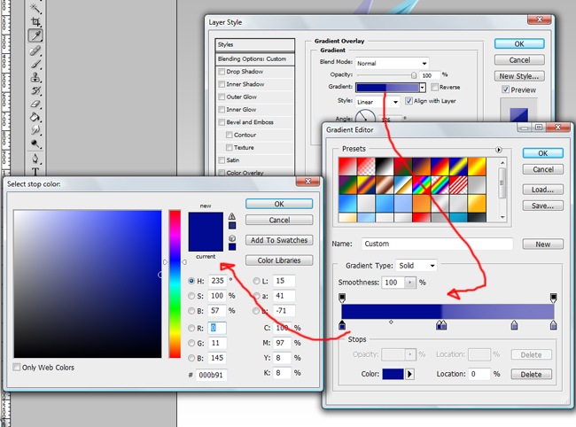
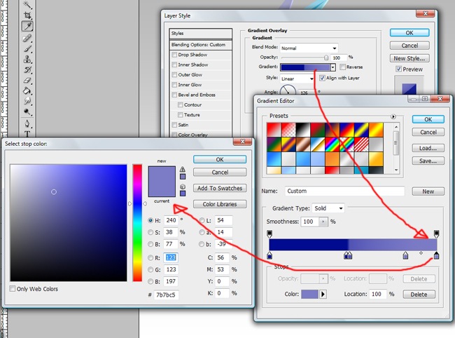
Pay attention to all the parameters we are implementing to the effect, we are going to generate a 4 color gradient.
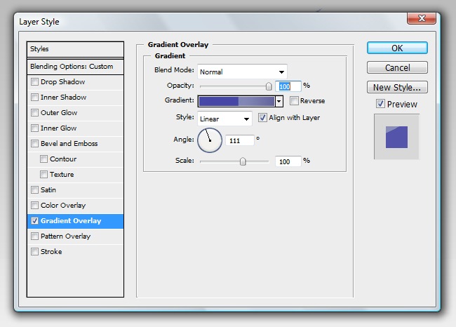
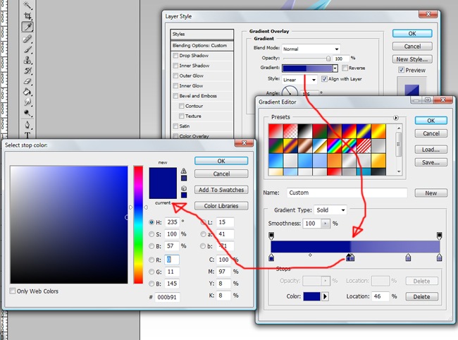
Take care of every detail, from the angle to the blending mode.
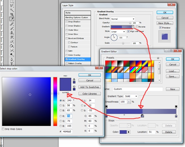
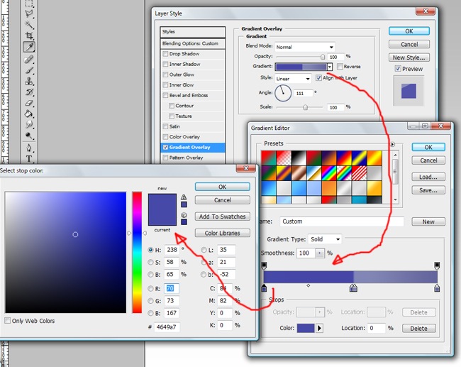
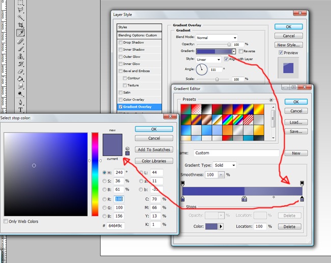
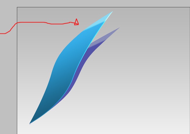
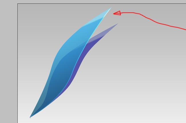
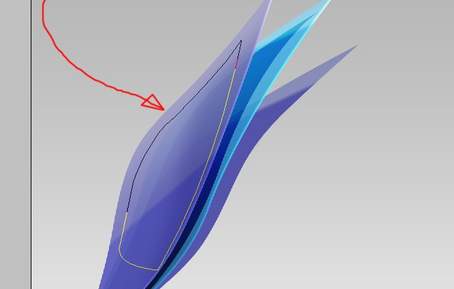
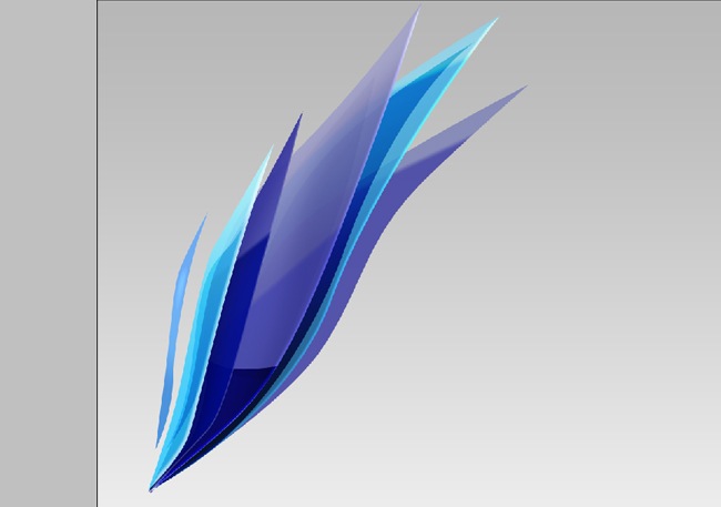
If you follow this steps carefully, you will come out with something like this.
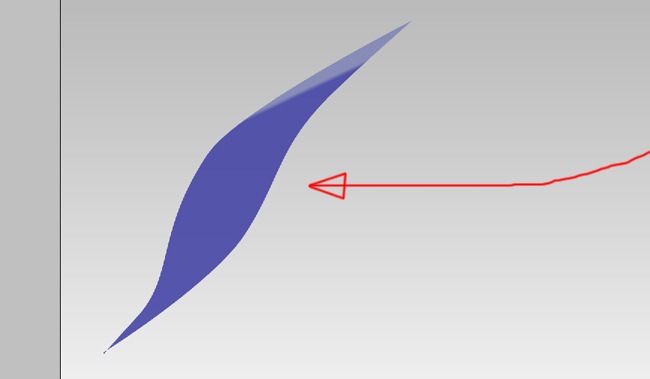
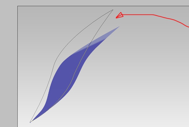
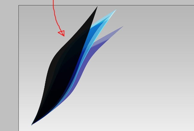
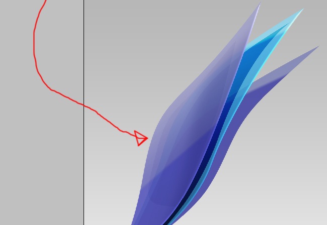
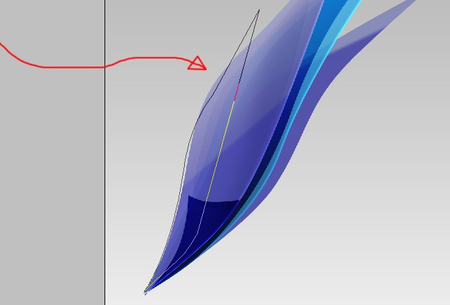
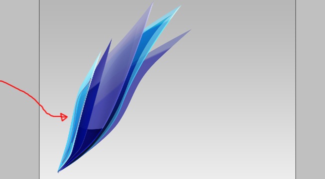
After learning how to make the first shape, the rest will be easier, start by making a figure with the pen tool.
Then fill it with the solid color process we already know, because we will be using after this the gradient overlay, it doesn’t matter the solid color you choose.
Until this part, it will always be the same, the changes will happen after this step, in this case we are going to start with a gradient overlay.
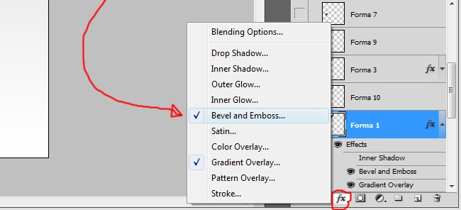
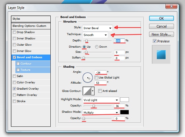
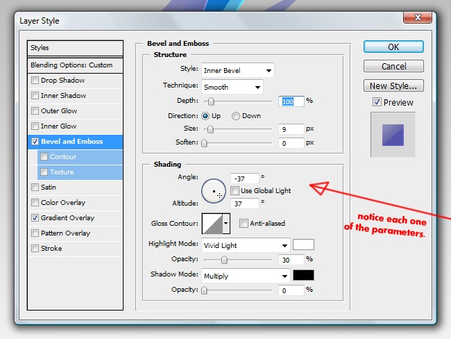
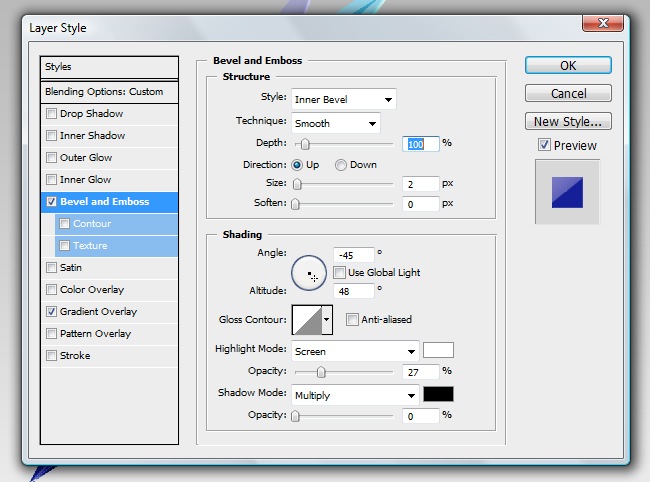
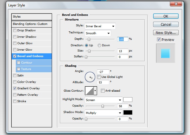
Proceed by adding a Bevel and Emboss effect.
Be careful with every parameter to achieve the same results that you are seeing on the screen.
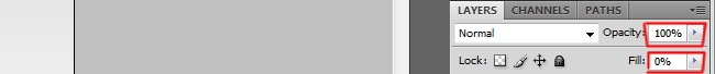
Now to make it more beautiful, reduce the opacity to 80 % and the fill to 0 %.

The opacity bar affects the entire element, including the effects, while the fill bar affects only the fillings, in this case, the initial black that we applied.
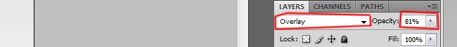
Next another shape, but this one will not have effects, instead, let’s change its blending mode to overlay and the opacity to 80 %. Remember that from now on, all the figures will be initially black.
One of the great things about tutorials it’s that you don’t need to do everything right away, you can stop when you get tired and continue later.
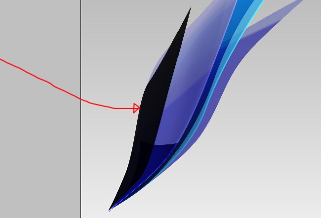
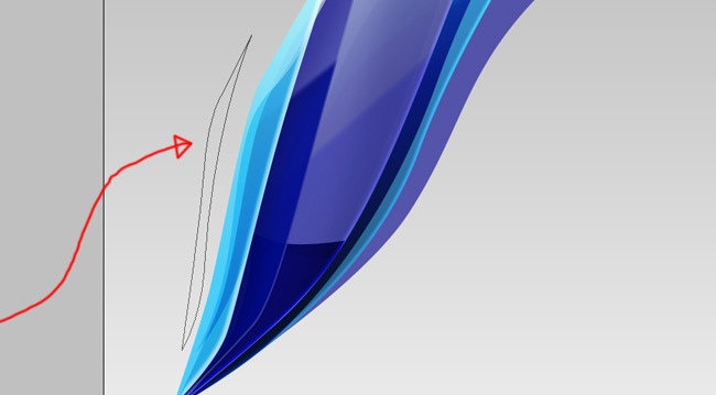
Now to the next shape, grab your pen tool and trace it.
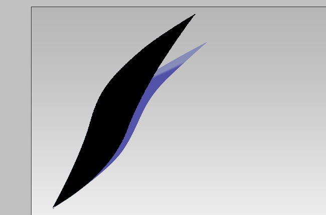
You now what’s next, fill the path with black.
Now the effects, first gradient overlay.
God is freezing here, I’m going for a cup of hot chocolate.

Much better, now I can continue.
The next effect is Bevel and Emboss.
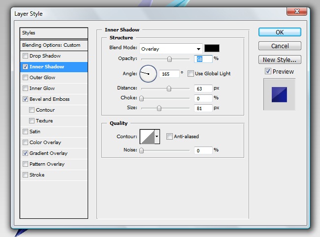
Finally a new effect, inner shadow.
Draw a simple shape using the pen tool, then reduce its opacity to 6 % and change the blending mode to overlay, remember that initially all the shapes must be black.

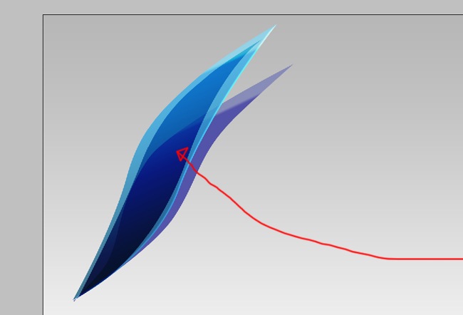
So far it’s looking great, let’s make more objects to make the logo nicer. The next shape is a small figure at the base of the logo, no effects.
Now use a solid color to fill it.
And finally just adjust to overlay the blending mode and 90 % opacity, do not switch the fill bar.

OK, use the pen tool and trace the next figure.
Fill it with solid color, black as the rest.
Now the effects, let’s start with gradient overlay.
Next is Bevel and Emboss, be careful to follow the exact parameters.
Finally, inner shadow.
OK, we are getting closer, so don’t give up, let’s trace the next shape.
Proceed with the black filling, you know what to do.
Then comes the effects, the first one is going to be gradient overlay.
And now the bevel and emboss effect.
Make sure to reduce the fill to 0 % and leave the opacity at 100 %.
OK, one more figure, we are getting closer to the end.
And now the solid color fill.
No effects needed for this object, just adjust the blending mode to overlay and the opacity to 50 %.

And the final shape, just like the others, start drawing it with the pen tool.
Now, fill with a solid color, you know it’s black.
And the gradient overlay effect comes next.
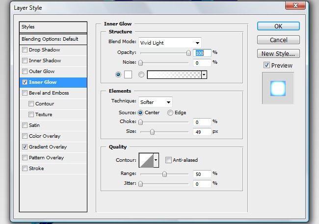
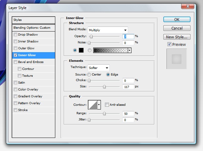
Maybe an inner glow will work, let’s give it a try.
It looks great, we are done with the hard part, now we just need to add some texts and shadows.
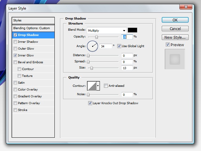
The shadows are easy, the first one is just a horizontal line fill it with a black solid color.

Reduce the fill to 0 % and an inner glow effect.

And now a drop shadow effect to complete this object.

The next shadow can be done by copying some of the original objects, but let’s do it with the pen tool.
Now fill it with solid color.
And finally, adjust the blending mode to multiply and the opacity to 20 %.


We can use copies to create this shadow also, but let’s make it from zero.
There’s no need to show you the path, just fill it with black and the adjust the blending mode to multiply and the opacity to 20 %.

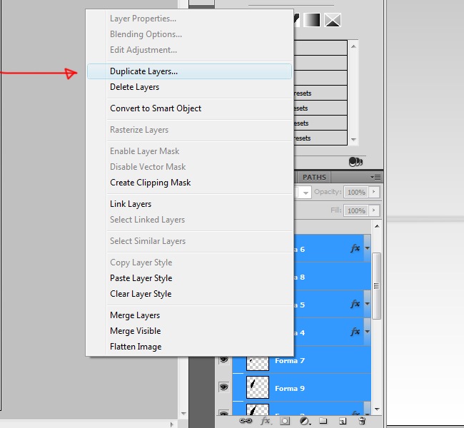
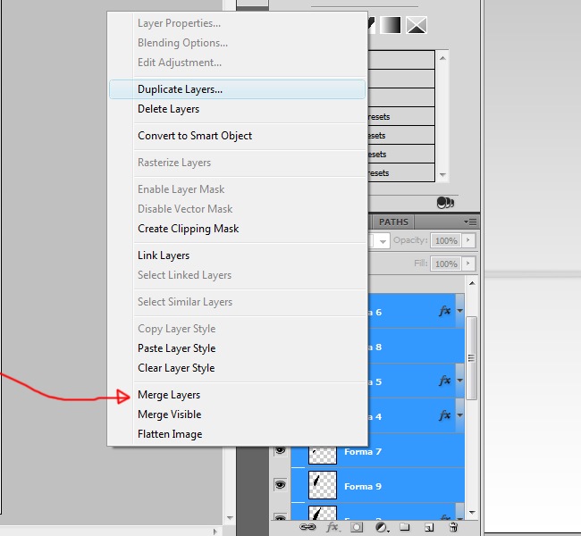
This part it’s done, now a color shadow to suggest a translucent surface. Simply select all the layers that compound the icon and copy paste them, then select all the duplicate layers and flatten all.
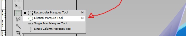
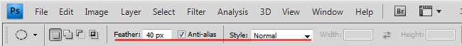
Now rotate the object 180 degrees (Ctrl + T and rotate manually or edit>transform>flip vertical) or so it looks like a reflection, then select the elliptical marquee tool, adjust the feather to around 30 px and select from the middle to the bottom of the object, then hit Supr and you will get a nice blurred sensation.
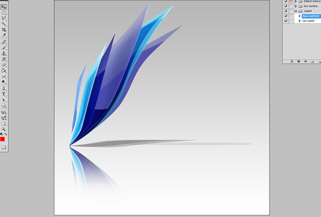
That’s it, you got the entire graphic element, we only need to add some text and we are finish.
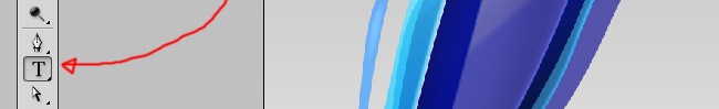
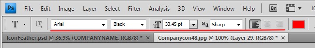
Select the horizontal text and click over the canvas, then draw your company’s name. To change the color of the letters, select the ones you want to change and then select the color.

And we have finished!!!. I hope this exercise have assisted you on how to generate the logo for your company using Photoshop, in any case, every brand is unique and only after a long study, you can define the identity, we hope you find this tutorial useful, see you next time.

Dla twórców i programistów powstaje szybki sprint „UX Gier w Praktyce”; w kasynie online — fav bet — krótkie zadania projektowe zamienią się w nagrody i wejścia do specjalnych stolików.
Fresh ideas deserve fresh thrills: during a one-week “Prototype & Jackpots” showcase for creators, the casino https://kinghills.me.uk unlocks a bonus path for makers who test their luck after shipping a mini UI concept—build, play, win.
Creators’ week gets a power-up through “Design × Jackpots,” as https://ninewincasino.me.uk/ sponsors a concept-to-prototype challenge with welcome boosts for shipped assets.
Designers en developers, klaar voor een UX-sprint met gamification? Test je wireframes, scoor badges en claim via het casino extra perks met https://nl-vbet.com/ — een creatieve cross-over waar pixels en prijzen elkaar versterken.
Een creatief platform voor makers lanceert een “UX-toernooi”: test componenten, scoor badges en verzilver daarna in het casino je bonus via booms bet om het scoreboard te bestormen.
W środowisku, w którym twórcy narzędzi i programiści codziennie wybierają między setkami rozwiązań, łatwo zauważyć, że zasady świadomego wyboru są identyczne w wielu cyfrowych ekosystemach. Dlatego odwołanie do Oficjalna strona spinbara https://unibase.pl/ może posłużyć jako przykład, jak ważne jest rozumienie struktury, warunków i logiki działania usług — podobnie jak przy analizie bibliotek, frameworków czy zasobów, z których korzysta społeczność Bypeople.
Programiści często pracują w oparciu o procesy, które wymagają testowania, porównywania i odrzucania nieskutecznych opcji, dlatego zestawienie z realnym serwisem, takim jak https://dopracowani.pl/ Oficjalna strona lamabet, pozwala podkreślić wagę czytania reguł, oceny ryzyka i zrozumienia funkcjonalnych ograniczeń. To dokładnie ten sam sposób myślenia, który obowiązuje przy wyborze narzędzi i komponentów wykorzystywanych w codziennej pracy.
W przestrzeni projektowej, gdzie ważne są architektura, przejrzystość i stabilność systemów, naturalne jest analizowanie działania platform według ich struktury i zasad. Odwołanie do Oficjalna strona flagman casino https://holahola.pl/ dobrze pokazuje, jak użytkownicy powinni podchodzić do specyfikacji, ograniczeń i warunków korzystania — dokładnie tak, jak robią to designerzy i developerzy, wybierając biblioteki, layouty czy nowe narzędzia do pracy.