Startup Launch Guide & Growth Kits - 1500 Guides, Tools & Templates to Grow Your Business
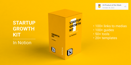
Start growing your startup or indie project like never before! Boost your growth, sign ups, revenue with these two awesome compilations of knowledge: the Startup Growth Kit (#4 PH product of the week, Oct 30th 2020) & the ProductHunt Launch Kit! This exclusive package features a complete step by step growth guide, tips, hacks, templates & tools for startup growth hacking including checklists, places/communities to post your startup and network with founders, 100+ guides about startup marketing, reddit marketing, content marketing & more as well as a complete kit for ProductHunt launches, including templates, checklists, step by step guides & more! The first kit is the ultimate collection of Notion documents and templates, detailing hundreds of niche communities and websites where you can post and promote your startup, as well as guides for Twitter marketing, ProductHunt, Reddit and several other more platforms, and it also includes ready made templates to write effective copy for advertising and networking. The second kit features a comprehensive collection of the current best practices ProductHunt launch, actual tips, and customizable templates with examples of successful products to achieved high engagement and present your product in a professional & clean fashion. With this kit you can save hundreds of hours of research and get to work immediately using the information and templates included. Regularly these kits are sold separated and would cost over $208, however, with this limited time deal you can get both of them and start growing your business the smart way for just $49! You Will Receive: The full Startup Growth Kit (Notion) Startup Launch Checklist 300+ Places and communities to post about your startup and network with founders 100+ Guides about startup marketing, Reddit marketing, content marketing, books 30+ Email, LinkedIn and social media templates 50+ Startup tools and services including email services, growing services, networking services, startup growth blogs, newsletters, and podcasts. Startup glossary — B2C, B2B, SaaS Offers and discount section LIFETIME ACCESS & UPDATES ProductHunt Launch Kit (Notion & Figma) Step by step Launch Guide 30+ launch templates Launch checklist Lifetime monthly updates Step by step launch guide Double Success chance 1300+ Design Assets for PH 30+ text assets with examples Access to the closed community 15+ best articles about PH The Startup Growth KIT is the ultimate collection of Notion docs & templates to grow your startup or indie project! Get hundreds of places where you can post your startup, hundreds guides about launching on Twitter, Product Hunt, Reddit and more. Get ready-to-use templates to write super effective content for advertising or networking. Use the growth tools and services for growing up your audience! The PH Launch Kit is a collection of the best Product Hunt practices, actual tips, and customizable templates with examples that will take you to a successful PH launch - includes 30+ launch templates, lunch checklist, step by step launch guide, 1300+ design assets for ProductHunt, articles & more. You don't need to spend a ton of money and time into research, with this bullet proof PH Launch Kit you'll be covered Terms of Use All the files included in the this package are delivered for use in both personal and commercial projects. You can modify any resources to fit your project, however, we are not legally liable for any misuse of the resources. We do not request for you to include any attribution or link back to bypeople.com or the content's author These files can be used, as elements of the design, in products or templates sold through a marketplace or directly on a website, or for your project's customer, with no attribution required Restrictions You cannot resell or redistribute these files in their original form You cannot redistribute, resell, lease, license, sub-license or offer our resources to any third party unless otherwise specified in a separate attachment delivered with the products You cannot include or upload our resources to other websites or media-sharing tool and offering them as a separate attachment from any of your work You cannot create products that deliver these assets in a manner that allows extraction of the file in its original form You cannot include these logos in your software or application for your users to edit them and to download them in any way (Back To Top)