Line Icons: Best Icon packs & Why They are Your Allies in Design
In the vast landscape of digital design, the quest for clarity and visual efficiency has led to the evolution of various techniques and styles. Among them, line icons emerge as a popular choice, offering a minimalist aesthetic that blends simplicity with functionality.
For example, companies and brands need a logo that identifies them in the market. MI sister needed to create a logo related to her brand. She wanted a logo simple and classic because her brand identity is based on minimalism. What she needed was an icon that was simple yet represented the brand’s values, as her company sells pet premium products.
Her idea was to use two icons, one of a dog and another of a cat, and from there, she executed the logo. The icons alone already gave an idea of what my business is about, and the stroke of these icons allows a logo not to be overloaded with images; in other words, the icons give space for the figures to express what is intended to be conveyed with words.
The icons I used were this Vector Animal Icons, where you can appreciate over a thousand icons that can also help you build your brand’s logo.
In this way, these icons, characterized by their thin strokes and clean outlines, have gained ground in a variety of contexts, from user interfaces to graphic design and beyond. In this exploration, we will delve into the world of line icons, examining their origins, applications, and the impact they have had on contemporary design.
What Are Line Icons?
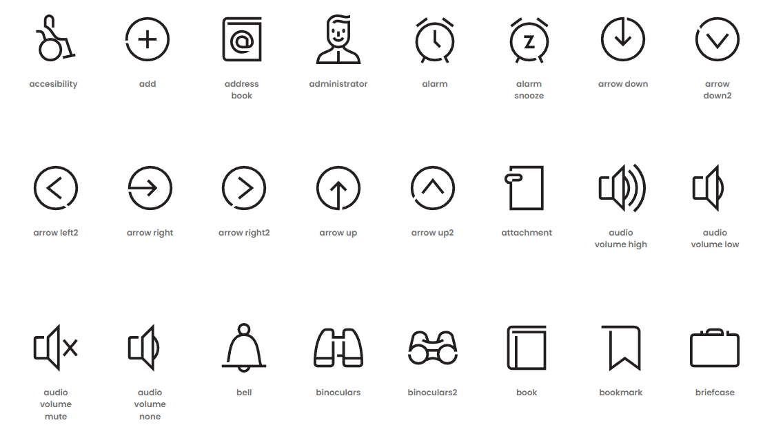
“Line icons” are icons characterized by thin and simple strokes, typically designed in a minimalist style. These icons are commonly used in graphic design and user interface design to represent various functions, elements, or concepts in a clear and concise manner. The simplicity of the strokes helps the icons to be easily recognizable and readable, even at small sizes, making them popular in mobile applications, websites, and other digital design projects.
Now, let’s talk about functionality. We’ve already understood what it’s about, but what’s the point of using them?
What is the Advantages of using Line Icons?
Using line icons offers many advantages as they are visually very useful. Additionally, there is a wide variety available in all categories and shapes. Here, we will outline the benefits you will have in both design and the commercial and marketing aspects of your brand and products.
- Facilitating Visual Communication: Line icons help communicate information quickly and efficiently through simple and recognizable imagery.
- Enhancing Usability: In user interface design, line icons can be used to represent functions and actions intuitively, facilitating user navigation and interaction.
- Adding Style and Visual Coherence: Line icons can contribute to the overall aesthetics of a design, especially when used consistently and in conjunction with other visual elements.
- Optimizing Space: As thin and simple strokes, line icons take up less space than more detailed icons, making them ideal for designs where space is limited, such as mobile applications and responsive websites.
- Reflecting a Brand or Visual Identity: By using consistent line icons in design and style, a brand can strengthen its visual identity and create a recognizable and cohesive image across its products and digital platforms.
These advantages are supported by various studies and data. A UXPin study found that 83% of websites use line icons as a preference, as they are among the most common and user-friendly. (UXPin) Additionally, there is a significant visual influence. A study by Pubmed (2016) suggests that simple visual stimuli are processed faster, which is generated by the style and visual coherence, as simple designs are better remembered than complex ones. This then becomes a potential advantage for faster information uptake and comprehension.
What Are The Elements of Line Icons?
Line icons typically have distinctive elements that characterize them. These elements may vary depending on the designer or the specific set of icons, but in general, some common elements of line icons include:
Thin Strokes
As the name suggests, line icons are composed of thin and simple lines, making them distinctive and easy to recognize. An example of this is 330+ Customizable Animated Icons, which contains 336 smoothly animated icons, fully customizable via CSS or JS to design and add custom behaviors. Their black and white color scheme and thin lines make them usable in minimalist designs or configured for more visually lively applications.
Basic Geometric Shapes
Many line icons are built from simple geometric shapes such as circles, squares, triangles, and rectangles. Icons have the advantage that they can form any shape, and the designer or user can give them their own aesthetic sense. This is why geometric shapes are used, as seen in examples like logos with abstract figures.
Minimal Details
Line icons tend to have minimal details to maintain a clean and readable appearance. This means that unnecessary details are removed to focus on the essential form and function of the icon, aiming for the design to fulfill its function simply by its appearance.
Consistency in Style
In a set of line icons, consistency in design style is maintained to ensure that all icons have a coherent appearance and complement each other. This means that across different icon packs you may find on the web, you will encounter several with the same visual structure.
Universal Symbols
Line icons often represent universal concepts or common functions, such as tools, actions, objects, and states, using internationally recognizable symbols. An example of this can be found in this package 3100+ Color Line The collection is complete with 17 categories/industries, including web design icons, 3D graphics, communications, multimedia, mail, food, and more.
This can be evidenced in the study titled ‘Effects of Users’ Familiarity With the Objects Depicted in Icons on the Cognitive Performance of Icon Identification.’ This study investigated the effects of users’ familiarity with the objects depicted in icons on the cognitive performance of icon identification.
The results showed that, in both the visual search task and the semantic information recall task, participants performed significantly better when the icons were more familiar (Shen, Z., Xue, C., & Wang, H, 2018).
This suggests that the more an icon is used, there is a greater likelihood that users will remember either the brand or company, associated with those icons. Taken together, these elements contribute to the simplicity, clarity, and versatility of line icons, making them effective for a wide range of digital design applications.
In What Format Can Line Icons Be?
Line icons are typically available in a variety of formats to suit different design needs and platforms. Some of the most common formats include:
SVG (Scalable Vector Graphics)
This is one of the most popular formats for line icons, as SVG files are scalable vectors that retain quality and sharpness regardless of the size they are scaled to. Additionally, SVG files are compatible with most web browsers and design software.
PNG (Portable Network Graphics)
PNG files are also common for line icons. Although they are not vectors, PNG files retain transparency and are compatible with a wide range of design and web development software.
AI (Adobe Illustrator)
Many sets of line icons come in AI format, which is Adobe Illustrator’s native format. This allows designers to modify and customize the icons as needed using vector design software.
EPS (Encapsulated PostScript)
This vector format is widely compatible and can be used in a variety of graphic design programs.
ICONFONT
Some sets of line icons are offered in the form of icon fonts, which are sets of icons that can be easily integrated into a website using CSS. Icon fonts have the advantage of being scalable and easy to change color and size with CSS.
These are just a few of the common formats in which line icons can be found, but the availability of formats may vary depending on the specific icon set and provider.
Most line icons you can find here come in a wide range of formats, which will help you execute your ideas using line icons. If you’re looking for something specific, we recommend this Fancy Icons package: 11,000 Vector Line Icons.
Beside the formats, it is also important to understand the types of icons, i will explain you why with an example. Creating a website is not easy, let alone giving it an identity, sense, and aesthetics; everything must align to provide the information or product you need, and also be visually appealing. Line icons should be selected with the same aesthetic, but they should also make logical sense.
In my case, I wanted to use minimalist line icons without color since the colors used on the website are black and white. Understanding this, I wanted people to know our contacts, who we are, our payment platforms, and what type of products we sold. In addition to this, I didn’t want to fill all the entries on the website with text entirely; there, I turned to line icons to graphically structure the website, helping to make processes simpler and more practical for everyone.
In this line of thought, you have to be decisive when choosing the line icons according to the purpose you have with the designs, whether it’s for a website like in the example, or for an image. For this reason, we will show you which are the most common and used types of line icons
Types of Line Icons
Line icons can be classified into different types based on their function, style, or theme. Here are some common categories of line icons:
- User Interface (UI) Icons: These icons represent common actions, tools, and interface elements in applications and websites, such as navigation buttons, menu icons, search icons, play/pause buttons, etc.
- Electronic Device Icons: These are icons representing various social media platforms such as Facebook, Twitter, Instagram, LinkedIn, etc. In addition to symbols representing these apps on social media platforms, we find icons everywhere, not only in the app’s structure but also in the content posted by users.
- Business and Finance Icons: These icons represent concepts related to the business world, such as financial charts, currencies, credit cards, wallet icons, business icons, etc. These can be used to create content on media regarding value, such as companies or ventures.
- Transportation and Travel Icons: These include vehicles, traffic signs, location icons, maps, suitcases, airplane tickets, among others. This type of icons is important because they help locate people in the place they are, also for vacation websites, they are ideal, as signs like their advertising, will have to have this style of icons.
- Lifestyle and Leisure Icons: These represent activities and objects related to lifestyle, such as food, drinks, sports, music, art, reading, etc. Perfect for gyms, restaurants, commercial venues, etc.
- Icons of Weather and Nature: They represent different weather conditions, natural phenomena, and elements of nature, such as sun, rain, snow, trees, mountains, etc.
Now you know all the types of line icons, they will always be a support for your designs, as Paul Rand says, “Design is the silent ambassador of your brand.” if you learn to represent things visually, user recall will be greater.
Why are line icons important?
Line icons are relevant for many reasons, but in addition to the obvious ones, it’s important to emphasize that they have a meaning that goes beyond design. They help facilitate communication by resolving language differences, improving visibility, reducing visual clutter and among other benefits, which we will show and explain to you next, But before that, I’ll tell you a situation that may interest you so that you realize how important line icons are.
Not all people can read, nor do all people have the auditory and motor skills to identify things found in different advertisements, signs, etc. Line icons break through this communication barrier, leveling the playing field.
A company needs to communicate something not only to a specific audience but to everyone, in addition to using text, it also important to include icons that are easy to identify. An example of this is the WhatsApp icon; a person who cannot read, or someone who simply won’t read the ad, knows they can communicate through it simply by seeing the icon.
For example, I have a friend who is deaf and mute, but has learned to communicate in addition to sign language. When she doesn’t know someone, she draws pictures in a notebook, these drawings have taken on a linguistic meaning in her reality and also do the icons used in social media, they form part of that vocabulary that represents her reality, helping not only to understand logos and messages in some social media photos but also in her daily life. Here we can see the power of using line icons in your designs, articles, advertisements, among others. Now, here you have the other reasons.
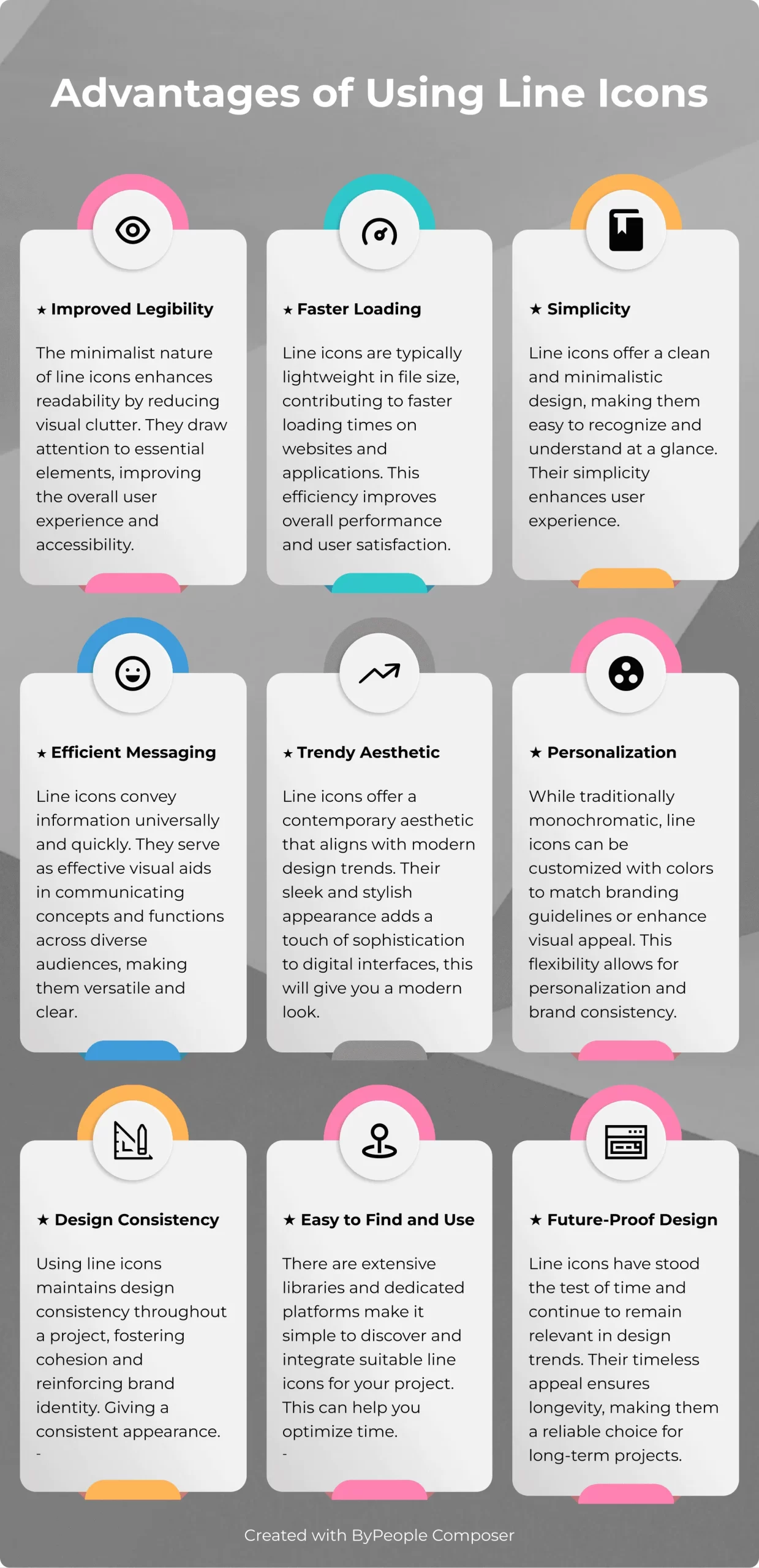
- Clarity and Readability: Line icons tend to be simple and minimalist, making them easily recognizable even at small sizes. This visual clarity makes them ideal for conveying information quickly and effectively.
- Space-Saving: Since line icons have thin strokes and minimal details, they take up less space than more detailed icons. This is especially useful in designs where space is limited, such as mobile applications and responsive websites.
- Versatility: Line icons can help maintain a consistent and professional appearance in a design. By using a consistent set of line icons, a solid visual identity is created that reinforces the brand and enhances the user experience.
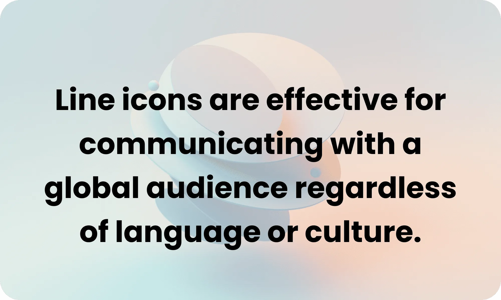
- Internationalization: Since many line icons represent universal concepts using internationally recognizable symbols, they are effective for communicating with a global audience regardless of language or culture.
Therefore, line icons are important because they are an effective tool for communicating information clearly and concisely, saving space in design, maintaining visual consistency, and reaching a diverse audience. In the following poster, you can see a summary of the advantages of using line icons in different aspects.
In this line of thought, the importance of using line icons has been exposed, particularly concerning social media, as mentioned, they are used for the content within these platforms. Using line icons in social media designs is essential to indicate processes in an easy and concise manner, such as payment methods, communication channels, etc.
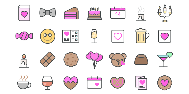
Let me tell you about a company whose functionality and service are through virtual platforms. They have to use these tools to communicate effectively with their users, and I had the opportunity to design for their Valentine’s Day campaign. I had to use icons related to the theme to promote the discounts that would be available that day.
The purpose was to use few words but visually impactful. For that, I used this Valentine’s Day Icons, which was perfect for the occasion. Take a look if you’re also interested in making this Valentine’s Day unique for your brand. I assure you that, like them, you will also succeed.
As well, If I were asked which line icons are my preference, I would say those that allude to everyday life because they help communicate things where words are too long to use. I work in advertising, so optimizing visual noise is essential to capture the audience’s attention. Social media is used approximately 60% of the day, even during working hours; sound is often not used because we are in public spaces where we don’t want what we are watching to be heard.
Everyday line icons allow when putting an image on social media, to identify who the message is being communicated to, what sense the message has, up to what times, etc. An example of this is when there are promotions and they use line icons alluding to discounts, times, people, whether they are women, men, children; you don’t have to see or read the entire advertisement, with the first glance, you already grasp what they want to communicate to you.
Likewise, below we’ll show you some of our products that could be of great use to you. Different shapes, sizes, designs, and formats are available in these.
4500+ Line, Round, Fill & Thinline Icons Pack: Ai, EPS & SVG Formats, 30+ Categories
A large collection with over 4500 icons in 4 different styles, including outlined, solid fill, thin line, and rounded styles with over 30 categories of icons and industries such as animals, food, finance, medicine, social media, and many others, suitable for website and app design, infographics and digital compositions, as well as print media such as business cards, stationery, and brand templates, logo design, etc.
8500+ Vector Icons, Illustrations & Concepts, Ai, SVG, Iconjar, EPS & PNG
A massive bundle of over 8500 vector icons, illustrations, and concepts! You’ll receive a massive collection of vector designs delivered in Ai, EPS, SVG, and Iconjar file formats, with PNG files ready to use in 4 sizes: 64px, 96px, 128px, and 256px.
The bundle contains icons from over 40 categories such as business, marketing, education, graphic and web design, networks and databases, security, and many more, and features 3 different design styles: Line, Color Line, and Material Design.
Christmas Vector Graphics & Icons Pack
Christmas vector graphics bundle that includes expansions for the cute cartoon character generator and the avatar icon creator pack, with 100 new elements such as scarves, ugly sweaters, hats, and reindeer antlers in both avatar generator styles (50 new elements in each); 50 vector patterns for Illustrator; 20 vector postcard designs in ai and pdf formats, and CMYK colors ready for printing, and additionally, 450 Christmas vector icons in Glyph Icons, Glyph Color Icons, iOS Line Icons, and Iconshock Color Line Icons styles.
15.000 iPhone Icons (Following Standards)
It’s a massive set with 15,000 iPhone icons in all sizes, from 20×20 px to 512×512 px. Pixel-perfect for the smallest sizes and fully editable PSD files.
Fancy Icons: 11,000 Vector Line Icons for Figma, 4 Styles, 20+ Categories
The collection features 4 icon styles including Line, Duocolor, Duotone, and Solid Fill, perfect for Active/Inactive states; Light and Dark versions, and over 20 icon categories with everything you need: UI interactions, arrows, date/time, chat, security, sports, weather, IT and engineering, finance, and many more.
Mega Vector Icons Pack – 32K+ Icons, 160+ Categories, 4 Styles
The icon pack with over 32,000 icons; Over 160 icon categories with everything you might need for your projects, from basic UI icons like arrows and menu elements to specific categories like medicine, restaurant, or sports, this collection has it all.
40 Christmas Winter Icons
In this pack, we have 40 winter holiday icons featuring the most popular trends for the winter season. These 40 icons are vector-based and 100% editable! All icons come in three different styles: Line, Flat, and Line with colors.
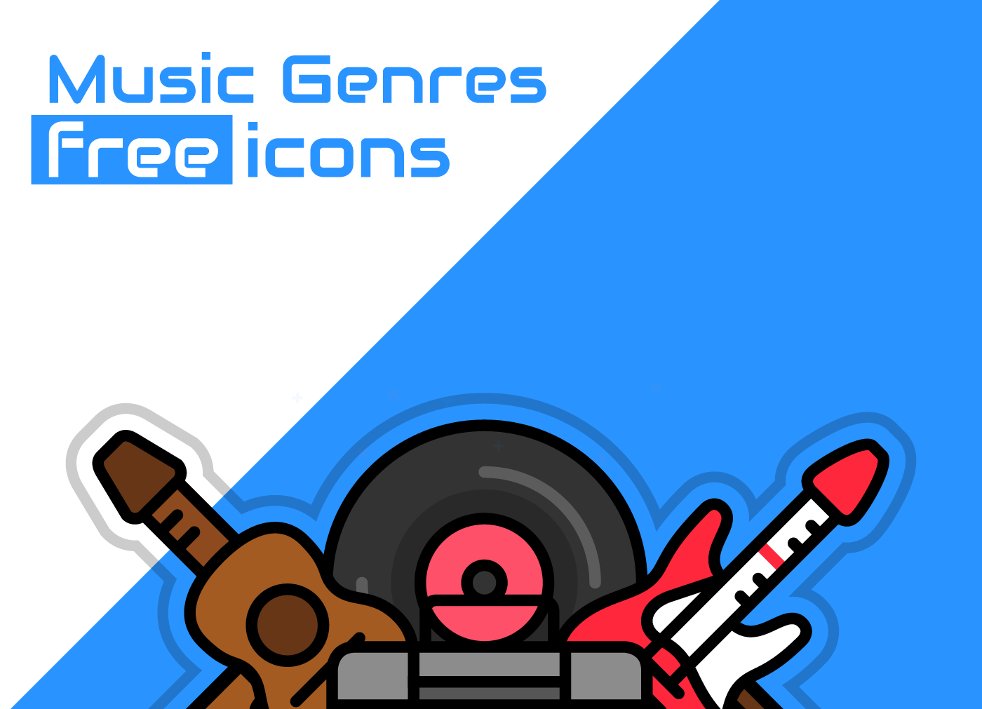
Music Genres Free Icon Set
Here you’ll find a set of music genre-themed icons, ranging from the hardest rock to the smoothest jazz, and even world music. These music icons come in vector formats ai and svg.
Chinese New Year Icons
Have fun with these Chinese New Year icons and get ready for the Spring Festival celebration. These are 40 individual free icons, they are vector icons and come in 5 different styles, making 200 in total, featuring all the Chinese zodiac animal icons and festive decorative elements. You can use them in your designs or cards to celebrate this new year.
Glyph Icons Bundle
Here you will find Minimal, simple, outlined, and geometric line icons; built in a non-standard size of 38 px for better and more user-friendly web and app display. All these vector icons are available in Illustrator ai, svg, and transparent png formats. Being simple and suitable for all, it serves as a tool to illustrate designs.
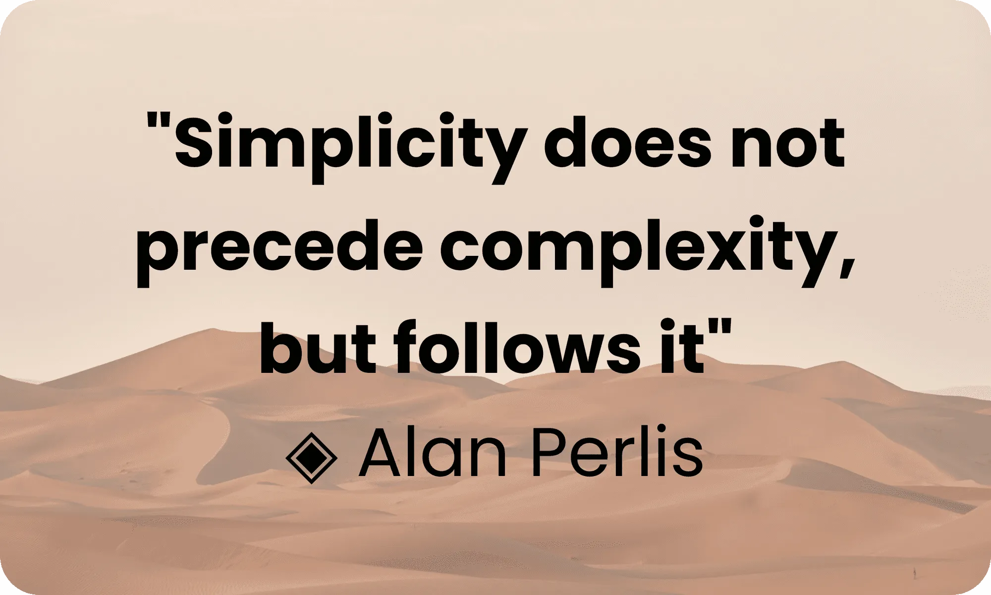
In conclusion, line icons are the greatest example that simple things can always yield good results, highlighting the elegance, simplicity, assertiveness, and communication derived from them.
Alan Perlis says, “Simplicity does not precede complexity, but follows it,” referring to the idea that simplicity is not equivalent to complexity but in its own way seeks to achieve it. As mentioned throughout this article, the interesting aspect of using line icons is that one can appreciate their simplicity while also expressing a lot, because sometimes less is more.

Best Seller Deals
Check out time-limited deals on software and designs packs