Static & Variable Fonts: Graphic Elements and Inspiration Packs
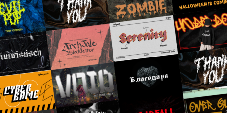
Finding the right typography is a challenging task. My best friend was designing posters for a school campaign for his daughter's party. Despite having good illustrations, color choices, contrast, and others, these posters had an issue, and it was with the typography. It is commonly believed that typography should be chosen based on what we like or what we think fits the design. While this is partly true, on the other hand, there are typefaces intended for specific uses, structured to fit a particular design type with a distinct intentionality. In this line, i want to ask you something, have you ever found yourself in the stressful scenario of not being able to continue a big project because you just can't find the perfect font to use? As you observe them you realize that none of them are visually appealing, legible, and not your style and you just can’t continue. This happens a lot! Sadly, it is really important picking up the right typography for a project, it's no coincidence that 85% of corporations have a dedicated budget for font licensing. But don´t you worry, In this article, we tell you where this imperative need to find the perfect source comes from. Initially, we must understand the difference between two important concepts: typeface and font, a fundamental part of the materialization of verbal language in the digital world. Differences between Typeface and Font Typeface: It is known as a group of characters that share common design aspects such as hierarchy, contrast, consistency, alignment, white space etc. The term "Typeface" is somewhat used interchangeably with the term "font family", although this is technically incorrect. Some of the most well-known typefaces include Arial, Times New Roman, and Helvetica, which have a character design unified by uniform visual properties. A lesser known example typeface would be the Artegra font family. Fonts: A font is the name given to one specific size, weight, and style of a typeface, for example, Arial Regular, Arial Black, or Arial Regular Italic. All of the different variations, sizes and weights of a given Typeface comprise the "Font Family", for example Helvetica Regular, Helvetica Bold, and Helvetica Italic. An example font family would be Causten Round What are Static Fonts? Static Fonts refers to fonts that do not change or have any dynamic features. They are the opposite of dynamic or variable fonts, which can adjust their weight, width, or other characteristics dynamically based on various factors like screen size or user preferences. Static fonts remain consistent in appearance regardless of the context in which they are used. Examples of static fonts include traditional typefaces like Times New Roman, Arial, and Garamond. Static fonts represent the traditional type of fonts where each style variant, such as bold or italic, is stored in its own separate font file. With this method, each variant requires its individual file, necessitating the loading of the specific file for the desired variant without the option for modification. For instance, if both bold and italic styles are needed, two distinct font files are involved. Although this approach has been the norm for a considerable period and remains prevalent, it may prove less efficient in terms of resource utilization and load time, particularly in web environments. Where can I use it: Traditional Printing Projects: In conventional printing projects, where design does not require dynamic adaptability, static fonts may be more than adequate. Brand Identity Consistency: If the project requires strict consistency, static fonts are preferred to ensure uniform text presentation. Specific Design Styles: Some design styles may benefit from fonts with specific features that do require variations. For example, decorative fonts or classic fonts can work well as static fonts. Old Software Support: When older software support must be ensured, it is usually not compatible with variable sources, so static sources are chosen. Kerning and spacing: In static fonts, kerning (setting the space between pairs of letters) and line spacing are crucial aspects that are carefully chosen to improve readability and aesthetics. Vintage Typography: These types of fonts (of which there is a wide variety) are often chosen for projects that look for a vintage or retro look. Classic fonts like Times New Roman or Garamond are often associated with a certain elegance and tradition. What are Variable fonts? These fonts integrate various variants into a unified file, enabling dynamic adjustment of attributes like thickness, height, or tilt without the need to load separate files. This approach offers increased flexibility and efficiency, particularly in web contexts, where properties can adapt dynamically to user preferences, device specifications, or design requirements. By consolidating multiple variants into one file, these fonts streamline resource management and enhance user experience by facilitating smoother, more responsive design implementations. Where can I use it: Multi-device optimization: In responsive web and design projects, variable fonts can be adapted to different screen sizes and devices more effectively. Dynamic Content Adjustment: If the project involves dynamic or generative content presentation, variable fonts can facilitate text adjustment according to specific conditions. File Size Efficiency: A variety of styles can be achieved with a single file, thus providing a lighter file with a lot of versatility CSS support: In web design, CSS (Cascading Style Sheets) has adopted support for this type of font which facilitates creation and design in this environment. Despite their versatility, variable fonts have only seen a 20% adoption rate in digital media Other uses of Static and Variable Typography The usefulness of Variable fonts and Static fonts materializes in the context of design and development of fonts for printed and digital texts; their difference lies in the practicality that each one offers when designing texts, depending on the objective of the content creator. Created with ByPeople Composer In the world of design and writing, because of the need to communicate attractively any type of information so that the message is received as clearly as possible, it's crucial to know about these concepts that have evolved to materialize visual language as we know it. With all the knowledge you´ve acquired, are you going to create your own brand identity like Netflix or Coca-Cola? Or are you going to change the world through messages that really make an impact? For a proper closure, we´ll attach some of the best font packages we have at ByPeople Premium so that you can explore your creativity and dare to leave your mark in the world of design. Sadi Variable Font Bundle The complete Sadi font bundle, an exclusive deal featuring the complete Sadi Sans and Sadi Slab font families as well as variable font files. With this deal you’ll receive these premium fonts in OTF file format as well as TTF variable font files for both the regular & the italic fonts – each font style includes 20 variations ranging from thin to extra bold, and supports languages in both Latin and Cyrillic scripts. Sharpe Variable Serif Font + Desktop & Web Files Sharpe variable font + the complete font family for desktop and web, an elegant serif font with 16 font weights and matching italics. The pack delivers files for desktop & web in on EOT, SVG, TTF, WOFF & WOFF2 with weights from thin to black as well as a TTF variable font file with multiple weights and styles – each style contains a ligatures and a variety of features, wide range of languages supported, and a stylistic serif design that you can use to make awesome display compositions. Genera Sans Serif Font Family + Variable Font Genera is a strong & clean modern sans serif font family designed in two versions – Genera & Genera Alt, which complement each other for body copy & display text. It comes in 10 weights with matching italics(blique) styles with 4 variable weight fonts for a total of 44 fonts, will give you a freedom to choose the weight you need between Thin & Black. This typeface also equipped with useful OpenType features such as Ordinal, Superior, Stylistic Alternates, Proportional Figure, Fraction, Numerator & Denominator. Each font file has 470+ glyphs which covers Western & Eastern Europe, as well as Latin based languages – over 200 languages supported! Fortuita Font Family Bundle, Versatile Sans-Serif for Copy & Display Fortuita is a versatile sans fit for text or display, comes with a tall x-height, rendering it readable at smaller sizes, it has sixteen weights, eight regular ones, and matching true italics, each with small caps, something you may not see very often with sans serifs. It counts with old-style numbers that can switch to its lining, small caps, or tabular versions through open-type features. The family carries a distinct personality in its design that will lend itself to its subject, all the while without becoming distracting or detracting from it. Escuela Font Family Bundle – 30 OTF Font Variations + Variable Font Escuela, a professional typeface with a charismatic grotesque design that works great for headlines in large text and heavy weights, while remaining serious and readable in smaller text bodies with regular and fine weights. Escuela features condensed, expanded, and slanted variants, with weights ranging from Light to Black, for a total of 30 font variations delivered in OTF, TTF, WOFF & WOFF2 formats – with this package deal you’ll also receive the variable font version of Escuela in TTF format. Handwritten Fonts Pack – 49 Font Families, 100+ Font Variations handwritten fonts for display purposes, featuring 49+ unique font families with a variety of styles, including cursive, bold fonts, sans-serif, western lettering and many others, delivered with files for Desktop and Web use. Contains over 100 font variations as well as variable fonts, with files delivered in OTF, TTF, EOT, WOFF & WOFF2, and they feature ligatures, stylistic alternates and multilanguage support, and include a variety of different weights and style effects to use when creating posters and other typographic compositions Modern Sans Font – Mazin Font Family + Variable Font Package This pack is a professional, neo-grotesque type family featuring a modern sans serif font design, covering the Adobe Latin 3 character set – Mazin is a workhorse family that performs greatly in modern display mechanisms for both print & digital media, on different settings such as body copy, long and short paragraphs, titles, headlines & more The font features 9 upright variation as well as 9 true italics to match them, with one variable font for both axes, so you can refine the line width, get faster loading pages, a larger variety of typographic options, create text animations/transitions, and be able to create beter responsiveness on your designs Alternative to Times New Roman – BD Megalona Variable Font This pack is an elegant serif font family that can double as a great alternative to Times New Roman, featuring beautifully designed characters and a myriad of OpenType features that provide it with a degree of versatility and few other type families can match for everything from display compositions for logos and magazines to headlines, body copy, branding projects, print templates, websites & more. The font family is delivered with files in OTF, TTF, WOFF & WOFF2 for each weight, as well as a Variable Font file, making it the perfect type family for any kind of project you want them on whether it is digital design, print design or web Roundkey Font Family, 24 Fonts for Desktop & Web with Matching Italics This pack contains a font family with a modern, clean and readable concept, featuring 2 versions, one with sharp and one with soft shapes, 6 weights, and delivered with files for desktop as well as web use so you can apply this typeface to your editorial projects, web designs, UI projects, display compositions and print templates, and maintain a consistent typographic identity across all media while using a professional, powerful looking sans-serif. Twisted Fonts Pack – 20+ Bold & Heavy Fonts for Display This bundle of distorted fonts featuring 22 different font families created with heavy & bold shapes, twisted characters, decorative swashes and font variations. The fonts in this package are all delivered in OTF file format as well as TTF format, and their designs feature a mix between vintage, psychedelic 60s & 70s typography, and more modern font designs, so you can use them to dish out stunning posters, t-shirt designs, branding projects & apply on any other print or digital design project you’re working on where you need your typography to truly stand out. Thus, we can conclude that static typefaces are suitable for designs that are not necessarily eccentric, but rather can complement minimalism and designs that do not require a wide range of aesthetic diversity in their fonts. On the other hand, variable typography is more suitable for achieving the flexibility that many designers seek. Currently, the more authentic designs are, the more appealing they are to audiences, and the flexibility provided by variable typefaces allows for that. When it comes to flexibility, experts like Artem Velychko (2023) assert that the flexibility provided by these types of fonts is the future of typography in design. Flexibility is more than just a trend; it's becoming a standard for typography. With this tool, designers can create engaging, dynamic designs that are accessible to new audiences. Remember these tips and draw inspiration from designs to never fall behind or become outdated.