The Internet, as an important part of emerging technology, keeps changing and evolving, depending on the major direction that people are pursuing. Therefore, we have decided to create this complete trend guide to show what’s going on, what’s on the table and what is definitely setting the direction to follow in everything related to graphic and web design and development, which by the way, are getting way closer to each other each passing day.
As the fields of Web design and web development increasingly intertwine, the need to use concepts that can be understood by both designers and developers becomes crucial. That’s why we want to help foster the growth of a new generation of web ninjas with this article-gift prior to our launching. Take this as a reminder of our commitment to fresh, quality and stunning content.
Be on the top-spot of responsiveness, embrace the latest practices
Responsiveness is the trend, the norm, the north and the right path to follow. If you are still confused about this concept, you can take a peek at A List Apart’s review by Ethan Marcotte. Thereafter you can take a look to Brad Frost‘s great resources showcase: This is responsive
It has become imperative to adapt the layout of every website to every new device and its respective resolution. Anyone who dares to dispute that fact or even assert an opposite view is going in an absolute wrong way… But wait, is it actually the wrong way?
Not as wrong as you would think. It didn’t matter how strong Achilles was, his heel was always his weak point. And so responsive web design, the modern day hero of the Internet, has its own flaw.
Of course, it’s still not perfect yet, it can sacrifices information in favor of layout, it is not yet adaptive enough, and is built on a foundation of standards that are not as adequately responsive as the end goal is supposed to be.
This is why it is important for us to take a look into the future, at some areas of opportunity, in other words, to the emerging evolution of responsive web design.
As we get immersed in Responsive web design development, we find many weaknesses that focus our efforts right there as we try to minimize or completely solve these issues. Of all problem solving approaches for responsive design, RESS stands out. RESS is the result of a acronym merger between Responsive Web Design and Server Side. RESS is intended to enhance web performance by combining client side and server side powers.
“The idea behind it is that we combine responsive web design techniques and server side techniques to serve an optimal experience for each device. This means that we will serve slightly different requests to some devices for a given URL, but we still use responsive techniques for whatever ends up on those devices.” Anders M. Andersen – .net Magazine
Such a concept was introduced in September 2011 by Luke Wroblewski, as he was making some bare implementations of this technique. It is thought to improve the way the layout of a website is displayed in different devices, as well as its performance and usability.
Let’s take a deeper insight into this. First off, let’s explain the basic flow of one RESS implementation: we begin gathering as much info as possible about the device (sizes, features, etc.), then we get the proper markup in the server: “this could be a drop down menu for a mobile site and a horizontal menu for bigger sizes or images with the proper size and with proper methods.”
When the markup specially generated to match the device is sent, we use media queries and other responsive design techniques to ensure that this markup will be adequate to what we are aiming at. In short, server-side markup will create the content we will show and responsive design techniques will determine how it will be shown. This sounds easy, but it actually requires a lot of good planning and coding; doing this the right way is the right choice. RESS source code can be found in Github, and you can get started with this cool guide.
Smarter RWD: Top-notch tips and techniques
We can’t ignore that currently responsive design is becoming more complex due to the rapid and continuous development of technology, especially in the mobile arena. It’s practically impossible to test and design for all devices. Simplicity slowly starts to be accepted as the reigning rule. We’re not just talking about visual simplicity, but also a simpler UX, simpler coding and simpler layouts.
This phenomenon stimulates a trend of giving more importance to content (the focus in this part of the guide) which is finally the core of every site. Here we will disclose those tips and techniques that would become trending about RWD and will define the next step of its evolution.
“Make things as simple as possible, but not simpler.” Albert Einstein
Responsiveness will be all about typography
Typography and font handling have become increasingly important in web design because of their versatile nature, and so it’s quite logical (not wrong at all) to think that typography will be the trendsetter in responsive design. In fact typography is being more important than ever as it’s undoubtedly effective at increasing site performance and highlighting content.
One of the obvious benefits of focusing on typography is the gain of simplicity since CSS has introduced the use of custom and web fonts. Now web designers have more elements to create stunning designs. They should analyze the behavior of a typography as the layout responds to the different resolutions, in addition to take into account the regular rules of proper typography.
Some considerations to keep in mind here are:
Remember, fonts are resizable by the end user.
Fonts may behave quite weirdly at different resolutions, so it’s useful to consider different font-faces.
There must always be a balance between content and design. In other words, typography must be a core part of design.
Content is always important and typography is the best way to convey a message, so assigning a great relevance to its handling in different responsiveness scenarios will provide more strength to the content on-screen.
Responsiveness will focus on standing out content
As a matter of fact, the world of web design got stunned and challenged by the sudden trend of mobile device browsing. The 2000’s decade was characterized by a beautiful and dynamic (not always usable enough) Internet. One of the main reasons of responsive design is to adapt this tendency of prettiness to a more usable stage.
It’s not uncommon, however, to see a prevalence of design over content, and the goal of any site, which is to convey a message, just ends underachieved in the midst of this dazzle. That’s why, as a way of recovering the essence of web, we have to focus on responsiveness without losing the sense of beauty.
A first step for this approach should be establishing priorities: which is the most important content to display regardless the resolution? What about foreground advertisers? Which images are actually illustrating the content and which ones are merely decorative?
Taking these aspects into account is the key to concede more relevance to contents when designing layouts with small resolution. In these cases a more accurate structure should be planned, avoiding the simplistic and common practice of indiscriminately piling columns up when resizing, relegating important contents to the bottom part of the scheme.
Now that we have understood the importance of prioritizing, let’s introduce a concept which may become a strong reference for this purpose.
Based on this concept we can find a first comprehensive approach called Content Choreography, posted by Trent Walton. The goal is to rearrange the layout after establishing the content’s hierarchy and relocating it in strategic positions, depending on the output size. It can be easily done with media queries and the use of the awesome, yet elusive, CSS3 Flexible Box Layout Module well explained in a post written by Chris Coyier.
.some-class {
 display: box // or should we use flex? or the weird flexbox?;
 display: -moz-box;
 display: -webkit-box;
}
After this article, using display: box seems to be the most supported syntax, but that should change soon since the latest approved and actually more intuitive syntax is display:flex (we’re still waiting for you on this, Firefox 18!).
Warning: neither of these notations will work in IE (surprise!).
Before we continue to the next point, we can review what Jordan Moore wrote about this great implementation of responsiveness in a simple but well explained article.
This face-off shows on top a regular Responsive implementation, as the content is transposed once the resolution changes just taking into account its original order. On bottom, Content Choreography implementation which may arrange the content to pile it up depending on the relevance instead of the original order. Here, a practical example to describe this behavior.
Another really interesting view has been introduced by Karen McGrane. In her talk, Adapting ourselves to Adaptive content, McGrane exposes the idea that web designers and developers should stop thinking in order to create bunches of layouts to be adapted to any possible device, but start creating reusable contents, hence this content will start to be more flexible, and may save lots of money as new contents could be replaced by already made ones.
Finally, all these concepts bring as a result an interesting definition about layout design, which puts the web in the road to device-agnosticism: refrain from designing for all screen resolutions, just design instead for any resolution.
Responsiveness will not care about resolution
Responsiveness needs independence since the goal is to be as versatile as possible and device agnostic. The thing that gradually needs to be accepted is that any design must be ready to fit any screen, instead of every existing screen. It’s not cheap to make multiple assets of a specific graphic in order to fit several resolutions.
If you want to adapt to anything, from a small mobile screen to high definition displays, a vector approach is the answer. SVG images could be a nice solution, as the format allows vectors to be displayed in browsers with all the advantages this brings, like theoretical infinite resizing without showing significant aliasing; however, it’s not yet fully supported and may take really long to load which diminishes performance. At the time being it may be better to use this solution with some moderation. On the other hand we have font icons, which are widely supported. There are a lot of related resources out there which could be included on any project and even customized.
Because the relevant issue here is resolution, we need to test in the maximum amount of devices possible, and in order to do that more efficiently Viljami Salminen introduced a great tool called Remote Preview, a JS based tool which allows to load a URL in many devices at the same time, becoming a great timesaver on responsive design processes when adjusting layouts to every viewport.
Responsiveness shouldn’t care about devices either
Responsiveness is something more than just how a set of containers will look across several existing resolutions and orientations. It should be focused on displaying content properly in any device, any browser and any circumstance.To do this is not necessary to fill your design with stunning effects and flourishing motion streams. You just need a little planning and executed design.
The term Mobile Web is commonly used to describe layouts for portable devices such as tablets, video game consoles and mobile phones. However these layouts don’t include anything different than HTML, CSS, in some cases JS. Hence the web remains the same one regardless the device where it is displayed. This is why Jeremy Keith wrote a vast article regarding this topic, claiming that there is no mobile web.
In addition, a more efficient process of web engineering should rely on new technologies, although being in the cutting edge shouldn’t be a must. This is when HTML5, which has been already on stage for a while, starts taking some importance for creating a cleaner web which can be device and circumstances agnostic.
Some features of HTML5, should help a lot to achieve this goal. For instance, creating standard based fallbacks for those moments when everything fails will prevent displaying an ugly website; although it won’t display all the effects and features, it will still be usable. In this sense, Christian Heilman has a set of very strong arguments in favor of HTML5, as he states in “Keep calm and trust HTML5”, a really useful slideshow if you prefer to have a more efficient website, rather than just applying an excess of latest and not well proven techniques that will only work in a reduced number of browsers.
Smart imaging for a more graphic web avoiding performance loss
The Web is becoming more and more demanding and one of its requirements is the need to make all elements responsive and focused mainly to the contents. This is why a concept like Smart Imaging becomes strong. Next, we’re reviewing in depth the new techniques that improve this.
Bitmap perfect vectorization. A very first step to pixel extinction
The limitations of bitmaps and vector images are well known, and these limitations have a huge impact in responsive web design. On responsiveness sake, it would be really nice to work with vector images. However, they represent a huge sacrifice in performance and are strictly limited to basic shapes.
Nevertheless, two British professors, John Patterson and Philip Willis, are claiming that the pixel will pass away within few years. The basis of their claim is a codec they developed which transforms bitmaps into vector images. Even photos and video! Their work is named VPI, which stands for Vectorized Photographic Images, and VSV (Vectorized Streaming Video). It consists of perfect conversions of image/video bitmaps into vectors. As we can see in the comparison below, when zooming in both images, the vectorized photo has better quality than the bitmap.
Comparison of qualities between bitmap (left) and vectorized photo (right). Click to enlarge. Source – Extremetech
Although it may sound really awesome, it has a big but: the performance is too slow as the codec is still too heavy. However, it seems to be a nice approach to solve the recurrent issue of having awful images when zooming in or increasing size of bitmaps, and that would help a lot on responsive designing processes.
The future of responsive imaging is here with JPEG2000 and WebP
One of the toughest headaches when handling raster images in responsive design is the eternal quest for reducing the ratio between quality and low file size. We all know they are inversely proportional to each other. This situation has caused developers and designers around the world to design, propose and implement many solutions, but no one has been universally or even widely accepted due to the fact that many times some of those tend to go very unbalanced.
David Bushell introduces to us the possibility of extending the support for SVG format, which now works for icons, shapes and simple images but not that much for raster images such as photos and complex patterns. Other choice might be the creation of a new adaptive friendly image format for which we don’t need to wait too much. There are currently some alternatives. We will talk briefly about the advantages of JPEG2000 and WebP formats.
Let’s start with JPEG2000, developed in 2000 (oh, yeah! way long ago) by the Joint Photographic Experts Group, same developers of the well known JPEG format, trying to improve the compression of images. Among the features of this improved format we can find:
The compression may be either lossless or lossy, against the sole lossless compression of standard JPEG.
The ability to display an image at a different size and resolution from the same image file.
The result of the compression is an image clearer than standard JPEG, avoiding the disgusting blurry and blocky characteristic look.
These features would simply make the web design rock, as the loss of quality would stop concerning designers and developers.
A similar solution is currently being developed as an open project by Google. It’s the WebP format, a lossy compression format which is intended to take the place of the beloved JPEG. WebP is currently supported by Chrome and Opera and native image editing software support includes Pixelmator and ImageMagick, while Photoshop and GIMP have available WebP plugins. WebP is supposed to have a higher compression rate than .jpg format, which could be adjustable when necessary, preserving quality and they’re planning to include alpha channel support to handle transparencies. The format hasn’t had a warm welcome from professionals, specially from photographers who state that the compression method makes the images more blurry and in some cases the color goes wrong as some information is lost.
As we can see, the future is here. Browser developers will realize -sooner than later- the importance of giving support to these raising solutions in function of the evolution of responsiveness.
How the WebP compression looks (left) and its low size, against a raw PNG (right).
Let’s get back to today, with these nice hacks for the meantime
An important fact here is that image responsiveness has been focused on size, on looking nice in every device. Now with the appearance of HiDPI devices (carrying the ‘Retina’ moniker on Apple HiDPI products), the obvious result is that competitors attempt to create similar or better technologies and many designers may start thinking that the paradigm should focus, as Ben Frain tells us, on hyper high resolution imaging.
That’s kind of true, nonetheless it has a huge “but” and it’s a well known one: the bigger the resolution, the heavier the image and the lower the performance.
In the race to develop the web in favor of Hi-quality, vectorial and lightweight images, the .SVG format plays a fundamental role as web browsers are gradually supporting it. The challenge would consist on how to make these vector images responsive, as shown in Joshua Sortino’s blog earlier this year.
Dan Denney uses SVG instead of PNG for certain illustrations, even those with a great level of detail, with great results on HiDPI devices. A really interesting study performed by Daan Jobsis at netviles blog shows a comparison between small images with low JPEG compression against huge images with high compression. The result is beautiful looking images with really similar file sizes. In fact, in the case of huge images, sometimes their size in kb was even lower than smaller ones, which is fantastic when displayed in brand new devices with HiDPI technologies without sacrificing performance.
Now, is it really necessary to keep creating those huge images? Are the owners of these devices always going to have super broadband connections able to display those images as quick as a finger snap? Are most of viewers set to wait enough time for those images to load? The answer for all those questions would have a common denominator and it is a huge NO! The average web surfers have average devices; for example the raw competition among mobile OS keeps placing Android on top, and its version 2.3.x, Gingerbread is still the most used, so it may illustrate how pointless would be to standardize these HiDPI practices.
The concept of adaptive images, by Matt Wilcox, could be saving the day out there as it optimizes not just the dimensions, but the actual size of the image file, enhancing the user experience without losing layout responsiveness and keeping also the aesthetic identity of the site.
Finally, let’s put on the table one really interesting practice, a project by Adam Bradley from CDNConnect entitled Focal Point. Its underlying goal is to crop and slightly resize an image using only CSS, all while keeping the focus, and subsequently the point of interest on the foreground of the picture. This contrasts with most practices today, where images are merely shrunk down, often losing context. A few benefits of this technique include that it works from only a small set of CSS, requires no JavaScript, and content editors are in control of how images crop using CSS classnames.
This nice practice illustrates our point: along the design process, content placement is becoming more important and needs to be as balanced as possible with layout, and we would predict that this will start to be the rule in a not too distant future.
Time for Ad-apting to the responsive stream
The beneficial relationship between media and advertising has always been absolutely undeniable, and whether you like it or not, this relationship must remain solid and strong as both business models depend on each other to succeed and be profitable. That profitability might have been affected with the arrival of responsive design as many advertising content just gets displaced, downplayed or simply disappears in the midst of the run for designing a nice looking layout when resized. If you were the one paying the advertising place, wouldn’t you like to see your foreground ad (normally banner) going downwards or simply disappearing when the screen becomes smaller. That’s not what you have paid for, huh? It’s a fact that a banner displayed at the very bottom of the site will have a really low CTR.
Advertising should also be adapted to responsive design. At this point, a significant problem may appear; how to make responsive advertising stand out without losing the grip on content which is after all the focus of any campaign. Some solutions have be proposed, although not widely implemented. For example, Mark Boulton suggests on his blog to change the concept of selling single ad spaces at a determined place of the site, for selling packages of ads including one different solution for each designed layout, depending on resolution.
Another interesting view is presented by Josh Clark, who suggests a model called Snap Banners, consisting in a fixed banner at the bottom, after a bit of scrolling the banner scrolls with the content and places itself at certain point; if the viewer decides to tap it, a full-screen content will be displayed.
On the other hand, Trent Walton’s suggests to change the way ads are created by making the text in HTML independent from the images, thus, making each banner adaptable to different layouts. Josh Clark has another model in which the banner on the bottom moves upwards at a certain scrolling point and lets the user roll it over to see its full content.
Josh Clark model; at certain point of scrolling the banner on bottom moves upwards and lets the user to roll it over to see its full content.
These solutions don’t look bad at all and are indeed really good temporary implementations until a fully responsive answer to this becomes widespread… and we may actually predict which one is that going to be.
What about adapting not only the banner size but adapting its position and orientation too? And what if when resizing, the banner it just not only scale, but becomes a simpler, less detailed and effective version of the ad that looks great on any small resolution? This is the approach by Responsive Ads, called Stretch, which introduces this concept and illustrates several scenarios where this technique could be implemented. We can highlight the principal advantages of this solution; the very content of the advertisement is given more importance as the banners are not simply changing their size but are adapting the ad’s text to the resolution and orientation of the display.
Different examples of how Stretch, by Responsive Ads are smartly adapted to screen depending on resolution of device.
The problem of hiding foreground advertising would be gone too, as the placement of banners will vary depending on the resolution. So, when displaying the web on mobile, the impression rate of the ad will remain the same than on a widescreen resolution; the click rate will improve and so will do the CTR. This could probably mark the path of reconciliation between advertising and beautiful web design.
Convey the message in a more clever way: eMail responsiveness sneak peek
Let’s not forget that, despite all the shine of today’s web trends, the one thing that started the revolution in communications was the E-mail. E-mail has played an absolutely important role, so it shouldn’t be taken apart from the responsiveness stream. That’s exactly what we are going to talk about right here.
In this case, responsive emailing is supposed to improve the relationship between marketing and the mean of web communication par excellence, as it is intended to cause some impact in the receiver and, of course, to reach most devices with access to the web. Out there the topic is already being discussed both from the design point of view and from the marketing standpoint. Many things come into analysis and away from the usual challenge of having many devices. It’s not as easy as just considering multiple browser support.
Since the early years of public Internet, there are eMail clients, and with the wide use of mobile devices, the number of these assistants is really big; the first obstacle here is to find some kind of universal support. We must consider which is the best way to reach mobile surfers. Here we can check out at Jakob Nielsen, who states that responsive design of Newsletters comes to be a central component of usability as users may simply ignore the content of an eMail if it’s not fitting and looking good on those small screens. Not to comply with the mobile experience would reduce the actual target of the newsletter, and also its impact.
Basics may still be the answer: Improving RWD classics
It’s not the end (yet) for desktop devices, formerly known as PC’s and laptops. Do you remember those? I’m actually kidding. I’m using one right now and the odds are you are also using one to read this at this very moment. The amount of people surfing the web from non-mobile devices is still considerable if you check the Nielsen Stats. RW designers should keep this clear, clear enough.
This is why a clean 960px grid still rocks (give a chance to 1200px too)
Studies reveal as a matter of fact, that many users are switching to even wider screens and higher resolutions, so designing in yet old 960px grid is a good choice, but have in mind that 1200px grid layouts can become more popular. 16:9 aspect ratio screens are becoming a trend instead of the 4:3 ones, this will make in the long run absolutely worth to take advantage of that leftover space.
Statistics show how 1024×768 resolution (4:3) has been decreasing its popularity, contrasting with the 1366×768 resolution (16:9) that has been more popular.
Of course the idea of the 1200px grid is not new at all, but it’s not widely implemented due to the common belief that 4:3 resolutions are still the main rule referring to big screen devices such as PC’s and their portable variations. There are nice tools like Boilerplate which allows the creation of content from the 1200px grid, but can be customized to start from 960px or any width. Another one is Percentage based CSS grid system, which dynamically adjusts responsive content starting from a 1200px layout, and it turns out to be a nice approach. Hence, if you’re having huge expectations and want to take advantage of a widescreen resolution, think outside the 4:3 box, and get used to this idea because it will become trendy for sure.
Web and native apps career – Performance against responsiveness
As the Internet is continuously changing, the way of surfing it is changing too. The old times of static and merely informative websites are history; people have made the Internet a part of their lives. Internet functions as an assistant, as a partner, and almost as a friend. All this is a consequence of the proliferation of devices that connect to the web. Each one has its own way to take advantage of the information and the interactive possibilities offered.
Hence, the need of applications focused on specific tasks built for each device became natural and rapidly widespread, and manufacturers took advantage from this to raise the popularity of their products by grouping them in marketplaces. Basically that’s the origin of native mobile apps.
On the other hand, the revolutionary responsiveness evolved due to the need of making the web friendly to mobile devices. The goal is making sites look and feel good in small resolutions, although in some cases, even when the content is rearranged to be visible on those displays, it may not be well enough as usability and user experience gets downplayed, and this is when web mobile apps come to play their role.
Native and web apps have quite similar goals, and that’s why there are applications with native and web versions, as we can see in the comparison below between Twitter native and mobile apps:
Twitter mobile native app (left) and mobile web app in Dolphin browser (right)
Moreover, the performance of a web application depends a lot on its design process. Good planning will result on a responsive, fast, beautiful and complete application. Thereby, it becomes easier to achieve this ideal scenario of creating an efficient app if we have powerful tools to do so, and to this regard, Google developer Addy Osmani suggests a comprehensive guide to the use of Chrome DevTools Timeline and Profiles which help developers to find weaknesses on apps performance, making these applications run much smoother.
An interesting view which justifies the creation and use of web apps has been presented by Simurai in a short speech for a conference, which was titled Flexible Web Apps, and established the difference between web sites and web apps and the utility of using flexbox to accelerate and improve the web app development process.
CSS has to be your best friend, why not glancing at its future?
In the beginning everything was dark, then the advanced techniques of styling appeared and everything was… just a bit clearer. They still had a lot of limitations, as layouts were designed using tables that produced rigid designs that wasted tons of precious minutes of machine rendering.
Afterwards the concept and approach of floating layouts took the stage and everything was better as it became the cornerstone of what we know today as responsive layouts. It finally made possible to place several columns alongside, handling those easier and reducing a lot the HTML lines to use.
Nonetheless, light is not clear enough at this point and new concepts need to be introduced to solve limitations like the lack of a center property for float and some difficulties with containment and column height handling, among some others. Well guess what? We’re going to check possible solutions to these issues and the upcoming new stuff on the horizon.
Font module is bringing on cool solutions
Typography has been evolving alongside the web, and new features have been added in order to render nicely these features in web pages. For instance, open type fonts are well known for including ligatures between determined characters, however this feature is only available for now in applications like Adobe’s CS5-6 Illustrator, Indesign and Photoshop.
Here’s an interesting hack which enables this feature on most used browsers, as a shortcut solution while browsers adapt to these features. By enabling font-feature-settings property with ‘liga’ value. (And assigning the appropriate prefixes for browser support), browser will enable those ligatures in the selected font. Code would look like this:
h1 {
 font-feature-settings: 'liga';
}
In addition, there are some other ways to use different language characters with specific fonts besides adding font icons; the use of the unicode-range property. By setting a determined range, special characters could be displayed in the desired font and also, unicode tables have specific slots to allow font designers to add special non-standard glyphs.
Layout is becoming more organic
Nowadays the Internet is all about adapting to everything: adapting to devices, resolutions, user preferences, languages, handicaps, time zones, use, abuse, sluggishness, light speed performances, coding and designing constraints, etc. However, as the web is not linear at all, it needs to start adapting to the pure essence of nature; the web needs be organic. The following implementations are still in larval stage and should be kept out from the reach of squared minded folks. Advertences apart, let’s introduce CSS Exclusions and CSS Regions.
This implementation allows text to flow inside or wrap around organic and irregular shapes. Exclusions are a first approach to the design process of organic layouts, as it happens in printed magazines, giving a strong element for text layout, specially useful when we want to integrate all the elements inside our design, instead of just having elements, i.e. images, that may well illustrate the idea shown in our text, but at design level looks to be really apart from the remaining layout. This idea presented by Adobe, looks for a complimentary relationship between irregular shapes and text alignment. CSS Exclusions in action – as seen on Chrome Canary A bird shape depicted using CSS Exclusions – as seen in Chrome Canary
Regions: destroying linear concepts of text layout
Complementing the previous concept, Adobe’s crew has been working in other great concept for text layout purposes called Regions. They allow a block of text, semantically marked up, to flow into elements (boxes). First, we can see a block of marked up text, second the delimited regions where the text will flow and finally how the text flows into these regions.
The following video shows an extract from a Google dev SXSW lightning talk in early 2012, where the technique is demonstrated.
SXSW lightning talk, a brief show about CSS regions by Paul Irish (starts at 1:50:57s)
This amazing implementation, still in development stage, will change the way the web is being designed. Round elements, organic and irregular shapes will have more importance and use, and even though both, exclusions and regions, are not a significant advance in responsiveness sake, they will become trendy as they will be adding more design elements to web design.
CSS and HTML Preprocessors
One of the easiest ways of coding HTML and CSS is with a shortcut. Shortcuts? Oh, yeah, that’s the role that Preprocessors play, as they use a slightly or sometimes completely different syntax to the original language. Check with us these great preprocessors which and get into the amazing world of shortcuts.
HAML is a lightweight markup language which describes XHTML by following some basic principles for its implementation, hence HAML scripting has to be beautiful, well indented and the resulting XHTML structure should be clear enough. HAML produced the development of SASS, so it’s common and accurate to say that HAML is to HTML what SASS is to CSS. Originally for use with ruby, HAML also has a PHP implementation.
/* HAML */
!!! 5
%html{lang: 'en'}
 %head
 %title Hello World
 %body
 %h2 Hello World, this is HAML
/* HTML Compiled */
 <!DOCTYPE html>
 <html lang = 'en'>
 <head>
 <title>Hello World</title>
 </head>
 <body>
 <h2>Hello World, this is HAML</h2>
 </body>
 </html>
Inspired in HAML syntax, SASS is a meta language created to work more efficiently with CSS by using some features such as, variables, nesting, mix ins and selector inheritance. SASS counts with two different syntaxes: the indented syntax, the older one, replaces many elements such as semicolons and braces for indented lines. The newer one is SCSS, whose syntax is quite similar to regular CSS implementations, uses all the elements omitted by the first approach. Both have advantages over each other.
The indented syntax doesn’t have many colons, semicolons and braces, its readability is increased, and it looks to be more understandable by humans by using indenting to separate blocks. It comes to be less abstract and also looks more concise over its newer implementations.
The Sassy CSS syntax. That’s what SCSS stands for. It’s a fresh option that’s really close to raw CSS syntax. It uses braces to separate script blocks, which allows creating better inline documentation and being more expressive.
/* style.css */
#fixed-header {
 font-size: 15px;
 background-color: #ffaa00;
 width: 80%;
 height: 15px;
 padding: 4px 1px;
 z-index: 99;
 font-family: 'open-sans';
}
#fixed-header ul li {
 float: left;
 margin-right: 8px;
}
#fixed-header ul li a {
 text-decoration: none;
 color: #bbb;
}
#fixed-header ul li.skip-header a {
 background-color: #000;
 color: #fafafa;
 padding: 3px 3px;
}
Less is a dynamic stylesheet language and an extension for CSS which works similarly to SASS. However, it’s able to work either in client and server sides, providing variables, nesting, mixins, operations, and functions. It can also be compiled using PHP as an alternative to the JS compiler.
/* LESS */
#header {
 h2 {
 font-size: 21px;
 font-weight: bold;
 }
 p {
 font-size: 15px;
 a {
 text-decoration: none;
 &:hover {
 border-width: 3px
 }
 }
 }
}
/* Compiled CSS */
#header h2 {
 font-size: 21px;
 font-weight: bold;
}
#header p {
 text-decoration: none;
}
#header p a {
 text-decoration: none;
}
#header p a:hover {
 border-width: 3px;
}
This is defined as a templating language for XHTML. It supposedly simplifies the code by avoiding the rule of closing tags and having sets of tags for structures like conditionals, loops and maybes.
/* Hamlet */
$doctype 5
<html>
 <head>
 <title>#{pageTitle} - My Site
 <link rel=stylesheet href=@{Stylesheet}>
 <body>
 <h2 .page-title>#{pageTitle}
 <p>Take a look to this list:
 $if null elements
 <p>There are no elements to show.
 $else
 <ul>
 $forall Element type cost <- elements
 <li>#{type} (#{cost} dollars)
 <footer>{copyright}
Here’s one more syntax option for CSS. It’s able to run whether in client side and server side. Numbers are written in words, which theoretically makes the code easier for human reading, but harder when coding (and many might find it pointless, by the way) and many of its variables and parameters should be introduced in British English.
One of the most annoying tasks to do when laying out a style sheet is the need to add some prefixes to certain properties to make them work well. This action may demand a lot of time that could be used for advancing in other features.
There’s this great tool, a Javascript plugin developed by Lea Verou which adds automatically and behind the scenes these prefixes only when needed: -prefix-free as this project is called, is a useful client-side plugin, which won’t affect the already included prefixes (although some bugs may appear there. In their documentation they suggest some hacks to fix this).
This plugin works well and is natively supported in IE and Firefox, while Opera and Chrome need some tweaks to do local testing.
JavaScript has been there for a long time, but this time is its time!
It’s undeniable that JavaScript has been helping the web to evolve for a long time. And it has also been treated with certain jealousy mistrust by developers and other languages founders. In some certain way, this mistrust was indirectly caused by the early 2000’s Flash boom, which delayed JS evolution. But now, with the mainstream following the trends and techniques of HTML5 and CSS, JavaScript has been given its place: the backbone of today’s web design.
Whether it appears in its AJAX (Asynchronous JavaScript and XML) or jQuery invocations, specially this last one nowadays, JavaScript has become widely used all around the world and has sparked interest from many developers. All this interest drives its continuous improvement with new surprising features. It’s totally worth learning and sinking into JavaScript’s world.
So, are you gonna take JavaScript seriously? learn Node.js then
Node.js, or commonly called just Node, is a server-side implementation of JavaScript, and it does boost JS features to the point that you may go surprised with the results and start wondering if it is actually JavaScript or not. Going earnestly into Node may require some knowledge of event-driven programming and a lot of curiosity for understanding JS, as it will actually deepen in its complexity to create great web applications and show all the glory of this language, largely despised for a long time in spite of its power and versatility.
Probably, the greatest thing about Node is the fact that it is JavaScript. There is no need to learn a new syntax. And the fact that it’s a fairly known syntax for web developers, is great for companies able to merge their client-side team with their server-side team.
This is not just good for humans, the machines will benefit from having the same language as well. Think of it this way, if server and client speak the same language no translation is needed. We would bet you are thinking about AJAX calls and responses… well, if you do you’re thinking properly.
Node.js is event-driven. That is, it’s a big machine listening for events and handling them accordingly (sounds like jQuery doesn’t it?) so every client AJAX calls is just a small step to the server side processing, no middlemen (well, sort of). Is that it? No middleman? Well, if that’s not convincing enough for you here’s, probably, the biggest advantage with Node.js: it is lightning speed fast.
If web server platforms and frameworks were superheroes Node.js would be The Flash. Most of the speed related to Node is caused by the fact that there are no translation preparations in the client-server communications (‘json_encode()’ anyone?) and the simplicity of JS events to handle asynchronous calls. If Node is that fast, can it handle ‘real-time’ responses in a client-server interaction? Yes, here’s a brief demo by Wes Bos:
We’ve been talking about real-time web applications using a single language. Is it there more of it? Yes. Probably the greatest feature of Node.js is the power of scalability. Node.js is a very, very fast guy that doesn’t need a translator, and that makes it the perfect messenger. It can handle scalable connections between servers with great speed and a reduced server footprint.
As you should know by now, there are no perfect tools, they are perfect for this or that purpose, but not overall perfect. Node is fast on execution, but not that fast on development. Handling heavy processes with JS is not the wisest move, of course you can still use C++ that can do the heavy stuff for Node.js, but that’s development time there. Node.js is a platform, not a complete web framework (such as Ruby On Rails), so use it with care, taking into account there could be different issues that the platform won’t clear for you (like the framework does).
Here are some great resources: first, Manuel Kiessling wrote this nice tutorial to go towards Node, it’s nicely written and has good explanations to become, as they say, an advanced novice. This directory is a site with a bunch of resources for JS/Node developers, it’s quite great. There is also Express, the great framework which will improve your node development speed. You may consider giving a chance to them, you may become a Node, JavaScript master and for sure you’re not going to regret it.
Bringing JavaScript to the next level
Two awesome tools to speed up JavaScript development are CoffeeScript and TypeScript. Figuratively speaking, the first brings JS a lot of gadgets as a super secret spy, and the last makes it taller by giving it a pair of stilts. Let’s see.
CoffeeScript – It’s JS with a full of gadgets belt
Launched in late 2009, CoffeeScript was made to enhance JavaScript syntax by, for example, making the parenthesis unnecessary. Therefore, function calls are implicit, replacing the use of braces for indenting lines to identify script blocks. The whole objective is to write the minimum code possible.
The CoffeeScript simplification is so clean that it doesn’t need anything different than the JavaScript Compiler to run in any browser. However it’s a lot smoother when compiled server-side using Node.js or your favorite server-side language/framework. The greatest thing about CoffeeScript is the fact that it follows a simple golden rule “It’s just JavaScript”, this means any library written in JS will work flawlessly with CoffeeScript and vice versa.
Developed by Microsoft as an open source project (oh, yes, you’ve read it well), TypeScript is a superset of JavaScript, which doesn’t enhance script syntax as Coffee does, but extends it, thus any JavaScript code is already contained in TypeScript.
“TypeScript type system is basically just a formalization of JavaScript’s type system.” Anders Hejlsberg, Microsoft Technical Fellow
Rise of frameworks: designers and developers are closer than ever
Web evolution has brought an incredible growth of development and web design skills. Each discipline has been bringing some hacks and trends to light, and the web benefited from this exchange.
However, with the boom of mobile and responsiveness, web development and design have become more complex. On the same way, web designers have realized the importance of knowing how their layouts become live by using code, and developers have learned that if the content doesn’t look good, it will not attract anybody. However, it could be tedious and impractical for a designer to try to learn programming or for a developer to attempt to get into design.
That’s why some interesting solutions have come to light and we’re talking about web frameworks. As they have a lot of strong basis to start and speed up web development, they can also be customized in order to give a fancy and nice look to a project.
Don’t you know about Bootstrap yet? Get into it, own it, love it, but customize it!
Developed by Twitter, Bootstrap is quickly becoming one of the most important web frameworks out there. This framework became the most popular Github project in early 2012 as it makes available a series of tools to create responsive websites in such an easy way. There is no need to have a specific skill set to start using it.
Some other characteristics of this great framework:
Comes with very attractive UI styles. They rely on the trend of being simple, minimalistic and clear.
It uses LESS helping to keep code organized and allows for rapid development.
Includes cool integrated JavaScript plugins to create sliders, carousels and light boxes with a simple and great look.
Bootstrap has rich documentation on its official site and as is well supported by many third party enthusiasts, it’s easy to find any assistance needed .
In spite of this, Bootstrap has an obvious and very criticized disadvantage; most of bootstrap based sites tend to look really similar, in other words, it tends to be quite obvious when a site is built with this framework. Not many people are eager to customize it. The reason behind this may be that most users barely know how to use Bootstrap, so they don’t have enough knowledge to customize it.
To remedy this, some tools and resources have been under continuous development in order to customize and give a fresh look to the webs created using Bootstrap. As many third-parties and developers have been really keen to use it, there are literally tons of resources out there. We are glad to share a couple of nice tools with you.
Are you new to Bootstrap, but the UI design is not enough pretty for you? Don’t worry, this great guide will not only introduce you to its world, but Anna Powell-Smith will also teach you how to customize its basic appearance. Furthermore, you can complement this with some valuable information about how to customize Bootstrap by Antonin Januska.
It’s worth to make a brief parenthesis here to talk about BootTheme. This is a great tool which uses and enhances Bootstrap with a lot of cool options to design web sites and creating themes. It includes free responsive themes, icons, a wide gallery, glyphicons, supports Google web fonts, LESS as CSS preprocessor and obviously all the features of BootStrap. Any review would be short compared with its wide range of features, so it’s well worth to take a deep look to it.
Great tools to rule the world with your Bootstrap at hand
As Bootstrap quickly becomes more and more popular, the huge community supporting and using it has developed a great amount of tools to improve and enhance this framework and added strong features to it.
Tocify by Greg Franko – It’s a plugin that dynamically generates a table of contents and can be themed with Bootstrap or jQueryUI. Tocify supports show/hide effects for nested TOC items and uses the scroll spy effect to provide dynamic scroll TOC item highlighting. Additional features include smooth scrolling and history support. If you are looking to improve your documentation, Tocify is your plugin.
Bootstrap-Lightbox by Jason Butz – This plugin for Bootstrap adds a lightbox to the site, based on the modal dialog.
My-Bootstrap-DateTimePicker by Martijn Gussekloo – A customizable date/time picker, allows to change the names of days and months in order to achieve an international standard.
WP-BootStrap-Gallery by Edward McIntyre – This custom WP gallery works for a dynamic thumbnail layout using Bootstrap 2.2.2 thumbnails. Its goal is to format a WP gallery short code to use Bootstrap thumbnail layouts.
SelectBoxIt by Greg Franko – This plugin replaces the ugly and hard to use HTML select boxes with gorgeous and feature rich drop downs. Bootstrap, jQueryUI, and jQuery Mobile themes are supported right out of the box. To use SelectBoxIt, you do not need to rewrite any of your existing form validation logic or event handling. SelectBoxIt just works. SelectBoxIt also provides first-class support for mobile, tablet, and desktop browsers, triggering the native “wheel” interface for mobile and tablet devices. Additional features include full keyboard navigation and search, ARIA, and event & method API support.
There is still a handful of more resources available so It’s very recommended that you take a deep look.
A glance on other raising frameworks that will surely rock the web
The amount of frameworks making their way on the web is really big, and it would be nice to take a quick glance to their main features and current statuses. Let’s review some of the best options:
This responsive framework is an open-source project, already in its version 3.2. It has been developed using Sass preprocessor and has a wide support for older browsers, even IE8.
Kube is a cross-browser framework, characterized by its minimalistic design. Developers version includes LESS with its mix ins, variables and modules. It also includes styles for web elements like forms, grids, buttons, tables and typography.
This framework built with node.js claims to be different from other frameworks as it has namespaces, so custom classes won’t interfere with its own classes. The JS plugins use CSS animation and it’s managed through Github and Bitbucket.
This is a great framework which includes a set of HTML5, CSS and JS files, created to ease design process, thus saving lots of time to web developers and designers on their web projects.
inuit.css – A really powerful Framework based on Sass
Developed by Harry Roberts, inuit.css is an ideal framework for developers who want to handle their own design; it’s simple and requires just a few things to work and create highly scalable front-ends from scratch.
A mobile friendly boilerplate which uses a 960px grid to start, style agnostic, includes great font styles, buttons, forms and media queries. Has great support for many browsers and takes care of working properly even in IE.
This is a complete and free boilerplate for eMail. It has a really careful design as it can reset many styles applied by eMail clients, allowing most of them a nice eMail display. It’s main goal is to prevent rendering problems.
CMS Evolution, no SQL and Static Publishing
The way of handling web data has been changing quickly and everything needs to be more dynamic, less rigid and lots of features are now required. It’s way better when a tool fits naturally to this new web full of responsiveness, interactivity, rich applications and content prioritization. That’s why we’re showing now some projects which are improving data handling in the world of Internet .
Jekyll is a static site generator whose objective is to reduce HTTP requests as well as database searches, becoming a great time saver for both client and server sides. It will take files from a directory and generate a blog or a website from them . Having some templates and site content is quite enough to let this CMS generate gracefully our site. Authored by Parker Moore, Jekyll is able to process either HTML or Liquid Markup. This is specially great for those folks who are not used to bare coding.
Jekyll also provides a set of variables to use into the templates, which are available in its documentation. Moreover, once the page is online, no code will be running on the web server, this will definitely improve performance a lot as all the content will be loaded there already and everything will flow better.
Harry Roberts, one of the top-notch developers and designers of today’s web (by the way, also the creator of inuit.css framework) has developed his website, CSS Wizardry by using his own CSS framework powered by Jekyll.
As there is no running code that may cause vulnerabilities, security increases because of static HTML, so once your site is live, securing your website wouldn’t be a mind blown; this is a step towards a more perfect world.
Octopress was created by Brandon Mathis as a framework for Jekyll written entirely in Ruby. This tool will enhance Jekyll experience as, unlike Jekyll itself, Octopress is able to set up HTML templates, CSS, JavaScripts and configurations to work with that great CMS. With Octopress a blog can be fully running online in less than ten minutes. That’s not a bad lap time, huh?
This framework uses a semantic HTML5 template, based on a mobile first responsive layout and uses Github pages as deployment strategy. Octopress may be cloned or forked from GitHub. It is also absolutely ready for responsiveness practices and takes advantage from Compass and SASS for easy theming.
Octopress has been built in third party support for Twitter, Google Plus One, Pinboard, Google Analytics, among others. Other features that make Octopress a really, really good choice are: its easy installation, their clean documentation, Markdown support and a beautiful solarized syntax as they describe in their site.
Once you have decided to use Jekyll, it’d be more than nice to improve all the experience by giving a chance to Octopress too.
During the past decade relational databases have dominated on data management in most websites. However, the data handling paradigm of this era (mostly pushed by social networks) requires faster and bigger loads of information that are to be constantly edited and stored in an easily scalable database. SQL databases didn’t cope with this task. The response to this need is not SQL databases.
What is noSQL? The official definition states that they are the Next Generation Databases, exhibiting some features like: they are non-relational, distributed, open-source and horizontally scalable.
Among the great amount of noSQL databases worth mentioning is MongoDB. This database is programmed in C, and its core strength is the coding facilities it provides (in addition to the ease to be scaled and the ability to handle big loads of information). MongoDB uses JSON-style documents which simplify most of the code-expensive processes among other noSQL and SQL databases out there. MongoDB is the database you’ll want to use when you want real-time interactions between client and server. Also, either you need a scalable database or not, MongoDB’s easiness will save you important development hours. NoSQL databases represent by far the end of SQL databases.
No tool fits every purpose, and relational databases still have a major part to. A lot of sites will still need the strong structure provided by relational databases, mostly for reporting and tabulating info.
Among others, here is a nice tutorial to get started with mongoDB.
Inspired in WP, let’s welcome the flexibility of MongoPress
It’s the next generation of flexible CMS, uses mongoDB and PHP. Was inspired by WordPress’s devoted users who, however, found several constraints on the most used CMS, like the need of a lot of setting up and tweaking to run accurately and its absolute reliance on SQL. Its goal is being as lightweight and versatile as possible, in their own words: “MongoPress has been specifically designed to function as a CMS framework, where we will continue to work on providing the absolute fastest and most secure way of accessing and manipulating web-based content whilst allowing you to create your own platforms, applications and sites in any way you see fit.” Mongopress is, therefore, a great alternative for content management as it is as nice as WP (and if you’re used to it, you will love this one) but using all the power of mongoDB for database handling.
Dropbox not just as a virtual drive; host your blog there is possible too
As you may already know, Dropbox is a cloud storage service which provides quick and secure access to those files you’ve stored in the cloud. Notwithstanding, the power of Dropbox doesn’t die there; using Dropbox to host blogs and static sites is becoming trendy nowadays. Whether you are a newbie or a skilled folk in web design/development matters, there are methods to help you by posting your blog on the cloud, hosted by Dropbox. If you’re not too much experienced, there is scriptogr.am, a software used to complete the process between the creation of content and its publishing stage by uploading on Dropbox. Scriptogram uses markdown technology (which we’ll be talking about some lines below), that in summary converts plain text into HTML; also assists the uploading and publishing process and helps setting an already own domain name to point to the Dropbox hosted site. Advanced users will be able to upload HTML files into their public folders just by dragging and dropping, and may set DNS to point their domain names manually. Easier is impossible. However, Dropbox blogging has its limitations, as it only accepts static sites, made with HTML, CSS and JS, and is unable to accept custom URLs as it includes its proper long and not too fancy URL style. One great way to use this choice is Calepin, a tool which reads plain text and markdown from Dropbox account and converts those to blog posts.
Climb a tree and post in a branch as Github blogging is here
Github, on the other hand, may host static sites too by creating a new repository or a new branch on an existing one, and pushing the HTML there. This way is more recommended for advanced users, specially skilled in Github handling as it is not intuitive at all. Besides the most of advantages offered by Dropbox blogging, Github blogging does accept custom URL’s by pushing a file named CNAME, and with the URL to use, inside as plain text. DNS pointing has to be performed manually. This is an interesting example, by Alex Cican, which illustrates the causes and implementations of switching from private servers to the cloud.
The Markdown technology: let’s make it even easier
Basically, Markdown, developed by John Gruber is a markup language which has the ability to convert plain text to HTML, being easy to read and easy to write and creating well structured and valid XHTML. If you have gone a bit in depth of GTalk, you may have realized about some little hacks to give rich format to your chats. For instance, if you write hello between two asterisks, you will have that word in bold, like this: *hello* world = hello world That’s simple and clear Markdown, and like the example above, there are many other easy formatting ways that when translated into HTML will add the corresponding tags and format. Markdown documentation offers a good summary about how to write this metalanguage, and despite it could well be a bit long, the ease of its use will be evident.
What about Graphic Design?
One key element on web design process is the translation of legendary graphic design rules and basics to the web. This has been a headbreaker for developers, and once they reach the way of implementing some techniques to let designers make the web more beautiful, these image and color freaks do everything and surprise everyone with those results. Let’s check some of those new developments that will serve designers as a wider canvas.
Raster images kingdom… in danger!
From the beginning of the visual Internet, raster images (A.K.A Bitmaps) have been ruling, kind of monopolizing the web, they had some versatility and used to add (not always accurately) some beauty to static sites we browsed in the past. Then the web started to move, as everything does in Universe, and those raster images started to be in check position as they weren’t moving enough, notwithstanding, some solutions came to life and that way we had to cope with the wide overdose of animated GIF. Afterwards, some approach to vector animation came, and let’s admit it succeed, and we are talking about Flash; whether it is no longer trendy nor even used, Flash traced a path to a more interactive web by its animation features and versatility. In spite of this, Flash kingdom started to fall apart while the web kept evolving, HTML5 was being developed. Basically some heavyweight that Flash applications tended to have causing delays on loading stages and the need of installing Flash player in many computers (yes, I’ve said computers, not devices) started to weaken its power. Finally the rise of mobile, finished the romance between the Web and Flash, as many devices just doesn’t support the player. Now that those times are just part of history, and when RWD has became the light to follow, a new challenge has appeared and has everything to do with responsive images as we wrote some lines above, so it’s time to check a couple of alternatives that may become really strong as they’re continuously evolving and also may topple raster images in behalf of responsiveness.
These formats offer richer graphics than raster images and some of their features are enough ready to provide that responsiveness that has been the headache for devs and designers when handling with rasters. Even though they still need a lot of development in order to take the throne of imaging king of the web, we are going to introduce you to their world and check some pro’s and con’s of their use. Canvas Pros
High, really high performance when drawing 2D images, by the way this performance tends to be regular unless image resolution increases too much. Everything is pixel here, that eases everything.
As Canvas allows manipulating some pixels, the result may be saved as .jpg or .png formats, similar to some edition tools.
Is the best option to work at pixel level, for example for online image edition.
Canvas Cons
No DOM nodes, which makes not possible to control elements.
There’s no API for animation.
Rendering of text doesn’t look any nice as it may go really aliased.
Canvas is not appropriate for accessibility when this matter is really important.
As today’s web require dynamism and interaction, Canvas is not too good for playing an important role in web sites and web apps.
SVG Pros
Independence at resolution as SVG works with vectors, then it doesn’t matter how much the image increases, it’s gonna keep its quality.
Is very good for animation, which adds interaction and movement to its performance.
Provides a great control over elements as it uses SVG DOM API in JavaScript.
In depth, SVG is an XML document which enables different browsers to handle it more efficiently than Canvas.
SVG Cons
When document complexity tends to increase, SVG performance goes lower, meaning longer rendering times.
Due to this complexity issue, SVG is not suitable for highly dynamic apps like games.
Graphic showing performance comparisons between Canvas and SVG. A clear technical draw is shown in the competition as one is stronger as the resolution increases, and the other is stronger when the number of objects increases. This comparison is really useful when trying to figure out which format is better to use for a web project. Despite the limitations they still have, they’re already nice to be included in web projects and applications, thus their development will be more fluid. If your goal is creating content which would bring image analysis, raster images generation or edition, or even though, using sprites for some game purposes, Canvas would be the best choice, then. Whether the goal is having resolution independence in web apps and sites, vector image editing, data charts, plots (even infographics) and Hi-interactive animated UI, SVG would definitely fit better.
Flat Design: Say Arrivederci to gradients and effects
Throughout the last few years, Apple has been setting the path of web and UI design, and skeuomorphism has been the main star inside this trend. Microsoft, on the other hand, decided to leave clearer, their arch-enmity with apple by setting the other hand on coin: simpler, flat and minimalistic design on their Windows 8 release. Of course this is not where flat design begins, but due to the high influence they have always had, it is where the trend starts to be spread.
“Sometimes a new project doesn’t need rounded corners or gradients” FlatStrap – The Flat version of Twitter Bootstrap
Simple to the sight, not that much to plan, layout and design, flat design provides as many features as headaches at the designing stage, which really worth to talk about them.
Flat Vs. Skeuomorphic design: Usability matters
This is a topic of wide discussion, whether there are Microsoft enthusiasts or Apple devote geeks which defend one over the other, and some designers which discuss the risk of falling into sterility when designing flat elements while some others state the unnecessary complexity at design and performance levels that skeuomorphism may have. There’s another point to consider, also, and it is usability, how intuitive may flat design be compared to skeuomorph? Would an alarm clock app be easier to use by a newbie if it emulates the appearance of an actual clock and its features? Or on the other hand would it be easier to handle by using flat buttons with simple text or icons which tell users what to do? Is the emulation of actual physical processes necessary? There’s a general concept stating that flat design is nicer to the sight, even relaxing and intuitive, however, there are still some people who are not too used to technology, then they get accustomed and prefer those designs simulating real life stuff. So, how to clinch this dilemma? That question leads us to the next point. At left, flat design show squared or rectangular elements and high contrast in all buttons, on the other hand, skeuomorphic calculator at right, shows low contrast and a lot of bevel and shadow effects.Sources: Deviantart – Metro Calculator 2 by ArcticPaco – AppleiPhoneSchool
When testing your design, think what a user would do. Performance and usability
When testing, it’s so common to do it while playing the role of a developer, designer or even marketer, but how about thinking as a user? Not thinking as an experienced, skilled, geek and cocky user, but as a newbie and reluctant one. The key for an accurate design, specially when talking about flat design, is realizing that its simple appearance may hide its actual complexity. Always check at the end how usable is it, and that means how obvious is the interaction and function when a newbie user is accessing your interface. Taking this into account would be the first important approach to a great flat design. Basic shapes, solid colors and simple icons make part of this nice theme for iPhone which shows the best of flat UI elements and is a clear advance on clearness.
How is it that Flat Design came to be as great as many people state?
Designing flat is not thinking flat. There are a lot of advantages in entering on this strong trend. Flat design is one -of many- variations of minimalism, it gives enough importance to basic shapes, flat, vivid and contrasting color schemes and big elements. These characteristics have strong advantages which could explain the success that this sort of design has gained.
Minimalistic/Basic shapes are important: The aesthetic goal of Flat design is getting simpler and lighter to the sight: Basic shapes start to play an important role as nothing is more simple than basic shapes. Squares, rectangles, circles and other basic polygons are combined with monochromatic or highly contrasting icons and texts.
Skype site, at its beta version, takes advantage of basic shapes such as rectangles and circles to give a fresh and simple look to their App.
Vivid and Solid colors: Basic shapes may bear everything, so a wide range of color schemes could be applied to these elements, avoiding bevels or drop shadows, gradients, glows, etc. However, in some cases, really slight and low contrasting shadows might be used without compromising the simplicity of the layout.
Above, a sample of how flat elements with solid colors may create a great user interface.
Color as an advantage for site branding: the implementation of corporate identity to websites and apps will be stronger; the use of flat colors for elements could facilitate the process of giving corporate identity to the site and make it more distinguishable with plain colors, shapes and general image of the brand or company.
Adidas for example, shows simple elements, big typographies and a combination of black and white to complement the corporate identity of their logo.
Perfect for HiDPI resolutions: The web faces the need of being more detailed and ready for high resolutions, and flat design is a step towards this goal. Its general features such as solid colors, basic elements and high contrast, would look really great either in small devices or in high resolution ones, and as there are not too many (or none at all) complex graphic elements, the time for designing would be dramatically reduced and it wouldn’t be so complex to design different layouts for responsiveness.
A lot of typographies, big basic elements and solid colors, make metaphiziks a great site to show at any resolution, from low to HiDPI without losing beauty and avoiding low performances.
High contrast to improve accessibility: People with visual handicap are being really taken into account, and this is one of the points in favor of flat design. As the trend is having big and contrasting elements and typography, it becomes easier to read, browse and interact to those people having some kind of sight impairment.
Symb.ly is obviously a high contrast site, and if it was obvious at first glance (left), when its colors are inverted (right) is a lot more obvious. It’s minimal style is a perfect way to show how to focus on content.
Big enough to improve haptic experience: PC’s and laptops have been coming to lose their dominant position and now mobile, represented by smartphones and tablets, have become the most used way to browse the web. As many of these devices use touchscreen and gesture technologies, it’d be really nice to have enough space for any finger size, avoiding mistakes and typos caused by small elements. This is another of the advantages of this flat trend; the elements are actually big and well defined and the haptic experience gets richer and nicer.
Big typographies and elements, soft contrasts between warm and mild cold colors… BigTop is a site which perfectly applies a balance between a mouse driven device and a haptic one.
Flatness improves performance as there’s not too much to render: The title said it well enough. Flat design allows the use of new techniques such as SVG and Canvas. As elements are not too complicated, it takes less time for the machine to render the final layout of a site or web app. This can translate into better performance and an amazing user experience.
A great design brought by an accurate implementation of simplicity using solid colors. Aaugh is a great example of being fancy without too many ornaments.
Great to focus on content without losing beauty: Let’s make clear the obvious stuff; if flat design wasn’t beautiful enough, it wouldn’t be a trend. Hence, its hot appeal is more than proven and it has a plus: flat and simple design enhances content, which is going to be another trend for sure. There aren’t too many distracting elements, and content tends to have mild or strong contrast with design elements. Everything will be focused on content and it will keep being beautiful, creating an almost perfect environment.
The Cheese survival kit was designed with simplicity, using a grayscale and slight red scheme. It provides great contrast, and uses flat elements that bring all the attention on their content. This is a great example of what a flat design website actually should be.
Of course, the point is not to copy exactly the design model that Microsoft has set with W8; this visual simplicity has many characteristics to play with.
Let’s dive into the latest and coolest web design practices
Full width backgrounds – Adding life to the Internet
The increase of devices with higher resolutions and DPI than usual is resulting in more people using high format photography. What a better place to show these images than in the background itself? Woodwork – In this sample, they refrain from using just one big photograph as a background and use 9 instead ! They achieve a great balance by contrasting these photos by their content and average color, making this landing page a perfect example of photo use. Far East Soho – Using several photographs placed in a non-rigid layout, this site shows a fancy approach of a good background. They also play with some links and contents, and when rolling over some of these pics, they go live and show some motion effects, which looks great.
Bright colors and high contrasts – Readability made beauty
As content is now a priority, a really nice way to point it out from the rest of page elements is by using high contrast accompanied by beautiful, plain and bright colors which cause a huge impact. Let’s take a look to some examples of this. Circles Conference – The first image shows an invitation to receive updates and news from the site. It’s highlighted by the white color of the text over the plain magenta on the background, while the form for email address input doesn’t downplay such invitation, but has still enough importance at simple glance. Below, few schedules are as beautiful as this one. Its white background provides an elegant canvas, while the modern share is given by photos inside monochromatic circles. In addition, big magenta text stand out each scheduled activity and small texts below as descriptions, provide enough contrast and balance to this design. Paid to Exist – A completely mold breaking caption featured with big typographies which sorts out the little contrast between yellow and white by adding a soft and solid shadow to the biggest word. Besides this, description text looks well balanced with caption. Josh Garrels – Although this is a more elaborated background and text elements are integrated with scheme colors, the use of the high contrast provides a nice look. 2012 on Twitter – They play with a range of several colors using white to contrast text over them and also to make color boxes look different from other elements like the big box on left.
Big fonts and big photos – High Definition requires Beautiful huge pics and texts
As we were exploring in the previous categories, big photos and big texts have a lot of importance in current design, hence it would be nice to explore some inspiring examples about these relevant elements. Crush Studio – Using a slider, beautiful photographs in grayscale are displayed to show the facilities of this studio. These nice shots fit into the full width of the site and look just great. Serving Orphans Worldwide – As usual, a photo is used here as background for a container, while text and icons are “floating” over the picture and the bright color makes it really stand out. At the same time it’s fully integrated with the content and message of the container. Serving Orphans Worldwide – This beautiful serif typography is placed over the picture, as such photo has few bright colors, text stands out really well. In addition, its size provides a really clear readability and introduces the goal of the featured idea. Pulpfingers – This informal Sans-Serif typography displayed with warm colors and big size elements communicates dynamism and a certain flavor of joy. Absolutely contrasting with background color, this text couldn’t be any clearer. Josh Garrels – A good choice of dark backgrounds and photography not too bright, allows this huge text to stand out using white color. Also, this slab typeface highlights these captions and provides an informal yet elegant style. Grain and Mortar – This is a great example of big and contrasting texts. The final look is not just given by highlighting the white text over the picture, but also by the mixed use of sans-serif and handwritten fonts.
Basic shapes: buttons and icons – Going back to basics
The goal is to go simpler but being careful of not going sterile. There are many examples of simplicity without losing certain beauty and taste, and we will take a look to some of these examples. Thibaud – This site is composed basically by a grid, which gives an original look to the site. The buttons take advantage of such grid, looking nice in their pastel colors and rounded corners. Text is aligned to the left bottom, which gives an elegant and balanced look to each button. ZURB – Rounded icons with a plain color according to the scheme of the category where are located, display fully contrasted icons and receive support from a simple caption located under each one. SpellTower – One of the most original designs for icons since they are kind of skeuomorphic but keeping certain abstraction and a particular design style. Serving Orphans Worldwide – A color triad of orange, cyan and gray give enough life to these simple but informative enough icons. Lift Interactive – Although these icons are well detailed in their outlines and inner traces, they don’t have any color different than plain white, adding simplicity to them, while a circle just a bit darker than the overall background plays really well to highlight the whole icon. Big Noise – Simulation of real elements without going away from flat design; these icons play really well with the design as they feel part of the whole scheme.. DIY – These basic, plain buttons feature rectangles with slightly rounded corners and a really soft bevel effect, which contrast really well with white text over each one.
One page websites – Infinite Scrolling, a double-edged sword
Many non-web professional users throughout the web could be acquainted already with this concept as it is shown in Facebook and Twitter. It consists in automatically displaying more content once the bottom of current content has been reached. Users of these social networks don’t seem to be mad at this implementation; these sites publish mini posts with little content and the latest ones should remain on top. They don’t carry lots of information, hence they doesn’t compromise performance; also they don’t have any footer, which doesn’t look like is needed as almost everything is in the header. That makes infinite scrolling a winning bet.
But how about sites with more elaborated and heavy content? Sites that don’t have clear contact information, and where users tend to look for a footer that they’ll never reach? What about performance when a lot of content has been loaded after a long time of scrolling? A fixed sidebar, displayed when clicking the button next to Mashable’s logo, as a solution for additional options rather than using a footer.
This approach could be really nice for a website, but may represent serious usability issues. It needs special attention when implemented to avoid problems. It may sound obvious, but it’s worth to remember that a footer should be fixed at screen bottom, otherwise some other solution should be implemented as we could see in the image above, where Mashable implemented a concealable sidebar, which actually works as a nav. However some of the important information usually placed in footers, could be there. Other solution is proposed by Gizmodo in Spanish, which also has infinite scrolling, but when users reach the bottom for the first time, they see a simple footer with some useful information and a button which activates infinite scrolling; after that, there’s no more button, everything will be infinite and no more footer will be displayed.
Gizmodo Spanish – When user reaches the bottom for the first time, a footer is displayed with useful information. Once a “Show more” button is released, the infinite scroll is activated and there is no more footer or stop, everything will flow automatically.
Finally, let’s remark that an ideal infinite scrolling site, should have lightweight content in order to avoid sacrifices of performance, otherwise the site will present lags and may affect other processes of the browser or even of the Operating System. This is why infinite scrolling looks like a nice practice and could be really useful for a bunch of users, but should be designed and implemented carefully to ensure its success.
Fixed headers and top menus – Keep your destination at first sight
Navigation is one of the most important aspects of usability to take into account. Having beautiful and useful navigation tools is more than mandatory. But normally navigation bars in headers are lost when scrolling down, so below we introduce you to these nice solutions. Circles Conference – A great header, the logo placed to the left and small texts to display the different functions available. This header appears on the screen once some scrolling has been made and the landing impression is out of sight. Lift Interactive – This nav uses huge texts close to each other to display its features. This header is displayed all the time while visiting the site, whether you scroll down or click on any link and content changes. They won’t leave you. Happy Cog – The nav bar remains visible all the time and stays on top even when scrolling down. This background separates its features with dashed lines and displays the logo at the center, uses black and white assuring maximum contrast.
Micro content – Loads of different contents shouldn’t be compressed
Second Story – One of the most interesting examples of microcontent. The layout is divided in 10 columns and the left navbar. If all columns can’t fit in the screen, some buttons can be pressed to navigate across them, and each column scrolls up and down independently. It’s worth taking a look! The Next Web – While content flows as usual on the right side, the left side provides a bar with independent scrolling showing the latest posts and will give you the option to load even more titles once the bottom has been reached. Fabulous design.
Simple colorful boxes and containers – The first impression is based on how content looks
Now it’s okay to give more importance to contents more than ever. As you know, the Internet is focusing on that. However, readers will be more eager to focus on content if the surrounding container has a compelling design which makes the whole block look beautiful without creating distraction. Everlovin’ Press – An interesting container using orange for caption highlighting and patterns as background. Women and Tech – A plain, orange container shaped like a rectangular bubble speech, that provides nice contrast against the white text. Supereight Studio – This rectangular container uses plain and slightly desaturated colors to stand out from the background picture and white for text and sets some substructures inside the container itself. Serving Orphans Worldwide – Using plain colors and some little scattered details, these rectangular containers allow focusing on content as their design isn’t distracting at all. Mashable – A very simple and beautiful container. It gives a great space for pictures and uses great captions in slab typeface, achieving great balance inside the box.
Colorful links – Standing out from the rest avoiding being annoying
When a link is placed inside a paragraph, it’s more than likely that it’s pointing to a useful resource like a definition or an illustrating idea. This is why highlighting links from the rest of the text block is so important, and it’s better if you can do it nicely, huh? Women and Tech – The bright orange color of links plays gracefully with the site’s color scheme and makes each link stand out from the rest of text. Also, each link is underlined to assure maximum distinction from paragraph words. Webdesigner Depot – These links are standing out from the rest of the content by the use of a stronger typeface, using a smoothly desaturated orange to highlight them, and having a great effect: once the pointer rolls over, links are highlighted by a nice 3D effect. By far, the nicest links we have seen in ages.
Basic illustration – Strokes and colors to give meaning to everything
Web is not just all about texts and photographs. Illustrations have their own strong participation there, as they serve as graphic interpretation of the main idea expressed on the site. Since plain design is overtaking the web, this is affecting illustration techniques and styles too as we are going to see below. Bond Cars – Using strong outline strokes and some narrower lines, depending on the level of detail of the drawing, this kind of illustration features simplicity and offers a nice perception when viewed. SpellTower – This is the closest that flat design could ever be to skeuomorphs. These illustrations depict objects from real life but keeping a distinctive design style. Pulpfingers – The look of this site is wonderful; illustrations play with the color scheme and combine accurately with the overall design. Envy Labs – These illustrations are notable since they don’t show single outlines, but masses of colors are the only boundaries which define every one of these elements.
Soft interactions – Highlighting in an elegant way
Web is interactive by nature, that’s one of the main features that have been attracting people from the beginnings of the popular Internet. Without accurate interactions, all websites would be just reduced to a bunch of boring and ugly amounts of text and images. The current trend about interactions is to make these as soft as possible and to give more importance to the affected element than to the effect. Ousback – When you hover over each element it slightly pops out, jumping a little upwards and leaving a strong and defined drop shadow. Thibaud – When you hover over the gray elements that don’t have icons, the grid element just darkens a bit. When rolling over the icons, these display hidden content by contrasting text with additional info. Women and Tech – Once elements are reached by scrolling down, these start to play short and soft animations which interact with each other achieving a great effect and preventing animations from looking strange in comparison to the rest of the design. Manos – Once the pointer is placed over these elements they shine just a bit to make note they are being highlighted. Lift Interactive – Taking advantage of 3D, when the mouse rolls over these books, they perform a little rotation to their left without losing quality.
Clean space – Distractions out, let’s get purely into the content then
Nothing could be more relaxing than being able to focus without interruptions, disturbing elements or annoying objects. Clean spaces provide a straight attention to content. Manos – Defining elements just by outlines that are slightly darker than the background and overall color scheme, this site defines some spaces with absolute cleanness and provides elegance, preventing an overload of colors and shapes. SpellTower – Avoiding unnecessary details, this design focus on showing what it has to show, using plain and bright colors to surround contents and make them look simpler but not sterile at all. Shelton Fleming – Using a simple scheme of grayscale and yellow, this plain site avoids the use of shapes and other trimmings focusing to display its slab typography and its content in a really beautiful way.
Typography still rules the web: have enough respect then
As the web is becoming simpler, responsive, flatter and more focused on content, typography is having a more important role. It’s not cool at all to see messy, unreadable typography that confuses and annoys the user. It better has clear, pretty and legible fonts that enhance user experience.
CSS capabilities have given typography a stronger personality since now it no longer depends only on the fonts installed on the local computer where the website is displayed. For instance, the @font-face property lets us use any font that we might wish and creating stunning design based on a wide range of font families and typefaces and even icons assigned to certain slots in the Unicode table. Also, designing while using typography as the primary element may lead to beautiful results; it used to happen in the beginnings of the development of typography, when designers had one or some more fonts as the only elements to create flyers, posters and magazine designs. An entirely typographic designed poster, mimicking the Art Nouveau style from the early XX century.
As typographical design is becoming really important, it’s really worth to take a look to some other examples of nice typographical designs based on early XX century canons. Some people believe that time is cyclic and thus, web design might be experiencing similar evolution processes than those lived in printed graphic design in the past.
Typography trends: for the beauty of web content
When you browse through the nicest websites around, you can start to realize that they slowly become trendsetters of many elements and techniques. One of the most important aspects nowadays is typography. Here you have a compilation of trendy and beautiful fonts from charming well designed websites.
Fonts are like chords, it’s nice when you know how to pair them
Like any design element, fonts have their own personality. They may express feelings, moods and ideas. A specific message needs specific elements to be correctly conveyed, and since fonts are representations of actual letters, it’s extremely important to choose the ones that will cause the desired impression. Sometimes, the message is too complex to be displayed in just one font, so it’s better to combine fonts for this purpose. However, that’s a process that cannot be taken lightly, as the mood, weight and impact of fonts should be complemented between them. Here are some aspects to take into account to do so.
If the goal is to reflect energy and a vivid mood: As we said before, each font has its own mood, and playing with contrasting moods may cause a sensation of fresh air, new things coming thru, adding joy and a playful spirit to the message.
Want to be overwhelming and powerful?: Using contemporary fonts with different features (such as tough strokes, rounded serifs, etc.) may help you avoid redundancy and will make the design strong enough to communicate any message intended to cause that massive impact on viewers.
For the seriousness and calm: Few things could be more relaxing than a balanced environment. If your objective is to reach equilibrium, using fonts which have similarities and combining them with different, even contrasting, textures, will definitely help you to achieve this goal.
For a respectful message (or source): Some messages deserve to be displayed with courtesy, sympathy and some taste; at this point it’s nice to mix similar fonts varying proportions and characteristics, but giving them different roles by limiting their size depending on the role they’re going to play.
These are some tips that can help you to successfully mix fonts. Remember that a trendy font might not be the best choice for your content. Trendiness doesn’t mean it’s going to fit everywhere. (You know, the hated Comic Sans used to be trendy in the early 2000’s)
Legibility is not a choice, is the rule!
The reason of every text is to display a message as clear as possible and cause some specific impact or impression on those who receive it. If the message is not clear enough it’s regarded as pointless. Many aspects may cause a written message to be imprecise, namely, the incorrect use of language, using jargon, being imprecise and writing the message in messy and unrecognizable characters. This last point is very important and it’s the one we’ll focus on. It has everything to do with legibility and readability.
To start, let’s establish the difference between both terms, as they may seem similar at first glance. Legibility is all about how letters look. Namely, their shapes, strokes and features. On the other hand, readability comprehends the interaction among letters, spaces, punctuation marks, and other typographic elements and how these affect the overall difficulty for reading each line, paragraph or other structure. Readability might be affected by legibility, but not otherwise. The text on the left shows letters with many ornaments and curls, making it difficult to recognize each letter. When using them together in a text, readability becomes too harsh. The text on the right shows a font with fully recognizable characters and an accurate layout which makes reading process as easy as it should be.
Now, let’s see deeper into some issues that may appear when handling fonts and that can affect legibility and readability. When you search the web for the most common obstacles for an accurate legibility, you will likely find a lot of discussions about whether it’s better to use serif or sans-serif fonts. However there aren’t enough conclusions in favor of one or another. Sometimes the discussion mutes into the defense of each one based on their aesthetics instead of their actual legibility.
For example, it’s a common belief that sans-serif fonts may look better on a computer screen, as it is composed of pixels, and such fonts will fit better in pixel grids since they don’t have details on their finishes (serifs) having a clearer appearance when being rendered. However, many of the trendiest fonts nowadays, are serifs or slab serifs and and they look really well at many levels indeed . In fact, it’s more likely that some legibility issues may appear among members of a given font-family (i.e., italics, bolds, regulars, lights, etc.) than between serif and sans-serif fonts. Images above show how either Sans Serif (left) or Serif (right) fonts, adapt nicely to screen’s pixel grid. – Sources:Nicksherman, Creativepro
It’s better to see some other characteristics that may definitely affect on fonts appearance and legibility; these characteristics may help when comparing different fonts in order to make the right choice:
Some other characteristics may also affect the font appearance and legibility:
Letters and other characters must have enough space among them. Depending on the shape of each character, it would look good if the previous character invades a bit of its space. However this is not an absolute rule. It’s better to be cautious if you do it, as it may make characters appear confusing if readers don’t know where a character shape ends and the other begins.
X-height should be a strong point of reference, as it roughly determines the proportions for each font. This is an aspect that also should be handled with care, as x-height will only affect positively some characters, but would harm some others, specially those with ascenders, descenders or diacritical marks.
It’s better to use regular letterforms instead of others that may appear creative and artistic but could force readers to make greater efforts to understand.
Once the legibility of a set of characters is achieved, an accurate mix of their elements will bring the message to readers in the clearest way possible.
That leads us to revise some aspects about readability:
If the paragraph looks heaped, not having enough space between the lines, it will be difficult for readers to catch the beginning of the next line. Hence, it’s better if the space size between lines is greater or, at least, equal than font size.
Every typeface has a purpose; some of these were made for headers, others for paragraph text, fewer ones for footnotes, and so on. Of course it’s okay to break the rules every now and then, but it’s better to do it when you’re sure that it’s going to work. The best bet is to use fonts for the purpose they were originally designed for.
In line distribution is fundamentally important. Sometimes, when text is justified and without hyphenating, some big gaps are created between words, causing a major impact as readers have to make an effort to join words. This will certainly break the reading flow.
To conclude this episode, we’d like to say that it’s always worth to look beyond the apparent. The point is not to emphasize on the eternal fight between serif and sans-serif, but going deep into every font-family and determine their proper use depending on how effectively will they articulate the desired message.
Tip: Some of the most visited sites, many of which could be favorites of yours, are not optimized for a comfortable experience when reading, causing some stress to readers and downplaying content that should actually stand out.
That’s why Readability has been developed. This amazing tool, useful either in desktops, laptops and mobile devices, provides a rich reading experience as it eliminates distracting elements, gives a better text structure to the paragraphs and allows to save text for reading later, and it has some options to customize the look of the converted article, to make your experience even more comfortable. This is really a cool tool if you are fed up of those text structures and surrounding elements that damage your reading experience. Content on original page (left) may get downplayed by sidebars, ads and text structure itself. Responsiveness takes the important stuff from the article (right) and displays it using a better structure and typography, enhancing the reading experience.
Content quality is a must. The web needs to be more precise
The World Wide Web is becoming wider than ever and its density is increasing quickly. This fierce competition is pushing content to higher standards on the fear of rapidly become obsolete.
As a consequence of this, nowadays users are not passive readers but they prefer to think, breaking down and discussing the concepts they apprehend. Content should be far, far away from being just nonsense and more prone to achieve high standards of quality. A great example of what this collective process of creation is all about is being presented by Sacha Greif in his website Sidebar, featuring top design links and curated content everyday.
Collaborative work has become more important for content creation, edition and quality assurance, putting into action different levels of knowledge. In a milieu of different points of view and diverse preferences, it is possible to detect mistakes that others may not see, or give fresh ideas to compel such content to a really high level.
It may also happen that this workflow of quality content may encourage the gathering of valuable compilations of resources, articles, opinions, examples and tutorials. An example of this is Svbtle, a site that claims itself to be a set of great curated articles from brilliant people. This site was created by Dustin Curtis and aims to reach high standards of quality on their articles.
Furthermore, sharing curated content is a step towards better learning tools. Since many people surf the web daily in order to find any kind of resources to complement their process of education, content should be precise and clear. Most of the time, the subjective point of view of a single person may cause a bias, up to a certain extreme that makes content lose neutrality.
To illustrate this, we can focus on Youtube and its video response feature. The video response feature has facilitated the opening of video talks about scientific, educational and innovation matters, which is a practical resource for users to analyze and unify concepts. Discussion forums are also great as they provide public spaces where concepts are questioned and ideas are judged to be accepted or rejected, similarly to ancient Greek public squares where philosophy blossomed through discussions and debates.
In order to highlight works on web development, it is worth to mention the page of Codepen, where web developers can post demonstrations of their code and serve as inspiration for other developers to create newer revisions of these codes, create projects based on them, or simply present a better implementation.
“I think the big use cases are: creating fun demos to share, creating reusable bits to remember for later (like a snippet library), and creating ‘reduced test cases’ – small bits of code to show off a bug or to suss out a problem they are having.” – Chris Coyier to Net Magazine
Web design has also benefited from this concept. Similar to Codepen for web devs, it’s Dribbble, a large community characterized by being a place where designers can share shots of what they are doing, propose new designs and inspire and get inspired by others. Dribbble has a really fresh design, good environment and a captivating language as they use many analogies related to basketball to illustrate their functions.
“The idea for Dribbble started back in early 2007. When I’d catch up with fellow designers, a common question asked was, “what are you working on?”. I was initially fascinated by the idea of being able to peek over the shoulder of your colleagues as they worked.” – Dan Cederholm, Dribbble’s co-founder on a talk to Webdesigner Depot
Next we’re going to explore collaborative work and see how it’s changing the quality of the web.
Wikivoyage – The brand new project of the Wikimedia Foundation with the goal of becoming an open travel guide via Wiki.
For starters, it’s mandatory to check the definition of Wiki. Most of us, if not all, have something to do with Wikipedia, the most notable sample of Wiki. So, let Wikipedia be our main example. We’ve visited it, browsed it, searched on it, and many even may have edited it.
Wikipedia’s content is in permanent mutation, in a quest to achieve the best quality possible in the history of Encyclopedia. Its main characteristics are its digital nature, and the possibility of being edited by everyone people on condition of registering. This editing undergoes the strict control of a committed community behind the encyclopedia, which discusses the content of every article and calls for valid sources for quotations and non-standard data.
Taking Wikipedia’s example to a bigger scale, these concepts of collective edition and construction could be applied not just to the many Wiki sites currently existing online, but also to any content subject to edition by a set of members. Discussion forums may help to agree about the standards and goals of such content. Different skilled people may help to give it a rich set of contributions, which may promote it to a higher grade of quality. These solid reasons make Wiki the basis of today’s collaborative work.
Content Forking FTW, the more pinched is content, the more tasty it will be
We can summarize the concepts shown above and define them as content forking. Basically, it allows users to copy and edit other people’s works. Then the editors make changes to such content and proceed to submit those changes to the original author for revision. Once these modifications are approved by the owner, the original work is modified.
To prevent a collective creation to turn into an exquisite corpse, some guidelines must be followed. These are set either individually by the owner or collectively, and most of the time these rules aim to mod extreme subjective thought or out of standard inputs, so that the final product could be as unbiased and homogeneous as possible.
Among the great advantages that content forking may have, it’s remarkable that sensitive content is always prone to be constantly updated by the community. As it’s permanently editable, every version can be accessed to overview it’s evolution. This phenomenon is usually related to web and software development and post edition, but content forking could be applied to almost any online content, since is editable in every way.
Git is today’s big boy of collaborative work. It has become really popular among the development community because it facilitates the work between teammates. Working together has become an important component of today’s projects since multiple collaborators allow a faster, easier and better control of versions.
Git allows multiple developers to edit a single file or a set of files at the same time. It also makes possible the creation of alternative branches for testing new features or fixing bugs without affecting the whole production code and sequence. Unlike regular source code management, which has one main repository in the server forcing developers to connect to it in order to edit files, Git gives every dev a copy of the central repository, so that they can work on the project locally and even without an Internet connection, which definitely breaks the mold and sets a new trend on this field.
The ease of use of Git has made possible the creation of different versions of projects, helping neophytes of version control to acknowledge the concept, and also developers are compelled to be more productive and collaborative. Among some other benefits, Git has several web-based hosting services, where GitHub and BitBucket are the most popular and can be used for free.
Rounding off this concept, there are two interesting articles about how to use Git and a guide for Windows users to install, setup and get started with it.
Now you know what the New Year will bring
Considering all these concepts, we can argue that today we have a living Internet that is built by everyone. Designers, developers, publishers, content creators and curators, all of them have an important contribution and help to the development of a higher quality web, a web more intuitive and dynamic, focused on appreciating good content and displaying it beautifully and simply. In this humongous task of making a better web, unity is definitively a synonym of strength.
Add a bold, edgy, and creative style to your designs with this 1000+ Ransom Note Letters collection. This massive pack features a wide variety of ...
Add a bold, edgy, and creative style to your designs with this 1000+ Ransom Note Letters collection. This massive pack features a wide variety of cutout characters inspired by classic ransom note typography.
Perfect for designers, content creators, and digital artists who want to create titles, posters, social media graphics, or collage artwork that stand out.
Each character is prepared in high-resolution PNG format with transparent backgrounds, easy to use in your projects.
It includes A-Z alphabet letters, 0-9 numbers, special characters & symbols, creative shapes, and premade words & text elements.
You will have complete freedom to use these assets in your products, as they are sold under a commercial use license.
Unleash your creativity and build unique typography designs with this huge ransom note letters bundle, and get it right now for just $29 (regularly $199).
You Will Receive:
1000+ unique ransom note elements
PNG graphics in high resolution
Easy to use
Transparent backgrounds
Suitable for both print and digital projects
Signature: hRj88iS5wMPWiHF4a2c3B65i8noozGjTWVuv2b9tQHBxQM4hnc1V4A1iN3oOeJaqLfo/UpfuTjdWuxHOKlXilLyojk/QKjHpLdK00Dg31hIXO0KaFJ3TkZEclMlWgDcsG4Ypo6G82Cc3V0n05d31HQ+tNRYj95GAKnXLXHuuYk0u1D8O8zZDA0Z0yESESwo9xBDcQgEpAKb3jGfxKRz8XA7zR64taRpfTZdscwuYPyIu2R4EniOMP/6a7NG1om9V0k3niG+PDhxBVi1SNFcSyXUpXN3mgaXjBlG34u9pWiQ=
1000+ Ransom Note Letters: PNG A-Z Alphabet Pack with Transparent Backgrounds in High Resolution
Add a bold, edgy, and creative style to your designs with this 1000+ Ransom Note Letters collection. This massive pack features a wide variety of cutout characters inspired by classic ransom note typography.
Perfect for designers, content creators, and digital artists who want to create titles, posters, social media graphics, or collage artwork that stand out.
Each character is prepared in high-resolution PNG format with transparent backgrounds, easy to use in your projects.
It includes A-Z alphabet letters, 0-9 numbers, special characters & symbols, creative shapes, and premade words & text elements.
You will have complete freedom to use these assets in your products, as they are sold under a commercial use license.
Unleash your creativity and build unique typography designs with this huge ransom note letters bundle, and get it right now for just $29 (regularly $199).
You Will Receive:
1000+ unique ransom note elements
PNG graphics in high resolution
Easy to use
Transparent backgrounds
Suitable for both print and digital projects
Signature: hRj88iS5wMPWiHF4a2c3B65i8noozGjTWVuv2b9tQHBxQM4hnc1V4A1iN3oOeJaqLfo/UpfuTjdWuxHOKlXilLyojk/QKjHpLdK00Dg31hIXO0KaFJ3TkZEclMlWgDcsG4Ypo6G82Cc3V0n05d31HQ+tNRYj95GAKnXLXHuuYk0u1D8O8zZDA0Z0yESESwo9xBDcQgEpAKb3jGfxKRz8XA7zR64taRpfTZdscwuYPyIu2R4EniOMP/6a7NG1om9V0k3niG+PDhxBVi1SNFcSyXUpXN3mgaXjBlG34u9pWiQ=
This is a versatile collection of modern decorative assets featuring 150+ abstract chrome graphic elements, including chrome icons, abstract gradi...
This is a versatile collection of modern decorative assets featuring 150+ abstract chrome graphic elements, including chrome icons, abstract gradient shapes, futuristic symbols, and UI graphic elements.
This pack is designed for branding, posters, social media graphics, web design, editorial layouts, and digital products.
The set combines Y2K chrome aesthetics with bold abstract forms and clean graphic shapes, making it perfect for futuristic, modern, and creative design projects.
Use these graphic elements to create attractive compositions, visual identities, marketing materials, and digital artwork with the commercial license included.
The files are delivered in PNG, SVG, and JPG file formats, and all assets are high-resolution (300 DPI). Get this pack today for just $9 before it returns to its normal price of $99.
You Will Receive:
21 Chrome Y2K decorative elements (hearts, stars, bows, butterflies and abstract symbols)
17 3D holographic shapes
22 orbit graphic elements
33 abstract graphic symbols
48 abstract backgrounds, high resolution 4000x5000px
Delivered in PNG, SVG and JPG file formats
Commercial use license
150+ Abstract Chrome Graphic Elements; Icons, Abstract Gradient Shapes, Futuristic Symbols, and UI Elements
This is a versatile collection of modern decorative assets featuring 150+ abstract chrome graphic elements, including chrome icons, abstract gradient shapes, futuristic symbols, and UI graphic elements.
This pack is designed for branding, posters, social media graphics, web design, editorial layouts, and digital products.
The set combines Y2K chrome aesthetics with bold abstract forms and clean graphic shapes, making it perfect for futuristic, modern, and creative design projects.
Use these graphic elements to create attractive compositions, visual identities, marketing materials, and digital artwork with the commercial license included.
The files are delivered in PNG, SVG, and JPG file formats, and all assets are high-resolution (300 DPI). Get this pack today for just $9 before it returns to its normal price of $99.
You Will Receive:
21 Chrome Y2K decorative elements (hearts, stars, bows, butterflies and abstract symbols)
17 3D holographic shapes
22 orbit graphic elements
33 abstract graphic symbols
48 abstract backgrounds, high resolution 4000x5000px
Delivered in PNG, SVG and JPG file formats
Commercial use license
Unleash pure creativity with our 500+ Scribble Textures collection, a massive pack of handcrafted, high-resolution PNG textures created to bring d...
Unleash pure creativity with our 500+ Scribble Textures collection, a massive pack of handcrafted, high-resolution PNG textures created to bring depth, emotion, and artistic intensity to your designs.
Whether you're working on branding, social media graphics, t-shirt designs, posters, packaging, or digital art, these scribble overlays will instantly enhance your visuals with a bold, modern edge.
Just place the PNG texture over your artwork, experiment with blending modes like Multiply, Overlay, Screen, and adjust the opacity to achieve a professional result in seconds.
These scribble textures are designed to help creatives incorporate a raw, hand drawn aesthetic, grunge and urban vibes, artistic layering effects, dynamic backgrounds, and visually appealing overlays into any project.
The commercial use license allows you to use these assets for unlimited copies, no matter where in the world you are operating.
Whether you’re a graphic designer, content creator, Amazon merch seller, or digital artist, this bundle unlocks endless creative possibilities. Grab it today for just $29 before it returns to its regular retail price of $149.
Upgrade your workflow and craft standout visuals with 500+ Scribble Textures today!
You Will Receive:
500+ Unique Scribble Textures
High-Resolution PNG Files
Transparent Background (Easy Overlay Use)
Ready to Drag & Drop
Organized & Easy to Access
Compatible With: PS, AI, Canva, Procreate, Affinity Designer, Figma
Commercial Use
500+ Scribble Textures High-Resolution PNG Bundle; Transparent Backgrounds; Ready to Drag & Drop
Unleash pure creativity with our 500+ Scribble Textures collection, a massive pack of handcrafted, high-resolution PNG textures created to bring depth, emotion, and artistic intensity to your designs.
Whether you're working on branding, social media graphics, t-shirt designs, posters, packaging, or digital art, these scribble overlays will instantly enhance your visuals with a bold, modern edge.
Just place the PNG texture over your artwork, experiment with blending modes like Multiply, Overlay, Screen, and adjust the opacity to achieve a professional result in seconds.
These scribble textures are designed to help creatives incorporate a raw, hand drawn aesthetic, grunge and urban vibes, artistic layering effects, dynamic backgrounds, and visually appealing overlays into any project.
The commercial use license allows you to use these assets for unlimited copies, no matter where in the world you are operating.
Whether you’re a graphic designer, content creator, Amazon merch seller, or digital artist, this bundle unlocks endless creative possibilities. Grab it today for just $29 before it returns to its regular retail price of $149.
Upgrade your workflow and craft standout visuals with 500+ Scribble Textures today!
You Will Receive:
500+ Unique Scribble Textures
High-Resolution PNG Files
Transparent Background (Easy Overlay Use)
Ready to Drag & Drop
Organized & Easy to Access
Compatible With: PS, AI, Canva, Procreate, Affinity Designer, Figma
Commercial Use
Description:Create powerful, eye-catching visuals with this Black & Grunge Titles Pack, a premium collection of bold headers and statement typ...
Description:Create powerful, eye-catching visuals with this Black & Grunge Titles Pack, a premium collection of bold headers and statement typography inspired by urban, cosmic, street, and monochrome aesthetics. Featuring strong black-and-white compositions, distorted lettering, expressive type layouts, and high-impact graphic styles, this pack is built to make your designs stand out instantly.
Perfect for apparel prints, posters, album covers, branding, social media graphics, and creative merchandise, these designs combine modern editorial energy with raw grunge textures and dramatic contrast.
What’s Included:
Vector-based designs available in Adobe Illustrator (AI) and SVG formats
Compatible with other software like Canva, Figma, CorelDRAW, and more (via SVG export)
Fully editable files with well-defined, organized layers
Editable text versions included so you can customize wording easily
Ready-for-print versions included
All fonts used are included, allowing you to adapt and modify the texts as you wish
Whether you're building a bold fashion collection or designing standout promotional graphics, this pack gives you the flexibility, structure, and professional quality you need to create striking, high-impact designs with ease.
Black & Grunge Titles Pack – Editable Vector Headers for Bold Designs (AI, SVG + Fonts Included)
Description:Create powerful, eye-catching visuals with this Black & Grunge Titles Pack, a premium collection of bold headers and statement typography inspired by urban, cosmic, street, and monochrome aesthetics. Featuring strong black-and-white compositions, distorted lettering, expressive type layouts, and high-impact graphic styles, this pack is built to make your designs stand out instantly.
Perfect for apparel prints, posters, album covers, branding, social media graphics, and creative merchandise, these designs combine modern editorial energy with raw grunge textures and dramatic contrast.
What’s Included:
Vector-based designs available in Adobe Illustrator (AI) and SVG formats
Compatible with other software like Canva, Figma, CorelDRAW, and more (via SVG export)
Fully editable files with well-defined, organized layers
Editable text versions included so you can customize wording easily
Ready-for-print versions included
All fonts used are included, allowing you to adapt and modify the texts as you wish
Whether you're building a bold fashion collection or designing standout promotional graphics, this pack gives you the flexibility, structure, and professional quality you need to create striking, high-impact designs with ease.
This is a large, carefully curated collection of aesthetic collage assets created for designers working with modern digital and print visuals. The...
This is a large, carefully curated collection of aesthetic collage assets created for designers working with modern digital and print visuals. The pack is inspired by soft girl, vintage, and scrapbook aesthetics, focusing on creating emotional and delicate compositions without overloading the design.
All elements are designed to work seamlessly together, making it easy to build cohesive layouts for social media, editorial projects, branding, moodboards, posters, and creative storytelling. The soft color palette and tactile details add warmth and character while keeping visuals clean and contemporary.
The assets are delivered in high resolution and are ready to use in Photoshop and other graphic editors. Transparent PNG elements allow flexible layering, while JPG backgrounds and textures provide a solid foundation for your compositions. Clean cut-outs and consistent styling ensure a fast workflow and professional results.
A commercial use license is included, allowing you to use the assets in personal projects or client work, with no limits on the number of copies or the country where they are used.
Take advantage of our $39 offer today before this pack returns to its regular price of $129.
You Will Receive:
46 lace elements and pearl shapes
152 soft cut elements
30 backgrounds
26 lace letter shapes
Delivered in PNG File Format with transparent background
Commercial Use
250+ Soft Girl Collage Bundle; Lace Elements and Pearl Shapes, Soft Cut Elements, Backgrounds, Lace Letter Shapes; Delivered in PNG File Format with Transparent Background
This is a large, carefully curated collection of aesthetic collage assets created for designers working with modern digital and print visuals. The pack is inspired by soft girl, vintage, and scrapbook aesthetics, focusing on creating emotional and delicate compositions without overloading the design.
All elements are designed to work seamlessly together, making it easy to build cohesive layouts for social media, editorial projects, branding, moodboards, posters, and creative storytelling. The soft color palette and tactile details add warmth and character while keeping visuals clean and contemporary.
The assets are delivered in high resolution and are ready to use in Photoshop and other graphic editors. Transparent PNG elements allow flexible layering, while JPG backgrounds and textures provide a solid foundation for your compositions. Clean cut-outs and consistent styling ensure a fast workflow and professional results.
A commercial use license is included, allowing you to use the assets in personal projects or client work, with no limits on the number of copies or the country where they are used.
Take advantage of our $39 offer today before this pack returns to its regular price of $129.
You Will Receive:
46 lace elements and pearl shapes
152 soft cut elements
30 backgrounds
26 lace letter shapes
Delivered in PNG File Format with transparent background
Commercial Use
Step into a world where creativity flows like liquid color. The Photoshop Creator Kit comes with 500+ assets and is your all-in-one digital toolbo...
Step into a world where creativity flows like liquid color. The Photoshop Creator Kit comes with 500+ assets and is your all-in-one digital toolbox, designed for artists, designers, and creators who want to transform their ideas into stunning visual art effortlessly.
Inside, you’ll find 300+ Stamp Brushes across 6 artistic themes: Buildings, Florals, Liquid, People, Shapes, and Statues. All crafted with fluid motion and organic forms to bring depth and energy to your artwork. Pair them with 50 powerful Photoshop Actions (in 10 creative categories) to instantly add dynamic effects and professional finishes.
Dive deeper with 100 Gradient Presets, 65 Free Fonts, and a versatile Template Builder, perfect for designing posters, banners, backgrounds, and other visual compositions for both digital and print projects.
Every element in this kit comes with a commercial use license, is delivered in PSD file format, and is infused with the beauty of gradient flow (bold, smooth, and immersive) to elevate your art to a new dimension.
And to make everything simple, we’ve included a clear and easy-to-follow Product Guide (PDF) to help you install, explore, and create in minutes.
Previously priced at $199, you can get it today for only $20.
You Will Receive:
Photoshop Creator Kit with 500+ Assets
Brushes, Photoshop Actions, Gradient Presets, Fonts, and More
Delivered in PSD File Format
Product Guide (PDF)
Commercial Use License
Photoshop Creator Kit with 500+ Assets; Delivered in PSD File Format; Brushes, Photoshop Actions, Gradient Presets, Fonts, and More Included
Step into a world where creativity flows like liquid color. The Photoshop Creator Kit comes with 500+ assets and is your all-in-one digital toolbox, designed for artists, designers, and creators who want to transform their ideas into stunning visual art effortlessly.
Inside, you’ll find 300+ Stamp Brushes across 6 artistic themes: Buildings, Florals, Liquid, People, Shapes, and Statues. All crafted with fluid motion and organic forms to bring depth and energy to your artwork. Pair them with 50 powerful Photoshop Actions (in 10 creative categories) to instantly add dynamic effects and professional finishes.
Dive deeper with 100 Gradient Presets, 65 Free Fonts, and a versatile Template Builder, perfect for designing posters, banners, backgrounds, and other visual compositions for both digital and print projects.
Every element in this kit comes with a commercial use license, is delivered in PSD file format, and is infused with the beauty of gradient flow (bold, smooth, and immersive) to elevate your art to a new dimension.
And to make everything simple, we’ve included a clear and easy-to-follow Product Guide (PDF) to help you install, explore, and create in minutes.
Previously priced at $199, you can get it today for only $20.
You Will Receive:
Photoshop Creator Kit with 500+ Assets
Brushes, Photoshop Actions, Gradient Presets, Fonts, and More
Delivered in PSD File Format
Product Guide (PDF)
Commercial Use License
This is a freebie Opentype font created with actual cut-out magazine letters. All characters are colored, the files include a .PNG and .SVG asset f...
This is a freebie Opentype font created with actual cut-out magazine letters. All characters are colored, the files include a .PNG and .SVG asset for each letter. Free for personal and commercial projects!
Check out more Vector Fonts here.
Features:
Font file in OTF format
Includes assets in PNG & SVG
Perfect for digital designs & printables
Ransom Note Vector Font - OTF, PNG & SVG Files
This is a freebie Opentype font created with actual cut-out magazine letters. All characters are colored, the files include a .PNG and .SVG asset for each letter. Free for personal and commercial projects!
Check out more Vector Fonts here.
Features:
Font file in OTF format
Includes assets in PNG & SVG
Perfect for digital designs & printables
Check out this interesting Email design system that will help you create a better email experience for your customers and effective marketing for y...
Check out this interesting Email design system that will help you create a better email experience for your customers and effective marketing for your business. Find out more Email Templates.
Features:
Sketch file format
Free for personal and commercial use
Mailplates - Email Design System
Check out this interesting Email design system that will help you create a better email experience for your customers and effective marketing for your business. Find out more Email Templates.
Features:
Sketch file format
Free for personal and commercial use
Check out this beautiful collection featuring watercolor clipart that is perfect to create cards, invitations, printable material, planners, sticke...
Check out this beautiful collection featuring watercolor clipart that is perfect to create cards, invitations, printable material, planners, stickers, and more. Check out also these Watercolor Brushes.
Features:
33 PNG files
300dpi resolution - transparent background
Free for personal and commercial use
Christmas Watercolor Clipart
Check out this beautiful collection featuring watercolor clipart that is perfect to create cards, invitations, printable material, planners, stickers, and more. Check out also these Watercolor Brushes.
Features:
33 PNG files
300dpi resolution - transparent background
Free for personal and commercial use
Grab a fantastic freebie featuring a bunch of product widget designs including lots of variations that you can use in your projects or use for insp...
Grab a fantastic freebie featuring a bunch of product widget designs including lots of variations that you can use in your projects or use for inspiration. Find out more Adobe XD UI Kits.
Features:
Column & row versions
Everything is fully assembled
Free for personal use
Adobe XD Product Widget
Grab a fantastic freebie featuring a bunch of product widget designs including lots of variations that you can use in your projects or use for inspiration. Find out more Adobe XD UI Kits.
Features:
Column & row versions
Everything is fully assembled
Free for personal use
This pack contains a funky selection of 100+ vectorized scribbles that are perfect for adding a little something extra to your pages. It allows you...
This pack contains a funky selection of 100+ vectorized scribbles that are perfect for adding a little something extra to your pages. It allows you to change to a color of your choosing. Find out more Graphic Design Tools.
Features:
Version 1.0 also included
Used by over 25,000 designers worldwide
100% vectors
Free for personal use
Scribbles Vector Pack
This pack contains a funky selection of 100+ vectorized scribbles that are perfect for adding a little something extra to your pages. It allows you to change to a color of your choosing. Find out more Graphic Design Tools.
Features:
Version 1.0 also included
Used by over 25,000 designers worldwide
100% vectors
Free for personal use
Check out this sticker pack delivered for Photoshop, fully editable featuring 7 stickers that are perfect examples for your next project. Check als...
Check out this sticker pack delivered for Photoshop, fully editable featuring 7 stickers that are perfect examples for your next project. Check also these Photoshop Stamps.
Photoshop Sticker Pack - Fully Editable
Check out this sticker pack delivered for Photoshop, fully editable featuring 7 stickers that are perfect examples for your next project. Check also these Photoshop Stamps.

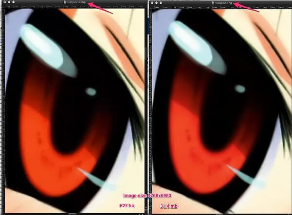


