If you're looking to build an online store for yourself or your clients, we've got you covered with this awesome deal from Themespell!
This offer ...
If you're looking to build an online store for yourself or your clients, we've got you covered with this awesome deal from Themespell!
This offer brings you lifetime access to DynoShop, an advanced WordPress theme jam packed with features that will empower you to create professional, fully featured online shops without programming knowledge or experience
It features 20+ demo web pages for different niche markets that you can easily import and populate with your products and content, a built-in, dedicated WooCommerce page builder where you can create single products, shop pages, carts, checkout pages and everything else from scratch through drag & drop simplicity, compatibility with Elementor page builder, Customizer and Gutenberg, White Labeling to offer fully featured and custom-branded shops to your clients or build them for yourself, and many more powerful options that bring tons of value to the table.
Everything is fully responsive so you can be sure it will look great on desktops, mobile devices and tablets, and its code is super clean and minified to take up less space, optimized for SEO and speed so you can jump right in without spending time creating responsive layouts or optimizing code for your stores
Not convinced? Check out everything that DynoShop has to offer, you won't find a better deal!
TL;DR
Create online shops without programming experience
Intuitive drag & drop builder
Best solution for Freelancers, Startups, Entrepreneurs, and SMBs
20+ Premade website demos
You Will Receive:
Lifetime access to DynoShop
Check out the plans available below
Create and manage your online store without programming experience
Built-in WooCommerce Builder
Compatible with WordPress' Gutenberg and Elementor Page Builder
Multisite support - build up to 100 fully featured websites
Limit Access control feature - restrict user access to functions according to your r...
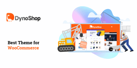
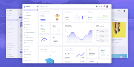
DynoShop - Best WordPress Theme for WooCommerce
If you're looking to build an online store for yourself or your clients, we've got you covered with this awesome deal from Themespell!
This offer brings you lifetime access to DynoShop, an advanced WordPress theme jam packed with features that will empower you to create professional, fully featured online shops without programming knowledge or experience
It features 20+ demo web pages for different niche markets that you can easily import and populate with your products and content, a built-in, dedicated WooCommerce page builder where you can create single products, shop pages, carts, checkout pages and everything else from scratch through drag & drop simplicity, compatibility with Elementor page builder, Customizer and Gutenberg, White Labeling to offer fully featured and custom-branded shops to your clients or build them for yourself, and many more powerful options that bring tons of value to the table.
Everything is fully responsive so you can be sure it will look great on desktops, mobile devices and tablets, and its code is super clean and minified to take up less space, optimized for SEO and speed so you can jump right in without spending time creating responsive layouts or optimizing code for your stores
Not convinced? Check out everything that DynoShop has to offer, you won't find a better deal!
TL;DR
Create online shops without programming experience
Intuitive drag & drop builder
Best solution for Freelancers, Startups, Entrepreneurs, and SMBs
20+ Premade website demos
You Will Receive:
Lifetime access to DynoShop
Check out the plans available below
Create and manage your online store without programming experience
Built-in WooCommerce Builder
Compatible with WordPress' Gutenberg and Elementor Page Builder
Multisite support - build up to 100 fully featured websites
Limit Access control feature - restrict user access to functions according to your rules
White Label - create custom branded stores for yourself or your clients
Easy Digital Download (EDD) Compatible
Optimized for Speed and Ranking
Fully responsive - mobile ready with app-style navigation
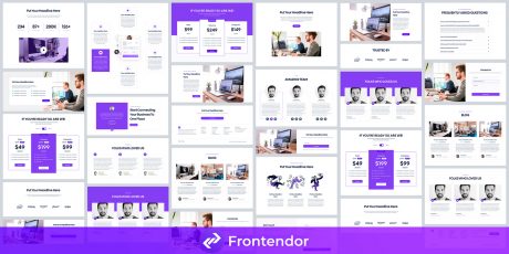
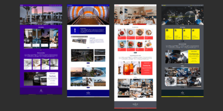
Includes 20+ premade demos, check out a few:
DynoShop - Sports & Fitness Shop Demo
DynoShop - Video Games Shop Demo
DynoShop - Footwear Demo
Great Collection of Demos
Demos help you to create websites right away and present completely finished web stores without any prior knowledge of design or coding. With Dynoshop's demos you'll have 20+ premade websites built by professionals, ready for you to populate them with your content.
Simply select any of the demos available and click on the import button, then your website will exactly look like the demo that you have imported.
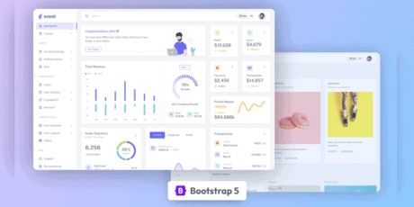
Built-In WooCommerce Page Builder
Dynoshop comes with a built-in WooCommerce page builder. You will be able to create your page and customize it in the way you like, create product pages, single pages, carts, shipping and more, with all the features you'd expect from a professional online store.
Compatible with Gutenberg & Elementor
DynoShop comes with support for Customizer, Gutenberg builder and Elementor page builder straight out of the box. You will be always able to use your favorite builder, and create/customize any page or any sections you want including headers & footers, single and pages, ship pages builder, product categories and everything else!
Simply click on the section you want to customize and all the settings related to the block will be displayed for you.
Multisite Supported
Build, setup and manage multiple websites from the same admin panel through DynoShop's multisite feature. You will be able to control all of your websites from the same roof and run your business without any hassle.
White Labeling
DynoShop offers White Labeling websites, so you can hide the default branding of the theme and apply your or your client's credentials, so nobody will know which theme you are using to build the WooCommerce stores.
Limit Access Control
The Limit Access feature enables you to allow and restrict the access of users so you can manage who can and cannot make use of certain functions according to your own settings and rules.
Clean & Minified Code
DynoShop's developer maintains and optimizes the code to make sure everything is written perfectly, so that you can run your business smoothly without worrying about backdoors and broken functions.
The code is also highly minified so that it takes less space and faster loading times required for your WooCommerce store.
Optimized for SEO Ranking & Speed
Dynoshop theme comes with proper speed optimization straight out of the box. its optimized so that it loads faster and ranks better in any search engine. With DynoShop you can forget about lagging and slow elements, everything is carefully built and maintained for optimal speed and functionality.
Fully Responsive Theme
Everything in Dynoshop is fully responsive, no matter which device you're viewing your WooCommerce store from, you will always find it perfectly fitted to your device's screen. All the layouts of Dynoshop are fully optimized to look great!
Update Notification From The Admin Panel
In most themes, you don’t get any update notification in the admin panel. Every time you have to manually check for the updates. But this is not an issue in Dynoshop. Every time an update is released, you will get a notification in the admin panel. You won’t have to manually check whether any update is released or not.
Plans Available
Standard Plan
10 websites
20+ premade demo websites
WooCommerce Builder, Compatible with Gutenberg & Elementor
Lifetime access, updates & support
Business Plan
50 websites
20+ premade demo websites
Access all features
White label
Limit Access Feature
WooCommerce Builder, Compatible with Gutenberg & Elementor
Lifetime access, updates & support
Agency Plan
100 websites
20+ premade demo websites
Access all features
White label
Limit Access Feature
WooCommerce Builder, Compatible with Gutenberg & Elementor
Lifetime access, updates & support
What are you waiting for? DynoShop's lifetime deal won't be around forever, and this offer brings you massive value with any of the plans available, don't miss out on this opportunity! Normally, this kind of access to DynoShop would be priced $199 per year, but with this deal you can forget about subscription fees, and get lifetime access to the best WordPress theme for WooCommerce, fully featured, for a one time fee!
(Back To Top)