Bootstrap Admin Themes Pack, 50+ Premium Dashboards & UI Kits, Angular, Laravel, React & More
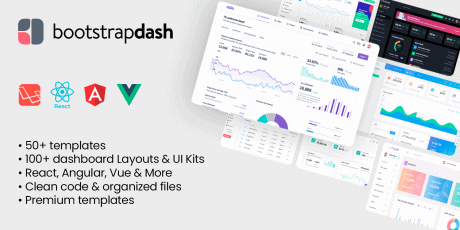
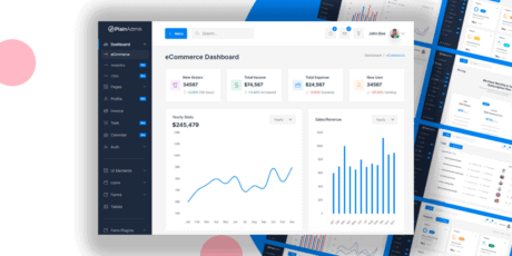
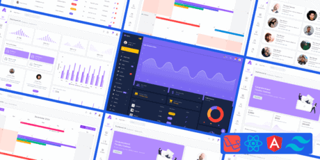
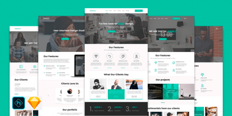
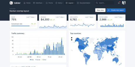
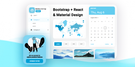
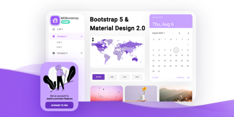
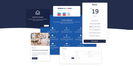
Introducing the BootstrapDash megabundle, a collection of premium code templates featuring 54 products, 100+ dashboard layouts & UI kits, fully functional and complete with demo pages, App pages, landing pages, coming soon templates & more, specialized for marketing, e-commerce & analytics for webapps, SaaS products, etc The collection delivers each template with their respective HTML, JS, CSS, SCSS & other code files, well organized and ready for production - these templates are all made with Bootstrap, Angular, Vue, Laravel and React technologies, and the files are cleaned up and organized, easy to update and work with so you'll have no problems integrating them with your projects, or develop new projects using them as a starting point With these 50+ Bootstrap templates you will receive hundreds of dashboards, UI kits & premade pages, several light & dark themes, multiple layouts & sample pages, and everything required to build complex web applications and SaaS products Regularly, this megabundle of code templates would be priced over $140, so why not get it today with a neat exclusive discount? With this limited time deal you can get this collection for just $79! You Will Receive: 50+ premium code templates 100+ dashboard layouts, UI kits & more Each template includes their HTML, JS, CSS, SCSS & other code files Clean code, easy to update & work with Bootstrap, Angular, React, Lavarel & Vue technologies 80+ Dashboards, specialized for marketing, e-commerce, analytics, and more 100+ pages (demos, landing pages, coming soon & more) Light & dark mode templates You can check out the full contents & live previews at BootstrapDash's official website Star Admin Pro 11 Unique Dashboards, RTL and Boxed layouts, 5+ Applications, 5 Attractive Sidebar layouts, 18 UI Elements, 4 Icon Sets, 25 Elegant Pages, 8 Charting Libraries, Dark and Light versions, and plenty more. Check out a live preview here Star Admin Pro React 1 Attractive Dashboard, 5+ Applications, 10+ UI Elements, 4 Icon Sets, 25 Elegant Pages, 6 Charting Libraries, and plenty more. Check out a live preview here Azia Admin 10 Stunning Dashboards, 10+ Essential Utilities, 1000+ Font Icons, 20+ Essential UI elements, 5 Beautiful Page Styles, 5 Useful Charting Libraries, 4 In-built Applications, Tables, Maps, Forms, and a lot more. Check out a live preview here Corona Admin Five Dashboards, RTL and Boxed Page layouts, 5 Sidebar Layouts, 15+ Useful UI Elements, 18 Stunning Pages, Pre-Built Apps, Excellent Data Representation Options, Tinted Sidebar, and more features. Check out a live preview here Corona Angular Five Dark Angular Dashboards, RTL and Boxed Page layouts, 5 Sidebar Layouts, 16+ Useful UI Elements, 18 Stunning Pages, Pre-Built Apps, Excellent Data Representation Options, Tinted Sidebar, and more features Check out a live preview here Corona React Attractive Dashboard, 5+ Applications, 10+ UI Elements, 4 Icon Sets, 25 Elegant Pages, 6 Charting Libraries, and plenty more. Check out a live preview here Stellar Admin Pro Four Unique Bootstrap Dashboards, Dark and Light versions, Horizontal and Vertical layouts, 5 Excellent Sidebar Layouts, 15+ Reusable UI elements, 8 Charting Libraries, 20 Beautiful Pages, RTL Arabic, and plenty more features. Check out a live preview here Stellar Angular Four Unique Angular Dashboards, Dark and Light versions, Horizontal and Vertical layouts, 5 Excellent Sidebar Layouts, 15+ Reusable UI elements, 8 Charting Libraries, 20 Beautiful Pages, RTL Arabic, and plenty more features. Check out a live preview here Stellar React Attractive Dashboard, 5+ Applications, 10+ UI Elements, 4 Icon Sets, 25 Elegant Pages, 6 Charting Libraries, and plenty more. Check out a live preview here Purple Admin Four Carefully Crafted Dashboards, 4 Pre-built Applications, 20+ Essential UI elements, 8 Useful Charting Libraries, 20+ Elegant Pages, Maps, Tables, Code Editors, and more attractive features. Check out a live preview here Purple React Attractive Dashboard, 5+ Applications, 10+ UI Elements, 4 Icon Sets, 25 Elegant Pages, 6 Charting Libraries, and plenty more. Check out a live preview here Material Admin Pro Multiple Stunning Dashboards, 10+ Excellent UI Elements, Multiple Charting Libraries, 5+ Beautiful Page styles, Forms, Tables, In-built Apps, and a lot more. Check out a live preview here Basic Admin Carefully Crafted Dashboards, 20+ Essential UI Elements, 3 Unique Page Layout Options, 5 Sidebar Layouts, 20+ Stunning Pages, 9 Useful Charting Libraries, Tables, Icons, and plenty more. Check out a live preview here Breeze Admin Four Unique Dashboards, 19 Reusable UI Elements, 5 Attractive Sidebar Layouts, RTL and Boxed Page Layouts, 8 Excellent Charting Libraries, 15+ Elegant Pages, Tables, Maps, Icons, Forms, and a lot more. Breeze Angular Four Unique Dashboards, 19 Reusable UI Elements, 5 Attractive Sidebar Layouts, RTL and Boxed Page Layouts, 8 Excellent Charting Libraries, 15+ Elegant Pages, Tables, Maps, Icons, Forms, and a lot more. Breeze React Attractive Dashboard, 5+ Applications, 10+ UI Elements, 4 Icon Sets, 25 Elegant Pages, 6 Charting Libraries, and plenty more. Xollo Admin Unique Dashboards, RTL, Boxed, and Horizontal Menu Layouts, 5 Sidebar Layouts, 20+ Essential UI Elements, 4 Separate Icon Sets, 8+ Charting Libraries, 20+ Stylish Pages, and a lot more. Plus Admin Four Stunning Dashboards, Light and Dark Versions, Horizontal and Vertical Layouts, RTL and Boxed Page Layouts, 4 Pre-built Apps, 20+ Advanced UI Elements, 20+ Beautiful Pages, Tables, Charts, Maps, and plenty more features. Plus Admin React Attractive Dashboard, 5+ Applications, 10+ UI Elements, 4 Icon Sets, 25 Elegant Pages, 6 Charting Libraries, and plenty more. Connect Plus 4 Stunning Dashboards, Horizontal and Vertical layouts, Light and Dark versions, RTL Arabic, 4 Pre-Built Applications, 5 Unique Sidebar Layouts, 20+ Essential UI Elements, 8 Charting Libraries, and 20+ Stylish Pages, and a lot more. Dario Unique Dashboards, 100+ Plugins and Widgets, Multiple Data Representation Options, Stunning Page styles, fine collection of reusable UI elements and components. Material Admin Dark Multiple Stunning Dashboards, 10+ Excellent UI Elements, Multiple Charting Libraries, 5+ Beautiful Page styles, Forms, Tables, In-built Apps, and a lot more. Miri Stunning Page Layouts, Huge Collection of Essential Components Including Alerts, Buttons, Tables, and more, Advanced Typography, Attractive Color Choices, and Plenty More Essential Features Breeze Vue Attractive Dashboards, Fascinating Collection of Advanced and Basic UI Elements, Multiple Charts and Tables, Stunning User, Error, Ecommerce, and General Pages. Icons, Form, Text Editors, and Plenty More. Plus Vue Stunning Dashboards, 25+ Basic and Advanced UI Elements, Code and Text Editors, Forms, Multiple Charts and Tables, Useful Applications, 15+ Stunning Page Styles, and a lot more. Connect Plus Angular Unique Dashboards, 25+ Reusable UI Elements, Plenty of Useful Widgets, Multiple Charting Libraries, 25+ Elegant Pages, Tables, Maps, Icons, Forms, and a lot more Purple Vue Attractive Dashboards, 5+ Applications, Huge Collection of UI Elements, 4 Icon Sets, 25 Elegant Pages, Charts and Tables, Forms, Notifications, and plenty more Purple Angular Attractive Dashboards, 25+ UI Elements, Five Icon Sets, 25 Stunning Pages, Three Charting Libraries, Popups, Notifications, and plenty more. Corona Vue Unique Dashboards, 25+ Reusable UI Elements, Multiple Form Elements, Charts and Tables, 25+ Elegant Pages, Maps, Icons, Forms, and a lot more. Star Admin Vue Unique Dashboards, 25+ Essential UI Elements, Tables, Icons, Forms, Separate Pages for Login, Register, and 404. Star Admin Laravel Attractive Dashboards, 25+ Reusable UI Elements, 8 Excellent Charting Libraries, Five Excellent Forms, 25+ Elegant Pages, Tables, Maps, 5 Icon Sets, Forms, and a lot more. Star Admin Angular Multiple Dashboards, 25+ Basic and Advanced UI Elements,, Forms, Multiple Charts and Tables, 4 Icon Packs, Useful Applications, 15+ Stunning Page Styles, and a lot more. Connect Plus Vue Attractive Dashboards, Fascinating Collection of Advanced and Basic UI Elements, Multiple Charts and Tables, Stunning User, Error, Ecommerce, and General Pages. Icons, Forms, Popups, and Plenty More. Plus Admin Angular Unique Dashboard, 25+ Reusable UI Elements, Plenty of Useful Widgets, Multiple Charting Libraries, 25+ Elegant Pages, Tables, Maps, Icons, Forms, and a lot more. Azia Angular Multiple Dashboards, Basic and Advanced UI Elements, Forms, Multiple Charts and Tables, 4 Icon Packs, Useful Applications, 15+ Stunning Page Styles, and a lot more. Azia React Multiple Dashboards, Basic and Advanced UI Elements, Forms, Multiple Charts and Tables, 4 Icon Packs, Useful Applications, 15+ Stunning Page Styles, and a lot more. Kapella UI Four Unique Dashboards, 19 Reusable UI Elements, 5 Sidebar Layouts, RTL and Boxed Page Layouts, 8 Charting Libraries, 15+ Pages, Tables, Maps, Icons, Forms, and a lot more. Majestic Admin Four Dashboards, elegant looking carousel, light, and dark versions, Horizontal and Vertical Layouts, RTL and Boxed Page Layouts, 4 Apps, 20+ Advanced UI Elements, 20+ Beautiful Pages, Tables, Charts, Maps, and plenty more features. . Allur UI 4 Stunning Dashboards, Horizontal and Vertical layouts, Light and Dark versions, RTL Arabic, 4 Pre-Built Applications, 8 Charting Libraries, and 20+ Stylish Pages, and a lot more. Pollux 4 Stunning Dashboards, Horizontal and Vertical layouts, Light and Dark versions, RTL Arabic, 4 Applications, 5 Sidebar Layouts, 20+ UI Elements, 8 Charting Libraries, and 20+ Stylish Pages, and a lot more. Celestial 4 Stunning Dashboards, Horizontal and Vertical layouts, Light and Dark versions, 4 Pre-Built Applications, 5 Sidebar Layouts, 20+ Essential UI Elements, 8 Charting Libraries, and 20+ Stylish Pages. Spica 4 Stunning Dashboards, Horizontal and Vertical layouts, Light and Dark versions, 4 Pre-Built Applications, 5 Sidebar Layouts, 20+ Essential UI Elements, 8 Charting Libraries, and 20+ Stylish Pages. LeadUI UI kit, standard bootstrap elements, 10+ sample pages, unique cards, fine collection of reusable UI elements and components. Unplug UI kit, standard bootstrap elements, 10+ sample pages, unique cards, fine collection of reusable UI elements and components. Login Bundle Collection of 5+ premium bootstrap Login Pages Wizard Bundle Collection of 5+ premium bootstrap Login Pages Pricing Bundle Collection of 5+ premium bootstrap Pages Pages. Ideal for SAAS application, subscription services and sale of software/digital assets. Coming Soon Bundle Collection of 5+ premium bootstrap Coming Soon Pages for pre-launch activities. Skydash Premium Bootstrap 5 admin dashboard template with plenty of pre-built pages. Star Admin 2 Brand new Bootstrap 5 admin dashboard template with beautiful, modern design. Purple Laravel A beautiful dashboard template with gradient colours. Tons of UI components and pre-built pages. Connect Plus Laravel A feature-packed admin dashboard with tons of plugins, widgets, and components. Stellar Laravel Premium Laravel dashboard template with pre-built pages, widgets, and tons of UI components. (Back To Top)

